It’s no secret that UI designers elicit the help of design trends to improve the user’s experience.
Today, we’ll focus on the neumorphic design trend. You’ll learn the ins and outs of this trend in our guide, including its benefits, drawbacks, and principles. Let’s get started!
What Is Neumorphic Design?
Naturally, when talking about neumorphism design, you’ll ponder questions like, “What is neumorphic design?”
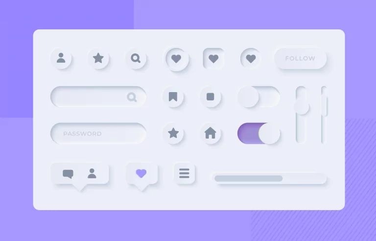
Neumorphism is a visual design trend that took the world of UI design by storm in 2019. It’s a style that blends together elements of skeuomorphism with a flat design to achieve soft, minimalist realism within user interfaces.
Neumorphism’s realistic qualities factor into the appearance of UI elements, making them seem like part of the UI’s background. This, combined with subtle shadows, quaint highlights, and muted colors, helps designers imbue their UI elements with raised, tactile aesthetics.
As you can imagine, neumorphism and visually appealing designs go hand-in-hand. But, with that in mind, neumorphism has its fair share of criticism pertaining to accessibility and spacing. We’ll discuss this in more depth shortly.

Flat Design vs Neumorphism: Understanding Key Differences
So, you know what a neumorphic design is. Let’s now discuss what it isn’t.
It’s time to settle the matter of flat design vs neumorphism. But, in order for us to do that, you need to know what flat design is first.
Flat design relates to a design style that makes use of 2D elements and bright colors. With flat design, you’d use no shading or extra visual flourishes – the goal is to avoid the three-dimensional look.
Minimalistic, simple, functional, and distraction-free – this is how we’d summarize flat design.
As we mentioned earlier, the neumorphic style derives a lot of its composition and principles from flat design. So, it’s not hard to discern the similarities between the two. Both design trends celebrate minimalism and simplicity.
However, neumorphism differs from flat design in its use of shadows and highlights. In particular, neumorphism makes UI elements seem as if they are protruding from the background, creating a 3D effect.
For that reason, neumorphic designs nearly always look more immersive and interactive than flat designs.
Another key difference is the use of color. Neumorphism involves the predominant use of neutral colors (mainly greys and whites), while flat design uses high-contrast, bright colors.
This makes flat design more effective than neumorphic design when it comes to accessibility and frictionless navigability.
The Benefits of the Neumorphic Design Style
Now that you know a little more about the neumorphic style, you need to know how it impacts UI design. Specifically, you need to know how implementing neumorphic elements into your designs will benefit your target users.
We discuss some of these benefits below:
- Neumorphic design can make your user interfaces look more natural and simple.
- Due to the realism within neumorphic designs, your UI elements would have an easily distinguishable, tactile, and interactive appearance.
- You can easily blend neumorphism with other styles like dark mode design.
- Since neumorphism celebrates simplistic, minimalist visuals, it’s also versatile enough for a range of various digital products.
Nothing’s Perfect: The Challenges of Neumorphism
So, it’s safe to say that neumorphism is the perfect style for achieving a soft, minimalist aesthetic. But is neumorphism a perfect design style overall?
Simply put, the answer is no. No design trend, no matter how popular, is without flaws, and neumorphism is, of course, no exception.
You will face challenges when implementing neumorphism into your designs, and we’ve addressed them below.
1. The Accessibility Issue
The biggest challenge that UI designers face with neumorphism is how it can compromise the design’s overall accessibility.
Neumorphism’s monochromatic color scheme and subtle shadows/highlights won’t help you create sufficient contrast in your designs. And, of course, high degrees of contrast make UI elements easy to identify without making your users strain their eyes.
Ultimately, using neumorphism could potentially result in a less-than-adequate experience for users, especially those with visual impairments.
We strongly recommend consulting the Web Content Accessibility Guidelines before you start experimenting with neumorphism.
2. The Spacing Issue
You should design every inch of space within your user interfaces with meticulous care, especially with mobile app designs.
The thing with neumorphism is that neumorphic elements require more screen real estate than traditional UI elements.
Why?
Well, neumorphic elements use two shadows – a dark shadow and a lighter shadow. These shadows are essential to a neumorphic element’s visual prominence, so you must make room for them.
As you can imagine, this poses problems for already complex or visually “busy” user interfaces.
Mastering Soft UI: The Principles of Neumorphic Designs
By now, you’ve probably got a good idea as to whether or not you’ll use neumorphism in your designs.
If you do want to add your own spin on neumorphism, we suggest sticking to the following principles.

1. Shadows
Neumorphic interfaces exhibit soft, subtle shadows that bring the illusion of three-dimensionality to life.
Add darker shadows to one side of a UI element while adding a lighter shadow to the other side. This is a great way to experiment with your use of shadows and create a sense of depth and realism.
2. Highlights
To support the sense of depth that your shadows create, you need to use subtle highlights, too.
Your highlights will propel a sense of realism and help your UI elements exhibit a tactile quality.

3. Monochromatic Colors
We mentioned previously that most neumorphic UIs use muted, neutral colors, but that doesn’t mean you have to as well. With neumorphism, you can use any color, but it’s important that you stick to a monochromatic color scheme.
Monochromatic color schemes simply use the various tints, tones, and shades of a singular color.
By using a monochromatic color scheme, you’ll find it easier to stick to one of neumorphism’s most central tenets: minimalism.
4. Positioning
To create neumorphic realism, you can’t just place your shadows and highlight anywhere on the screen. The goal is to mimic how shadows and highlights affect real-life objects.
So, consider positioning your shadows on the lower edges of your UI elements.
You should also consider placing your highlights on the upper edges of your UI elements. By doing so, you’ll enhance the sense of protrusion that your UI elements will convey.
How To Make Neumorphism Designs
It’s time to get down to brass tacks – how to make neumorphism designs.
Below, we’ve provided a quick, simple guide to help you start creating neumorphic designs.
- Align your business’s goals with user research. This will help you determine the perfect colors for your monochromatic color scheme.
- Select the tool you’ll use to design your neumorphic UI elements, like Figma.
- Create your frame and choose your background color.
- Use your chosen platform’s shape tools to create your UI elements.
- Apply your monochromatic scheme to your UI elements, making sure it’s the same as the background color.
- Add your inner and outer shadows and highlights to your UI elements.
- Implement icons and textual labels to your UI elements to bring the content they represent to life.

Neumorphism in Action: An Example
To inspire you, we’ve looked at the “Light Mode Simple Music Player” from Filip Legierski.
As you can see, this design is minimalistic and simple and makes use of neutral colors, making it perfect for neumorphism.
Take note of the shadows and highlights around the circular album cover.
The placement is perfect, making it seem like an overhead light is shining down on the protruding UI element.
But it’s not just the placement of the lighter and darker shadows that make this neumorphic design great.
Legierski’s pop of pastel color elevates the intrigue within the design, contrasting the neutrality of the overall interface. The use of color creates a contrast that supports visibility while not detracting from the tenets of neumorphism.
Overall, this is a great example of clean, clear neumorphism with a touch of the designer’s unique flair.
FAQs
Before you finish reading our guide, we’d like to answer some of the questions you’re likely to have about neumorphism.
Let’s take a look at some of our most frequently asked questions surrounding this topic.
- What is skeuomorphism?
Skeuomorphic design involves mimicking the look of real-life objects to create intuitive interfaces that users easily recognize. Think of the recycle bin icon on a Windows device, which mimics an actual bin.
- What is the difference between skeuomorphism and neumorphism?
Neumorphism focuses on how shadow and light affect real-life objects to create an illusion of three-dimensionality in UI designs.
Skeuomorphism replicates those real-life objects, imitating their textures and materials to make UI elements look and feel more familiar.
- What is the best background color for neumorphic designs?
Neutral colors and neumorphism complement each other extremely well, so it’s worth experimenting with neumorphism with grays and whites.
But using neutral colors isn’t the most exciting way to approach UI design.
So, if you want to use other colors, we suggest opting for a softer, pastel variation of your chosen hue.
Neumorphic Design: Final Thoughts
Hopefully, you can make a well-informed choice about the neumorphic design trend after reading our guide.
Undoubtedly, design trends are valuable tools for designers who are looking for ways to improve the user’s experience. But you can’t rely on design trends alone to achieve that goal; you also need other forms of inspiration.
This is where Page Flows enters the picture.
Page Flows is the home of thousands upon thousands of screenshots, emails, and, most significantly, user flow recordings. We document all types of common but crucial user flows from big-name brands like Spotify and Amazon.
What’s more, we document these user flows across multiple industries, covering everything from food to finance. We do this to help designers find a reliable foundation of inspiration that will directly improve the user’s experience.
Like neumorphic design, we prioritize simplicity and straightforwardness. Get started today to uncover the secrets to a better user journey!