
Nowadays, we have access to anything and everything at our fingertips. Tap away on your mobile keyboard to find the answer to the question you and your friend are discussing over dinner. No need to wait to get on your laptop to do some research. Or perhaps you start watching a movie on your phone in the subway. Later, when you get home, you may want to continue watching it on your laptop. The transition was so seamless that you didn’t even notice going from one device to another. The responsiveness of a website is crucial in our technologically advanced world.
A responsive web design is extremely important in growing your business and providing customers with a delightful user experience. According to Exploding Topics, over 55% of internet traffic comes from mobile users. More than half of the world’s internet-using population is accessing the internet with their smartphone. So, if your website doesn’t fit well on both mobile and desktop screens, you’re likely causing some headaches for your customers. You’re also losing engagement and repeat visit opportunities. Eighty-eight percent of online users won’t return to a site after a bad experience. To improve the user experience, let’s talk more about what responsive design is and best practices.
What Is Responsive Design?
So what is responsive design? To put it simply, responsive design is automatically scaling your website to fit any screen size. This ensures users get a seamless experience whether they are using a desktop computer, tablet, or smartphone. If someone needs to zoom in on their mobile device to read content on a website, it creates inconvenience. This extra effort adds to the workload for the customer. Your website should automatically adjust to the mobile screen so users do not need to zoom in to read something. If someone has to scroll horizontally on a mobile device to see the rest of the website, the website is not responsive. Users have to put in the extra effort to see what the website offers. Providing the user with a responsive design can significantly improve the user experience, eliminating the inconvenience.
Benefits of UX Design
I’ve mentioned a little bit already how poor responsive sites lead to poor user experiences. Let’s talk more about the benefits of UX design and how a responsive design improves the user experience.
So, what is UX (user experience) design? It is a process that design teams use to create products that are user-friendly. The goal of UX design is to provide users with a meaningful and positive experience. Designers are able to create and provide such an experience by using data. They collect data and analyze data based on user needs, preferences, behaviors, and pain points. Design teams work on a lot of different things to improve the user experience, including usability, accessibility, aesthetics, and functionality.
When creating a website, thinking about the users first helps solve many issues. Designers specifically consider the screen users might use for interacting with the product. Using a responsive design enhances the overall user experience.

Benefits of Responsive Design
A responsive design leads to a positive user experience along with other benefits. Let’s take a look at the benefits of responsive web design.
Reduced Bounce Rates
A bounce occurs when a website visitor leaves the site after visiting only one page. Visitors might leave a website if they can’t find what they’re looking for or if the mobile experience isn’t great. If the information is missing or viewing the information is difficult, visitors will leave the site quickly. A responsive design decreases these frustrations, potentially leading to a lower bounce rate.
Higher Conversion Rates
A conversion happens when a user completes a desired action, like making a purchase or subscribing. Having a lot of website traffic is important. However, it is also important to pay attention to the percentage of visitors who convert. Responsive sites do not require users to zoom in to see something on the page. It does not require users to scroll horizontally to see a cut-off image. Thus, responsive sites make it easier for visitors to engage with and go through your website. This can potentially lead to higher conversion rates.
Higher Site Ranking
Search engine algorithms these days consider how mobile-friendly your website is. Google prioritizes mobile-friendly websites in its rankings. So, if your website is mobile-friendly, it’ll rank higher in searches. If your website becomes more visible in searches, you can attract more visitors. With more visibility, your online presence becomes stronger.
Faster Page Load Times
According to Forbes, 40% of users will leave a website if it takes more than 3 seconds to load. Responsive designs optimize images to fit on the screen the user is looking at. This leads the page to load faster. A faster load time contributes to a pleasant user experience.
Future-Proofing
As technology advances, we gain new devices to use, such as smartwatches or new TVs. Responsive web designs allow us to adapt to these changes quickly. This ensures that visitors have a seamless experience across all devices.
As seen in this list, responsive websites only benefit your company and your customers. Make it easier for search engines to rank your website higher than your competitors. Get more people to engage with your website and convert. Optimize your site for faster loading times and give your customers immediate gratification. Responsive designs prepare you for the advancing digital landscape.

Responsive Design Best Practices
Now knowing the impactfulness of responsive design, let’s review some responsive design best practices. These practices can enhance your own product’s performance and user experience when implemented.
- Mobile-First Approach: Just as this approach states, design for a mobile screen first. The screen real estate for mobile devices is much smaller than desktop screens. Starting with a mobile-friendly layout first makes it much easier to adapt when building out larger screens.
- Fluid Grid Layouts: Before, it was common to create two separate websites, one for a mobile version and another for desktops. Now, designers use fluid grid systems that make it easy to scale elements proportionally to the user’s screen width. These new adaptable layouts work best to fit any screen size.
- Responsive Media: Using scalable vector graphics (SVGs) allows images to scale up and down without quality loss. This makes it easy to maintain image clarity across various sizes. Communicating with your developer ensures images scale correctly to user devices.
- Media Queries: Developers use media queries to check various factors, such as screen width and height, resolution, and device orientation. They employ this CSS (Cascading Style Sheets) technique to apply different rules or styles depending on the user’s device characteristics.
- Thumb-Friendly Design: When using mobile phones, users often use their thumbs to navigate and use the website. So, make sure the buttons and elements are appropriately sized and spaced to accommodate touch gestures.
- Optimize Typography: This one may seem obvious, but make sure to select fonts and font sizes that are legible across different devices. Instead of focusing on font size, use percentages or em units so typography is responsive on any device.

Responsive Design Tools
Designers and developers work closely together to bring a product to life. This also includes working together to build a responsive design. If you’re a one-person team, website builders, such as WordPress and Squarespace, offer templates that are responsive. This allows you to put your focus on the content and the user experience your website can offer.
When it comes to building your website from scratch, many tools are available to help you. We’ll highlight just a few.
- Chrome DevTools: In the Google Chrome browser, developers can use the built-in developer tools. DevTools provides features like device emulation, responsive design testing, and real-time CSS debugging. Optimize web pages with a helpful tool like this.
- Figma: Figma is a great design tool that allows for easy collaboration. When designing your web pages, utilize Figma’s auto layout feature. It automatically emulates how your website would appear on various screen sizes.
- BrowserStack: BrowserStack allows you to test your websites and mobile apps on real devices. It also offers accessibility testing to assist in analyzing and auditing.
These are just a few tools to use to test the responsiveness of your website. Experiment and see what works for you and your specific project requirements.
Responsive Web Design Examples
We’ve talked a lot about responsive web designs, so now, let’s look at some responsive web design examples. The first example shows poor responsiveness, and the second example shows great responsive design in action.
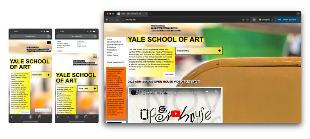
Yale School of Art
The Yale School of Art’s website does not showcase the best responsive design. When viewing the mobile screen, the text becomes a bit hard to read. Improving it involves expanding the paragraph across the entire screen instead of sticking with the two narrow columns. Fortunately, the navigation menu of the website is under the hamburger menu on the top right, as most mobile-friendly websites do. However, once the navigation expands, the different options are too close together. Trying to tap on the precise page the user wants to go to will be difficult as the menu does not have enough spacing.
Looking at this webpage on a mobile screen and a desktop screen is a frustrating experience. I have to squint my eyes to read and carefully tap around in order to explore this webpage. Feeling the urge to personally make changes to the website, let’s quickly move on to our next example. We’ll explore a site that offers a delightful experience with its excellent responsiveness.
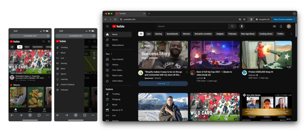
YouTube
YouTube is a highly viewed site and is one of many sites that is responsive. The desktop screen shows the videos laid out nicely in a grid with a navigation bar on the side. For the mobile screen, instead of showing videos in three columns, one video scales across the screen for easy viewing. Imagine having to look at three videos in a row on a small screen. On the tablet version, three videos in one row would also be quite small. So, the tablet scales to have two columns of videos.
On the mobile screen view, the navigation bar tucks under the navigation icon. This allows for easy visibility of the videos. Tapping the icon reveals a nicely spaced-out navigation bar. This makes it easy for users to navigate to where they would want to go next.
YouTube, along with many other businesses, uses responsive design to provide delightful user experiences. The consistency from the mobile screen to the desktop screen makes it unnoticeable. It makes me grateful to product teams that work hard to create these seamless experiences.
Check Out Responsive Designs on Page Flows
A responsive design improves the user experience, SEO, branding, and overall website performance. With all these improvements, visitors are likely to see your website and stay on it for longer. Keep in mind that the content of your website is important as well. So do your due diligence to display content visitors want to see, along with making sure your website is responsive.
Are you inspired to improve the responsiveness of your website? If you’re looking for design inspiration, why not learn from proven products? Page Flows is a helpful resource for finding responsive design ideas. Get started today to access our growing library of user flow recordings and also stay up-to-date with current design trends.