Logos are branding’s bread and butter. The right logo can grab attention and tell people what your business is about in just a few seconds. In the sporting world, it’s what defines team identity, along with the colors and mascots that make fans proud. And in a league with an 80-year history, it’s no wonder that there are so many iconic NBA logos.
These days, logos are an important aspect of graphic design. Indeed, they’re important for web designers in general. But what can designers learn from logos in the sporting arena? As it turns out, a lot as our guide reveals below.

History of the NBA Logo
Let’s start with the logo of the league itself. In fact, the logo we know and love today has been around in some form since the late 1960s.
In 1968, designer Jerry Dior created the logo for Major League Baseball. It’s a classic, simple design, playing on America’s red, white, and blue. Dior used negative space to create the silhouette of a batter about to take a swing. Dior’s supervisor took this logo to the heads of the baseball committee and received almost instant approval.
Then, J. Walter Kennedy, commissioner of the NBA, saw this logo and decided he had to have it. At the time, the NBA was struggling with its reputation. So, associating itself with an all-American league like MLB could help. He approached Dior’s supervisor, Alan Siegel, for a design.
They wanted a similar logo: red and blue with a white silhouette. After digging through the photo archives at Sport Magazine, they landed on the perfect one: a photo of Jerry West. The iconic silhouette features West dribbling while playing for the Lakers. It has some nice movement to it, just like the MLB logo.
Ironically, West hates his association with the logo. He has said, “I don’t like to do anything to call attention to myself.” This is unfortunate for the face of such an iconic logo.
It’s so iconic that it has barely changed in years. One minor change occurred in 2017 when the League refreshed the font to make it slightly taller and leaner. It’s barely different at all, however.
And this enduring, simple logo is a true testament to design. Siegel, who has designed many award-winning logos, is still known as the guy who made the NBA logo.
5 Cool NBA Logos
All logos for the National Basketball Association are cool in their own ways. Each one has its own design history, some more interesting than others. Let’s check out five cool NBA logos to see what makes their designs so great.
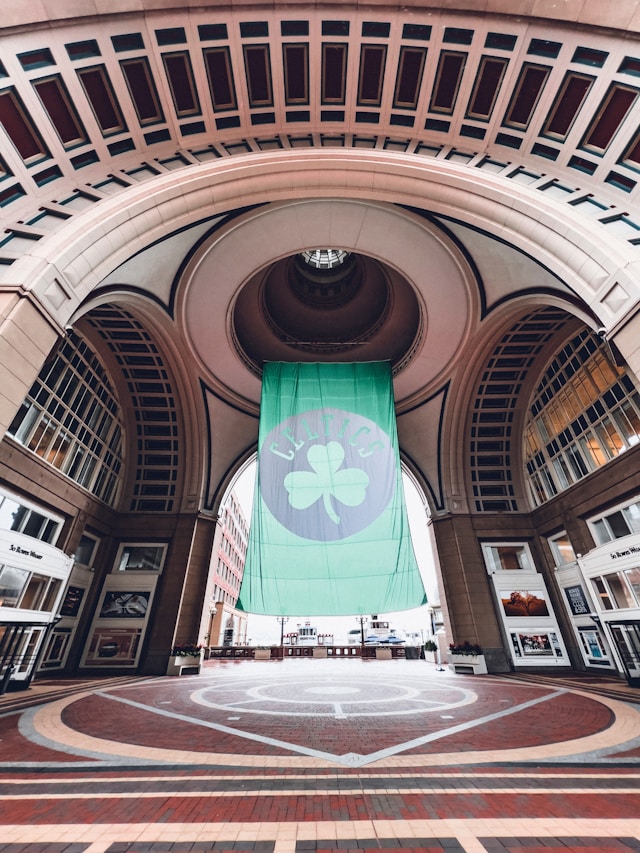
1. Boston Celtics
The Boston Celtics are one of the league’s original eight teams. Their name and logo pay homage to Boston’s large population of Irish Americans.
Cartoonist Zang Auerbach, brother of head coach Red Auerbach, designed the logo. He went all out, leaning into his cartoon roots with a jaunty leprechaun design. Lucky the Leprechaun spins a basketball in the center of the green logo.
The team has had several logos over the years, but this one encapsulates the fun-loving spirit of the community.
2. Charlotte Hornets
The Charlotte Hornets are currently in North Carolina, but they originally hail from New Orleans. Over the years, the team has bounced back and forth between two names: the Hornets and the Bobcats. In 2014, the team reverted to its original name and created its current logo.
Jordan Brand, a division of Nike, helped create the logo. And let’s be honest, they are experts when it comes to brand design. The NBA’s Global Merchandising Group and some senior-level executives at the club also helped with the design.
It uses a very distinctive color palette of bright blue and muted turquoise. A stylized hornet sits in the center, its design leaning into the aggressive stereotype that the team wants to portray. Meanwhile, jagged lettering with sting-like serifs gives some dynamism to the logo. Look closely, and you’ll see that the hornet’s body has the markings of a basketball.
3. Chicago Bulls
Perhaps one of the most iconic logos in basketball, the Chicago Bulls logo is the only one to never have changed. Perhaps it’s this that makes the design so iconic. Or, maybe it’s because the Bulls are the only franchise to win multiple championships while never losing a Finals series.
The name of this team points to the city’s meatpacking history. However, it also symbolizes strength and power, and that’s what the logo aims to represent.
The logo features a simple, angry red bull. It’s bold and instantly recognizable. American graphic designer Deap P. Wessel created the logo, and he did such a good job that nobody has bothered to change it! That’s powerful design.
4. Miami Heat
Miami Heat is a unique team, with a fan picking the name in a contest. After that, the team ran a logo contest. Mark Henderson and Richard Lyons won with 34% of the vote out of 13,000 submissions. Since then, the logo has barely changed.
It’s relatively straightforward, depicting a basketball traveling through a hoop and bursting into flames. But its asymmetric design is genius, standing out among other NBA logos. It’s powerful, dynamic, and oh-so-cool.
5. Toronto Raptors
As the NBA expanded into Canada, new teams arrived. The Toronto Raptors, founded in 1995, were one such team. Again, they enlisted fans to help them choose the name and logo.
Over 2,000 people entered the naming contest, but ultimately, the Jurassic Park-inspired name won. The original logo features an aggressive velociraptor dribbling a basketball and wearing sneakers.
In 2014, the Raptors switched to a more modern, simplistic design. It featured a circular shield that a velociraptor has torn to shreds. It’s aggressive but fun and simple enough to use for a variety of purposes.
NBA Teams’ Old Logos
Designs rarely stay the same. Even if your logo is amazing, technology and consumer preferences change. These NBA teams’ old logos are great examples of this.
1. Dallas Mavericks
The original logo for NBA team Dallas Mavericks featured a cowboy hat on top of the letter M. There was a basketball in the background.
These days, it features a much more modern, dynamic design that includes a steely-looking horse. It’s more dynamic, powerful, and intimidating. Not to mention, the color palette is a lot more mature.
2. Detroit Pistons
The Detroit Pistons initially had a unique logo featuring the outline of a Tin Man dribbling a ball. The logo has undergone many changes over the years, at one point displaying a flaming ball with a horse. The team name stretched backward as if firing on all cylinders.
Now, the team has opted for a simple design with the team name on a red basketball. It’s clean, straightforward, and no-nonsense.
3. Denver Nuggets
The Denver Nuggets logo has changed a lot to reflect current design trends. It was initially a simple basketball design before it evolved to include a miner motif in 1974. In 1994, they adopted an iconic mountain badge, which has since given way to a more streamlined version.
Today, the design is a simple circle with two crossed pick-axes. The darker color palette is much more intimidating.
What NBA Logos Can Teach Designers
NBA team logos offer several key design lessons. By prioritizing simplicity and timelessness, you can keep your logos relevant. If you make them iconic enough, you might even win parody logos from jealous designers.
They also highlight how you can reflect cultural and historical relevance. While this isn’t always important for companies, it’s an important lesson in how logos can symbolize what you want. Colors, fonts, and icons are all important here.
If nothing else, these logos are certainly inspiring!
Need More Logo Inspo? Use Page Flows
Logos are just one aspect of design. And, as a UXer, chances are that you’re not working on NBA logos right now! Still, you can take inspiration from all around you.
If you’re looking for more design inspiration, you’ve found it. Get started with Page Flows today to see a library of user flow recordings and tech design ideas.