Color is an essential element in any graphic design project. It helps set the tone for your product and will leave a lasting impression.
Choosing the right color palette can make or break your design project. But, with so many combinations out there, it might feel impossible to pick the perfect colors for your design.
If you’re struggling to make a decision, don’t worry. In this guide, we’ll walk you through various graphic design color palettes. We’re covering everything from the basics to finding the best color combinations for your project. Let’s dive right in!
What Are Graphic Design Color Palettes?
A color palette is basically a collection of colors that help create a cohesive look for projects. Think of it as a toolkit of shades, tones, and hues that guide how your project feels visually.
The colors you end up choosing will influence every single aspect of your graphic design project, from backgrounds to icons.
Graphic design color palettes help you stay consistent across all your different design elements. They allow you to create a more harmonious look that feels both intentional and polished.
It doesn’t matter if you’re working on a website or brand logo. You need to choose the right colors for your target audience.

Why Is Choosing the Right Color Palette Essential for Your Project?
If you want your user to have a great experience, you must be familiar with web design color theory and select the right color palette. The colors you end up choosing will influence audience perception of your design and the emotion it evokes.
In fact, 92.6% of people say the visuals are the main factor influencing their purchasing decisions. So, if you are selling a product, a good color palette for your brand can make all the difference.
Here’s why choosing the right color palette for your project is fundamental.
1. Sets the Mood for Your Project
Colors are powerful. They have the ability to set the overall mood and tone of your designs. Bright colors like yellows and pinks create a more cheerful atmosphere. Meanwhile, darker colors like navy blue or black convey seriousness and sophistication.
By being careful when choosing your color palette, you can take control of your design’s emotional impact. You can also consult a color psychology chart if you are not familiar with how to invoke mood through the colors you use.
2. Improves the Visuals
Choosing colors that work together can make your designs far more appealing. It helps to create much-needed harmony and balance, making your design pleasing to the eye.
Clashing colors will create visual chaos, distracting the reader from your message.
3. Makes Your Brand Identity More Recognizable
A strong brand identity is the key to becoming recognizable in the market. Your colors can establish who you are almost instantly. Think of brands like Coca-Cola. The red and white color scheme is recognizable straight away.
Whether you already have a brand color palette or you’re building it, you should continuously revise your decisions.
What Are the Main Types of Color Palettes?
There are thousands of combinations of color schemes, but not all are chosen for graphic design projects. Only some work well with audiences. Here are the main types that go over well with users.
Monochromatic Color Scheme
A monochromatic color scheme uses different shades and tones of a single color. This type of palette will create a more harmonious and cohesive look, perfect for minimalist designs.
Monochromatic schemes are easy to work with since you don’t have to worry about clashing colors. But, if you do it wrong, the design can feel too uniform. Adding some contrast with texture and patterns will help add more visual interest.
Analogous Color Palette
An analogous color palette consists of colors that are next to each other on the color wheel. These palettes create a smoother and more pleasing look as these shades naturally blend well together.
Using analogous palettes is a great way to create a more harmonious look and feel for your graphic design project. However, you should try to use contrast wisely – all your elements need to stand out.
Complementary Colors
Complementary colors are opposite on the color wheel, helping to create a high contrast and more vibrant look. This type of palette will help to make your design elements, including your call to action, stand out.
Watch out when you use complementary colors. Because it can be so bold, you should only use one of your colors sparingly. You don’t want to overwhelm the reader.
Triadic Color Schemes
Triadic color schemes use three distinct colors evenly spaced out on the color wheel. This helps designers offer a more balanced and vibrant look, making it a great option for high-energy projects.
For the triadic color palette to work, you should choose one dominant color and two others that act as accents.
Split-Complementary Palette
This palette is a slight variation of the complementary color scheme. It’s all about using one base color and two adjacent colors on the wheel. It still offers contrasting complementary colors, but it’s less intense and more balanced.
Split complementary palettes are the best option for graphic design beginners since they’re easier to work with.
Tetradic (Double-Complementary) Palette
Tetradic, or double-complementary, palettes use two pairs of colors. They offer more variety and contrast than a split complementary palette.
Because it includes four colors, tetradic can be hard to balance properly. For it to work, you’ll need to choose one dominant color and then three supporting ones.
Warm and Cool Colors
Warm colors include reds and oranges, whereas cool colors consist of blues and greens. Warm colors evoke feelings of energy and excitement. Using cooler colors makes the design more calm and tranquil.
Combining both warm and cool colors helps to create a more balanced design. You could choose to use cool colors for the background and warmer colors for focal points.
How To Pick a Color Palette (Graphic Design)
Finding or making the right color palette that perfectly compliments your designs is the most rewarding part of the design process. But finding that perfect combination can be a challenge, especially if you’re a newbie.
Here’s how to pick a color palette for graphic design projects in six steps.
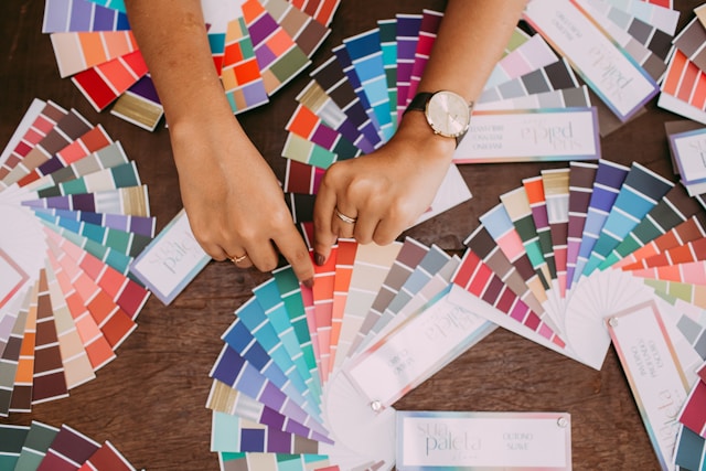
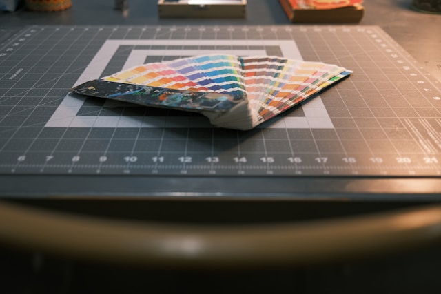
1. Start by Looking at a Color Wheel
Using a color wheel is invaluable. It helps you understand how different colors complement and clash with each other.
Before anything else, try to familiarize yourself with the color wheel. Then, use it to explore all different kinds of palettes and apply them to your designs. Try out analogous, complementary, and triadic schemes.
2. Consider the Project’s Audience
Think about the purpose of your designs and the audience that you’re trying to reach out to. This will help you choose colors that will have maximum appeal.
Let’s say you’re designing a website for a sweet company. In this case, bright colors might work better for your audience. A corporate website will likely need a more subdued and professional color palette using cooler colors.
You need to have a firm grasp of your project’s goals and audience before you finalize any colors. It’s the only way to effectively communicate the right message.
3. Get Inspired
You can find inspiration in many different places. It could be in nature, art, or even existing designs.
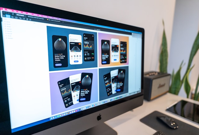
Take a look at successful designs in your industry using Page Flows. See what color palettes graphic designers use for different projects. Finding inspiration is also easy on visual platforms like Pinterest and Instagram.
4. Test Different Combinations
As a graphic designer, you should never be afraid to experiment. Try out mixing and matching colors to see how they look in practice. Start creating mockups for your designs using all your different palettes. You’ll notice that one slight shade change can completely overturn the design feel, which is why testing is essential.
5. Keep It Simple
When it comes to color palettes, less is normally more. It might be tempting to use lots of different colors. But, sticking to a simpler color palette usually ends in a far more cohesive and professional design.
A good rule of thumb to follow is to choose one or two primary colors. Then, add one of two accent colors for some variety.
6. Use Contrasting Wisely
As a graphic designer, you know that contrast is key for making your different elements stand out. Having high contrast between your text and background colors is especially important for readability.
However too high contrast is jarring, and makes designs far too bright and overwhelming. Experiment with different contrast levels to find the exact right level for your graphic design project.

FAQs
What is a color palette in graphic design?
A color palette in graphic design is a set of colors that create a more cohesive design. This includes primary, secondary, and accent colors. All of these work together to establish the future tone of your project.
Choosing your color palette wisely will help you create a consistent design that improves its overall visual appeal.
What are the main types of color palettes?
The main types of color palettes in graphic design are:
– Monochromatic
– Analogous
– Complementary
– Triadic
– Split-complementary
– Tetradic
– Warm + cool colors
Each type offers a completely different approach to color harmony, evoking different feelings in the user. You should think carefully when choosing your color palette, thinking about the purpose of your project.
What is the color rule in graphic design?
The color rule is a principle of color harmony. It should help you select the right color palette for your project. It’s all about using the color wheel to identify the best color combinations. This could be complementary, analogous, or triadic color schemes.
The goal of the color rule is to help graphic designers create a more balanced and harmonious design.

Make Choosing a Color Palette Easier With Page Flows
Choosing the right color palette for your graphic designs is a surefire way to create an appealing end product. But sometimes, finding the perfect combination can be a challenge – especially when there are so many options. That’s where Page Flows comes in.
Page Flows is a valuable resource for UI and UX designers looking for inspiration and guidance. With a vast library of user flow recordings and design templates, Page Flows helps you stay updated with design trends.
Whether you’re designing a website, app, or software, Page Flows offers examples that can help inspire your choices of graphic design color palettes. Start browsing design examples by signing up to Page Flows today.