Your digital product could offer your users a revolutionary user experience. However, if your users can’t effortlessly and intuitively navigate through your content, you will not fulfill your business goals. How do you organize your content in such a way that the user can easily find the relevant content? You employ reliable, comprehensible information architecture (IA).
If you’re unfamiliar with that term, its meaning, and its principles, look no further than this actionable guide. Today, we shall explore the topics referenced above, as well as examine examples and the effects of AI-generated IA.

What Is Information Architecture in UX Design?
Before you apply IA to your design process, you must ask yourself: what is information architecture in UX design?
Information architecture (IA) is the process of making a digital product’s content/information easily findable and understandable. It aims to guide users through a site’s information via a straightforward, intuitive hierarchy of content.
Consistency is vital to IA as, without it, your users may struggle to locate the appropriate content.
Imagine your IA as a simple navigational system. Employ a straightforward structure to organize your hierarchy of content seamlessly. Additionally, you should then use conventional labels to represent and classify the categories within your hierarchy.
When you combine an effective structuring and labeling system, you reduce the risk of your users becoming overwhelmed or lost.

The Importance of Information Architecture: Do You Need IA?
The simple answer is yes; you can’t have good UX without an easy-to-follow information architecture.
Primarily, the goal of every UX designer is to create a digital product that resolves a user’s issue. Information architecture provides the consistency, maneuverability, and structure required to achieve that goal.
Given that our attention spans are only growing shorter, it is imperative that users can find the right content quickly. Without the urgency for straightforward IA, users could grow impatient and confused and ultimately abandon your product.
Needless to say, this would be detrimental to your sales and acquisition of loyal customers. However, what’s more, you risk losing your prospective users to your competitors who prioritized an intuitive IA structure.
Consequently, even if you refine your IA post-launch, success isn’t guaranteed. That being said, IA’s most compelling facet is its positive impact on your conversion rate.
Note: Your conversion rate records the number of users who have completed a desired action. You will divide this number by the total number of visitors to your site to obtain a percentage.
By increasing content findability, your IA will minimize your user’s cognitive overload of information. As a result, your users will complete desired actions efficiently and in adherence to your objectives as a UX designer.
The Principles of Information Architecture
Dan Brown, an information architect who went on to cofound EightShapes, set out to clarify the requirements of IA.
Due to his efforts, Dan Brown illuminated the most crucial components of an effective site’s structure and functionality. He then categorized his insights into eight principles that every UX researcher should reference.
Here are the eight principles of information architecture.
1. The Principle of Objects
This principle encourages you to, quite literally, breathe new life into your content.
You must treat your content as if it were a living entity. Therefore, you must visualize your content with a defined lifecycle. Similar to your users, your content will also have unique behaviors and attributes within this visualization.
To apply this principle effectively, you must start every project by identifying the types of content your product will offer. You must then consider the characteristics of each content category and how they complement one another.
You must consider the behavior of the content when the user interacts with it.
2. The Principle of Choices
This principle addresses how giving users too many choices can be cognitively overwhelming. Navigating a user interface should be simple and straightforward.
Looking back on our dwindling attention spans, having too many choices can be detrimental to the completion of a task.
To adhere to this principle, you should limit the amount of choices regarding your users’ interactions with your content. This will help to reduce your users’ cognitive overload and allow them to complete tasks without feeling confused or frustrated.
Simultaneously, the choices you offer your users should focus on helping the user complete a specific task.
3. The Principle of Disclosure
This principle speaks to the amount of initial information you present to the users.
Think of the principle of disclosure as a corkscrew. The top of your corkscrew is a preview of information that your user can expect to find once explored further.
Without this principle, your users would be ‘spiraling’ through your content without any stable structure. The likelihood is that your users will become overwhelmed and, ultimately, they will abandon their searches for the relevant content.
With this in mind, you should limit the amount of information that users see at any one given time. In doing this, you will allow your users to accomplish their tasks more effectively because you’ve provided digestible information.
If your users wish to delve deeper into your previews, they can progress from said previews into more detailed subcategories. Ultimately, you’re granting your users complete autonomy regarding how they move forward through your content.
4. The Principle of Exemplars
The principle of exemplars states that you should provide examples of your content when describing content categories.
If your content categories are not immediately self-explanatory, your users may skip over that category without realizing its relevancy.
Instead of employing lengthy descriptions, you should utilize visual language to represent the content within your categories.
Related icons and images are incredibly useful regarding the portrayal of visual language. By using icons/images, you will allow your users to identify your categories with ease.
5. The Principle of Front Doors
This principle prompts you to realize that not all users will land on your home page first.
Keep in mind that your site will have multiple ‘entrances’. The last thing you’ll want is for the user’s first experience with your product to be confusing.
So, how do you adhere to this principle?
You remove any degree of ambiguity from all of your content pages.
Don’t be mistaken — you don’t need to provide lengthy, repetitive descriptions. However, adding some basic information that indicates where the user is and what they can do next is essential.
By providing accessibility, summarized information, and navigational aids, you will prompt a sense of clarity and belonging for all users.
6. The Principle of Multiple Classification
Your users will navigate through your content in different ways. Multiple classifications mean that you should provide different ways for your users to browse through your content.
Essentially, this principle encourages you to provide a multitude of simple ways for your users to find desired content.
By adding search functions and filtering options to your product’s site, you will adhere to this principle.
7. The Principle of Focused Navigation
Focused navigation encourages you to define your navigational menus by the content they contain rather than where they appear.
Navigation should be consistently intuitive — if users become lost in your content, you’re unlikely to garner their prolonged interest.
To maintain your navigational aids’ consistency, you should relate content categories to the appropriate menus.
Avoid mixing irrelevant content categories to diminish the risk of confusing your users. You should also avoid overly specialized vocabulary to reduce the users’ learning curves further.
8. The Principle of Growth
This principle relates to the scalability of your product.
You should always assume that your product’s current content reflects a small fraction of your ‘final’ product.
Allow for your product to evolve organically alongside the information you will undoubtedly add to its interface.
Incorporate built-in flexibility into your product so that when you add new information, you don’t risk ‘cluttering’ your site.
An Information Architecture Diagram
Simply put, an information architecture diagram is a visual sitemap that serves as a skeletal visualization of your site.
Below, we have examined a site from Duke University. This site details a redesign of Duke University’s library website.
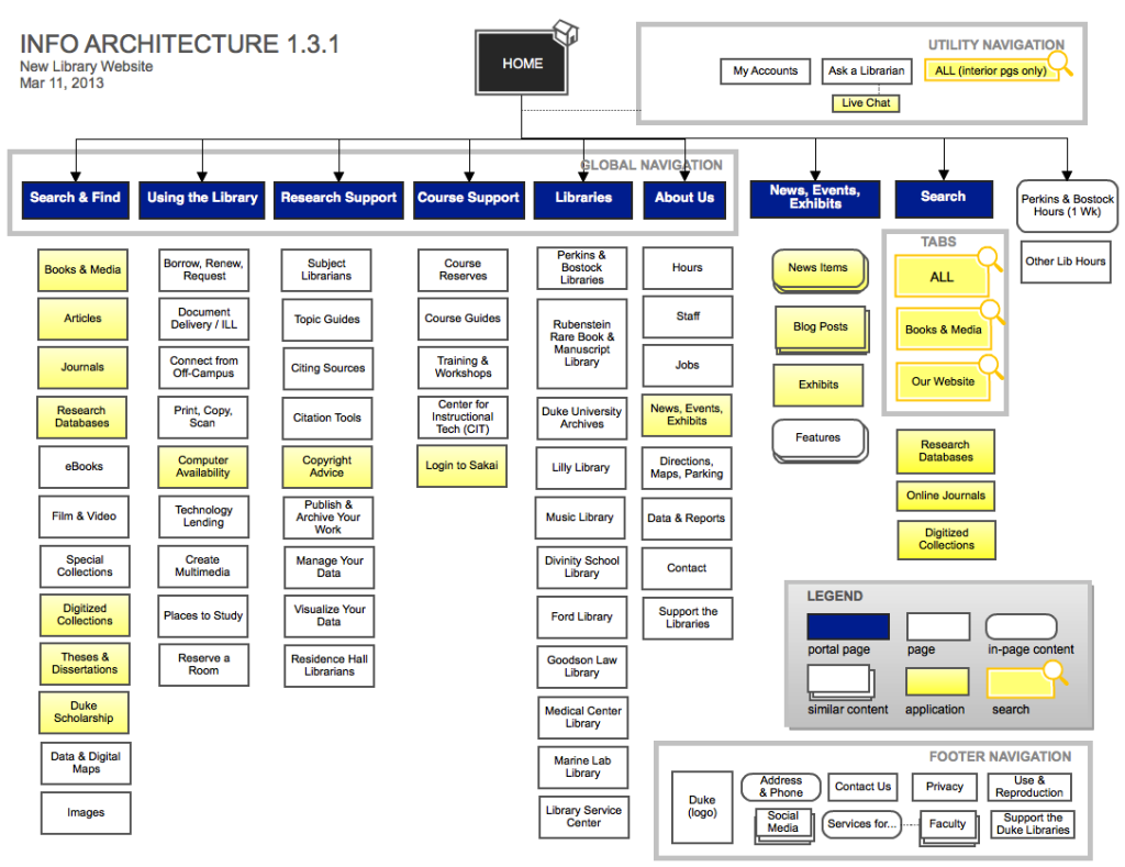
As you can see, Duke University’s information architects have utilized a global navigation bar. This ensures a consistent design regardless of which page the user lands on, adhering to the principle of front doors.
Additionally, the hierarchy of content is split into six categories. Every category clearly states what type of information the user can expect to find if they explore further. Through the use of a ‘mega dropdown’ menu, Duke University has effectively adhered to the principle of disclosure.
Lastly, through the use of search boxes and jargon-free labels, the user isn’t cognitively overwhelmed with too many choices.

Card Sorting UX: User-Driven Information Architecture
Card sorting (UX) puts IA, like Duke University’s new library website, in the hands of real users.
This UX research technique requires participants to organize and categorize certain topics into groups that make logical sense to them.
When a UX researcher conducts a card sort session, they’re uncovering the user’s mental model. In doing so, UX researchers reveal how their users would utilize their intuition and prior experiences to locate relevant content.
Ultimately, a card sort session unveils how the user would design your product’s information architecture. It’s highly recommended that you conduct card sorting sessions to implement IA that matches your users’ expectations.
Information Architecture: Examples
To fully understand information architecture in action, we have provided analyzed examples of information architecture.
Punk Avenue
Punk Avenue is an excellent example of clear yet visually striking navigational menus. Keeping the layout concise and embellished with images, Punk Avenue’s content categories adhere to the principle of disclosure effectively.
Following from the previous metaphor, their content categories serve as the perfect handle to a straightforward spiral of content. The navigational headers clearly exhibit what the user will be exploring if they choose to delve deeper.
Additionally, Punk Avenue considers multiple classifications by providing brief summaries of what they offer on every page. By doing this, Punk Avenue ensures their users always have a clear understanding of their product’s content.

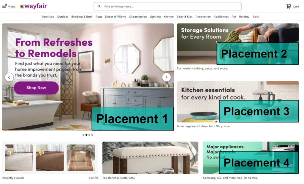
Wayfair
The ineffectiveness of Wayfair’s IA resides within its visual hierarchy and divergence from some of the previously listed principles.
On Wayfair’s home page, you’ll see a visually ‘busy’ culmination of choices. In Wayfair’s case, they have given the user too much choice and have diverged from Brown’s second principle.
Wayfair’s visual hierarchy also diverges from Brown’s principle of disclosure, having vague headers like ‘Furniture,’ followed by ‘Kitchen’ and ‘Appliances.’ This could be potentially confusing for first-time visitors.
Additionally, nearly every element is the same size and color, displaying no visual uniqueness to separate categories. By adhering to the principle of exemplars, their home page’s layout would be less cognitively overwhelming.
Information Architecture: AI Examples
AI-generated IA infuses the above principles with newfound promise, revolutionizing the way information architecture functions.
AI-driven IA offers a range of features, such as intelligent content categorization, dynamic content mapping, and predictive user behavior tools.
Let’s take a look at an example of AI-powered information architecture.
Consider Amazon’s Alexa.
Alexa flaunts a voice user interface (VUI) that allows the user to interact with the product via speech commands. The most crucial aspect of Alexa’s IA is that its features are hands-free and eyes-free. This allows users to tend to other tasks.
Alexa also sports evaluative frameworks related to the user’s satisfaction and sociability. Alexa is proactively enhancing the user experience by providing communicative, entertaining, and informative features.

Optimizing Your User Interface With an Effective Information Architecture
Now that you know the basics of information architecture, it is time to prioritize what you have learned.
Above all, your information architecture should be a part of the enjoyability of your user’s experiences. You’ve displayed unwavering dedication to the content within your product. Your dedication shouldn’t falter regarding the findability of your content.
Hopefully, what you’ve taken away from this article is that every facet of your design process should exhibit creative flourish. Enjoy the creative process, and always keep your users’ needs and desires at the forefront of your mind.
To examine the effects of unexcelled information architecture in practice, look no further than Page Flows. Specializing in a range of different sectors, from music to Monzo, Page Flows excels at finding new, innovative solutions.
Experience a complete walkthrough of your users’ journeys as they interact with your products. With Page Flows, you have access to a collection of emails when we record user flows. Thus, you can learn which emails you should be sending to your users as they experience your exceptional information architecture.
Page Flows has worked alongside over 1,000 happy customers from revered brands via our unparalleled user flow design decisions.
Get started today to access our growing library of user flow recordings and finally stay up-to-date with current design trends.