Homepages set the tone for the rest of the product, influencing user perception and behavior. A well-designed homepage can encourage exploration, increase user engagement, and foster brand loyalty.
In this article, I discuss common homepage design mistakes, differentiate homepages from landing pages, and explore well-known design examples. By putting time and effort into your design, you can ultimately boost your product’s performance and enhance the user experience overall.

Identifying Common Homepage Design Mistakes
Understanding the common pitfalls in home page design can help you avoid them and create a more effective and user-friendly experience. Three key areas to be aware of are overcrowding, poor navigation, and lack of clarity in messaging.
An issue I’ve often encountered is overcrowding a homepage with excessive information. This leads to a disorganized layout, overwhelming visitors and potentially hindering navigation. By prioritizing content and maintaining white space, you can avoid this problem altogether, resulting in a more streamlined user experience overall.
Poor navigation is another frustrating obstacle that can discourage users from exploring your website. On the opposite side of the spectrum from overcrowding, some websites require users to click or scroll before being allowed to access initial content.
While it may seem aesthetically pleasing, poor navigation can make me assume the site lacks content or isn’t user-friendly. To prevent this, designers should focus on creating intuitive navigation that enables users to find content easily. Don’t forget that this also includes navigating back to the homepage itself!
To create an effective menu structure for homepages, consider the following:
- Prioritize navigation items based on user needs and importance.
- Use clear labels and descriptive categories to help users find information easily.
- Implement hierarchical menus for more complex websites with multiple pages and sections.
I’ve also encountered websites that prioritize creative wording over clarity, confusing me and hindering usability. Balancing aesthetics with concise, straightforward messaging is crucial to maintaining functionality. Furthermore, conducting user testing can ensure that your intended message is conveyed effectively.
These issues can lead to high bounce rates and low engagement. Recognizing and avoiding these common patterns is essential for creating a user-friendly, intuitive, and effective homepage.
Analyzing Poorly Designed Website Homepage Examples
Additional common mistakes I have encountered include cluttered layouts, confusing navigation, lack of clear calls-to-action (CTAs), and irrelevant content. To avoid these issues, I suggest you focus on simplicity, clarity, and relevant content tailored to your target audience.
Though popular and well-known, Craigslist’s arguably iconic homepage suffers from an outdated design, cluttered layout, and poor organization. Its simplicity may have been effective in the past, but it can now seem unappealing compared to modern websites.
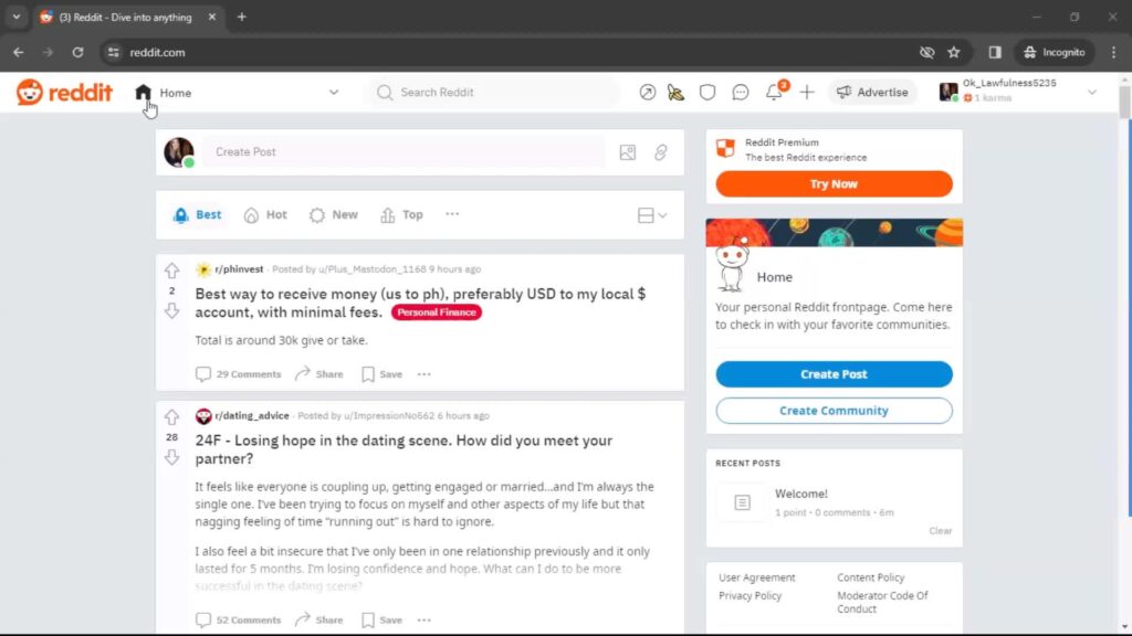
Compared to what it looked like before, Reddit’s redesign significantly enhanced its usability from a text-heavy, cluttered interface to a cleaner, more modern look. Despite retaining some of its classic feel, the improvements have resulted in a (debatably) better user experience.
Enhancing User Experience for Homepage Design Success
Home pages are frequent starting points of user flows and can be crucial in UX design. Good home pages ensure visitors find your website easy to use and navigate, increasing engagement and conversions.
A user-centric approach considers users’ needs, preferences, and behaviors to create an enjoyable, accessible, and valuable homepage experience. I have found that conducting user research and performing usability testing can result in increased user satisfaction, engagement, and loyalty.
The homepage is often a user’s first impression of a website, and a positive experience can encourage further exploration. User needs and expectations evolve over time, so continuous improvement based on user feedback is essential for upholding a successful homepage.
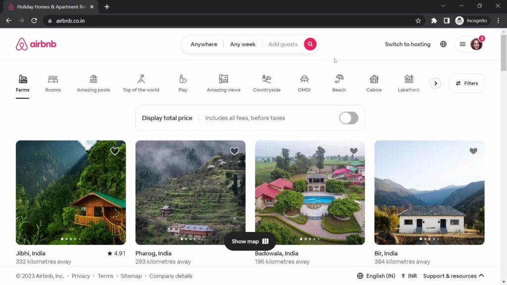
Airbnb’s homepage serves as a great example of balancing numerous user interactions while maintaining strong navigation throughout. Since I started using it, Airbnb has continually refined its homepage design in response to user feedback and testing. This dedication to improving its user experience has contributed to Airbnb’s status as a household name.
Boosting Engagement With Interactive Elements
Interactive elements, like sliders, galleries, and animations, encourage users to engage with your homepage, increasing time on site and reducing bounce rates. In my experience, however, interactive elements have been best employed sparingly, ensuring they serve a purpose and encouraging faster loading times.
Homerun’s homepage presents a good example of balancing quite a few interactive elements:
- A large banner/button at the top of the page presents users with important and time-sensitive information.
- Scrolling down, users can then create new jobs from a handful of templates with helpful previews displayed via horizontal scroll.
- Next, an interactive mini-dashboard overviews users’ active jobs, candidates, events, and to-dos.
- A section on guides at the bottom of the page allows users to continue learning after finishing with the other site content.
- A vertical navigation bar is always on the left side of the screen, allowing users easy access to other pages.
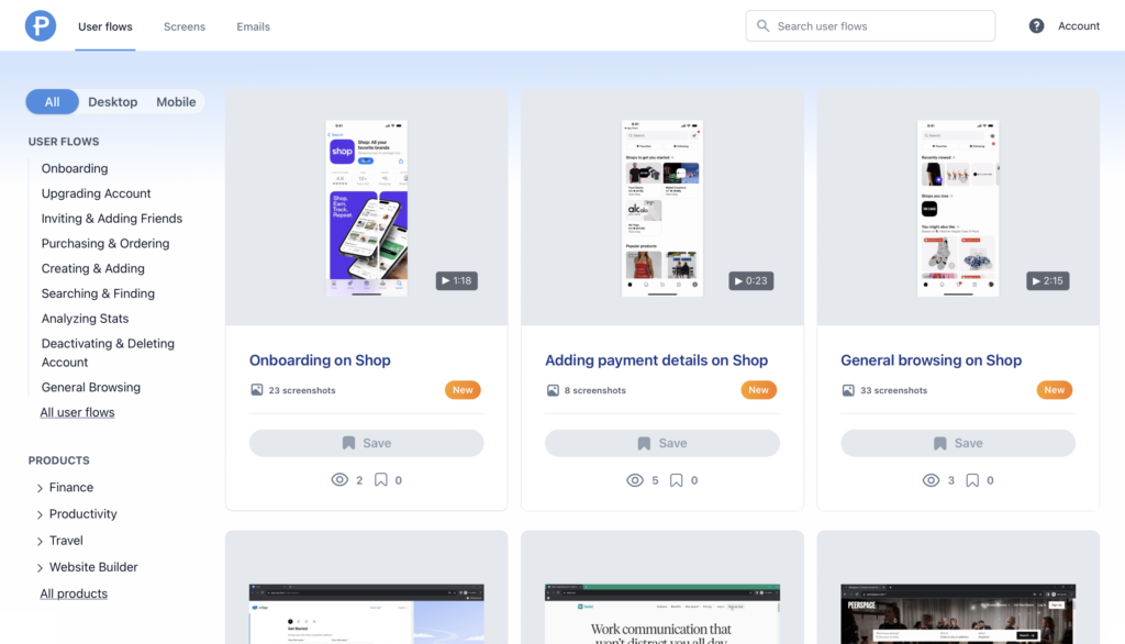
As we can see with Homerun, a balanced mix of interactive features can create a dynamic user experience while maintaining functionality. Additional Homerun screenshots on Page Flows provide further insights into Homerun’s design.
Incorporating interactive elements strategically can greatly enhance user engagement and time spent on your website. Don’t forget to continuously analyze and optimize these design elements based on user feedback and performance data.
Implementing Homepage Design Ideas
To create a tailored, effective homepage design, I suggest you incorporate a clear hierarchy, visually appealing design elements, intuitive navigation, compelling CTAs, and relevant content. Be sure to consider users’ needs, brand identity, and website goals when designing your homepage.
Once you have a design in mind, remember that the work doesn’t stop there. Again, iterative design and testing based on user feedback and performance data can help refine your homepage. In my experience, embracing this process leads to continuous improvement and, ultimately, a more effective and user-friendly design.
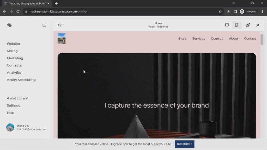
Squarespace, for example, does a good job of reinforcing its brand identity and providing clear navigation on the main page of its website editor. The clear hierarchy prioritizes displaying the user’s website while including other interacting and engaging components on the page.
As shown in the screenshot above, Squarespace also effectively caters to trial users by incorporating a compelling CTA. The “Subscribe” button not only encourages users to take action but also stands out among other elements on the page. This ensures that users can easily find and engage with it.
Squarespace’s dedication to user needs combined with a visually appealing and (usually) highly functional design results in an ultimately engaging experience. Balancing brand consistency with user-centric elements like clear CTAs leads to a successful homepage that encourages further exploration and action.
Homepages vs. Landing Pages: What’s the Difference?
Homepages provide comprehensive overviews and act as gateways to different sections of a website. On the other hand, landing pages are targeted, campaign-specific, and often have a higher conversion focus.
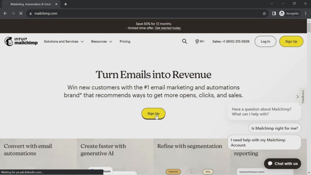
For example, Mailchimp’s landing page, as shown above, differs from its homepage in that its primary goal is to get potential customers to sign up. Its homepage provides other features to its users, such as the ability to create campaigns, advertising its SMS marketing feature, and more.
Both engage visitors but with a different approach; homepages offer exploration while landing pages drive specific actions. A well-designed website could have both types of pages to cater to multiple user needs.
Landing pages are goal-oriented, focusing on specific campaigns or offers, while homepages (often) provide a more general introduction to a website. By understanding the differences between a landing page and a homepage, you can create a more tailored and effective user experience.
Integrating Color Theory on Your Homepage
Color theory plays a significant role in shaping users’ emotions, perceptions, and behaviors, ultimately impacting engagement and brand perception. Understanding the basics of color theory, such as color harmony, psychology, and accessibility, is also crucial for effective homepage design.
In my opinion, you should choose a color palette that reflects your brand’s personality and complements your content. This will create an appealing design that guides users’ attention to important elements. My favorite websites typically use contrasting light and dark shades, experiment with color schemes, and implement user feedback toward continuous improvement.
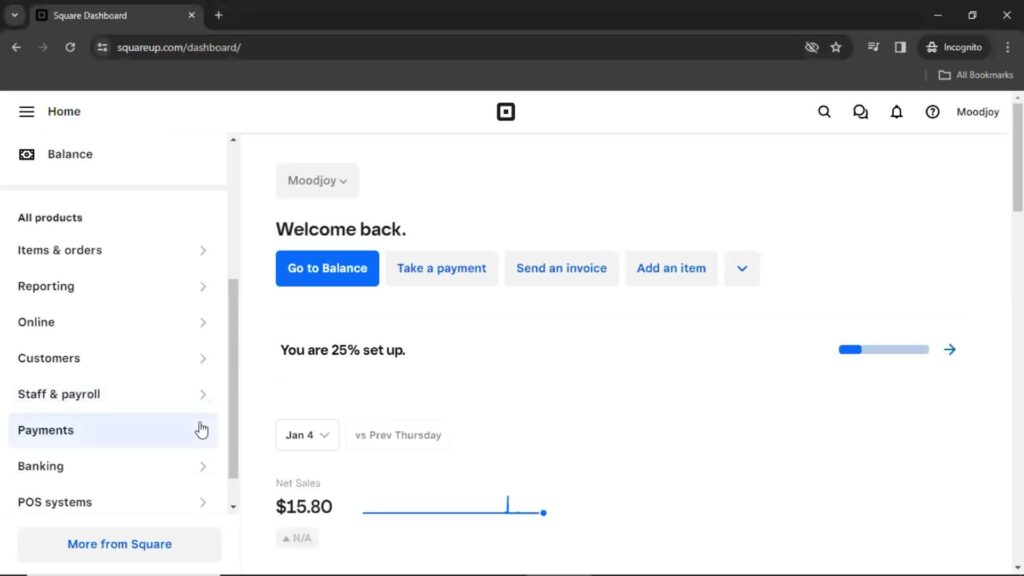
For instance, Square strategically uses blue and black as accent colors to differentiate marketing and product content. On the other hand, Medium puts emphasis on its articles by only using black as its accent color. By thoughtfully considering color choices, your homepage can communicate your brand’s unique identity and improve user experience.
Improving Homepage Performance With UX Metrics
UX metrics can evaluate a homepage’s usability, accessibility, and user satisfaction and identify areas for improvement. Analyze metrics to identify trends, patterns, and potential issues.
Key user engagement metrics include:
- Bounce rate: The percentage of users leaving after viewing only the homepage, indicating a potential lack of interest or poor usability.
- Time on site: The average duration users spend on the homepage, reflecting the engagement and relevance of the content.
- Click-through rate: The percentage of users who click on homepage links, demonstrating the effectiveness of calls-to-action and navigation.
- Scroll depth: How far users scroll down the homepage, indicating their level of interest in exploring its content.
- Conversion rate: The percentage of users who complete a desired action, such as signing up or making a purchase, after landing on the homepage.
Analyze these metrics to identify trends, issues, and areas for improvement. Use this data to inform design decisions, test improvements, and iterate based on results. Additionally, consider evaluating your homepage using usability heuristics to identify potential design flaws and areas for improvement.
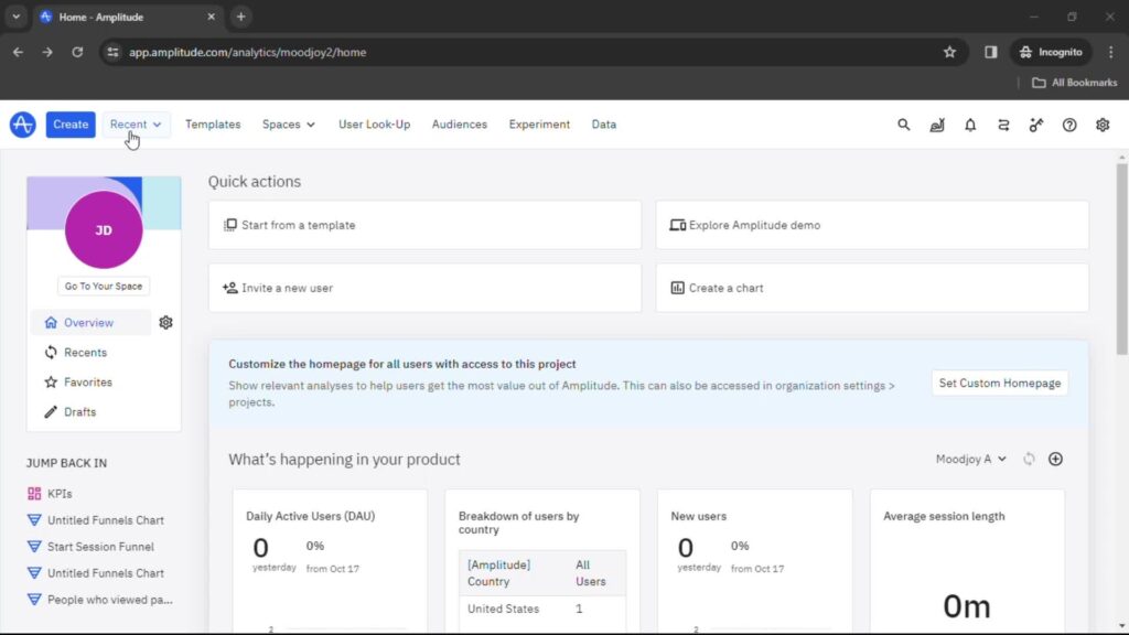
You can use tools like Google Analytics, Amplitude, and Mixpanel to evaluate homepage designs using UX metrics. Amplitude, for example, as shown above, allows me to create a custom, product-specific homepage. This way, I can choose relevant analyses to make my homepage more tailored.
Creating Memorable Impressions With Cool Website Home Pages
Cool home page UI attracts attention, engages users, and builds brand reputation by showcasing uniqueness and creativity. A visually appealing homepage encourages users to explore further, increasing engagement, potentially boosting conversions, and fostering brand recognition and loyalty.
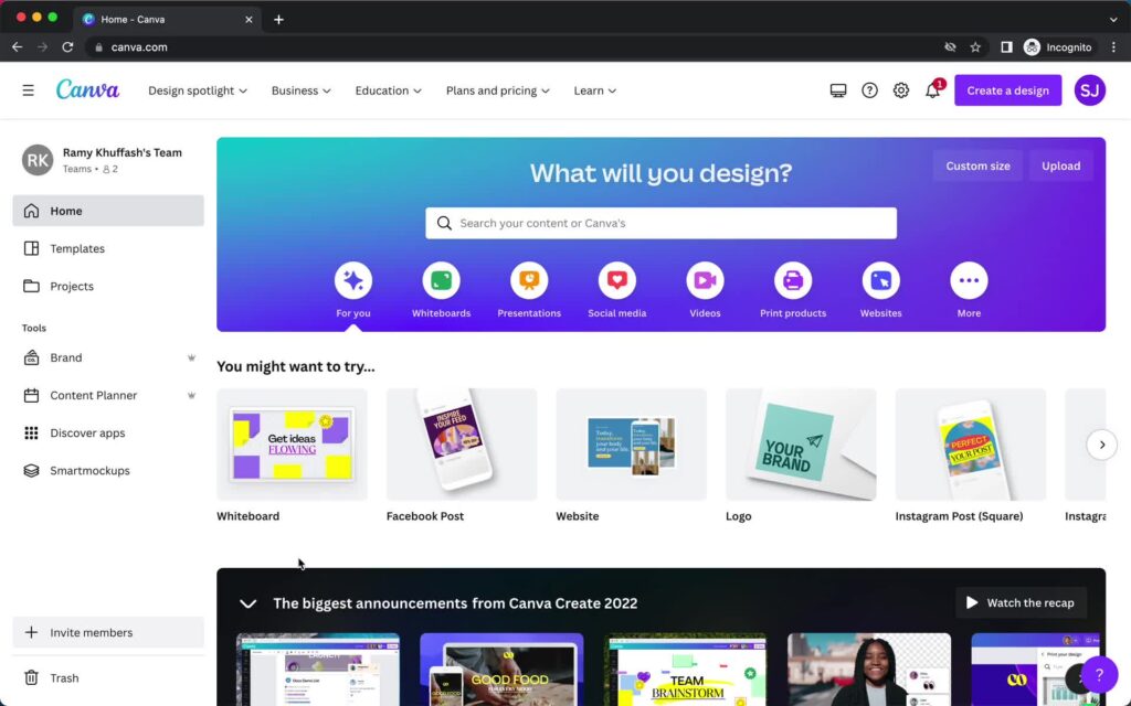
A well-designed homepage can make a lasting impression by catering to the preferences and expectations of your target audience. For example, opening Canva inspires me and instantly gets me into a more creative mood. As shown in the screenshot above, there are classic elements like navigation, search, and brand reinforcement with its logo and colors.
A large, center-stage banner asks me, “What will you design?” with colorful suggestions and helpful templates. This visually engaging and memorable layout encourages user engagement and makes it easy to start a new project.
For creating cool homepage designs, I’ve found the following to be generally pretty effective:
- Incorporate visually appealing elements like high-quality images, videos, and animations.
- Experiment with unique layouts and interactive elements that make your homepage stand out.
- Tailor your design to your target audience, ensuring it resonates with their preferences and needs.
- Ensure your design remains functional and easy to navigate, balancing creativity with usability.
Emerging trends and innovations in homepage design, such as voice user interfaces and artificial intelligence integrations, can also enhance user engagement. For instance, voice user interfaces enable hands-free interaction and can improve accessibility.
By incorporating these cutting-edge technologies, you can demonstrate your commitment to innovation and provide users with memorable, interactive experiences that set your homepage apart. Monitor evolving trends and assess their relevance to your target audience.
Designing a Layout: Website Homepage Design
Layout design is vital for user experience and engagement, impacting content hierarchy, readability, and overall aesthetics. Some fundamental layout design principles include:
- Balance: Achieving visual harmony by arranging elements with equal visual weight
- Hierarchy: Emphasizing the importance of elements through size, color, and placement
- Alignment: Organizing elements along a common axis for a structured layout
- Proximity: Grouping related elements to create visual relationships and improve comprehension.
For instance, grid systems enable structured content arrangement and consistent visual patterns, helping maintain consistency and organization in homepage layouts. Implementing responsive design ensures optimal displaying and interactions across devices, enhancing accessibility and user satisfaction.
Organized content also enhances usability, helping users find important information quickly. Finally, incorporating white space improves readability, visual appeal, and overall user experience by providing breathing room for design elements.
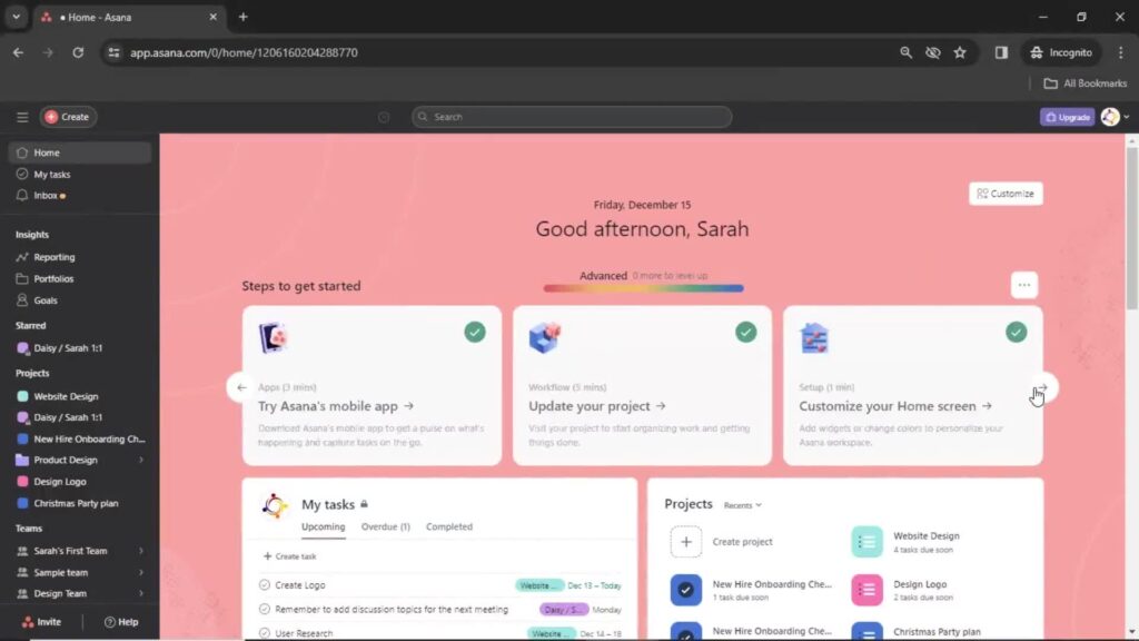
Asana, for instance, employs a layout with vertical navigation on the left, a search bar at the top, and main content occupying most of the screen. Within the main content, cards stand out against the on-brand background, as shown in the screenshot above. These cards are spaced out using a grid system, maintaining a clear hierarchy and preventing overcrowding.
While this article primarily focuses on website homepage designs, many of these principles also apply to mobile app homepages. Some distinctions that cater to the unique needs of mobile users include touch-friendly design, responsive layout, and app-specific functionality.
Mobile homepage layouts often require larger touch targets for easy navigation and prioritization of essential content to accommodate smaller screens.
Fundamental layout design principles are crucial for creating an engaging, user-friendly homepage. Following these principles ensures that your homepage layout provides an exceptional user experience across devices, fostering exploration and driving conversions.
Leveraging a Website Homepage Template
A well-designed website home page template provides a strong foundation for creating a visually appealing, engaging homepage. Ideally, you should customize templates to match your brand and target audience to ensure a unique, tailored design. Monitor user engagement to gauge the effectiveness of your design and make data-driven improvements.
Inappropriate or poorly designed templates can result in a generic, unappealing homepage that fails to engage users or convey your brand’s uniqueness. To avoid this, choose customizable templates that align with your brand and modify them to match your website’s goals and target audience.
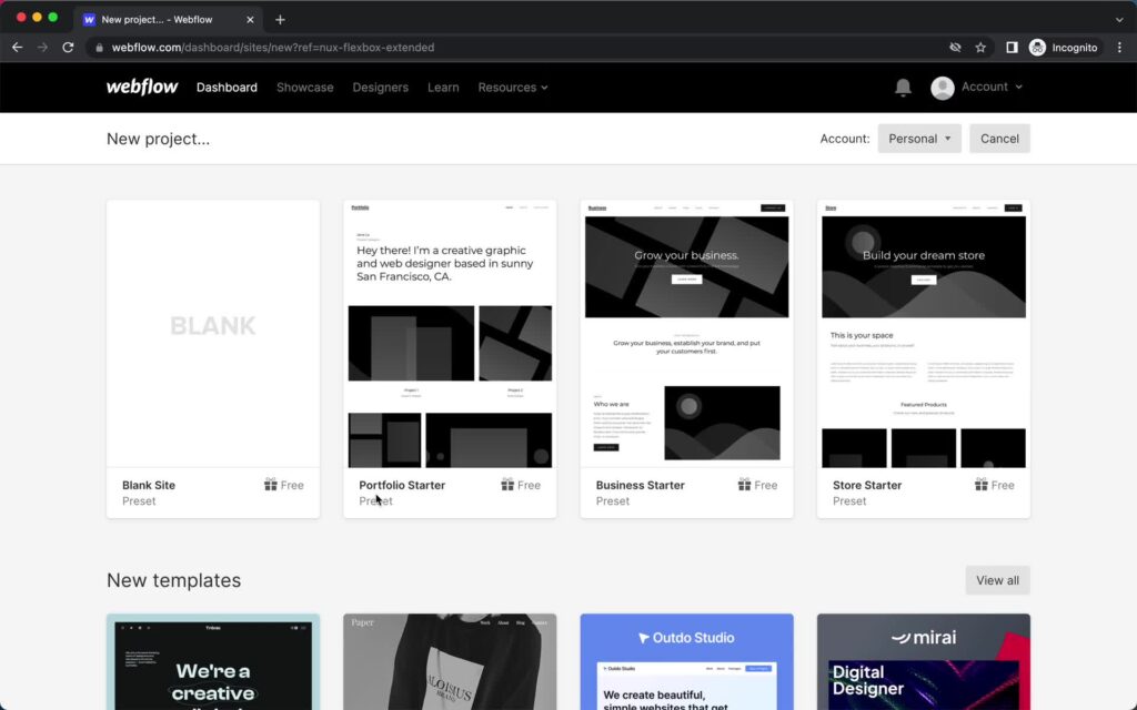
Some popular website builders with templates I’ve tried include Webflow, Squarespace, and Wix:
- Webflow enables designers and businesses to create custom, professional websites using a visual development platform. It provides a range of templates and extensive design features without requiring coding skills.
- Squarespace provides visually appealing templates combined with robust built-in features for e-commerce, blogging, and more. This enables users to create professional websites with ease.
- Wix is a versatile website builder that empowers users to create custom websites easily. It features an intuitive interface, an extensive selection of templates, and seamless drag-and-drop functionality for easy customization.
When selecting a template, factor in design flexibility, mobile responsiveness, and compatibility with your preferred website builders. If you’re going to use a template, make sure to select one based on your brand’s personality and values.
To modify templates without getting rid of their original appeal, I would recommend the following:
- Preserve the template’s core structure while customizing colors, fonts, and images to match your brand.
- Keep essential features and functionalities, but tailor them to any unique offerings and your users’ needs.
- Experiment with different layouts and graphic design elements, but ensure your modifications enhance usability and maintain a consistent user experience.
Learning From Proven Homepage Designs With Page Flows
Page Flows is an invaluable resource for exploring and learning from successful homepage designs. The interactive library provides inspiration and insight into various effective strategies, enabling you to create an engaging homepage that resonates with your target audience.
You can gain a competitive edge by understanding and adapting the key elements of proven designs to your unique website needs. Learn from the best and create a distinctive homepage design that sets you apart from the crowd with Page Flows.