
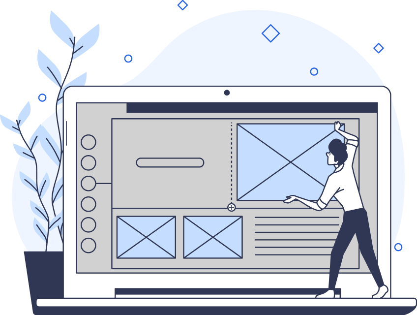
Visual design has the power to increase your product’s usability, raise your brand’s visibility and credibility, and evoke users’ emotions. That is if designers create it effectively.
If you’ve ever encountered a webpage with a vast array of visually demanding elements, it’s likely you soon became frustrated. What’s more, you probably didn’t revisit that webpage. In the UX field, if a design is too confusing/complex, it can’t guarantee a positive user experience.
For this reason, effective visual design—and therefore UX design—isn’t possible without a clear visual ranking.
If you’ve ever pondered the question ‘What is visual hierarchy?’ then you’ve come to the right place.
In today’s guide, we shall explore the meaning, components, and importance of having a hierarchy of visuals within the UX field. We will also examine examples of visual hierarchies within the digital landscape.
What Is Visual Hierarchy in UX Design?
Fundamentally, UX design aims to optimize every facet of the user’s experience. Visual hierarchy governs how the user navigates through their experience.
Essentially, this hierarchy refers to the arrangement of specific design elements. What’s more, this arrangement should convey each element’s importance to the user in order to guide them towards their goals.
By utilizing logic, empathy, and an understanding of their users, UX/UI designers can propel their users toward desired content.
The Components of a Conventional Visual Hierarchy
To grasp this concept fully, you need to understand its components.
Below, we will address the components of a conventional hierarchy.
1. Size
If you look at traditional graphic design, the most common design strategy you’ll encounter relates to sizing. Typically, a designer will make the most essential design elements the largest on the screen.
Secondary and tertiary design elements will appear downsized in order to convey a sense of hierarchy.
Creating an effective visual hierarchy involves using size to direct the user’s attention to the largest design elements. In doing this, you’ll influence the way the user interacts with the product and ultimately create a more engaging experience.
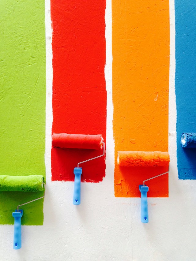
2. Color
Color has a significant impact on the quality of the user’s experience. It also has a considerable sway over the user’s emotional state during their interactions with the product.
Needless to say, bold, bright colors attract more attention in comparison to dull, muted colors. Thus, UX/UI designers will use brighter or contrasting colors to guide users through their experience with the product.
You can break down effective color use into three components: value, hue, and saturation.
- Value: the lightness or darkness of a color.
- Hue: a pure pigment from the dominant color family, without tint or shade.
- Saturation: the intensity of color.
Tips:
- With value, in a primarily dark design, you should use lighter elements to emphasize essential elements and vice versa.
- With hue, use warm colors like red to draw the user’s eye. Check a color chart to test which colors immediately demand your focus.
- With saturation, if your design is primarily monochromatic, add a singular splash of color with increased saturation. In doing so, you’ll immediately attract the user’s attention while staying true to the product’s overall theme.
3. Contrast
Contrast is a prevalent quality amongst several of the necessary components of this practice. The use of contrast is highly effective in guiding users to prioritize information.
Adhering to your brand’s guidelines is imperative when bolstering brand visibility. However, this doesn’t mean you can’t use complementary opposites within the color wheel to achieve that goal. In fact, it’s encouraged that you employ such contrast to create a clear visual hierarchy.
Contrast doesn’t just refer to color, either. You can use contrast within fonts, sizes, and patterns to guide the user toward essential information.
4. Positioning
Expectedly, the top-down rule is prevalent in most websites/digital products. Consequently, your users will perceive the content you place at the top of the webpage as the most important.
Most UX/UI designers will employ usability testing methods like eye tracking to determine the user’s reading pattern.
The F-pattern is a well-known reading pattern for text-heavy websites. The F-pattern refers to three steps:
- The user reads in a horizontal line, typically across the upper half of the webpage.
- Users then move further down the webpage and read in a second horizontal line.
- Lastly, users scan the left side of the webpage in a vertical line.
The F-pattern reinforces the notion that you should place the most important content at the top of the webpage.
5. Alignment
Alignment indicates a sense of order by connecting elements through the use of space.
Needless to say, a seamless flow of content is crucial to the smoothness of the user’s experience. With precise alignment, your users will be able to find and absorb essential information with utmost ease.
Alignment encompasses everything to do with a digital product’s order and organization. That said, it doesn’t mean you shouldn’t approach alignment creatively. Imbue your product with a unique flair by changing the angle at which you present information.
However you align your elements, remember that your primary goal is to clarify the user’s trajectory through your product.

6. Proximity
It’s natural to assume that design elements that appear grouped together share a relation or fundamental similarities. The proximity principle, known as a basic role of design in a visual hierarchy, involves visually grouping related topics and content.
Essentially, proximity refers to the visual grouping of related topics and content.
UX designers employ proximity to help users understand information by having the opportunity to recognize patterns and relationships.
7. Repetition
Repetition, in this case, refers to the use of similar or identical elements throughout a digital product.
Re-used elements help to create visual unity and cohesion that bolster the user’s navigational ease through your product.
Naturally, users will associate certain sounds, colors, and even idioms with a brand. Therefore, repetitive design elements increase the visibility of your brand and your brand’s messaging.
8. White Space
White space, also referred to as negative space, helps to emphasize important content by focusing the user’s attention. White space is the empty space that surrounds the important content/information.
White space can exist between and within a design’s visual elements. It’s an incredibly useful technique that can help you ‘declutter’ your product’s web pages.
Note: White space isn’t necessarily synonymous with blank space. White space can exhibit different colors, textures, or even images.
9. Texture
Texture can amplify the visual intrigue of your designs. Using contrasting textures in a visual hierarchy guarantees commanding the user’s attention.
For instance, you could highlight valuable content by using shiny, glossy textures. To contrast those textures, you could use matte textures in the background. In doing so, the background of your design will actively strengthen the visual prominence of the desired information.
10. Typography
Typographic hierarchies guide the user through a product’s content, emphasizing the order in which the user should read the content.
A typographic hierarchy makes a product’s text more readable. By using different fonts, font colors, sizes, and positions, you can create an understandable reading experience.
You should utilize typographic distinctions to break up your product’s content. Employ said distinctions when designing a table of contents, headings, and subheadings.
The Importance of Visual Hierarchy
Knowing the conventional components of visuals in UX will partially reveal the importance of visual hierarchy.
Yet, there is so much more to it that goes beyond design components and their visual weight.
Visual hierarchy is crucial to the user’s experience because it defines the importance and sequence of elements and content. Without it, the user wouldn’t experience seamless navigation when interacting with a digital product.
Instead, the user would likely encounter confusion, which would result in the user abandoning the product.
Interestingly, having a ranking for visuals isn’t just a necessary component of the user’s comprehension of content.
By establishing visual relationships between pieces of content, you can ensure your visual hierarchies relay the company’s brand messaging.
Your content’s structure reflects your brand’s values, and so, with a visual hierarchy, you can establish a user-brand relationship.
Visual Hierarchy Principles You Should Know
Design principles govern every facet of UX design. Ordering your design elements is no exception.
Here are some principles of visual hierarchy that you should adhere to in order to thrive as a UX designer.
- Size and scale command visual dominance.
- Visual weight creates perspective.
- Color and contrast draw focus.
- Fonts dictate style.
- Space provides dynamic movement.
- Proximity suggests connection.
- Negative space provides direction and focus.
- Alignment clarifies the navigational trajectory.
- Lines create a fluid illusion of motion.
- Repetition unifies every design element.
Visual Hierarchy: Examples
By seeing great visual hierarchies in action, you’ll get a rough idea of how to design your own.
To help you find inspiration, we’ve provided some visual hierarchy examples below!
The Noun Project
The Noun Project’s homepage stands as a testament to minimalist but effective elements. The white search bar set against a black background immediately captures your attention.
The black-and-white color contrast makes for a visually appealing color scheme that immediately exhibits visual dominance. The generous use of negative space also helps to draw the user’s eye to the search bar.
The sparse use of visual design elements serves to showcase what the user can expect to access and enjoy.
Enhanced by a highly visible CTA, The Noun Project spectacularly demonstrates the effectiveness of a simple, monochromatic visual hierarchy.

MoMA
To contrast our analysis of astonishing monochromatic design, we’ll now look at MoMA’s vibrant design elements.
MoMA uses vibrant, complementary, and contrasting color schemes to guide users through their website. As you can see, their use of negative space exhibits vivid, solid blocks of color and a dominating font.
The contrasting positions of the color blocks are also intriguing. Not only does it adhere to MoMA’s artistic brand messaging, but it naturally guides the user’s reading pattern.
Due to MoMA’s repetitive use of positioning patterns, the user can easily immerse themselves in a visually ‘busy’ website. What’s more, the use of minimal text and images makes the user’s navigational trajectory seamless. This is especially impressive when considering the vast array of colors within the website’s design.
Additionally, the use of green typography to highlight MoMA’s CTA creates a significant focal point within a vastly colorful website.

What Can Be Used To Improve Visual Hierarchy?
A crystal-clear visual hierarchy is synonymous with a compelling design for a reason. You must know what can be used to improve visual hierarchy. By knowing how to optimize the user’s navigation through your product, you’ll enhance their overall experience with it.
Here’s what you need to help you create an exceptional hierarchical design.
- Empathy: Understand your audience via thorough user research data. Familiarize yourself with their goals, needs, desires, and pain points to understand how your product will fulfill its purpose.
- Clarification: Identify which graphic elements you need to command the most visual dominance and convey your brand’s messaging.
- Experimentation: Utilize visual elements with varying dimensions and proportions. In doing so, you can determine which elements should attract the user’s attention. Additionally, you’ll have a better understanding of the impact of visual emphasis. You can also experiment with different hues to see how colors interact with one another to enhance visual prominence.
- Strategy: Strategically utilize positioning to see the impact of users perceiving your visual elements in different ways. In testing how the users initially read and perceive your information, you can create effective positioning strategies.
- Testing: It’s imperative that you test and re-test your designs. Design is an iterative process. By evaluating the effectiveness of your visual hierarchy, you can refine it. As a result, you’ll ensure your design enhances the user’s experience as much as possible.
Visual Hierarchies: Guiding the User Toward Their Goals
Hopefully, what you’ve learned should inspire you to utilize unwavering empathy when designing your product.
Every graphic element you’ve encountered today contributes to the quality of the user’s experience. A positive user experience will guarantee the success of your business/brand.
So, when creating visual hierarchies, you must have navigational ease, intuitive layouts, and easy-to-find content.
In order to succeed in creating such visual hierarchies, you’ll need some inspiration.
Consider Page Flows.
We’ve garnered over 1,000 happy customers from esteemed brands. You may wonder how we’ve created such an exceptional user experience. We collect emails when we record user flows so we can consistently revise our interactions with our users. In doing so, we have ensured that the user can always relay important feedback as they interact with our services.
From ASOS to Amazon, we offer an abundance of user flow inspiration!
So, when you ask yourself, ‘What is visual hierarchy?’ you’ll know exactly how to create one that is user-centric.
Get started today to access our growing library of user flow recordings and finally stay up-to-date with current design trends.