There are many color palettes that you can use to elevate your design’s visual appeal. In particular, color palettes that are synonymous with decades are incredibly popular at the moment. After all, who doesn’t love a nostalgic trip down memory lane?
To celebrate your users’ love of nostalgia, today’s guide will discuss the 90s color palette. We’ll discuss the signature colors of the 90s and tips you can use to modernize said hues.
Which Colors Do We Associate With the 90s?
In terms of color palettes, the 90s was a decade of division. On the one hand, fluorescent neon colors and hot hues were everywhere, including in fashion and even interior design. Think hot red, magenta, bright orange, electric blue, and lime green.
The love of these bright and bold colors began in the 80s but prevailed thanks to 90s rave culture. It wasn’t uncommon to see people adorn daring patterns and neon hues, mirroring high-energy techno, acid, and electronic dance music.
On the other hand, however, not everyone gravitated toward bright hues, and that’s very much apparent in 90s grunge culture. Grunge rejected mainstream culture and embraced oversized clothing designed to hide the figure and features of the wearer.
As you can imagine, many people would wear darker hues and punkier, edgier styles to align with grunge’s countercultural aesthetic. That’s why colors like dark plum, army green, and black were especially popular.
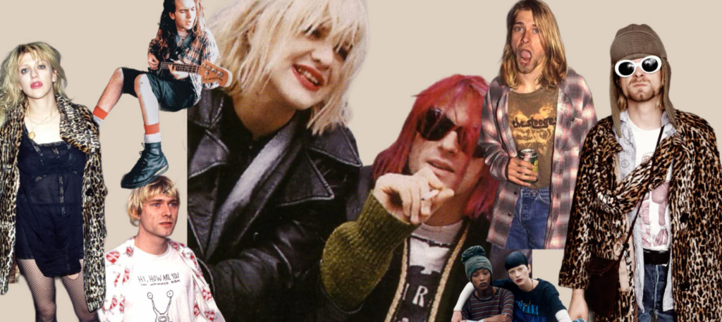
Exploring the 90s Grunge Color Palette
The 90s grunge color palette was very punky and edgy. If you want to tap into your inner 90s grunge side, you need to experiment with moody, muted tones.
We recommend choosing colors that speak to natural, subtle aesthetics, including the following:
- Deep wine reds: In color psychology, deep dark reds symbolize intensity, passion, and aggression, making them perfect for grunge palettes.
- Olive/army greens: Olive greens represent renewal and growth, while army greens speak to strength and resilience. In a grunge color palette, this connotes a solid outgrowth of – and stance against – conformist lifestyles.
- Blacks and greys: You probably know a few people who associate black hues with death, power, and darkness. Blend that with the neutrality of grey, and you’ll have a palette that communicates moodiness.
- Plum purples: Plum purple hues imply ambition, creativity, and even enlightenment in some cultures. In other words, dark purples represent freedom against misinformation and ignorance, as well as unabashed authenticity and individuality.
- Dark browns: Dark shades of brown can imply safety while simultaneously making those who view it feel a degree of solitude. This is perfect for a grunge color palette as it communicates the message, “It’s okay to be on the outside.”
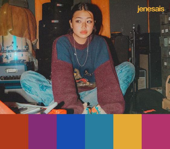
Discussing the 90s Anime Color Palette
It wasn’t just rave and grunge culture that was popular in the 90s. Anime was extremely popular, even in the mainstream. For that reason, it’s definitely worth shining a light on the colors you’d find in a 90s anime color palette.
- Bright primary colors: Think of animes like Dragon Ball Z and Sailor Moon. You’ll find an abundance of bold, vibrant primary colors (red, yellow, and blue). Primary colors are naturally intense, so when combining them with strong saturations, you evoke a distinctly powerful sense of energy.
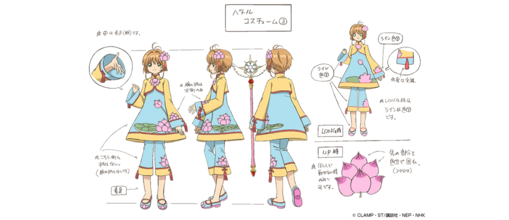
- Soft pastels: Consider the pastel lotus costume and pink yukata in Cardcaptor Sakura. These costume designs comprise pastel pinks, yellows, and blues, eliciting feelings of peace, calm, and hope. They also provide an aesthetically pleasing contrast to hues with intense values and saturations.
- Muted, dark hues: In animes like Cowboy Bebop and Ghost in the Shell, you’ll find dark, muted, and moody environments. As you’d expect, these animes utilize a lot of black, dark greys, and cosmic blues.
Tips for Creating a Modern, Aesthetic 90s Color Palette
Now that you know more about the dominant colors of the 90s, it’s time to bring them into the 2020s. Below, you’ll find some helpful tips and tricks for creating a modern yet aesthetic 90s color palette.
- Take inspiration from the use of neon colors in futuristic, cyberpunk color palettes.
- Experiment with a variety of different tones, tints, and shades of the three primary colors.
- Implement gradient effects into your designs. For instance, you could blend hot red hues with pastel pink colors.
- Consider using the typical colors of 90s interior design (especially rustic gold) to create muted metallic colors.
- Look to the nature around you (think forests and gardens) to find the best grungey colors.
- Compile color-focused mood boards, sourcing your images from 90s movies, animes, and music videos.
- Utilize the bold vibrant colors of the 90s as accent colors rather than dominant colors to adhere to modern minimalism.
- Combine 90s design trends with modern design trends like funky, experimental typography with 3D surrealism to create compelling color palettes.
90s Color Palette: Hex Codes To Make Note Of
To help you further, we’d like to draw your attention to some handy 90s color palette HEX codes. Consider using or modifying these hues in your next graphic design project!
- Light Green: #00db96
- Hot Pink: #e10086
- Lemon Yellow: #fdfb76
- Royal Purple: #49297e
- Coral Red: #ff4040
- Dark Army Green: #2f4228
- Rich Blue: #0f5ad1
- Bright Orange: #fa7b52
- Black: #000000
- Dark Brown: #3d2a1d
FAQs
What is the 90s color palette?
In the 90s, vibrant colors were essential to the majority of color palettes. That’s why you’d often see colors like royal blue, bright teal, and sunshine yellow in a 90s color palette.
What are some typical colors in the 90s color palette?
Some of the most common colors in a 90s color palette would include the following:
– Olive green
– Bright purple
– Electric blue
– Hot red
– Magenta
What were the interior colors of the 90s?
Beige, cream, white, earthy red, and rustic gold were incredibly popular interior colors in the 90s.
Your 90s Color Palette: Check Out Page Flows for Ideas
Your color palette is what will establish the emotional impact that your designs have on your users. With a color palette that celebrates the 90s, you’ll be sure to evoke feelings of nostalgia, joy, and optimism.
That said, you shouldn’t just rely on your color choices to create meaningful user experiences. You should also master your user flows, which is something Page Flows can help you with.
Thousands upon thousands of web and mobile user flow recordings and screenshots spanning successful brands and thriving industries. This is what you can expect to access and take inspiration from when you join Page Flows.
Our flows are not only exceptional quality but also cover every crucial step within the user’s journey. So, if you need onboarding flows for a social media app, we have what you need. If you need an archiving flow for a blended learning platform, we will accommodate you.
Create stunning aesthetics with your 90s color palette. Combine that palette with the intuitive user flows that you learned from Page Flows. Go to Page Flows now to expand your knowledge of essential user flows!