Mixing together a color palette, cyberpunk characteristics, and user-centricity is a great way to create engaging, futuristic designs.
Cyberpunk aesthetics include not only compelling, dystopian visuals but also the raw, unfiltered grittiness of humankind. That’s why a cyberpunk color palette and the style behind it are incredibly popular in 2024.
Due to its increasing popularity, we’ll discuss cyberpunk color schemes and palettes in more depth in today’s guide. You’ll learn what these palettes comprise, as well as how to create your own.

What Are Cyberpunk Color Palettes?
To understand signature cyberpunk colors, you need to first understand cyberpunk. Cyberpunk is a science fiction genre that explores potential dystopian futures in which technology advances significantly while society deteriorates rapidly.
That’s why cyberpunk media plays around with the notion that technology will not further humanity as a whole. Instead, it will fuel the oppressive forces within humanity, like authoritarian governments, and mobilize countercultural, morally grey anti-heroes.
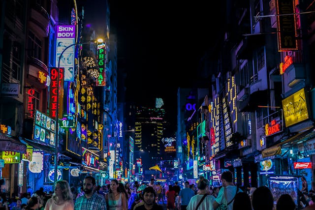
From this understanding of cyberpunk culture, it’s easy to see why neon hues are popular in cyberpunk color palettes. They are a staple of modern technology and modern aesthetics. Additionally, many people associate neon colors with the future, largely thanks to sci-fi movies like Blade Runner and The Matrix.
Outside of pop culture, neon colors also relate to a vibrant nightlife. This is why UI designers often use dark hues like black and deep purple to complement them.
As you can see, cyberpunk color schemes celebrate extremities in terms of both light and dark colors. This contrast is crucial to a cyberpunk color palette, as it symbolizes the contrast between technological advancement and societal decay.
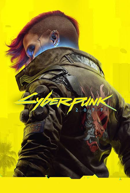
Exploring the Cyberpunk 2077 Color Palette
Cyberpunk 2077 is a 2020 open-world RPG (role-playing game). Like many cyberpunk stories, Cyberpunk 2077 explores the blurring of the line that separates man and machine. Knowing this, you can begin to imagine the hues in the Cyberpunk 2077 color palette.
Exploring the popular Cyberpunk 2077 colors will help you create your own Cyberpunk graphic design color palettes. So, let’s start by looking at the predominant color in the game’s cover art.
- Neon Yellow: It makes sense that neon yellow is the predominant color in the game’s cover art. In color psychology, neon yellow embodies semantic contrast, representing energy and playfulness as well as warnings and danger.
- Cherry Red: On the surface, this shade of red speaks to passion and excitement, which you’d expect from red hues. But cherry red, in particular, reflects deep desire, strong allures, and unwavering motivation.
- Pale Neon Blue: The ethereal glow of pale neon blue is an effectively subtle nod to “high tech.” Aside from its ties to technology, pale neon blue resembles the colors of the sky and, thus, freedom.
- Dark Brown: Dark brown hues strongly represent the resilience and dependability of the earth. In the context of Cyberpunk 2077’s cover art, this gives the player insight into the protagonist’s personality.
How To Create a Cyberpunk Neon Color Palette
It’s time to capture the essence of cyberpunk culture in your own UI/graphic designs. Below, we’ve revealed how to create a cyberpunk neon color palette that resonates with and intrigues your target audience.
1. Researching Your Target Audience
Like any design project, you need to start by conducting user research to understand your users’ desires and preferences.
Let’s say the majority of your target audience prefers pink colors. You could accommodate that preference by making pink your dominant neon color, which would increase user engagement.
Ultimately, what you find out about your users should define the colors you use in your cyberpunk palette.

2. Choosing Your Base Color
Having knowledge of your target audience, you can now shift your focus to your base colors.
Your base colors are the building blocks of your palette, and they establish the overall mood that your designs evoke. You’ll often decorate your background elements with your base color, as they will contrast your dominant colors.
With cyberpunk palettes, dark hues are must-haves, especially when it comes to contrasting neon colors. Dark hues also symbolize the vibrant nightlife we discussed earlier. That said, this doesn’t mean you just have to use black shades.
You can experiment with deep purples, midnight blues, or even dark browns, like Cyberpunk 2077. As you experiment, we recommend creating a few iterations of your base colors for future A/B testing.
3. Selecting Your Dominant Neon Color(s)
In cyberpunk palettes, your dominant neon color(s) will be the color that makes your users notice your designs. This is where your UX research becomes invaluable, as it will clarify the most suitable neon colors for your designs.
You’d also benefit from investigating modern design trends to implement a sense of futurism that cyberpunk media celebrates.
To inspire you, we’ve listed some suggestions for your dominant neon color(s) below:
- Bright yellow
- Electric cyan
- Hot pink
- Vaporwave violet
- Lime green
- Blood red

4. Elevating Your Colors
Your next step is to add some depth to your dominant and base colors with complementary/accent colors.
For accessibility reasons, we suggest that you avoid using more neon hues to complement your dominant color. If you do, you could subject your users to overwhelming eye strain, which will negatively affect the user experience.
Instead, try using colors that display low saturation and subtly complement/contrast your dominant neon. Think back to the pale blue in Cyberpunk 2077’s cover art. Take inspiration from how it offsets the harsh brightness of the neon yellow.
Once you have a complete color palette, you’ll need to reinforce its neon allure. Implement soft glow effects with paler, semi-transparent iterations of your dominant colors. These effects will contribute to the glowing nightscape that you want your palette to represent.
5. Testing Your Palette
The last thing you need to do is conduct A/B tests on real users. By testing your palette’s variations, you’ll find which one communicates your design’s core message most effectively.
When you know which palette performs best, you can conduct further usability tests to identify areas for improvement. Make the necessary tweaks, and by the end of your creative process, you’ll have an engaging cyberpunk color palette!
FAQs
What are the typical colors used in a cyberpunk palette?
You’ll typically find an array of bright neon colors like neon yellow, red, pink, cyan, and magenta in cyberpunk palettes.
Why is it called cyberpunk?
The origins of the team cyberpunk come from author Bruce Bethke’s short story Cyberpunk (1983). This title reflects a narrative setting full of technological advancements, anarchy, and moral ambiguity.
What themes are related to cyberpunk?
Many consider the most important theme of any cyberpunk media to be the combination of “high tech and low life.” As technology becomes more and more exceptional, the society that encompasses such advancements decays and slips into anarchistic ideologies.
Cyberpunk Color Palette: Create Unique Designs With the Help of Page Flows
As you embrace passionate, futuristic cyberpunk styles, remember to prioritize the timeless design principle of user-centricity. It’s one thing to follow trends, but it’s another to have users resonate with your unique approach to them.
At Page Flows, we know that creating a designer’s uniqueness stems from their knowledge of proven products. That’s why we provide inspirational resources that designers can leverage to refine their design’s user flows.
User flows are the building blocks of seamless, intuitive user journeys, and we cover every flow you need. From onboarding to subscribing, we collect the best web and mobile user flows from prosperous brands and thriving industries.
You can’t reinvent the wheel of in-product navigation without learning from it, and with Page Flows, you’ll learn quickly. Like a cyberpunk color palette, we celebrate the future of great design, and we believe that the future starts with you. Check out Page Flows to learn how the brands you admire approach user-centric user flows!