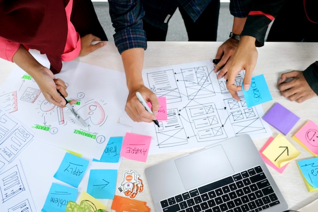
Gathering your UX research is one thing; organizing it is another. Having a wealth of data is great, but it can be incredibly difficult to categorize your information. However, doing so is crucial if you want useful data that you can refer back to. Fortunately, there’s an easy way to sort your information: affinity mapping.
Affinity mapping is a type of workshop that can help you collate your ideas. But how do you do it and do it well? This guide reveals all.
What Is Affinity Mapping?
Firstly, what is affinity mapping? In short, it’s the process of grouping your qualitative research by category. Some people call this method snowballing, affinity diagramming, or cluster mapping. In other fields, some people call it card sorting. However, in UX, card sorting is a specific method. It goes by many names, but the technique is the same.
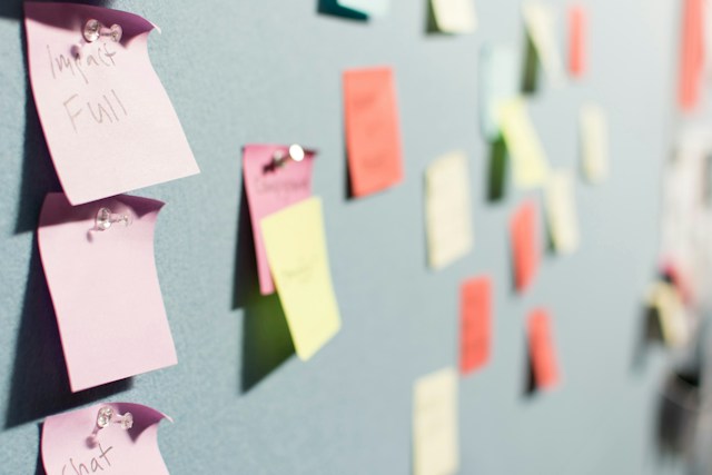
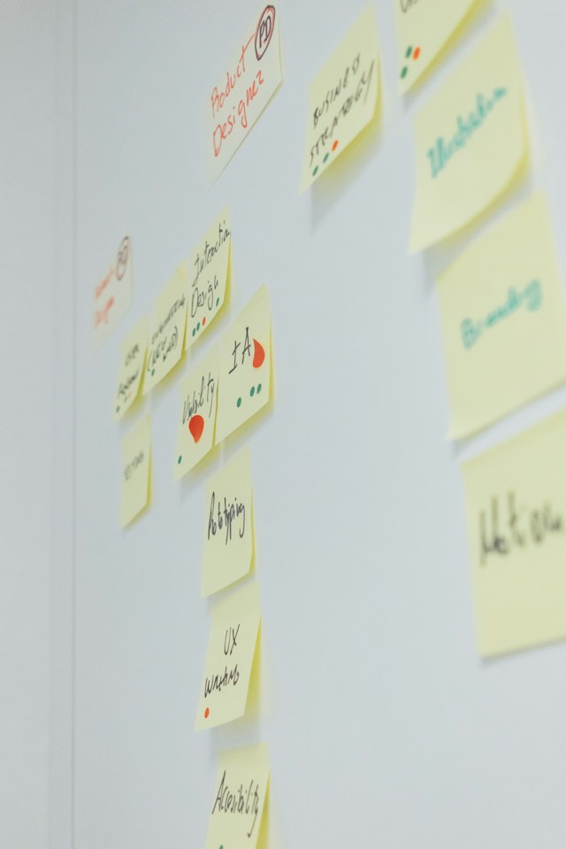
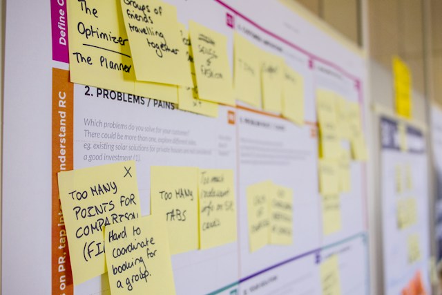
The resulting diagram is an affinity map. Often, groups create an affinity map by placing sticky notes on a whiteboard. However, it’s often useful to digitize the map by photographing it or using software. That said, the traditional affinity diagram always consists of sticky notes.
The diagram helps you organize information such as usability feedback, customer service chats, interviews, and more. As a result, you can begin to synthesize your qualitative data.
Mind Mapping vs. Affinity Diagram
Some people mix up affinity diagrams with mind maps. While the two share some similar characteristics, they are ultimately different approaches.
Both tools are visual ways to brainstorm and organize your ideas. However, mind maps are more about coming up with fresh ideas and jotting them down. You don’t necessarily need to categorize everything. With affinity maps, the goal is to categorize information.
When it comes to mind mapping vs. affinity diagram creation, it’s best to use the former for unstructured brainstorming. Meanwhile, use affinity maps to create structured, organized ideas.
How To Use Affinity Maps for UX
When you need to conduct user research, UX affinity mapping comes in handy. It can be difficult to make sense of qualitative research. And yet, it’s qualitative data that really lets you get to know your users.
Usually, you need to use thematic analysis to make sense of your user research. This technique involves creating themes to organize the information you collect. Affinity maps are one way to do thematic analysis, giving you a visual representation of your ideas.
However, user research is just one option.
With affinity maps, the possibilities are endless. You can create themes for a variety of research and design projects. Generally, teams use them to organize observations from research, ideas from design-ideation meetings, and ideas about UX strategy.
How To Make an Affinity Map
The affinity diagram process is fairly straightforward. The gist of it is to write down all ideas on sticky notes and then categorize those notes.
This guide explains the process step by step.
1. Appoint a Workshop Leader
Affinity mapping is a team exercise. To keep things on track, you should appoint a workshop leader.
This role involves:
- Communicating the agenda and goals.
- Describe each phase of the workshop.
- Tracking time for each step.
- Putting the notes on the wall.
- Address any issues, like helping someone who is struggling or mitigating disagreements.
2. Set Up
Next, you need to choose a location. Find a meeting room with enough space for everyone. You also need a wall, whiteboard, or window where you can attach the sticky notes. Make sure there are pens and blank sticky notes available.
The workshop leader might also want to write down the agenda. As the meeting begins, it’s important to explain the process. People may arrive at the meeting with sticky notes if there is a lot of information to go through. Or, there may be some time at the beginning to write notes.
This process depends on the purpose of the affinity mapping process. For example, when collating small amounts of research, everyone can do this together. Each person goes through the research and jots down their thoughts on individual sticky notes.
Then, the workshop leader puts all notes on the wall in no order. You can also add a few category names to begin sorting. Add a “?” category, too, for things that don’t make sense yet.
3. Explaining the Process
The workshop leader then announces the different steps of the process. This includes:
- Sorting into top-level categories.
- Sorting into subcategories.
- Summarizing those categories.
- Determining priorities.
- Planning subsequent meetings.
They should also outline any rules, such as not talking over each other and setting time limits.
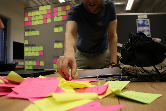
4. Sort Notes Into Top-Level Categories
Next, the sorting begins. The leader takes a sticky note from the wall and reads it out. There may or may not be some discussion about where it belongs. Then, they stick it beneath the relevant category.
If there are notes saying the same thing, stack them so that the most descriptive one is on top.
If the note does not fit into an existing category, think of a new one. Or, if it is not understandable, put it in the “?” category.
Try to do this step in around thirty minutes.
5. Organize Into Sub-Categories
Next, you need to organize those notes into subcategories. The workshop leader can assign attendees to different categories. In turn, they look for related themes within the category and sort the notes into subcategories.
Some people may finish earlier than others. It’s the leader’s responsibility to make sure everyone is busy—if someone finishes, reassign them to help elsewhere.
At the end of each step, it’s a good idea to allow for questions.
6. Present Each Category
Now, it’s important to make sure everybody is on the same page. Anyone who sorted a category can stand and read each finding. They can then summarize the category and the subcategories.
If you have time, allow other attendees to make related points or ask questions. However, you may choose to skip this step if you’re in a rush. Otherwise, work around the room to present all the categories.
7. Analyze the Results
Affinity mapping is rather useless if you don’t use the results. However, the way you analyze the results depends on the purpose of the meeting. The Nielsen-Norman Group outlines several tests you can use.
Analyzing Usability Tests
- Severity: Go through the findings and vote on the severity of each point. Assign a rating of High, Medium, or Low to each one. You can do this via a show of hands for each rating for ease.
- Points: Give each attendee a number of attendance points. Often, people get three points each. Each person can assign those points to the items they consider the most important. People can cast votes by putting stickers or marks on the sticky notes of the most importance. Sometimes, people can assign multiple importance points to a single issue if they consider it to be crucial. For example, you could assign one issue two importance points and give another one.
Analyzing Design Ideation Meetings
Meanwhile, for design ideation meetings, there are other ways to analyze the data and make decisions. Again, attendees can vote on or assign value to their most important issues. However, there are some different methods to do this.
- One-Hundred Dollar Test: There may be several design ideas for one problem. In this case, give the group $100. The group then splits the money among the ideas generated. This method forces the team to think in terms of the design’s worth. Often, one design emerges more valuable than the others.
- New, Useful, Feasible (NUF): Rate each design idea on a 1-to-7 scale for three attributes. Ask the following questions. 1) Has the team used this design before? 2) Is the idea useful, and does it solve the problem? 3) How feasible is it to implement the idea? Total the ratings and use the overall score to rank the ideas.
There may be other ideas you can use to assess the meeting. However, these four techniques provide an easy framework to begin analyzing.
8. Finishing Up
Following the meeting, it’s important to record how it went. Write down the main points in bullet-point style so that everybody can see them. That way, it’s easy to ensure everyone is on the same page. Someone should document the sticky notes on the wall by taking photos of them.
At the end of the meeting, the workshop leader should assign follow-up tasks. Remind attendees that a written report or recording will be available shortly. Then, announce the plan going forward to act on the things you learned in the meeting.
9. Digitizing Your Affinity Map
Ideally, you should digitize your map after the meeting so it’s easy to share and read. You can assign this task to someone at the end of the meeting.
Here are some software options to consider:
- Canva: You can use the blank templates to design an affinity map. You can lay it out however you choose, and most of the features are free.
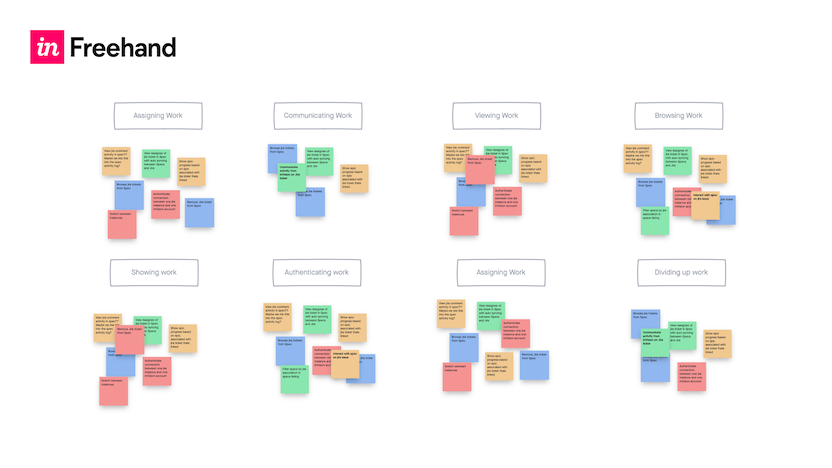
- InVision: The freehand option from InVision is ideal for affinity mapping. There are sticky note templates and easy ways to organize categories.
- LucidChart: With built-in affinity map templates and a drag-and-drop interface, LucidChart is easy to use.
- Figma: Many design teams already use Figma, but did you know you can also create affinity maps on it? This is a straightforward option if you’re already used to the software.
Many teams create their maps directly in software. Sometimes, though, it’s easier to start on paper and digitize later. That way, it’s quick and easy to collaborate.
Affinity Map Examples
Since affinity diagramming is such a versatile tool, there are endless examples. Here are some affinity map examples of how you can use this technique.
- User feedback: Sift through user feedback gathered during testing to see what users think and what improvements you can make.
- User personas: Collect data from user interviews and demographic research to group common characteristics. You can use this to identify patterns in user goals, frustrations, and motivations. In this way, affinity maps can help you define user personas.
- Content organization: Evaluate content for digital products, grouping related information to create a coherent Information Architecture. Identify content hierarchies and navigation patterns to enhance the UX.
- Feature prioritization: Gather input from stakeholders and users about desired features. Then, categorize these features based on the NUF criteria. Use this information to guide development efforts.
- User journey mapping: Map the entire user journey from awareness to conversion. Use your affinity map to identify touchpoints, emotions, and pain points at each stage.
The possibilities go on. Whatever you use it for, an affinity map can give you a key insight into what your data looks like. It’s an exceptionally useful tool for getting to the bottom of your data.
Stay Up-To-Date With All Things UX
Beyond affinity mapping, there’s always a lot to learn about UX. This is an ever-changing field that evolves with new technologies and user preferences. Research is just one part of it. Page Flows can help you stay up-to-date with all things UX, including new design ideas.
If you’re looking for design inspiration, why not learn from proven products? Our growing library of user flow recordings is a helpful resource for finding interaction design ideas. Get started today to finally stay up-to-date with current design trends.