
Steve Jobs is responsible for a lot of the ways we think about the devices we use. Apple’s exceptional usability and clean aesthetics are no accident, especially because the tech giant places so much emphasis on visuals. Apple’s Human Interface Guidelines (HIGs) govern what designers create, ensuring that users always enjoy the user experience on Apple products.
These guidelines ensure that designers can create user-friendly interfaces across various devices. The end goal is to make things better for the user, but how can you do this?
What Are Apple’s Human Interface Guidelines?
The Apple Human Interface Guidelines have existed since 1977, detailing design principles for Apple II. For those not in the now, that’s a personal computer Apple made back in the 1970s.
Over the years, Apple has honed these guidelines to keep up with the latest technological advances. Today, it exists as a set of guidelines that covers the entire Apple ecosystem. The guidelines are available online for all designers to see and use.
Whether you’re designing for Apple products or not, the guidelines might be useful. After all, they’re all about human-centric design. But they’re best for iOS, macOS, watchOS, tvOS, and visionOS designs.
Apple’s Design Documentation
Simply put, design documentation refers to a set of details about the designs and decisions of a particular product. It’s essentially a style guide. It might include information about icons, color, typography, interactions, and more. Depending on the project’s complexity, there might even be information about research and wireframes.
These documents maintain consistency across a project. They also ensure scalability, allowing your design team to handle new features, new devices, and more with ease. They can even save time when you’re designing quickly.
Apple has a lot of products under its belt. How does it ensure a seamless experience for its users across devices and apps? The answer is the HIGs, which give designers a full toolkit for designing for Apple.
The full set of guidelines is on the HIG website, which is publicly available. The documentation here covers absolutely everything you need to know. The downside of that, though, is that there are lengthy amounts of text. Apple divides the guide into six main categories, each with detailed information.
We’ll cover each category in more detail later. For now, it’s important to understand how the HIGs differ from Material Design.
Human Interface Guidelines vs. Material Design
Google also has its own set of guidelines called Material Design. Both sets of rules have similarities, especially because they both aim to improve the user experience. After all, in UX/UI, it all comes back to what the user thinks.
However, there are also lots of differences since Apple and Google are competitors. The main difference between Human Interface Guidelines vs. Material Design is the operating systems. The HIGs are for iOS, and Material Design is for Android/Google.
There are other differences, too. Apple uses a primary flat design, whereas Google opts for UI that mimics materials and leaps off the screen.
Both guidelines have had a major influence on the designs of other companies, but perhaps Google’s more so. That said, Apple’s emphasis on clean aesthetics is certainly compelling. For many designers, the use of white space and modern visuals is preferable over Google’s depth and animations.
As a designer, it’s up to you which guidelines you follow. It’s worth familiarizing yourself with both design documents in case you design for different operating systems in your career.
The Guidelines
So, with all that out of the way, it’s time to explore the iOS Human Interface Guidelines. As we mentioned, the site breaks them down into six categories, each with subcategories. You can view these in the menu bar on the left-hand side of the website. Here’s what you need to know about each category.
Platforms
The first category explains how to create high-quality apps for all Apple platforms:
- iOS
- iPadOS
- macOS
- watchOS
- tvOS
- visionOS
On each platform, the user should be able to focus on tasks and primary content. In other words, you need to focus on visual hierarchy.
The Notes app on iPhone is a fantastic example. The interface is clean, with a layout that’s easy to use and prioritizes the features the user needs most. There’s also plenty of white space so you can focus on what’s important: the text you add as a user.
It’s always important to choose which information you display and where/how. Think about what the user wants, what they need, and how you can show it to them.
Foundations
The next category is Foundations, which provides a list of crucial design elements. This includes colors, fonts, layout, imagery, and accessibility. We’ll discuss icons and typography in more detail later.
As for colors, Apple recommends avoiding using the same color to indicate different things. Avoiding this similarity makes your interface more intuitive and accessible. So, you might put primary actions like ‘Save’ and ‘Continue’ in blue. However, you shouldn’t put destructive actions like ‘Delete’ in the same color; instead, it appears in red.
Furthermore, you shouldn’t base color usage on personal preference. Make sure your colors have ample contrast to enhance accessibility. In fact, the HIG provides resources for checking things like this. We recommend that you take a look at the guidelines in detail.
Patterns
Patterns provide design guidance for user interaction. Basically, any time the user can interact with the product, this is where you’ll find the information. Think about sharing actions, searching, feedback, multitasking, and so on.
Apple’s main guidance here is to give the user clear and consistent feedback. As the user interacts with the product, they should understand what’s happening at every stage.
You can do this by informing the user about errors, visually indicating progress with loading bars, or providing notifications. Would you rather Apple tell you before your iCloud storage is full? Or would you rather find out when a photo you just took doesn’t save? If it’s the former, then you understand the importance of feedback!
Components
Next is the Components category. This covers how to use and customize various system components. The end goal is to ensure consistency.
There’s information about layout and organization, content, menus and actions, navigation, and more.
Overall, the recommendations are to make things clear but not at the risk of usability. For example, use the Tab Bar for navigation and make sure it’s always visible. In the modal view, you can omit the Tab Bar, as it closes and doesn’t interfere with navigation.
Inputs
The next category is Inputs. These are the different ways that users can control your application and enter data. For example, there may be keyboards, touch bars, gestures, and even eye gaze for visionOS.
Apple’s main recommendation is to offer different ways to interact with each product. This is mostly for accessibility purposes. After all, your users might rely on assistive technologies.
Technologies
Finally, the Technologies category includes various Apple services that you can use within your app. This includes Game Center, Apple Pay, iCloud, Maps, and so on.
Each technology has its own characteristics, so it’s worth reading through Apple’s recommendations on the HIG website.
Apple Icons
Going through some of the subcategories in more detail will help you see what makes the HIGs so special. For example, the Apple Icons section covers details on the icon design, best practices, resources, and more information.
Apple says: “An effective icon is a graphic asset that expresses a single concept in ways people instantly understand.” Each page opens with a punchy statement like this to help you understand the overall concept.
So, with icons, Apple goes on to say that app icons use rich visual details like shading, texturing, and highlighting. These all serve to communicate an effective idea. However, there are also interface icons, which help the user interact with the app.
Designers can choose symbols from the SF Symbols app and customize them to suit their needs. Either way, the HIGs provide ample guidance.
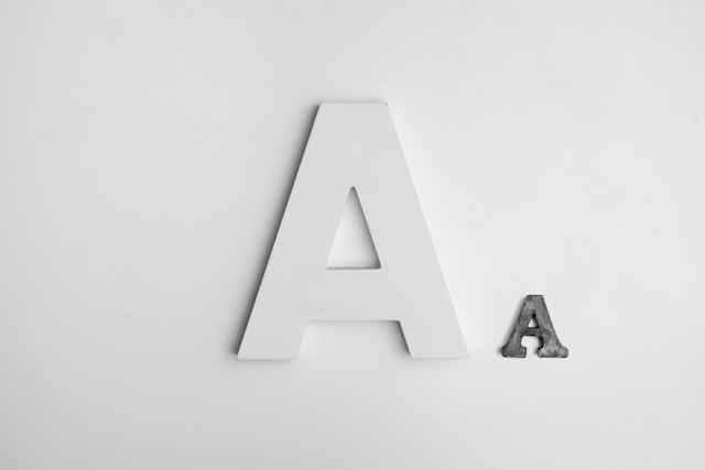
Apple Fonts
Meanwhile, Apple fonts aim to ensure legible text and clarify information hierarchy. They can even help you express your brand.
Apple outlines six best practices for using their fonts.
1. Readability
Aim for a minimum font size that most people can read easily. Device displays can alter the minimum font size, but there are also other factors. Consider the reader’s proximity to the text, for example, and whether they’re in motion.
Dynamic Type allows people to choose the size of visible text in various Apple operating systems. This is a great way to improve accessibility and overall UX.
2. Visual Hierarchy
Adjust the font weight, size, and color as needed to emphasize important information. Make sure you maintain the relative hierarchy and visual distinction when people adjust the text size.
3. Less is More
Minimize the number of typefaces you use. Mixing too many together can obscure information hierarchy and hinder readability. It can also affect your branding.
4. Test Legibility
Not only do you need to test readability, but you also need to test it in different contexts. Test with different font sizes. Test it outside in bright sunlight and indoors in the dark. Test it in motion and view it from a distance.
The more you test, the better you can make your product.
5. Avoid Light Weights
If you can, avoid light font weights. This will help you maintain readability. For example, opt for Medium, Semibold, or Bold font weights. Use Regular sparingly.
6. Prioritize
When responding to text-size changes, prioritize important content. When someone selects a larger font size, they simply want to make the text they care about easier to read. So, they don’t necessarily want to increase the size of every word.
For example, Apple Mail enlarges the subject and body of the message. However, the date and the sender remain smaller.
Design for iOS and Beyond With Page Flows
Apple’s Human Interface Guidelines can be really helpful tools, especially when designing for iOS. Even in other contexts, some of them serve as UI best practices.
But if you want to create amazing interfaces that dazzle your users, you’ll need inspiration. So, why not learn from proven products? Page Flows is a helpful resource for finding interaction design ideas. Get started today to access our growing library of user flow recordings and finally stay up-to-date with current design trends.