UI/graphic designers strive to enhance the user experience by designing compelling static and interactive elements. From micro-interactions to overarching design styles, there are an endless number of design elements that demand a designer’s attention.
One element that designers may not always prioritize is background design. Given that this acts as the bedrock for the rest of your design’s visual intrigue, it’s worth discussing.
So, in today’s guide, we’ll explore the different ways in which you can design an engaging background.

The Different Types of Background Design
Designing an excellent design background takes more than finding an aesthetically pleasing image online. First, it requires an understanding of the different ways in which you can bring your background to life.
To help you elevate your graphic design websites or mobile applications, we’ve discussed the most popular backdrop design types below.
- Textural Backgrounds: These types of backgrounds convey the appearance, consistency, and tactile sensation of a particular surface or object. Backgrounds that mimic the surfaces of paper, fabric, and rocks are all examples of textural backgrounds.
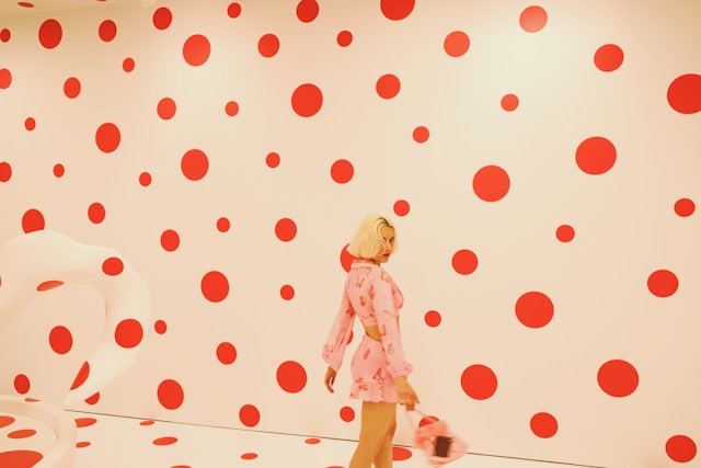
- Patterned Backgrounds: Patterned backgrounds display a repetition of certain graphic design elements like lines and shapes. A classic example of a patterned background is a polka dot backdrop.
- Liquid Backgrounds: Graphic/UI designers can create liquid-esque backgrounds in two ways. The first involves using a simple image of a liquid. The second, which is more popular, requires an animation of flowing liquid to communicate a sense of fluid movement.
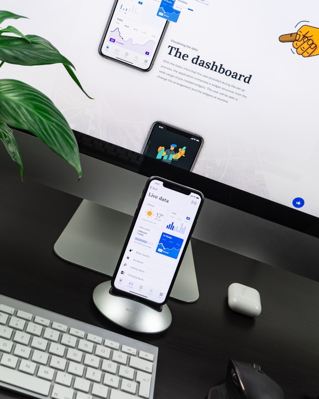
- 3D Backgrounds: Three-dimensional backgrounds strategically utilize light, shadow, and color to imbue the overarching design with a sense of realism.
- Split Backgrounds: It’s popular for designers to divide their backgrounds into sections using different colors, images, shapes, and lines. Any background with these types of segments/divisions is a split background.
How To Design Your Own Background: 7 Top Factors To Consider
It’s time for you to learn how to design your own background like a professional designer. Follow our step-by-step guide below and you’ll end up with an eye-catching backdrop design!
1. Understanding Crucial Context
The first thing you need to understand is that your background should strengthen the visual intrigue within your design’s foreground. It shouldn’t draw your user’s focus away from it.
So, revisit the appearance of your design’s content and key elements. Brainstorm ways in which your background can elevate your foreground.
For instance, let’s say you were creating a website that focuses primarily on FPS (first-person shooter) games. Let’s also say that you were using neon red icons and typographic elements to mirror a laser sight’s red hues.
In this scenario, a dark background would really help your design elements stand out to your users.
2. Researching Your Users
Your backdrop designs shouldn’t just align with your design’s foreground or content; it should also align with your users’ preferences.
To ensure this alignment, you’ll need to conduct user research. Your research will help you find out what types of background designs your users prefer and why.
You can then narrow down the design ideas from your brainstorming session and tailor your remaining suitable design solutions accordingly.
Tip: Research your competitors’ backgrounds and make note of what you think works and what doesn’t work.

3. Prioritizing Contrast
Contrast is a crucial component of accessibility, and overall readability. For that reason, there must be a high level of contrast between your design elements/textual content and your background.
You should also keep in mind that your backdrop colors should be subtler and softer than your text’s colors.
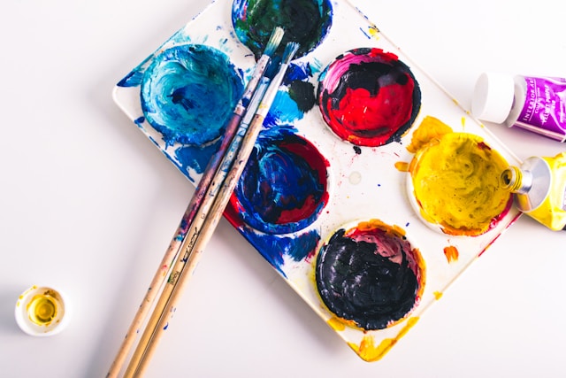
4. Selecting Your Colors
Now, you can focus on your design’s colors. If you’re working on a brand’s digital products, ensure that you incorporate brand-specific colors.
This will help you maintain your brand’s visual consistency and facilitate brand recognition amongst users.
You’d also benefit from researching color psychology to learn how certain colors can elicit particular emotional responses from your users.
Overall, your backdrop’s colors should also bridge the gap between your design’s content and your users’ expectations.
5. Experimenting with Backdrop Designs
When you’re happy with your use of color and contrast, you can enhance your design’s visual intrigue with experimentation.
Play around with the different types of background designs, including the ones we discussed earlier.
Most importantly, keep every iteration of your backdrop designs for the tests you’ll conduct in the future.
6. Leveraging Negative Space
Negative space refers to the empty space between design elements. It’s also a must-have aspect that every design should implement to avoid overwhelming users.
What’s more, if you want to enhance your design’s readability, using negative space is a perfect idea. We recommend implementing negative space around key areas in your foreground, including its textual content and CTAs.
Not only will keeping these areas “empty” help improve your design’s readability, but it’ll also help you increase conversion rates.
7. Testing Your Designs
You should conduct A/B tests on your design iterations from when you were experimenting with different backdrop types. These tests will help you find out which of your background designs resonates with your users the most.
You’ll also need to conduct usability tests on your finalized backdrop design. The user feedback you get from these tests will help you evaluate the functionality and aesthetic value of your background. After making the necessary improvements, you’ll have an exceptional backdrop design!
FAQs
What are the different types of background designs?
Some of the different types of background designs include the following:
– Textural backgrounds
– Patterned backgrounds
– Split backgrounds
– Grainy backgrounds
– 3D backgrounds
– Liquid backgrounds
Where can I find good background images?
The most affordable way to find good background images is to peruse free stock photo sites like Pexels and Unsplash.
What is the best color for a background design?
Ultimately, the best color for your backdrop designs will depend on the products/services you sell and your users’ preferences. That said, it’s always a good idea to use neutral colors like black, gray, beige, and white for your backgrounds.
Background Design: Get Inspiration From Page Flows
We hope that you can now optimize your backdrop designs as effectively as you would with your other design elements. Design with your user engagement and readability in mind, and you’ll never go wrong.
Another great way to engage users and elevate your backdrop’s functionality further is to refine your user flows. This is something that Page Flows can help you with.
With Page Flows, you’ll learn from top-of-the-line examples how you should approach intuitive, in-product navigation. What’s more, you’ll have thousands upon thousands of recordings and screenshots that cover every essential user flow, including onboarding flows.
Best of all, you’ll never struggle to find inspirational flows that relate to a specific brand or industry.
Exceptional user flows pave the way for engaging design elements, excellent background design, and spectacular user experiences. So, start your design process the right way with Page Flows. Join us today to learn how to design user flows that keep your users coming back to your products!