
The typographic elements you use will significantly impact the overall graphic design of your digital product. For this reason, you should choose your product’s typography carefully.
With the right elements of type, you can elicit certain emotional responses from your users. Then, as a result, you can determine how you’ll enhance the user’s experience through your choice of typography.
The question is, ‘How do you pick the right typography elements?’
In today’s guide, we’ll answer that question for you! We’ll explore the key elements of typography and font anatomy to ensure you can make well-informed design decisions. Beyond that, we’ll also address the main types of typography and discuss trending fonts that you could use. By the time you’ve finished reading this guide, you’ll know precisely how to effectively implement typographic elements into your designs!
What are Typefaces?
When you saw the title of this section, you may have expected us to use ‘typefaces’ and ‘fonts’ interchangeably. However, it’s important to distinguish typefaces and fonts as two different entities immediately.
So, if typefaces and fonts aren’t the same, what are typefaces?
Typefaces represent a family of related fonts. On the other hand, fonts act as singular graphical visualizations of said ‘family’.
In other words, a typeface is a distinct set of characteristics that indicate a particular style of lettering. A font represents a variation within a typeface, like italic or bold. As variations, fonts within a typeface ‘family’ can exhibit different widths, weights, and styles.
To clarify further, an example of a typeface would be ‘Roboto’. On the other hand, an example of a font would be ‘Roboto Thin’ or ‘Roboto Black’.
Generally, a graphic or UI designer will use four different types of typefaces:
- Serif typefaces
- Sans-Serif typefaces
- Script typefaces
- Decorative typefaces
Let’s examine these typefaces in more depth…
Types of Typography Every Designer Must Know
So, you now know the four most popular typefaces: Serif, Sans Serif, Script, and Decorative. The next step is to confidently affirm that you can distinguish each typeface from one another.
If you can’t confidently say you know the differences between these typefaces—don’t worry! Below, we have explored the most distinct characteristics of the four main types of typography.
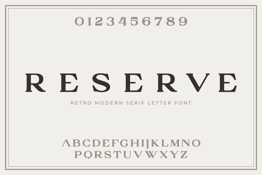
1. The Serif Typeface
Expectedly, the most distinct characteristic of a Serif typeface is its serifs. A serif is a horizontal or vertical stroke that attaches to the ends and corners of a letterform.
Serif fonts can help a brand appear more authoritative and professional. Due to their archaic, typewriter-esque appearance, Serif typefaces exude a sense of timelessness and credibility.
Examples of Serif fonts include Times New Roman, Garamond, and Georgia.
2. The Sans Serif Typeface
Simply, a Sans Serif font serves as the opposite of Serif fonts because they don’t utilize serifs. Sans Serif fonts are great for more casual brands as they lack decorative ornamentation.
Examples of Sans Serif fonts include Helvetica, Roboto, and Futura.
3. The Script Typeface
Script fonts are fluid, decorative typefaces that take inspiration from calligraphy and handwriting.
Brands that celebrate elegance and sophistication would find script fonts a considerably handy tool.
Examples of Script fonts include Alex Brush, Allura, and Sofia.
4. The Decorative Typeface
Decorative fonts display characteristics of versatility and uniqueness, flaunting unabashed boldness and ornamentation.
Brands should use decorative typefaces with a unique aesthetic to grab their users’ attention.
Examples of decorative fonts include Leah Gaviota, Swashington, and Ginga.
The 8 Key Elements of Typography
To truly understand how to effectively utilize typography, you must familiarize yourself with its most integral elements first. Like how UX designers follow UX design principles, graphic and UI designers must consider the basic typographical design elements.
There are eight typographical design elements that you should know about. Let’s take a look at them!
1. Fonts & Typefaces
The font and typeface you use will be one of the first interactions your users have with your product’s content.
As previously mentioned, there are four main types of typefaces to choose from.
Your chosen font and typeface will determine how users perceive your brand. Whether you want to appear casual or sleek, your font and typeface should help you adhere to your brand’s personality.
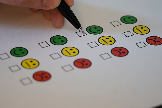
Additionally, as we mentioned earlier, your font and typeface will influence your users’ emotional states. It’s important to clarify how you want your users to feel. Then, you should conduct UX research to acquaint yourself with your users’ behaviors and determine how you’ll achieve your goal.
Tip: We recommend that you conduct A/B tests to assess how your users react to variations of your typography. Once you’ve identified the typographies that users resonate with, avoid using more than three of them in your designs.
2. Contrast
Contrast is an incredibly useful tool for UI designers who wish to create a clear visual hierarchy within their products.
Contrasting typography not only makes a text more visually compelling but also helps you communicate emphasized design elements. Essentially, contrasting typographic elements can help focus your users’ attention and streamline your users’ journey toward locating their desired content.
You can utilize varying typefaces, sizes, weights, colors, and styles to create visually intriguing, contrasting typographic elements
3. Consistency
Consistency serves as a fundamental principle of the entirety of UI design, not just typography! Given this fact, it’s safe to say that you should approach your typography with consistency as a top priority.
Using too many different fonts with different characteristics can lead to confusion for your users. So, you should always aim to employ the same font styles for related information/text. By doing so, you’ll convey crucial information clearly, allowing your users to identify and familiarize themselves with your typographic patterns.
Tip: Establish a consistent hierarchy of typefaces. You can do this by choosing a set font for your headers and a set font for subheaders, for instance.
4. Hierarchy
Your hierarchy should clearly organize your ideas. A clear hierarchy makes it so that your users can easily determine which category the information they’ve read falls into. In other words, an effective hierarchy enables your users to utilize their intuition to navigate through your product’s copy.
If you saw a large, emboldened typeface at the top of the page, you’d naturally assume it was a title. This is an example of an element that adheres to a conventional typographic hierarchy that your users will instantly recognize.
5. White Space
White space—or negative space—refers to the empty space around objects and text. Concerning typography, white space can take the form of margins, padding, and even just an empty area within your website.
Negative space can imbue your product with a visually appealing, clean appearance and help to focus your users’ attention. What’s more, creative use of negative space can emphasize the importance of a piece of content within your product.
An effective use of white space means that your product exhibits an uncluttered user interface and readable text.
6. Alignment
Alignment refers to the unification of text, graphics, and images to ensure equal sizing and spacing between each element.
For example, you may want your logo to align to the same size as your initial header.
7. Color
Color can make a piece of text stand out and help you communicate your brand’s personality or core values.
There are three main components to color usage:
- Value
- Hue
- Saturation
A good use of color reflects a balance of those three components. By balancing these components, you’ll make your text more enjoyable and readable, especially for visually impaired users.
8. Spacing
Spacing is a crucial element of legible typography. You can break typographic spacing into two components: kerning and leading.
Leading refers to the space between lines of text or ‘line height.’ Effective leading requires balance. With too much space, text becomes too tedious to read. With not enough space, text becomes too difficult to read.
Kerning refers to the space between letters and individual characters. Like leading, effective kerning also requires balance. A product has utilized kerning effectively when its text displays an equal amount of white space between each letter.
Font Anatomy: Crucial Components
Like a car engine, fonts have a lot of moving parts—a font anatomy, if you will.
If you wish to improve your design’s typography, you must know the most important elements of a font’s anatomy. Let’s take a look at them!
- Ascender: A vertical stroke that extends beyond the x-height.
- Baseline: An invisible line that all letterforms sit upon.
- Bowl: A fully closed, curved part of a letter that encloses the circular parts of some letters like ‘d’ and ‘o’.
- Cap Height: The distance from the baseline to the top of a capital letter.
- Counter: The transparent space enclosed inside a letterform.
- Cross Bar: A bar that crosses between two other strokes within an individual letter.
- Descender: The segment of a letter that extends below the baseline of a font.
- Finial: A tapered or curved end of an individual letter.
- Ligature: Where two letters join to form a singular glyph.
- Lowercase: A lowercase letter or the smaller form of letters within a typeface.
- Stem: The main vertical stroke in an individual letter.
- Serif: A mark or line that appears at the end or edge of a letter’s stroke.
- Stroke: A main line, either curved or straight, that makes up the appearance of a letter.
- Terminal: The ending of a stroke that has no serif.
- Uppercase: A typeface that contains capital letters.
- X-height: The distance between a typeface’s baseline and the top of a lowercase letter, excluding ascenders.
- Weight: The thickness of a typeface’s stroke in any font.
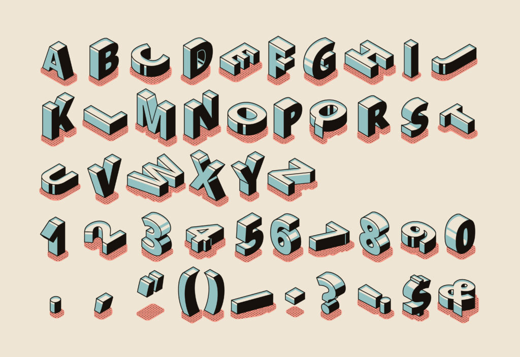
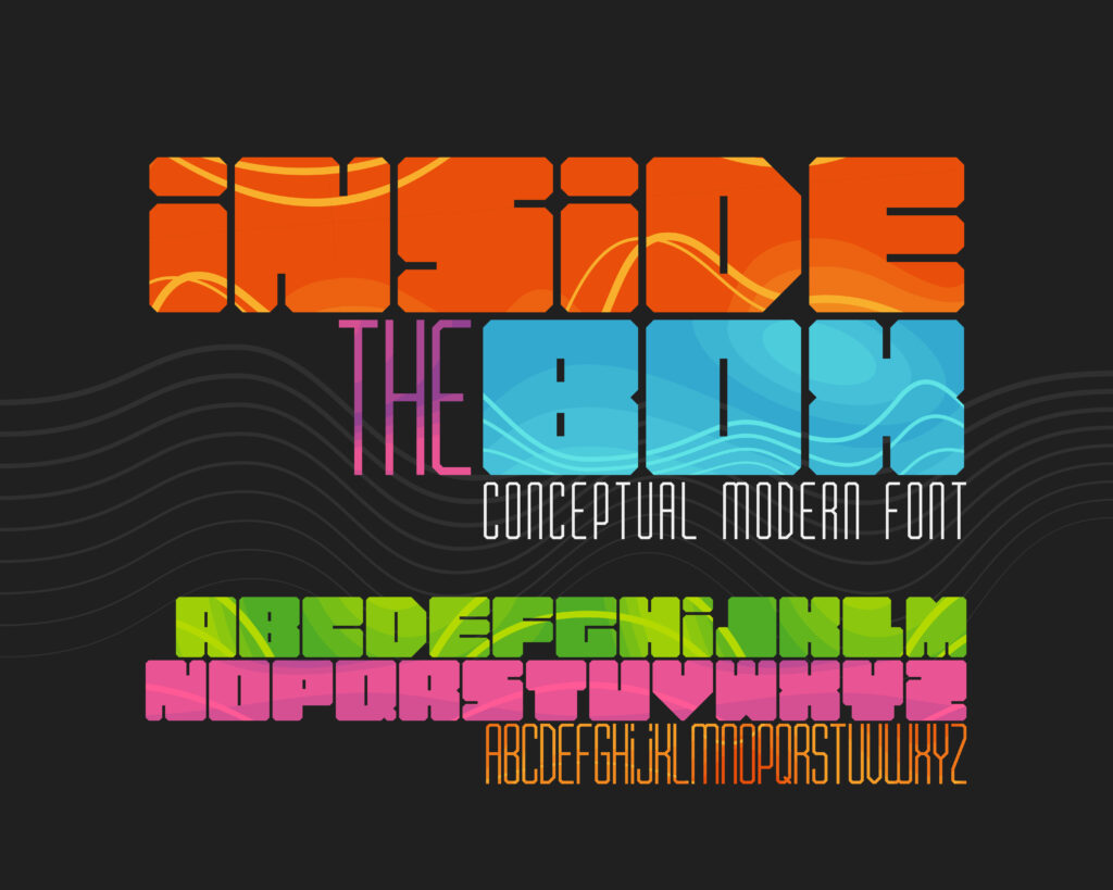
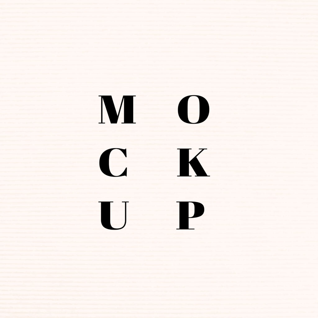
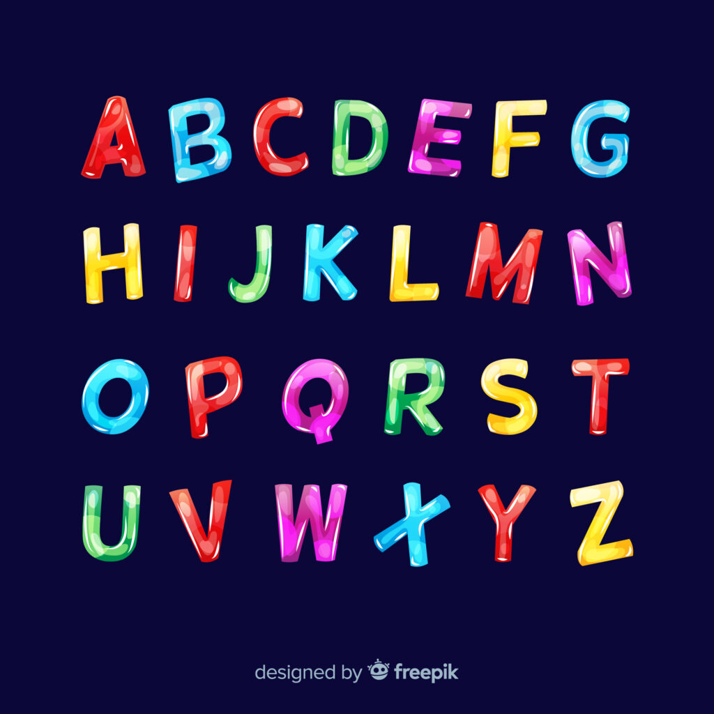
Trendy Fonts You Should Consider Using
Before you finish reading our guide, we’d like to provide you with some inspiration.
Below, we’ve assembled a list of some of the best, trendy fonts that you should experiment with!
Typography Elements: Utilizing Effective, Compelling Typography
It’s your role as a designer to make well-informed design decisions that optimize your target user’s experience with your product. That being the case, it’s imperative that you focus on enhancing every functional and aesthetic element of your designs.
The way you implement contrast, white space, typefaces, and so on will impact the quality of your user experience.
So… have fun with it! Experiment with different typographic elements and garner relevant user feedback to evaluate how it affects your user interface. By doing so, you’ll create compelling typographic designs in no time!
On the topic of compelling designs, it’s time for you to take inspiration from a trusted design solution provider. Welcome to Page Flows.
Page Flows is a revered source of user flow inspiration, working alongside esteemed brands like Disney, Google, and Vimeo.
Our mission is simple. We strive to help you when you’re in a rut and you need some new, innovative solutions. We offer a cross-industry hub of inspiration that hosts over 4,800 recordings and over 20,000 emails! With Page Flows, you’ll learn how to design an engaging product. What’s more, you’ll also learn how you should interact with your users as they experience your product.
When it comes to creative typography elements, don’t leave anything to chance. Take inspiration from Page Flows and see the impact of effective typography on your users’ experience with your products.
Get started today to access our library of user flow recordings, screenshots, and emails!