The digital products and mobile apps of today exhibit a UI designer’s keen ingenuity and empathy.
The work of a UI designer plays a significant role in the seamless interactions users now have with digital products. By optimizing the visual elements of a product’s user interface, UI designers can enhance their users’ overall experience.
You may now wonder, ‘What features of an exceptional user interface allow it to enhance the user’s experience?’
Primarily, great UI designs enable the user to accomplish their goals as efficiently as possible without a substantial learning curve.
However, the best UI websites are so much more.
In today’s guide, we will address the meaning of UI design, uncovering the difference between UI and UX design. Additionally, we’ll also explore what makes a great UI design with accompanying examples.
What Is UI Design?
So, what is UI design?
UI design, otherwise known as user interface design, is a crucial part of the user’s navigational ease through digital products.
Specifically, UI design refers to the process of utilizing user research data to craft a product’s look, feel, and interactivity. With the user research data, UI designers can anticipate what users may need to complete their tasks.
For this reason, a UI designer will employ accessible, consistent, and understandable visual elements.
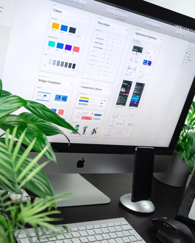
Combined, these visual design elements make up a product’s visual design, interaction design, and information architecture.
What Is the Difference Between UI and UX Design?
You’re here because you have an interest or passion for UI design, and undoubtedly, you’ll have a few more questions.
It’s likely that, in your research of UI design, you’ve come across the term ‘UX design.’ If so, it’s probable that you’ve wondered, ‘What is the difference between UI and UX design?’ We’re here to answer that question.
Although closely related, you shouldn’t perceive UI and UX design as the same thing. UX design is known as user experience design. Thus, a UX designer will also gather, analyze, and utilize user research data. However, a UX designer will use said data to refine the user’s introduction and interaction with their digital products.
As its name suggests, UX design refers to the careful planning and construction of the user’s experience. In addition, the aim of UX designers is to create design solutions that solve the user’s problems.
In comparison, UI design focuses more on the aesthetical, interactive aspects of the digital product.
Essentially, UX design focuses on the user’s experience with the product. On the other hand, UI design focuses on creating the interfaces that guide the user experience.
What Makes a UI Design Great?
Before we examine some examples of great UI designs, it’s essential to know what features you should look for.
Below, we’ve explored the facets of effective UI designs that every UI designer should utilize.
1. A Great UI Design Is Intuitive
The best UI designs don’t demand their users to experience a steep learning curve. If your UI is too complex, you risk your users becoming too frustrated and abandoning your product.
This is why it’s important that you don’t exercise your creativity to an excessive degree. Your users’ familiarity with UI elements is crucial; thus, you should utilize conventional navigational patterns and aids.
Additionally, you should use your most visually appealing design components to emphasize the most important content/information within your product.
You should also utilize clear, descriptive labels so that the user immediately knows what every navigational button does.
In doing so, you’ll enable your users to utilize their prior experience with similar products to navigate through yours intuitively.
2. A Great UI Design Is Consistent
Consistency is a vital element of making your user interface designs more intuitive. However, there are additional benefits to creating a consistent UI.
A consistent UI design will let users easily recognize your brand/company, which is vital for garnering customer loyalty. Of course, the more loyal customers you have, the easier it is for you to expand your user base.
You should ensure your users can easily learn both the visual and behavioral aspects of your design. How to keep the consistency of visual elements of your UI (color, shape, space, etc.) is self-explanatory. However, it’s likely that—if you’re new to UI—you may not instantly recognize what we mean by ‘behavioral’ aspects.
UI behavioral patterns will help you manage the interactions and communications between different items and classes in your design system. In terms of your users, the behavior of your UI can modify how they think, feel, and act.
To ensure your UI exhibits consistent behavioral patterns, you should adhere to your user’s spatial memory. Your users may use their prior experiences with similar products to locate what they need from yours.
For instance, your users will likely assume that your navigational menu will sit at the top of the landing page. Thus, for the sake of consistency, you shouldn’t expect your users to diverge from their spatial memories.
3. A Great UI Design Is Inclusive
By designing with inclusivity in mind, you’ll acknowledge the diversity amongst your target audience. Inclusive UI designs recognize that not all users have the exact same needs. Some of your users will have physical/cognitive barriers that prevent them from accessing and enjoying your products.
That is unless you ensure that you create great UI designs. Furthermore, you can only create great UI when everyone can use and understand your products.
There is an extensive list of guidelines that you should familiarize yourself with. However, to help you ensure you’ve created inclusive designs, here are a few useful tips.
- Not every one of your users can use a mouse or touchpad. You should ensure that those users can navigate through your website using a keyboard only.
- For visually impaired users, your use of color can impact their overall experience. You should utilize a color palette that provides good contrast and is easily viewable.
- Consider multi-lingual accessibility. You should offer your content in a range of different languages.
- You should provide alternative methods of absorbing content for users with hearing impairments. Provide descriptive alt text for images and transcripts for videos.
4. A Great UI Design Is Simple
Regarding inclusivity, using simple language and avoiding complex jargon will improve the user experience for those with cognitive difficulties. Using simple UI designs also has other benefits.
Minimalist user interfaces will express their visual hierarchies using simple typography, color palettes, and contrast ratios. In keeping your designs straightforward, users will find it easier to focus their attention and locate desired content effortlessly.
If you employ simple, straightforward proportions and spacing, excessively bold design choices won’t overshadow your users’ experiences.
5. A Great UI Design Is Adaptive
Great UI designs extend beyond computer or laptop screens. Nowadays, it’s extremely common for users to experience your product for the first time while using their mobile phones.
With this in mind, ensure you can adapt your user interface to any screen size across all electronic devices.
Ultimately, adaptability links back to one of the central tenets of UI design—empathy. Consider your users who may interact with your product while on the go. Mobile phones are, of course, more portable than a laptop/computer, and thus, your users are likely to use them more.
By guaranteeing a consistently positive user experience across all devices, you’ll generate customer loyalty and reduce your bounce rate simultaneously.
6. A Great UI Design Is Visually Appealing
Aesthetics are a facet of UI design that you shouldn’t overlook. Usability and functionality are incredibly important for the smoothness of the user’s journey, but aesthetics influence the user’s emotional state.
Needless to say, visually appealing UI designs can make the user’s overall experience with your product more enjoyable.
Upon deeper inspection, however, a unique visual style, typography, and imagery can evoke specific emotional responses from your users.
Specifically, using particular color schemes can evoke a sense of happiness, comfort, or sophistication.
The Best UI Websites: Analyzing Exceptional Designs
Knowing what makes a great UI design is a significant first step to creating your own exceptional UI designs.
Just knowing the qualities of the best UI websites isn’t enough; you will need some inspiration.
Below, we’ve explored some of the best UI designs currently available within the digital landscape.
Spotify
Spotify is a globally revered titan among music streaming services. Blending aesthetics with functionality, Spotify diverges from the traditional, static user interface in favor of dynamic content conveyance.
Spotify uses album/playlist covers to convey meaning while also appropriately representing its brand and industry in an expressive manner.
Sporting a personalized experience, Spotify employs in-app user data to create suggestions that align with the user’s preferences.
Spotify’s most compelling quality regarding its UI is that it’s adaptive to other devices. Spotify provides a universal experience across all devices, meaning that every form of its product flaunts faultless, intuitive design.

Zoom
Zoom is a communications platform. Its UI design excellently categorizes tailored content for various sectors.
Zoom demonstrates a straightforward, minimalist layout that is perfect when considering the user’s cognitive overload.
Zoom’s use of spacing and icons makes navigating through its multiple product offerings seamless.
Additionally, what sets Zoom’s UI apart from others of its kind is its use of CTA. Their call to action stands as a solitary statement under its introductory copy. A contrasting color scheme also encompasses Zoom’s CTA, drawing the user’s attention immediately to it.

Bumble
Bumble is an online dating and networking application that launched two years after Tinder, the leading authority of dating apps.
Following Tinder’s successful ‘swipe right’ functionality, Bumble celebrates the user’s choice to personalize their own romantic journey. As a result, the ‘swipe right’ functionality serves as a testament to user-centricity. Bumble’s UI elements are not only usable; they satisfy the user’s preferences.
So, why have we mentioned Bumble instead of Tinder? Bumble allows for business networking and friend-finding, which makes it stand out against other dating apps. Yet again, this feature of Bumble emphasizes its user-centricity while utilizing the user’s prior knowledge of dating apps. In doing so, Bumble has employed conventional UI elements for dating websites, facilitating intuitive interactions between users and the product.
Bumble’s minimalist approach to visual elements also ensures a smooth navigational experience with a diminished learning curve for its users.
With a fluid direct messaging system, Bumble demonstrates simple typography and color contrasts that make messages easily readable. Additionally, the color palette is consistent with the brand’s identity, bolstering brand recognition across all platforms.

UI Design: Guiding the User’s Experience
The key takeaway from this guide is that creating a positive user experience is an integral part of successful interfaces.
No matter how you choose to creatively express your company’s/brand’s identity, you must focus on the user primarily. Knowing your users as individuals is an imperative part of creating intuitive, engaging interfaces.
Only in understanding your users’ needs will you be able to create user interfaces that demonstrate the previously discussed components.
Once you’ve mastered those components, you’ll not only become familiar with the best UI websites, but you’ll create them!
In order to do that, you’re going to need some inspiration.
To help you find inspiration, you should learn from proven products. Consider Page Flows.
With over 4,200 recordings of tried and tested products, we’ve transformed user onboarding into an art form. We’ll provide you with a solid base of knowledge as you witness how successful products organize the user’s experience! Inspired by the best UI websites, we’ve garnered over 1,000 happy customers from esteemed brands. From Monzo to music, we offer an abundance of user flow inspiration!
Get started today to access our growing library of user flow recordings and finally stay up-to-date with current design trends.
