With user experience (UX) design, we often think about the big things. Whether it’s user flows, interface layouts, or interactions, these are the things we typically associate with UX. However, you should never neglect the minor details, such as the UX copy, that can have a huge impact. But what is microcopy, and why is it so important, anyway?
Stay tuned as we cover the ins and outs of UX copy with a mission to explain why it matters.
What Is Microcopy?
In UX, microcopy refers to text that helps users understand how to do things. For example, this includes labels, pop-up hints, CTA buttons, and error messages. They might seem small and insignificant, but they can enormously impact conversions.
Here are some of the things it includes:
- Error messages: The text on 404 pages or other error pages to tell the user the problem. It may also tell them what to do next.
- Success messages: Conversely, success messages let the user know they have completed a task.
- Onboarding copy: Text guiding users as they sign up for a product or service.
- Offboarding copy: Text that guides a user through the process of leaving a service.
- Tooltips: Labels that appear when the user hovers over an element. They provide information about functionality and features.
- Loading messages: Text that appears while users wait for their action to process.
- Captions and alt texts: Captions are short texts that describe the content of a picture. Alt text refers to text that a screen reader reads aloud for those with visual impairments.
- Notifications: Short messages that provide important information. They are often time-specific.
- Text fields: Text that guides the user through the process of completing a form.
- Empty states: Placeholder text that appears on a blank page when the user hasn’t started using the product yet. It explains why the page is empty.
These are just some of the elements that you need to know how to write.
Microcopy and UX Writing: What’s the Difference?
You might also hear the term ‘UX writing.’ Is this different from microcopy? And how so?
Truthfully, the answer to this question depends on who you ask. Jakob Nielsen of the Nielsen-Norman Group has been using the term ‘microcontent’ since 1998. He uses it to describe headings, meta tags, and so on. Of course, this is different from the definition we outlined above.
Indeed, microcopy and UX writing have a lot in common. However, the latter can include anything on the page that contributes to UX. On the other hand, UX microcopy is more specific. Notably, it’s not just any small piece of text. It is not marketing copy.
Marketing copy tries to persuade people to make a purchase. Meanwhile, microcopy tries to help people engage with digital products. Yes, there’s a lot of overlap. Indeed, UX writers can take inspiration from marketing copy, but it’s crucial to understand this difference.
Why Is UX Copy Important?
So, why is it important to master the art of UX copy? There are plenty of reasons. Generally, it’s because great copy can improve the user experience by providing clarity and guidance. It answers questions users might not even know they have, facilitating the user journey.
Essentially, there are two main reasons why you need it:
- It helps users to achieve their goals. It can reassure them that they’re taking the right actions, explain why something is happening, and guide them. As a side effect, it can help build trust with your users.
- It improves conversion rates by influencing the actions of your users. This is where there’s an overlap with marketing. In essence, the right words, shown at the right time, can encourage users to take action.
Focusing on the first point, copy adds a lot to the user experience. It can answer questions and address concerns. However, if the copy isn’t good, then it can have the inverse effect, damaging UX.
Think about a button that says ‘Click Here’ for example. Why? You have no idea what will happen when you click. Where will the link take you?
The key to good copy is ensuring that you provide value. And to do that, you need to know your users. With this in mind, though, you can start to create exceptional copy that really improves UX.
4 UX Microcopy Examples
It’s often helpful to see examples of something when you’re trying to pin down what makes it great. Here are four UX microcopy examples to take inspiration from.
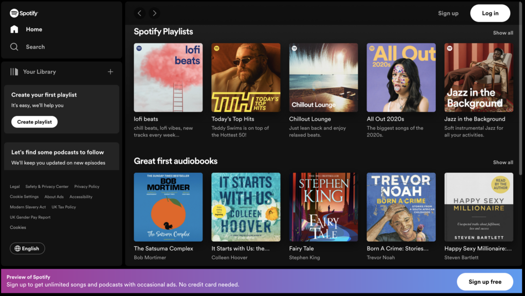
1. Spotify
Music streaming giant Spotify has a great hack to encourage sign-ups. The landing page shows you a preview of what you can get if you sign up. Users can explore albums, artists, and playlists but can’t play anything until they make an account.
A brightly colored banner at the bottom tells people how to access the library. “Sign up free,” reads the button. It’s simple, to the point, and yet you know where the link leads. The copy beside that even says, “No credit card needed.” This is a punchy copy that backs up what the button has to say.
In this way, the text can guide users in the right direction.
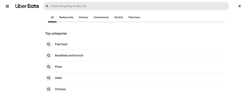
2. Uber Eats
Uber Eats provides a great example of a search-based copy. The search bar features placeholder text that says, “Food, shopping, drinks, etc.” This gives the user information about the sort of thing they can enter into the search bar.
At the same time, it invites users to be creative with the “etc.” tacked onto the end. Plus, it highlights “shopping” as one of its unique selling points, which not all food delivery apps offer.
3. Better FPL
The UK’s version of fantasy football, Fantasy Premier League (FPL), has its fair share of third-party tools. This one from Better FPL has an eye-catching sign-up process. Here, the placeholder text for the email address has a humorous touch, tapping into the target audience. (If you know, you know!)
It makes it clear what the user needs to do while at the same time appealing to the target audience. This is a great reminder that your copy should always be on-brand.
4. Bored Panda
The online magazine Bored Panda has a great pop-up that encourages users to turn off ad blockers. Again, it’s incredibly on-brand messaging that plays on the cute, funny aspect of the company.
With knowledge of what its audience wants, Bored Panda can encourage its users to take a very specific action.
How To Write Good UX Copy
Not all copy is good. Not to worry—Page Flows is here to help you understand how to craft compelling UX copy. Generally, you want your copy to be three things:
- Compact: Ensure that all your copy is brief and to the point. Don’t say more than you need to.
- Aware: Be aware of who your audience is and who you’re trying to reach with your words. Where are they on the journey? How will your copy provide value?
- On-brand: Sure, a copy needs to be valuable, but it doesn’t have to be boring. Try to make your copy fit your brand voice. Whether it’s fun and casual or professional and authoritative, there’s a way to make it fit.
With these three features in mind, here are five tips to help you nail your UX copy.
1. Define Your Voice
Firstly, you need to know your brand’s tone of voice. This part is crucial for a lot of the design process, not just copy. So, you can probably just refer to your existing style guide. If you don’t have one yet, you can design one by thinking about your target audience.
Your branding should appeal to a particular user persona. Think about what appeals to this demographic, including gender, age, interests, pain points, and so on. If you’re stuck, try looking at the branding of your competitors for inspiration.
It’s helpful to define your brand with three adjectives. For example, Page Flows is educational, to the point, and friendly.
2. Keep It Casual
You might feel the need to professionalize your copy, especially if your brand is a serious one. However, copy doesn’t have to be boring. If you look at most sites and apps, the copy is fairly relaxed.
Think of it this way. Copy is trying to encourage your users to take action. If it were you, are you more likely to follow guidance that’s relaxed and inviting or stiff and cold? The first one, right?
Try to relax your users wherever you can, and you can drive conversions. This is especially true in any areas where the user might feel stressed, such as error messages. However, it also applies to other parts of your site.
Think of the Uber Eats example. Instead of saying “search,” the placeholder text provides an example of things to try. It’s inviting, not demanding.
3. Be Clear
All good copy is clear. Without clarity, it’s confusing. Be as clear as possible throughout your site, and don’t try to be funny for the sake of it.
Clarity also means speaking your user’s language. Don’t confuse them with overcomplicated words and jargon. Instead, point them in the right direction with simple, clear language.
4. Provide Value
Copy should always provide value, or it’s a waste of space. Make sure any text you have provides some sort of value to the user. It needs to help them use the product, not lead them to a dead end.
Sometimes, adding value is about reinforcing a message. Take the Spotify example: you could argue that the “no credit card” needed is unnecessary. However, it’s this punchy copy that might just seal the deal.
5. Test, Test, Test
As a UX designer, you’ve heard this one before. But that’s because it’s true—you need to test your products constantly. This includes testing the copy.
A/B test your copy with your audience to find out what makes better conversions. And, during usability testing, find out if you could make it clearer. Over time, hone your copy until it’s the best it can be.

Final Thoughts: Improve Your UX Copy With Page Flows
So, what is microcopy? Essentially, it’s those small pieces of text that all digital products use to guide users through the process.
UX copy is just one thing you need to master as a UX designer. If you’re looking to become a better all-round designer, you need inspiration. Spark ideas for everything you need, including UX copy, with Page Flows.
Our library is a helpful resource for finding interaction and UX design ideas. Get started today to access our growing library of user flow recordings and finally stay up-to-date with current design trends.