Have you ever found yourself buying something just because you liked its packaging? We’ve all fallen victim to this at one time or another. The design might be flashy, or it might remind you of something you love. Either way, it all ties back to emotions. Why do you think nostalgia marketing works so well? Hint: it’s all to do with emotional design.
Designers can reach users on three different levels: visceral, behavioral, and emotional. If you want to learn more, keep reading.

Emotional Design for User Engagement
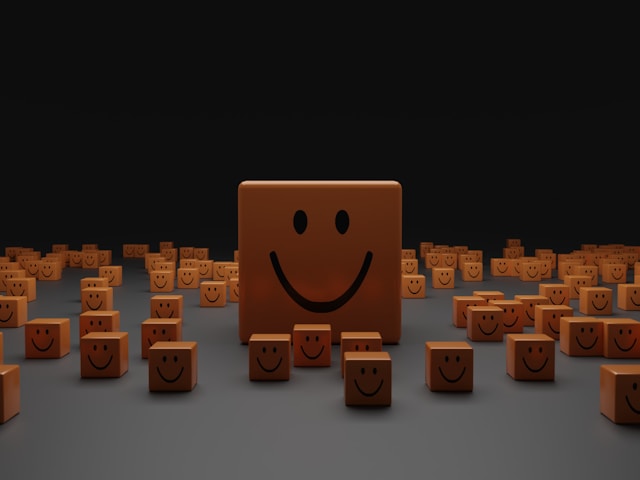
Emotional designs are ones that inspire emotions in your users. Ideally, your designs will provoke positive emotions, but the truth is that most designs elicit an emotional response. In some cases, designs bring out a negative emotion in the user.
Don Norman, the master of design who coined the term, said, “Everything has a personality.” Even if the designer doesn’t intend it, it’s there.
There are three levels to this:
- Visceral
- Behavioral
- Reflective
So, when a designer is creating something, they attempt to reach users at all three levels. The result is the user develops a positive association with the brand. This can even foster user engagement if you do it right!
The Psychology of Design
Let’s dive into those levels in a little more detail. Together, they make up the psychology of design.
- Visceral: The user’s gut reaction to a design. For example, many users assume that aesthetically pleasing interfaces are easy to use.
- Behavioral: When the user subconsciously evaluates the design to decide how it helps them achieve goals.
- Reflective: After encountering the design, the user consciously judges it. This includes deciding its value for money and so on. If they have a positive experience, they form an emotional bond with it.
Designers should keep all three of these levels in mind when designing. Since you only have a short time to grab the user’s attention, visceral design is crucial. However, behavioral and reflective design are also important factors because they contribute to loyalty and engagement.
While the user’s initial impression creates an instant emotional reaction, you need to go deeper than that. You need to leverage their emotions to move them through the product and keep them happy. The eventual goal is to form an emotional connection, which gets the user to purchase. Not only that, but it can lead to lasting loyalty.
Quite a lot of this process is subconscious. The user doesn’t even realize it’s happening. But, as the designer, it’s your job to provoke those feelings and guide the user’s emotions.
Don Norman: Why We Love (Or Hate) Everyday Things
The concept of emotional design seems relatively simple at the heart of it, and the truth is it is. Don Norman of the Nielsen/Norman Group coined the term decades ago. He even wrote a book, Why We Love (Or Hate) Everyday Things. This plays on The Design of Everyday Things, his earlier book from 1988.
His book delves deep into the subject to explain why people spend thousands on designer handbags. It’s all about emotions, after all.
In fact, it was Norman who came up with the three levels we discussed above. However, since he published his book, plenty more things have come into existence. UX has changed rapidly over the years, and now we face more technology than ever before.
So, with that in mind, let’s cover some modern examples of each emotional design type.
Emotional Design Examples
Examples of emotional design are all around us. Remember, everything we encounter elicits an emotion.
Below, we’ll provide three emotional design examples that cover each level.
1. Slack – Visceral Emotional Design
The communication platform Slack leverages friendship as a part of its emotional design. It uses ‘Slackbot’, a friendly robot that shows users around the platform as part of the onboarding. Think of it this way: would you rather watch a boring video tutorial or have a friend show you around?
Humanizing the platform is a really easy way to leverage emotion. Humans love to anthropomorphize stuff, which is why cute animated characters tend to play well with audiences.
Of course, doing this sort of thing can depend on the tone of voice. Nevertheless, it’s a great way to create an immediate bond.
2. Notion – Behavioral Emotional Design
Personalization is key. In fact, these days, users expect personalization. If you don’t provide it, you’re just giving users a reason to churn.
Onboarding is a fantastic time to personalize, and the organizational app Notion is great at it. When you sign up, you get an onboarding journey tailored to your needs. When this happens, the user feels like everything is oh-so-simple. After all, they get absolutely everything they need to succeed on the app.
Since, in the behavioral stage, users are making evaluations about your product, you need to provide them with this information. Doing so allows them to understand how your product can work for them.
3. Asana – Reflective Emotional Design
Task flow app Asana humanizes the experience by adding funny error messages. There’s an art to a good error message; it needs to be straightforward and clear. And yet, it doesn’t need to be boring.
Asana generates a funny code for you to pass on to the support team. It could be “five evil cobras jog, sadly.” The image this conjures up is funny and is likely to put a smile on your face. And this is even though the app isn’t working!
By apologizing and cracking a joke, Asana consciously inserts itself into the user’s mind. They’ll probably think about that one for a while!
How To Create Emotional Authority in Human Design
Emotional authority means finding your brand’s emotional wavelength and sticking to it. When you know what emotions you’re trying to provoke, you can make conscious decisions to elicit them.
Here are seven ways to create emotional authority in human design.
1. Create a Connection
At its core, the whole reason for emotional design is to create a connection with the user. You want to form a bond with them for several reasons. First of all, they’re more likely to have a positive experience.
Secondly, they develop a deeper loyalty to your brand or products. As a result, they’re more likely to stay, invest in your new developments, and so on. Apple is a fantastic example of this, with users always keen to get the latest iPhone model. By providing a positive experience, Apple creates a lasting bond that means users won’t jump ship to Android.
In fact, Apple users often go beyond loyalty to be passionate brand advocates.
2. Make It Usable
A fun quirk of the human psyche is that products that look good seem easier to use. As a result, they provoke a positive emotion in the user. Again, this is Apple’s entire philosophy, which uses clean aesthetics and minimalism to make it seem easy.
Google’s search engine does the same. It employs a clean interface so that users see it as efficient and user-friendly. Even if it’s slow to load, it just seems so simple!
3. Make It Memorable
Emotional experiences are much easier to remember. Whether it’s a bad or a good experience, users will remember it more than they would a neutral one.
We’ve all had a terrible customer service experience, and you can probably recall yours right now! Alternatively, if we asked you to think of your favorite pair of sneakers, you could probably name them right away. That’s because they evoke a strong emotional response for whatever reason.
It could be nostalgia, or joy, or something else. Either way, they elicit emotion.
4. Differentiate It
Your product also needs to stand out. Going back to the sneaker example, there are hundreds of designs available from dozens of brands. What makes your favorite pair different?
Emotions can differentiate your product from those of competitors. For example, Nest thermostats are different from others because they have an emotional design. They:
- Personalize the experience by learning your routines and preferences.
- Foster a sense of security by giving you control from anywhere.
- Make you feel confident with a user-friendly interface.
So, they’re not just functionally different but also emotionally appealing.
5. Try Motivating
Trying to provoke emotion isn’t always enough by itself. Sometimes, you have to give your users a little nudge. If you can, try incorporating encouragement and motivation directly into the product.
Duolingo is amazing at this. The language-learning app’s design uses gamification to motivate its users. It congratulates them on their achievements and shows them their progress. It even uses clever push notifications that encourage the user to come back when they haven’t visited the app.
Talk about stickiness!
6. Focus on Wellbeing
Depending on your industry, you can evoke emotions in users by contributing to their well-being. Users will certainly remember a brand that’s thoughtful and makes them feel at peace.
This is easy for apps in the well-being industry, such as the meditation app Headspace. It uses friendly cartoons and reassuring copy to stick to its calming ethos. After all, the entire goal is to reduce stress and anxiety.
7. Think About Branding
A lot of what we’ve covered above is about brand perception. But it’s crucial enough to reiterate it here.
You can’t create emotional authority without knowing who your brand is at its core. You’ll need thoughtful brand design and a detailed style guide. That way, you can think about the kinds of emotions you want to invoke.
If you want to go one step further, you can improve brand perception through community initiatives. Charity work not only makes your brand look good (rather selfishly), but it also makes your users feel good.
Make Amazing Emotional Designs With Page Flows
Emotional design is all about reaching your customers on an emotional level. Striving for positive emotions is a great way to start, but how do you go about it?
If you’re looking for design inspiration, why not learn from proven products? Page Flows is a helpful resource for finding interaction design ideas. Get started today to access our growing library of user flow recordings and finally stay up-to-date with current design trends.