There are a lot of factors to consider when designing a user interface. From collating user research to solving problems through innovation, you need to make a lot of creative decisions. Although creativity is an inherent part of the process, it’s not everything. After all, in user interface (UI) design, sometimes the tried and tested methods are best. Following UI best practices can be a great help in many cases, ensuring you have the right foundations.
This guide covers eight best practices for UI designers to follow. But first, let’s delve into what UI design is and what its basic principles are.

What Is User Interface Design?
So, what is user interface design? Essentially, UI design involves creating the visual layout of a digital product.
The designer focuses on anything to do with the visual design, including colors, fonts, and images. Throughout the design process, they work to create the entire interface that the user interacts with. This includes optimizing the interactive elements and creating progress bars, icons, and more.
This may seem like a job concerned with aesthetics, but it’s actually psychological. When you create great UI, it enhances the user experience (UX), creating a seamless experience for the user.
UI Design Principles
Before we get into the UI design best practices, it’s worth noting the most important UI design principles.
- Consistency: Use consistent visual elements wherever possible. This includes the same fonts, cohesive colors, and a consistent layout.
- Simplicity: Keep the design simple and easy to use. Avoid using unnecessary elements that add clutter.
- Flexibility: Design your interface to accommodate different devices, screen sizes, and more. Responsive design can help your UI adapt to user needs.
- Accessibility: Ensure that your design is accessible to many users. This includes differently abled users. Use appropriate color contrast and keyboard shortcuts, and provide alternative text for images.
- Clarity: The interface should communicate its purpose clearly. Provide users with feedback as they interact with the interface.
With these in mind, you can start to create an interface that’s enjoyable for users, providing a seamless experience.

UI Design Tips and Best Practices
These eight best practices in UI design will help you design the best interfaces you can. Consider these the ultimate UI design tips for creating useful, aesthetically pleasing interfaces.
1. Research First
All great UX/UI design starts with research. You need to understand the problem you want to solve, which means understanding your users.
Think about who the target audience is, whether they use desktop or mobile devices, and what their customer journey is. Research can tell you all of this and more, so don’t underestimate the importance of the research phase.
2. Empathize With Your Users
Research alone isn’t helpful. After all, you cannot reduce your users to a set of data points. Using qualitative data, you can start to understand your users better. Create empathy maps and user personas to understand your users, then design your UI to suit them. After all, if your UI doesn’t help users achieve their goals, then it isn’t helpful.
3. Understand Common UI Patterns
Sometimes, it’s better not to reinvent the wheel. Usability heuristics dictate that your users expect certain things. For example, when visiting a new site, they expect the search bar to be near the top of the page.
Patterns may evolve over time, so it’s important to be aware of the current industry standards. As long as you follow common conventions where possible, it makes the experience better for users.
4. Create UI Design Patterns
Consistency is one of the principal tenets of UI design. One of the best ways to maintain consistency is by creating your own UI design patterns. A good pattern library goes a long way in helping you maintain consistency throughout.
Here are some of the elements you should consider:
- Typography: The fonts you use need to be appropriate for the brand. The size and placement of text are also important for the visual hierarchy, scanability, readability, and more.
- Branding elements: The logo, color scheme, and typography are all important for branding. Brand recognition is important for the UI because it helps you stay consistent. Plus, for new projects, it reassures the user that they’re using a familiar product.
- UI elements: There are lots of UI elements to consider. This includes buttons, icons, lists, panels, progress bars, and cards. Make sure all of these components are consistent.
If you’re struggling with your own patterns, you can try out templates and existing pattern libraries. These can be great sources of inspiration to help you plan and design a pattern library.
5. Understand Design Hierarchy
Users are instinctively aware of the visual hierarchy of a website. They know which elements are important based on their size, color, and so on. So, when designing the layout, think about this visual hierarchy and how it guides users through the site. This improves the user experience because it makes their journey through the user flow more seamless.
6. Make Actions Consistent
UI has a close overlap with UX. While UI designers are not creating the interactions, they can contribute to them. For example, by giving buttons a consistent appearance throughout the site, users know what action clicking an element will trigger.
Carefully consider how users navigate through the site and how they view data at each stage.
7. Keep It Consistent
Since consistency is one of the major principles of UI, you should also consider it a best practice. Of course, this includes visual elements and branding, but it also includes content.
Content plays a crucial role in UI. Partially, this is due to the role that typography plays in the UI. Designers need to be careful about how they portray text visually. This includes body copy, tables, data, and dropdown menus. It also includes buttons, error messages, loading screens, and anywhere the UI matters.
Once again, it’s important to apply brand consistency to the content. Inconsistencies can become confusing for the user, so make sure all buttons for the same action say the same thing.
8. Keep It Simple
Simplicity is another one of the central tenets of UI design. In fact, it might be the most important of the user interface best practices. It’s true what they say: less is more.
It’s important to make use of white space as a UI designer. If an interface is too cluttered, users won’t know where to focus. As a result, they can become overwhelmed or frustrated and exit the site. At the very least, the user experience will be more negative than it could be.
People spend less than a minute on many websites across different industries. That means you have under sixty seconds to grab the user’s attention and get them to stay.
With a clean interface, you can smartly guide users through the right process. Users will take the action you want them to if there are fewer options on the screen. In other words, you can guide them along the sales funnel just by design.
Not to mention, simple designs load faster and can reduce the bounce rate.
Best UI Websites To Inspire You
Do you want to build digital products with great UI? It’s a good idea to check out websites to inspire you. All of these websites adhere to the user interface design best practices. However, they also add their own twists to create something innovative.
Here are three of the best UI websites.
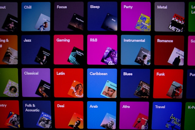
1. Spotify
Music streaming service Spotify is a powerhouse of UI. It blends stunning aesthetics with fantastic functionality.
It uses visual cues like album covers to convey meaning in place of too much test. This presents a clear, dynamic interface that even provides a personalized experience thanks to its algorithm.
Spotify’s branding is also exceptional, with consistency across colors, fonts, and more. Even with third-party visuals from album art, everything looks cohesive.
Its UI is also adaptive to other devices. As a result, users get the same great experience no matter where they access the app.
2. Zoom
The Communications platform Zoom does a great job of categorizing content based on sector. Its UI is minimalist and straightforward, supporting the user’s cognitive load.
With plenty of white space and icons that match the user’s mental models, it’s very easy to navigate the site. The icons are in Zoom’s blue hue, standing out starkly against the white background.
Plus, there’s just one call to action beneath the introductory copy. In this way, Zoom leads users through the site exactly how it wants to.
3. Bumble
The dating app Bumble came about after the rise of Tinder. It followed the convention of ‘swiping’ to match the user’s mental model, giving them something familiar. However, Bumble isn’t a carbon copy of Tinder; its UI is clear, unique, and innovative.
In fact, Bumble isn’t just for dating. It also has a section for finding friends and business networking. And yet, it employs the swiping convention to satisfy user preferences and minimize learning curves.
Bumble follows a lot of other best practices, too. It has a clean, minimalist interface with buttons that stand out in a bright yellow. Its visuals ensure a smooth navigational experience. Even in the messaging part of the app, it’s easy to read everything thanks to color contrast and readable fonts.

Improve Your UI Best Practices With Page Flows
Following the UI best practices in this guide will help you better understand what makes a good product. However, like the examples above, creating a digital product that stands out takes more than just industry knowledge. You need to combine knowledge of UI with creativity and innovation.
Nevertheless, taking a look at examples might give you the creative spark you need. When you need UI design inspiration, why not learn from proven products? Page Flows is a helpful resource for finding UI design ideas. Get started today to access our growing library of user flow recordings and finally stay up-to-date with current design trends.