When you build a great user-friendly app, you have to keep the user psychology angle in mind. This could mean adding the Zeigarnik effect’s UX design principles to your app. Knowing how a user’s mind works will help you keep them engaged.
In this article, the Page Flows team looks at the Zeigarnik effect and its place in app UX.
What Is the Zeigarnik Effect?
This neat quirk of the mind is all about unfinished business. If we have a task still left to do, we’re more likely to think about it. Finished tasks instead fade from our minds as soon as we take care of them. This seems to be the case in most jobs and fields.
Incomplete tasks build tension and take up more space in our minds. On the most basic level, we’re more aware of them due to their urgency. If we forget these tasks, this leads to problems in our lives and jobs. Once we finish them, we can stop thinking about them.
Good task management applies in most media forms. Any TV show that ends in a cliffhanger, for instance, uses it. Digital products (from video games to web apps) also harness the effect in many ways. This not only helps engagement — it also drives sales.
Zeigarnik Effect UX: The History
In the 1920s, Bluma Zeigarnik began a series of memory tests. Her mentor, Kurt Lewin, found that waiters would recall unpaid orders more easily. She set out to test if this was true in all settings. In doing so, she found out that interruptions helped people recall a task’s details.
One of Zeigarnik’s most famous tests saw her give tasks to 138 children. When they were partway through, she interrupted half of the group. She then found that only 12% had better recall of the finished tasks. 80% of the kids she interrupted recalled them a lot more easily!
The Soviet psychologist believed that starting a task builds tension in our brains. This makes us think about it a lot more. Interruptions add more tension, which can then make the task even easier to recall. Zeigarnik went on to publish this in the Psychological Research journal.
This effect is now a key part of the UX process in SaaS and other apps. Interrupting a user during their setup can make them recall features more easily. This then helps them to use an app more fluidly. The buyer is then more likely to keep paying for it!

How the Zeigarnik Effect Boosts Conversions
To expand on this, churn is a big problem in SaaS. If buyers can’t use their new tool after a month, they’ll stop paying for it.
Companies have lots of ways to turn leads into loyal buyers. This includes the Zeigarnik effect. With a dash of human psychology, they can easily boost each user’s knowledge of the software.
Many of us learn by doing. This means just one push to finish a task could help teach us a vital feature.
Beyond SaaS, this even extends to online shopping. Here, even a small “nudge” by email can get people to return to their cart. This frames the purchase as the only way to end a task’s tension.
The Zeigarnik effect in UX turns tasks into a game. Some apps even give badges for certain tasks. This uses the brain’s own reward system.
If people like finishing tasks on a SaaS app, they’ll have a better time with it. These feelings will then help them decide if they should renew their subscription.

Why Mental Load Matters in Zeigarnik Design
Mental or cognitive load is the amount of brainpower a task will require. Until you can finish it, your brain will use more resources for the task. In a way, it works harder to stop you from forgetting your duties. Once you do them, your brain frees up the space for other tasks you might have.
However, devs must make sure they don’t overwhelm their users. This would turn them away from the tool while hurting their recall.
With too many complex guides, users can still forget the task. There are still ways in which developers can prevent this. For example, they can break up big tasks into several small ones.
Mental load is the key to user engagement. Devs need to add new tasks and features at a fair pace.
However, the gap between them can’t be too big. If an app waits too long before going back to a task, the user may still forget it. A UX designer must test their apps against this.
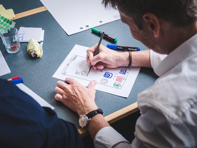
Adding the Zeigarnik Effect: A Step-By-Step Guide
If you’re making a SaaS app or any other digital tool, this trick could be a great help. However, your team has to be quite precise in how it uses setup tasks. An unfinished task that goes on for too long could make your users lose their focus. Here are the four main steps to follow when using Zeigarnik’s work in your new app.
1. List User Actions
Map out the goals a user needs to be able to complete in your app. You should also list a range of deadlocks, such as complex tasks users may struggle with. Find new ways to draw the user’s focus to these tasks.
2. Set an Interruption
Guide your user from one task to the next, even if they don’t finish the first. You can frame it as letting them perfect a feature that will help them later. If you do this right, they’ll still focus on the first task while they work.
3. Add Reminders
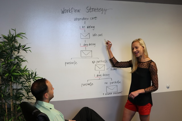
When a user completes a task, remind them about the one they’re only partway through. In some cases, such as online shopping, this could take the form of a cart reminder email. Nudges like these are key psychological principles for making users take action.
4. Give Rewards
Once the user completes all the tasks, it helps to give them a reward. This can be through a virtual award or just crossing tasks off their list. This phase is optional — but it’s still in plenty of Zeigarnik effect examples.

What Is an ‘Aha!’ Moment?
In SaaS, the “Aha!” moment is when a user truly knows the tool they’re using. This is where they put their setup progress to the test, and it all just clicks. For example, when during user onboarding, they finally find out how to use a complex feature with no guide.
What is the Zeigarnik effect without a trick like this? An app that tries to add these tactics must show users the progress they’ve made. This is what keeps them engaged. An “Aha!” serves as a big release of tension when the user needs it most.
Devs can build these moments through scaffold learning. This means they take away the app’s built-in guides until the buyer barely notices they’re doing it alone. If the team does this right, they can make a helpful (and memorable!) UX.
Zeigarnik Effect Examples To Inspire Your Design
There are several ways to add the Zeigarnik effect to your UX design. Some of these don’t even use interruptions. At their core, these apps make use of the human tendency to seek closure when adding these features. Here are the main forms this effect can take in apps.
1. New Messages
Some apps give “lessons” in the form of messages. These only go away when you read them. By this point, the task itself has technically already begun. The goal of this UI element is to tempt a user to act on the messages and remove them.
2. Progress Bars
A progress bar will show users right where they are in the setup stage. They can then judge if they have time to complete one more task and move the bar. These bars can help them recall their current progress with the task.
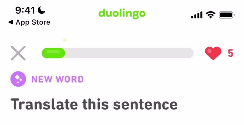
3. Gamification
Some apps and programs add game-like features to help with tasks. For example, the Duolingo app lets players level up and join new leagues. This gives them a goal to always reach for. As the app’s purpose is to help you learn a new language, this effect is very useful.
4. Cart Reminders
Online shopping platforms such as Amazon also use the Zeigarnik effect in UX design to help with user engagement. They do this by sending emails or other messages about items still in their cart. If the buyer actually forgot, this will focus them back on the purchase with more tension.
The Zeigarnik Effect: Creating Great User Flows
Adding the Zeigarnik effect in UX will help your buyers get a full rundown of your apps. So many tools today use reminders and the tension of unfinished tasks to keep people hooked.
If you’d like some examples for yourself, Page Flows has lots of UI flows that show these tricks in action. Check our full catalog today to find excellent setup features and more.