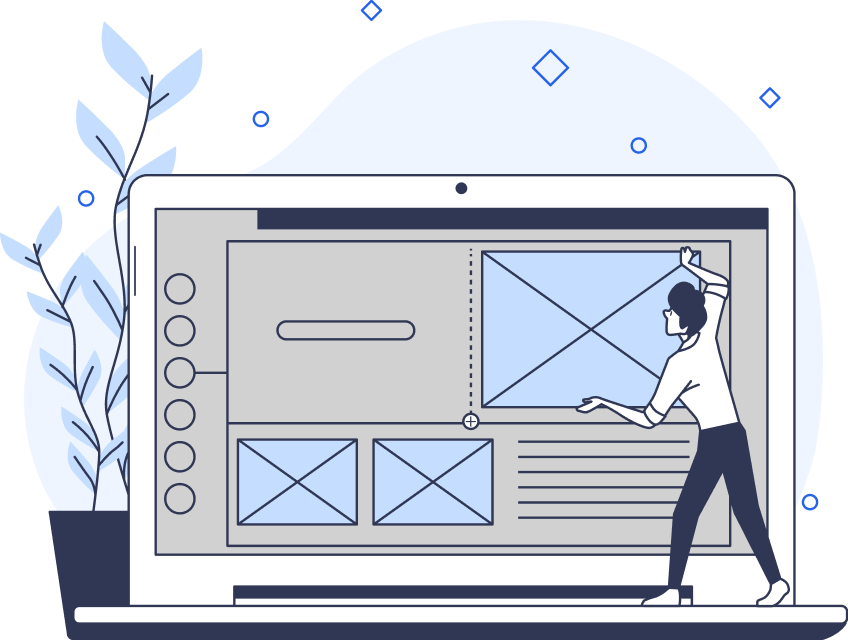
The goal of every UX/UI designer is to create an enjoyable user experience.
When you think about creating compelling user experiences, you’re likely to immediately think of user research and usability testing methods. While that is important, the smaller micro-interactions really make a difference, too.
Today, we’ll focus on one specific micro-interaction: progress bar UX. Once you’ve read this guide, you’ll know why progress bars carry so much significance in the world of UX design. We’ll also discuss the different types of progress indicators and reveal the best progress bar design practices!
What Is a UX Progress Bar?
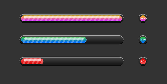
In UI design, a progress bar is an important visual element within a digital product’s user interface. It serves as a visual representation of the user’s progression of an ongoing process/task.
Think of onboarding processes, data uploads, and software installations — these tasks will often have progress bars. Why? Because progress indicators visually break down a process or task into discernible, logical, and numbered steps. As a result, these visual indicators make even the most basic tasks transparent, driving more positive user experiences.
UI/UX Progress Bar: Why Every Digital Product Needs Them
From what you’ve just learned about a UI/UX progress bar, you can start to see their significance. But there’s more to a progress bar’s UX design that contributes to your users’ satisfaction.
To become a better UX designer, you need to know how these handy progress status trackers enhance user-centricity.
Let’s take a look at the benefits of having well-designed progress bars in your digital products.

1. Visual Feedback
Let’s face it: your users won’t like navigating your user interfaces blindly.
Think of the last onboarding process you went through that didn’t have a progress bar attached. How frustrating was it to have no clue as to your current progress? That frustration you felt is what your users will experience if you don’t provide progress bars.
The visual feedback of a progress bar enables your users to monitor their current progress. But beyond that, progress bars communicate how many steps the user has left to complete their goals.
2. Positive Motivation
The successful completion of tasks and the subsequent positive feedback is one of the oldest motivators in human history.
Just look at the Endowed Progress Effect. The idea behind this effect is that when you provide your users with artificial advancement, they’ll want to make progress. In other words, when users feel like they’ve made real progress, they’ll feel the motivation to see the task through.
In this way, progress bars act as the perfect visual motivators for your users to complete simple and complex processes.
3. Friction-Less User Experiences
Progress bars don’t just help users understand the progress of their own tasks. They also help users understand the progress of your product’s internal processes.
Take loading screens as an example. With no indication of how long a screen will take to load, your users will itch toward that refresh button.
You can imagine how this user action will lengthen their user journeys unnecessarily and cause friction.
Instead, you can use a progress bar to stay transparent with your users and create a seamless experience.
The Different Variations of the Progress Bar in UI/UX
A Progress bar in UI/UX design comes in many forms, and you need to know about them. After all, you can’t maximize the potential of your progress bars without choosing the right one first, right?
Below, we’ve discussed some of the most popular types of progress indicators that designers commonly use to inspire your creativity.
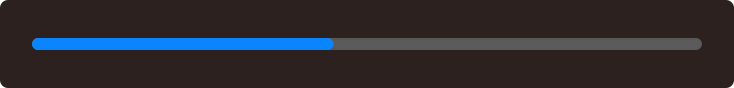
1. Determinate Indicators
Determinate progress bars communicate how long a process will take for your users to complete.
Designers often use these types of indicators when they know the process’s duration and completion rate. For that reason, you’ll often see a linear or circular track that fills with color as users complete certain tasks.
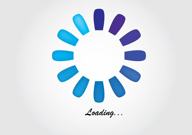
2. Indeterminate Indicators
Indeterminate indicators aren’t as helpful and transparent as determinate indicators.
While these types of progress indicators show that a process is happening, they can’t visualize a specific wait time. There can be several reasons why you might need an indeterminate indicator.
On the one hand, indeterminate indicators prove useful when load times are too quick to visualize in detail. On the other, they are also helpful when you don’t need to communicate how long a process will take.
A classic example of indeterminate indicators is when designers create animated spinning wheels.
3. Looped Animations
In the previous section, we referred to spinning wheels as classic examples of indeterminate indicators. But they are also a great example of a looped animation progress indicator.
With progressive looping or progressive animation, designers can create cyclical animations with a single clip. When discussing progress indicators, these single clips are often small circular icons/images that move in a clockwise direction.
Commonly, these looped animations represent one thing: that the website/mobile app is taking a while to boot up. So, instead of having your users stare at a blank screen, you’d use a looped animation to convey this information.
What’s more, by doing this, you’ll accommodate users who have a slow/delayed internet connection.
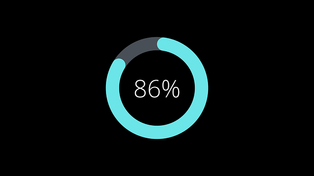
4. Percentage-Based Progress Indicators
A percent-done animation/indicator falls under the determinate indicator category. These animations simply depict a progress bar that increases from 0% to 100% without ever decreasing in value.
You can use either linear or circular progress bars for percent-done animations.
Tip: We recommend using percent-done animation for actions that take longer than 10 seconds.
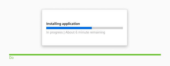
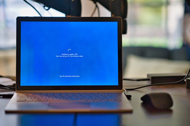
5. Time-Estimating Progress Indicators
Another type of determinate progress indicator you could use is one that displays time estimations. These progress trackers contain textual estimates of time that relate to how long a process is likely to take.
Time-estimated progress bars are easier to understand than percent-done animations. That’s why you’ll often find them when downloading files or software updates.
Designing a Better Progress Bar: UX Best Practices
Knowing about the different types of progress indicators will definitely help you create them in an engaging, practical way. But the reality is that you’ll need more tips and tricks to inspire your best work.
Below, we’ve listed some of the progress bar UX best practices to point you in the right direction.
- For the sake of transparency, use determinate indicators in every possible instance that you can.
- Even out the pace of your status indicator’s progress. Let’s say it takes thirty seconds for the first 80% of progress and five minutes for the remaining 20%. The result is that your users feel like you’ve deceived them.
- Use concise labels to let your users know precisely what they’re waiting for.
- Maintain visual consistency – don’t switch to circular progress bars if you use linear tracks, for instance.
- Incorporate some brand-specific elements, like your brand’s color palette and logo design, into your progress indicators.
- There’s nothing worse than having to wait a while to access desired content. Keep your users engaged with playful animations and colors.
- Your users should easily spot your progress bars, regardless of their device’s screen size or the interface’s other elements. In other words, design with visibility in mind.
- Users and autonomy go hand in hand when it comes to good user experiences. Give your users the option to pause and cancel their progress where possible.
- Always keep your status tracker moving or spinning so users know that they aren’t waiting in vain.
- You must – must – prioritize accessibility. All of your users should understand your progress bars and what they represent.
Progress Tracker Examples To Learn From
Before we leave you to exercise your creativity, we’ve provided you with some helpful progress tracker examples.
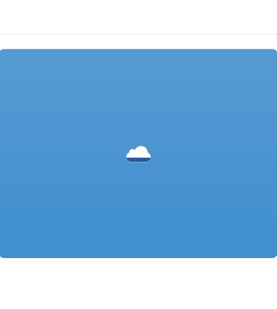
Kevin Jones
Look at this example from Kevin Jones.
This example indicates the process of saving your files/work. For starters, it’s incredibly straightforward, highly visible, and utilizes the Cloud’s brand colors to maintain visual consistency.
This progress tracker moves upward and displays a tick upon the completion of the process, making it fun and unique.
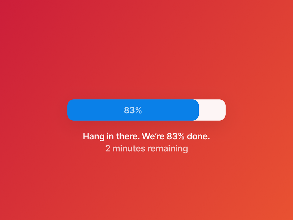
Damiano Magrini
The next example is from UI designer Damiano Magrini.
What we like about this progress indicator is that it combines percent-done animation with time estimation. By doing so, the user knows precisely how their status is progressing down to the minute. It’s transparency at its best.
Progress Bar UX: Final Thoughts
We hope that, having read this guide, you feel more confident when enhancing vital micro-interactions like progress bars.
With the perfect progress bar, you can turn a usually mundane part of the user’s experience into one of intrigue. But you’ll need a little extra help to truly bring a compelling, helpful user experience to life.
That’s where Page Flows enters the fray.
Page Flows collects thousands of recordings and screenshots of engaging user flows from big-name brands like Google and Vimeo.
Our mission is simple – we want to help designers master their craft. And what better way is there to accomplish that goal than by showing you how successful brands design user flows?
From making purchases to upgrading accounts, we make learning from common but impactful user flows a breeze. Like a progress bar in UX, we’re here to help you through every step of the way to becoming a better designer.
Get started today to find your footing in the world of UX/UI design!