
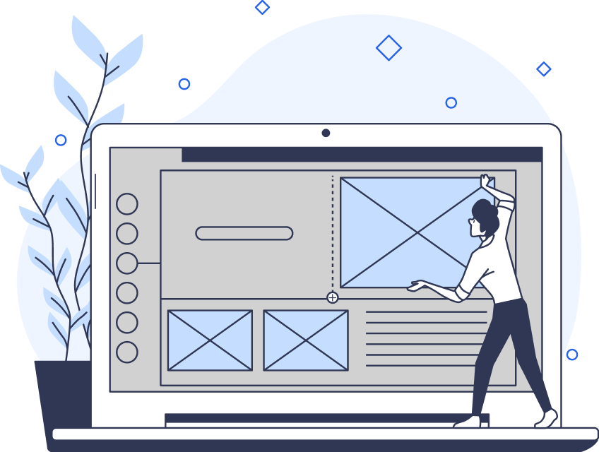
When you visit a website, do you normally do so on your phone? Or do you prefer your laptop or perhaps a tablet? The answer to this question is different for everyone, and it often depends on context. For example, which website are you visiting? With so many different answers, web designers have a lot to consider. One thing you need to decide is how the website will look on different devices.
This is where adaptive vs. responsive design comes in. As a user experience (UX) designer, it’s crucial to decide which method to incorporate into your design strategy. Both methods concern how to make a better experience for users, no matter what browser window they’re using. However, there are some key differences.
Here’s how to decide.

What Is Responsive Design?
Firstly, it’s important to learn what the two methods are. So, what is responsive design? Essentially, responsive web designs are pages that automatically adjust to any screen size. This technique uses CSS media queries to see what device the user is looking at, then renders the site accordingly.
Web designer Ethan Marcotte introduced this practice in 2010. He had been increasingly working on what clients termed ‘iPhone websites,’ designing separate sites for mobile and desktop. In place of the tiring work, he wanted to create something to suit every screen size. He said, “I’d always been interested in creating layouts that were flexible and beautiful.”
In theory, responsive sites improve the user experience because the user gets a consistent experience. They’re viewing the same site from multiple devices, and yet it always fits their screen.
Of course, there are pros and cons to every method.
Responsive Design Pros
- Consistent design across all browsers and devices.
- Responsive websites will work on all new devices, regardless of the dimensions.
- They take significantly less work to create and maintain.
- These sites perform better in search engine rankings because they are mobile-friendly.
Responsive Design Cons
- There is less control over how the site renders on each device.
- If elements re-flow in the wrong size or order, it can damage the visual hierarchy.
- Requires more expertise from the designer, along with more cross-platform user testing.
- Dynamic content loads more slowly.
What Is Adaptive Design?
Then, the question remains: what is adaptive design? Adaptive web design involves pre-made pages that load based on the detected device.
To make adaptive sites, the designer creates different designs for varying screen widths. So, a different layout loads for desktop users, various smart devices, and so on. Typically, these are the most common widths (in pixels):
- 320
- 480
- 760
- 960
- 1200
- 1600
Generally, the user doesn’t lose out on UX. This is because the site loads to the precise screen resolutions. On the user’s end, it always looks like a perfectly designed website.
Aaron Gustafson coined the term ‘adaptive design’ in his 2011 book, Adaptive Web Design. The idea is that companies increasingly want to control how their site looks. That’s why you’ll often see huge companies using adaptive design, including Apple.
Again, though, there are pros and cons.
Adaptive Design Pros
- Gives the user a tailored experience for their device.
- High-performing since the content is specifically for the target device. Furthermore, it gives companies control over their content.
- Easy to fit third-party content such as advertisements.
- Fast-loading because they only deliver the code for the relevant screen size.
Adaptive Design Cons
- Can have a negative impact on search engine rankings if the design is inconsistent.
- Designing is a long process that involves designing a new layout for every dimension.
- If the user accesses the site on a screen of a different size, it won’t format properly.

Examples of Adaptive vs. Responsive Designs
There are plenty of examples out there of sites using both adaptive vs. responsive designs. As a result, there is no clear-cut answer as to which one is best. It often depends on the company and the situation at hand.
Here is an example of each type.
Adaptive: Amazon
According to Statista, Amazon receives over 2 billion web visits per month. As a result, they need a great site. Amazon decided that adaptive design was the way to go. Why? Because global e-commerce customers enjoy faster page loading and consistent design.
The adaptive approach means that customers can browse from their desktop device or a mobile app. Whatever they choose, they can enjoy the same experience. They’ll always know where to look because the design is consistent across layouts.
Responsive: Shopify
Shopify has taken a different route. No matter what device you access their site from, you will get the same experience. Nevertheless, Shopify still delivers different CTAs and graphics at different sizes and locations. So, without compromising UX, the site responds to your device.
For example, desktops and tablets show the CTA buttons on the right, while mobile displays the CTA in the center. The difference is that the mobile-first version shows the CTA at the bottom of the page.
Should You Use Adaptive or Responsive Design?
When it comes to choosing responsive vs. adaptive design, there’s no right answer. The above examples show that it’s possible to build a great website with both methods. Often, it depends on many factors, such as the company’s needs and goals. It may also depend on resources.
When given the option, it’s best to consider your users first and foremost. After conducting UX research, you should know who your users are. As a result, you’ll know how they access the site.
Often, it also depends on whether you are starting from scratch or optimizing an existing site. These days, most designers work with responsive design for new sites. However, there is virtually no data on how many sites use adaptive design. Generally, design teams favor responsive sites because they are easy to build and maintain.
That said, some companies with a large budget prefer adaptive designs. Catchpoint conducted a study by building two web pages in WordPress, one adaptive and one responsive. After conducting speed tests, they found adaptive sites to be far quicker. This is why many clients request an adaptive format.
For now, both methods remain relatively popular. Whichever method you choose, it’s a good idea to design for mobile first. According to StatCounter, mobile now possesses 59% of the market share for web visits. With over half of the share (and counting), mobile is the way to go.

Why Is Responsive Design Important?
When it comes to responsive design vs. adaptive design, both are valid choices. However, Google currently recommends responsive web design and has since 2015. This is partially because it favors mobile-friendly sites, but there’s a larger story.
Why is responsive design important in the eyes of Google and other search engines?
- User experience: A responsive website can give any user a decent viewing experience, allowing for easy navigation and interaction.
- SEO: Search engines prefer websites that can provide a seamless experience across devices. Specifically, they like websites optimized for mobile.
- Increased reach: Responsive websites also cater to a wider audience because they’re usable across devices.
- Easier to maintain: In case of an update or issue, responsive websites are easier to fix. There is just one website to change, rather than several sites for different devices.
- Industry best practice: Currently, responsive websites are the industry standard. As a result, many businesses choose responsive websites when building from scratch.
- Cost-effective: Thanks to their easy maintenance, responsive sites can be cheaper. Making just one site reduces expenses while saving effort for the design team.
- Boosts conversion rates: Responsive sites have indirect advantages, too. An optimized page that gives the user a good experience is more likely to boost conversions.
- Analytics: With a responsive website, you can easily track website performance across all devices. As a result, you can garner valuable user insights.
- Future proof: Since responsive websites fit all screens, you don’t have to plan for new tech. With adaptive sites, on the other hand, you may need to create a new site to fit a new device. So, responsive sites can be better when considering the future.

Web Design Best Practices for Both Methods
There are compelling reasons to choose both design methods. Whichever one you go for, here are some best practices to ensure your website is successful.
Design Mobile-First
As we already mentioned, more users are visiting sites from their mobile phones. As a result, it’s a good idea to design for your users that are visiting on mobile. This marks a big change from several years ago when the desktop reigned supreme.
For responsive designers, this is fairly easy. For adaptive designers, this means transitioning to an approach that works for multiple screen sizes. Designers can work in percentages instead of fixed ratios, ensuring their approach works for many screens.
You don’t have to abandon the desktop, but focusing on mobile is key for the future.
Consider Gestures
Most mobile devices have a touchscreen. So, designers have more options available to them beyond just pressing buttons. Users can interact more deeply by zooming, pinching, swiping, and scrolling.
It’s easy to implement these gestures for adaptive sites, eliminating them on the desktop version. For responsive designs, it’s more tricky. However, it’s not something you should ignore if you want to improve UX. Consider implementing a uniform structure that you can replicate on other devices without the same gestures.
Think About Buttons
When using a desktop website, the size of buttons is not usually an issue. However, for mobile users, buttons that are too small to press can be frustrating.
For an adaptive site, this is an easy fix. However, responsive designers need to be careful with how their design renders on a small screen. Sometimes, a responsive site can bunch clickable elements too close together or make buttons too small. Not only does this affect UX, but it can also lead to decreased conversions.
Functionality First
The golden rule of UX is that the user comes first. The look of a website is part of UX, of course, but it should always be functional above all else.
If a website doesn’t work well, users will become frustrated. And if they become frustrated, they’ll leave your site. This is especially true if the site looks good. With a great user interface, they’ll expect a site that runs well.
This expectation also exists for switching between desktop and mobile. Users expect sites to work on whatever device they use. So, no matter what method you choose, conduct user testing to ensure your site is functional.
Matching URLs
Some adaptive sites have separate URLs between the desktop and mobile versions. This is something you must avoid for several reasons. Firstly, it’s a waste of time for users who want to access your site and think they know the URL. Secondly, it can damage your search engine rankings.
Sometimes, using multiple URLs can help you create lightweight mobile versions. However, you should only opt for this format if your desktop version is impossible to render for mobile.
Planning for the Future
A lot can change in a short time span in the technology industry. It’s difficult to plan for the future when working in UX. Nevertheless, you should try to future-proof your site as much as possible.
This means considering maintenance costs down the line. Responsive sites are easier to maintain and cheaper because you only have to edit one site. However, there may be more bugs to fix. Adaptive sites are more costly to maintain, but they can run more smoothly.
Either way, try to consider the financial risks of each method.
Get More Design Tips and Advice
There is no right answer in the adaptive vs. responsive design debate. Often, the best technique depends on the job at hand. With both methods, it’s possible to create a fantastic, user-centric website that does the job. However, it’s important to consider how that website will function down the line.
Want more UX tips? If you’re looking for design inspiration, learn from proven products with Page Flows. Our library of interaction design ideas and user flow recordings is a great source of inspiration. Get started today.