Nowhere is the psychological effect of color more obvious than in the Disney movie Inside Out. Each character, representing an emotion, has its own designated color. Joy is yellow, Anger is red, Disgust is green. These all play into underlying assumptions we already have about color, whether we know we have them or not. And that’s why every brand designer needs a color psychology chart.
In our article, we will be covering different aspects of how color affects emotion and what are the best colors to use for your brand. Let’s dive right in!

What Is Color Psychology?
The psychology of color is all about how certain hues and shades can affect human behavior and emotions. Every color has certain psychological effects, whether we know about them or not.
In marketing, this is a really important concept. The colors you choose to represent your brand can impact how potential buyers perceive your products. In fact, according to research from Quicksprout, colors can influence 85% of customers’ purchasing decisions. That’s the astonishing power of color theory. Warm colors invoke passionate emotions, vivid ones are exciting.
And this is crucial in UX and graphic design, too. Referring to a psychology color chart can help you understand how users will view your site. As a result, you can make better design decisions that align with your users’ needs and perceptions.
Colors Representing Emotions
As humans, we match each color with an emotion. These color associations are crucial in brand design. So, we’ve put together this guide highlighting colors representing emotions and popular brands that use them.

Blue
Apparently, blue is the world’s favorite color, according to a survey by YouGov. But it’s also astoundingly popular among brands, with around a third featuring the color blue in their logos.
Blue invokes feelings of:
- Security
- Strength
- Wisdom
- Trust
These are great traits for companies and organizations that want to seem dependable. However, it can have negative connotations. It’s a poor choice for foods, for example, since there are few blue foods in nature. Furthermore, it can appear cold and unfriendly.
Facebook and LinkedIn both use blue, as do many other social media sites that want to seem trustworthy.
Purple
The color purple sits between blue and red in the color wheel. Historically, this color is associated with royalty and wisdom. This dates back to a time during the Roman Empire when Tyrian purple was more expensive than gold.
For brands, purple can convey superiority and sophistication. However, it can also represent excess and decadence.
Typically, this color also has a feminine association, so be careful that you’re targeting the right audience.
Hallmark, for example, uses purple to appeal to its predominantly female audience. And since few TV channels use purple, it stands out in the crowd.
Orange
Fun, bright orange is all about creativity and confidence. Its vibrant nature makes it seem warm, friendly, and exciting.
But it’s not all sunshine. In fact, orange can also convey immaturity. It isn’t a luxurious or elegant color, so it’s definitely not suited to all brands.
Nickelodeon has one of the most famous orange logos, with its characteristic splat icon. But since their target audience is kids, it suits them perfectly!
Red
Designers should be careful when using red. Consumers associate this color with:
- Passion
- Excitement
- Energy
- Power
Red is often the choice for call-to-action buttons because it conveys a sense of urgency. But it also features in warnings, which is why you need to be careful. Red means stop, and red means danger. It can raise the viewer’s blood pressure.
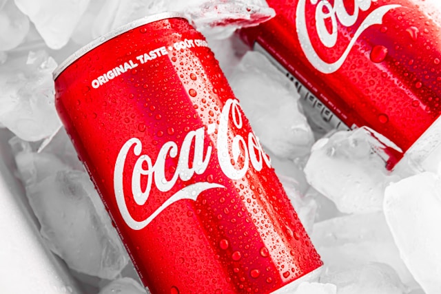
Coca-Cola has used its trademark red color for decades. The iconic shade is exciting and thrilling, and red is a good choice for beverages.
Green
Green can have negative connotations, like jealousy and disgust. But it’s also the color of life. Plants, trees, grass, and bushes are green. It can represent health, wealth, and freshness.
This is a delicate balancing act that brands need to consider. And often, it depends on the exact shade of green you use.
Whole Foods uses a dark green to represent its fresh produce. Marketing itself as “America’s healthiest grocery store,” green is the obvious choice.

Yellow
Yellow is the color of joy and happiness. It’s the color we use for smiley faces, and it’s also reminiscent of the sun and bright flowers. It’s an optimistic, warm hue.
Of course, it’s not always positive. Yellow is also the color of police tape and traffic lights. So, it can represent anxiety and stagnation.
McDonald’s makes great use of yellow in its famous golden arches logo. It’s youthful and happy–a natural choice for the signature Happy Meal.
Black
Classy, sleek black is everywhere. It exudes power and elegance, which is why you’ll find it in the logos of luxury and high-end brands. Chanel, Dior, and Balenciaga all use black.
On the flip side, black can be cold and oppressive. Sometimes, its power is intimidating. Black is the color of Disney villains and fear. It’s also the color we use to mourn. So, you’ll rarely see it in the health industry.
Nike uses black in its iconic swoosh logo to represent power and athleticism.
White
White is a wonderful accent color, but it’s also ideal for any brand seeking simplicity. It’s modern and elegant and can help to achieve a pure aesthetic.
However, marketers should be careful with white, as it can feel sterile and boring. But, when you do it right, it can be a gorgeous and luxurious color.
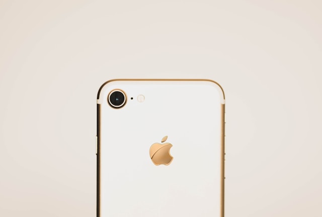
Apple uses a trademark white logo to represent its modern products. And it adds a touch of luxury, too. So you feel like every new iteration of the iPhone you get is a little treat.
Pink
Often, pink is the color of femininity. Depending on the shade, it can be bright and youthful or muted and classy. Bright pinks are popular for brands looking to stand out.
However, these shades can also be childish or represent rebellion.
Barbie is a famous example of an all-pink brand. And with a target audience of young girls, it’s the perfect color.
Color Effect on Branding
The color effect in marketing is staggering. Many purchasers make decisions based on visuals alone. Get it right, and you can significantly increase brand recognition. Get it wrong, and you can put your entire business at risk. Yes, it’s that serious.
So, when creating a brand style guide, it’s important not to simply opt for popular colors. Instead, you need to create the perfect color palette to encapsulate your brand. That way, you can create something that resonates with your target audience and encourages them to make a purchase.
You can make a color palette in many ways, but it’s important to get it right. For example, your colors don’t just need to be the right ones, but they also need to pair well. It’s vital to make your palette inclusive and accessible to those with color blindness.
Make sure you check your site against accessibility guidelines. Plus, use a tool like Google’s color picker to get the right color code every time and create seamless cohesion.
Mood Colors: A Cheat Sheet
Now you know the basics of colors and their effects on mood. Cool colors are calming, reds make you hungry, and so on. But it can all get confusing! Here’s a cheat sheet on mood colors to help you remember the emotion color psychology chart:
- Black: Noble, powerful, mysterious
- Blue: Peace, wisdom, hope
- Green: Nature, freshness, life
- Orange: Joy, warmth, kindness, youth
- Pink: Soft, feminine, youthful, rebellious
- Purple: Noble, mysterious, glamorous
- Red: Passion, love, excitement, anger
- White: Truth, indifference, modernism
Yellow: Joy, optimism, hope
Master the Art of UX and the Color Psychology Chart With Page Flows
Color plays an absolutely crucial role in branding. When creating your website or app, there’s a lot to consider, and color is one of them. Luckily, having a color psychology chart on hand can help you create the vibe you want.
And if you want more examples of great design inspiration, look no further than Page Flows. Our library of user flow recordings can show you exactly how website branding looks in action. Get started today to open up a whole new world of inspiration.