The signup process is the first real interaction your users have with your product. They might have already interacted with your brand or have even explored your site. But now, they have decided to take action. At this stage, the best signup flows serve to rope the user in further and keep them interested.
Get it wrong, though, and you might alienate your users and turn them away at the first hurdle. They might leave, never to return. And that’s why it’s crucial to get the sign-up flow just right.
Fortunately, the team at Page Flows is here to give you some expert pointers about crafting your onboarding process. Let’s get into it.

How To Design a SaaS Sign-Up Flow
Creating a sign-up flow isn’t a one-size-fits-all kind of deal. There are different types, and it depends what you’re designing it for. A B2B SaaS sign-up flow might be friction-based. This is especially the case for complicated software with a steep learning curve.
Meanwhile, B2B platforms and mobile apps might aim for a frictionless flow. This tries to make the login user flow as simple as possible. That’s easy when your product delivers the “a-ha!” moment all on its own.
The point is that you should always start with user research. That way, you can understand who your audience is, what they want, and how to give it to them. It’s important to design a sign-up flow that suits your product and your users best.
With that in mind, here are some best practices to consider.

Sign-Up Flow Best Practices
If you want to create the best sign-up flow, you’ll need to stick to certain best practices and design principles. After all, the main goal is product adoption. Make it difficult, and potential users will bail.
Check out these sign-up flow best practices to hone your process.
1. Limit Sign-Up to One Page
Don’t make it more difficult for your users to sign up than it needs to be. Instead, keep it to a single page that uses the minimum number of fields. The longer the form, the more likely it is that users will give up.
2. Make It Different From the Log-In
Users might get confused if the log-in and sign-up pages are the same. And this can be frustrating. Don’t irritate your users–simply separate the pages to make the process more user-friendly.
Also, make it easy for your users to switch between pages with a simple button. It should be easy to spot but shouldn’t distract users from the main content.
3. Allow Linked Sign-Up
Usually, it’s possible to sign up for a new site with Apple, Gmail, or Facebook. Think about how much quicker and easier this makes the process!
Utilizing social login can vastly improve the process for your users. So, incorporate this where you can.
4. Add a Welcome Page
It never hurts to be nice. Adding a simple welcome page, or even a banner, can put your users in a good mood. You can also include a catchy CTA or a simple, compelling reason to proceed with signup. That’s an easy way to remind them of the benefits.
5. Make CTAs Visible
Speaking of CTAs, you’ll need to make sure any you use are easy to spot. Position any CTA buttons somewhere that are easily visible, and make sure they draw attention.
6. Utilize Visual Hierarchy
You can also utilize visual hierarchy to make buttons stand out. Place buttons of the most importance at the top. And, use bold fonts and colors to make them stand out more.
7. Allow Multiple Options
Some users prefer usernames, while others like the simplicity of remembering their email address or phone number. Offering only one option can result in failed login attempts.
So, allow your users to sign up and log in with whatever option they choose.
8. Allow Users To Reveal the Password
Users often make mistakes. It’s easy to enter the wrong letter when inputting a password. But, allowing them the option to reveal their password gets around the frustration of a failed login attempt.
9. Prevent Errors
As users add their details, use inline validation to provide real-time feedback. This flags potential errors and ensures that users don’t make mistakes while signing up.
Also, consider providing a password requirement checklist. This means they won’t struggle to create a password.
Mobile App Sign-Up Flow Best Practice Guide
When it comes to mobile apps, the signup process shouldn’t be vastly different. However, there are some key considerations. Think about these mobile app sign-up flow best practice tips before you start designing.
- Design for mobile usability: All elements should be easy to tap. Apple’s guidelines recommend a minimum tappable area of 44×44 pixels.
- Automatically trigger the keyboard: When using text fields, bring up the keyboard automatically. Consider using the appropriate keyboard, such as numeric or email-optimized, for complete ease of use.
- Optimize form layout: For mobiles, a single-column layout is typically more straightforward.
- Use progress bars: For more complicated sign-up processes, use a progress bar. This helps encourage users along the way.
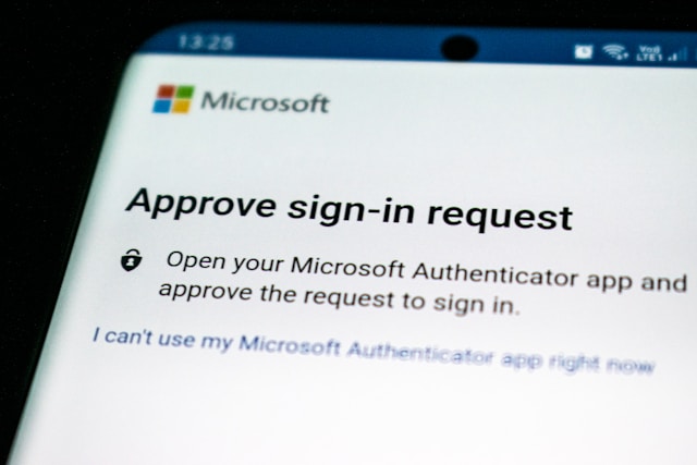
- Implement 2FA: Two-factor authentication (2FA) helps users protect their data. Mobile phones can easily go missing, so data security is more important than ever.
With these specificities aside, building a mobile flow is similar to others. Whatever you’re designing for, make sure you test and iterate until you get the process right.
Sign-Up Flow Examples
Before you race off to design your flow, it can be helpful to see some sign-up flow examples. These are some of the best sign up pages we’ve seen in the world of design.
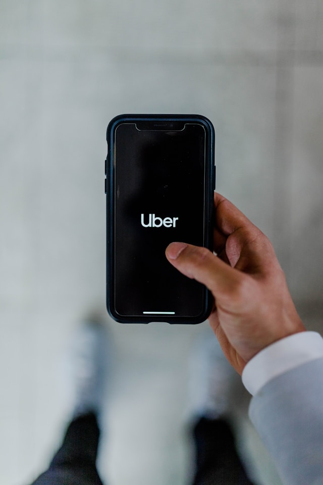
1. Uber
Rideshare apps always make an interesting case study. They need two sign-up flows: one for drivers and one for passengers.
Uber’s driver sign-up flow is remarkably simple. We love the “welcome page,” where a banner at the top reminds potential drivers of the benefits. While the user starts to fill out their info, auto-fill speeds up the process and makes it simple.
The necessary background check is super easy to fill out, with helpful tips and info throughout. And Uber even personalized the flow by using the driver’s first name after they’ve entered it. It’s almost perfect.
2. Instacart
The shopping app Instacart makes it really easy to sign up. Again, it begins with a welcome page that reminds users of the benefits.
Instacart’s sign-up flow then utilizes social login to facilitate the process. It doesn’t ask for any more information than the app really needs. And then, when they’re in, the user can easily select all their favorite stores from a list.
This is a great example of a really simple user flow. It’s perfect for consumer-facing apps because it’s so straightforward and quick. Users don’t want to spend valuable time signing up. They want to shop!
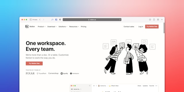
3. Notion
Notion’s workspace sign-up is really great. The app has quite a wide target audience, from startup CEOs to large companies and agencies. So, their signup flow has to target all of these areas.
It’s a simple flow. All you need to do is enter a “work” email address and a couple of other bits of info.
The thing we like most is the bold CTA button, which stands out in a striking red. While red might usually be for warnings, in this case, it calls the user’s attention to it with ease.
See the Best Signup Flows and More on Page Flows
Those are three of the best signup flows, but there are plenty more. Here at Page Flows, we scour the web for the best of the best in design. Our growing library of user flow recordings can teach you everything you need to know about UX/UI design.
So, what are you waiting for? Get started today and explore more incredible user signup flows. You’ll find the perfect source of inspiration in no time!