Fun, trendy fonts can help your product’s copy truly enhance the user’s experience with your brand. With thoughtful application, your whimsical typographic elements can even help you establish a brand identity that users resonate with.
For that reason, we’ll discuss the ins and outs of fun fonts in today’s guide. We’ll address the meaning and benefits of fun typography and how you can use it effectively in UI design.
Exploring the Fun Fonts Alphabet: What Are Fun Fonts?
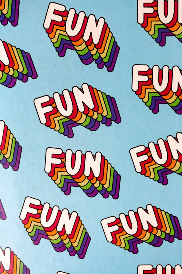
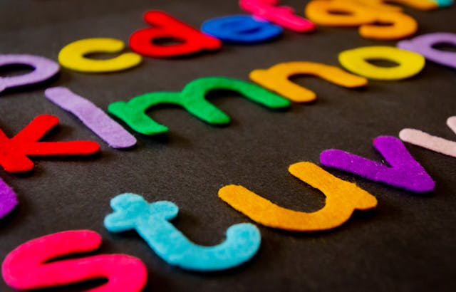
A fun font alphabet refers to an assortment of typefaces that inject your designs with a sense of whimsy. These fonts speak to playfulness and creativity, and for that reason, they are less serious than most sans-serif and serif fonts.
To help you visualize what an effective fun font looks like, we’ve listed some of their most common components below.
- Eye-catching shapes: Many whimsical fonts utilize intriguing, unusual letterforms with exaggerated curves, unconventional angles, and even distorted silhouettes.
- Asymmetry: Although symmetrical designs are more visually satisfying, they are very commonplace. That’s why UI designers often use asymmetry with less serious typography; it’s atypical and, thus, more engaging.
- Bold colors: Intriguing fonts need to command the user’s attention. That’s why you’ll often see vibrant, bold, and even multiple colors within engaging typography.
- Pleasing patterns: Many visually striking fonts draw the user’s focus via patterns like stripes and polka dots.
- Three-dimensionality: 3D fonts take inspiration from vibrant street art and graffiti, making them perfect for edgy, fun designs.
- Unconventional baselines: Straight baselines are great for a polished look but not so great for visually striking fonts. That’s why many memorable fonts stray from conventional design in favor of dynamic, wavy baselines.
- Various stroke widths: Fonts with a mix of thick and thin stroke widths convey a sense of energetic motion. This energetic motion is what makes a font more interesting to look at.
- Handwritten aesthetics: Fonts that appear handwritten imbue your typography with a feeling of carefree informality, making them appear more fun.
The Benefits of Finding Fun Fonts To Draw
Now that you know more about fun fonts, the question is, “Why use them?”
It may surprise you to know that finding fun fonts to draw has many benefits aside from creative experimentation. Let’s discuss some of those benefits.

Emotional Responses
Every design element you create contributes to the emotional response your designs evoke from your target users. Your choice of font is no exception.
With a fun font, you can make your users feel joy, playfulness, nostalgia, and excitement. All of these emotional responses stem from passion, which can incentivize your users to complete desired actions.
Uniqueness
Most brands gravitate toward fonts that look sleek and sophisticated. While this isn’t a bad thing, using go-to fonts like Times New Roman can make it difficult to stand out.
Standing out as a unique brand is especially important when it comes to leaving a lasting impression on new users.
With unconventional fonts, you make your brand unique and memorable for the right reasons. If your brand sticks in your users’ minds after their first interactions, they are more likely to revisit it.

Engagement & Productivity
It’s not your users who benefit from a visually engaging font – your design team will, too.
When it comes to typography, most UI designers don’t have much room for creative experimentation or expression. As you can imagine, this can make designing the visual aspects of a product’s copy pretty tedious for many designers.
And we don’t have to tell you what repetitive, mundane tasks do to an employee’s productivity.
But fonts with vibrant colors, unusual shapes, and intriguing patterns can reawaken your design team’s creativity. As a result, your team will have more fun when designing your product’s content.
When a design team has more fun, they are also more likely to be more productive at the same time.
How To Use Whimsical Fonts in Your Designs
With all of this talk of creativity, you’re probably eager to know how to implement fun typography in your designs.
Below, you’ll find a step-by-step guide that reveals how you can do just that!

1. Researching Your Users
To create typography that engages your users, you need to first understand and empathize with them. So, it’s best to conduct user research to familiarize yourself with their needs, desires, and expectations.
With appropriate UX research methods, you can leverage your research data to find the best font for your users’ needs.
2. Clarifying Your Brand’s Identity
You shouldn’t focus solely on your users. You need to prioritize your brand’s visual identity and personality as well.
Revisit your brand’s core message and value proposition and design your font accordingly. For instance, if your brand appeals to newly engaged couples, it may not be wise to use a graffiti-inspired font.
3. Creating Your Font
The preparations are in place – you now need to create your font. You can use font creation tools like FontLab or even font generators to create your intriguing typography.
Experiment with the elements we mentioned earlier and – most importantly – exercise your creativity.
Tip: Remember always to bear your users and brand in mind when you create your eye-catching fonts.
4. Maintaining Readability & Consistency
Now that you have your new font, it’s time to make sure it’s readable and consistent.
For readability, we recommend limiting the use of your font and saving it for elements like headers, logos, and CTAs. It could also be a good idea to use simpler text for long textual segments.
For consistency, we suggest creating a brand style guide so your fellow designers can replicate your designs accurately. You should also make sure your designs translate successfully to multiple devices, including smartphones and tablets.
5. Ensuring Accessibility
UX accessibility refers to making your product usable and enjoyable to all users, regardless of their physical or cognitive capabilities.
In actuality, your font, as fun as it may be, can compromise your product’s usability, especially for visually impaired users. To avoid this problem, we recommend consulting the Web Content Accessibility Guidelines (WCAG) 2.2.
We also recommend using high-color contrasts and alternative text for users who rely on screen readers.
Tip: Implement customizable settings for your font’s colors and sizes.
6. Testing & Iterating
The last thing you need to do is test your new font with your users, design team, and even stakeholders.
With their feedback, you can identify and fix any issues within your design. You can then iterate your designs until you have an engaging, polished, finalized font!
Designing Playful Fonts: Tips & Tricks
To help you further, we’ve also compiled the best tips and tricks for implementing fun typography into your product’s content.
- Define your font’s theme by carefully selecting inspiring concepts like nature, games, and vintage aesthetics.
- Sketch, share, and iterate your ideas before finalizing them.
- Experiment with variations in your font’s shapes, colors, sizes, baselines, and stroke widths.
- Conduct A/B tests with your finalized font designs to test your typography on real users.
- Consider using white space to enhance your font’s readability, especially if it’s complex.
- Try out software like FontForge and Glyphs to edit your fonts.
Examples of Designs With Fun, Effective Fonts
If you need inspiration, look no further than our examples of designs that use fun letterforms effectively.
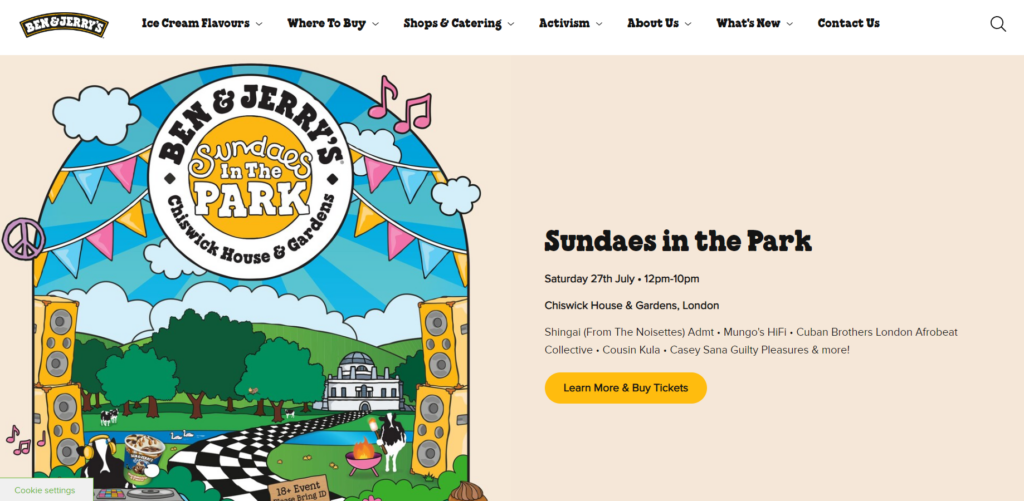
Ben & Jerry’s
On Ben & Jerry’s homepage, you can see a medley of unique fonts with different styles, sizes, and stroke widths.
This variety of typographic elements mirrors the appealing variety of flavorful products that Ben & Jerry’s sells. It also adds a sense of energetic fluidity that you don’t often see with big-name brands.
Curved baselines, bold font outlines, and a nod to casual handwritten elements. All of these visual aspects demonstrate that Ben & Jerry’s designers know how to use fun fonts effectively.
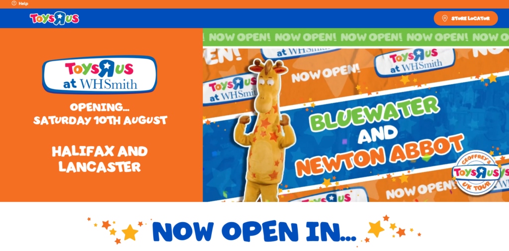
Toys R Us
What’s great about Toys R Us’s font is its use of “handwritten” but readable letterforms that resemble a child’s writing.
Most notably, the “R” in Toys R Us’s logo is backward. This typographic choice elicits a sense of cuteness and creativity that we associate with children. Not only does this meet the users’ expectations, but it also perfectly reflects the brand’s personality.
With an uneven baseline and vibrant colors, Toys R Us’ font is engaging, consistent, and effectively appeals to its users.
Experimenting With a Fun Font Generator
Aside from taking inspiration from examples, you can also take inspiration from a fun font generator. So, to point you in the right direction, we’ve listed some font generators that you should experiment with, such as:
- FontSpace
- TextStudio
- Cool Symbol
- Cool Text
- Quicktools by Picsart
FAQ
What is a fun font?
A fun font is any typeface that elicits a sense of enjoyment, creativity, and whimsy from your target users.
How do I write fun fonts?
You can create fun fonts using font creation software like FontForge and FontLab. You can also write intriguing fonts by experimenting with font generators like FontSpace.
What is the most attractive font?
Of course, since the most attractive font is subjective, there is no definitive answer to this question. That said, here are some of the most popular, visually pleasing fonts:
– Lato
– Allura
– Helvetica
– Garamond
– bArvo
– Merriweather
Fun Fonts: Enhance Your Designs Even More With Page Flows
We hope that you feel ready to experiment with whimsical typography to elevate your designs for your users’ enjoyment.
That said, in order for your users to enjoy your playful letterforms, you need to make your designs navigable first. That’s why you need Page Flows.
With Page Flows, you’ll never lack design inspiration because we offer thousands upon thousands of resources. Our resources, whether recordings or screenshots, detail the foundation of intuitive user navigation – user flows.
From onboarding to switching accounts, we document the essential user flows that every digital product could leverage. We also source recordings and screenshots from a wide range of successful brands and thriving industries.
Like fun fonts, we can help you elicit the right emotional response from your users.
Get started with Page Flows today to learn how masterful designers approach seamless user navigation!