
Accordions are effective user interface (UI) elements with expandable and collapsible features. Implementing an accordion UI can offer an elegant solution for presenting extensive information without compromising usability.
In this article, we dive into accordion layout essentials, compare accordions with collapsibles, and discuss progressive disclosure in UX. Learn when and when not to use accordions alongside helpful real-life examples.

Understanding Accordion Layout
Understanding the accordion layout is essential for implementing this common design element effectively. Accordions have three main elements:
- A vertical stack of headers
- Corresponding icons
- Collapsible content panes
Accordion item styles may vary. In my experience, clicking on either the header or icon component in mind reveals or hides the associated panel beneath it. Commonly, only one pane can be open at a time.
To ensure greater accessibility, I would recommend designing the entire header-icon region as a hit target for opening content panes. This can make interacting with and navigating the content easier for users. In the next section, we’ll discuss the role of icons in enhancing usability and providing visual cues for users in accordion design.
Accordion Icons: Using Visual Indicators to Improve Usability
Ensure users know they can expand sections by including icons. I prefer using carets over plus signs, as the latter might imply adding something rather than expanding on it. I would advise starting with the caret pointing down to indicate expandable content. The caret would then change from down to up upon triggering the accordion to indicate collapsible content.
Right arrows can also be misleading, as users might expect a new page to open instead of a panel expanding below. This confusion could occur regardless of the device (mobile or desktop). Not using any icon may cause further uncertainty, making it the least desirable of the options.
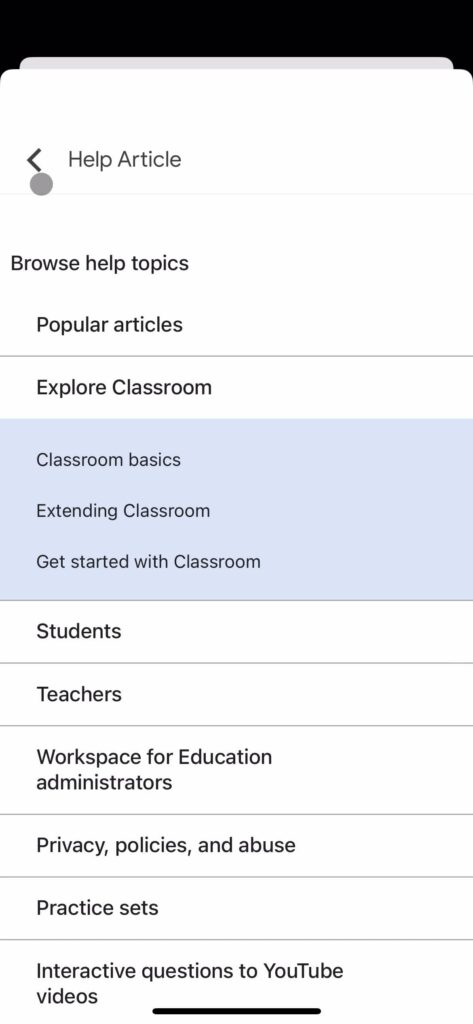
For example, in the Google Classroom screenshot above, I might be unsure what to expect when clicking on a help topic. Clicking on a “white” topic expands the accordion, while clicking on a “blue” one takes users to a new page. The absence of icons distinguishing the two might lead to confusion and distrust when navigating through future lists on Google Classroom.
Page Flows offers resources on other usability metrics to look out for. By understanding and addressing potential user concerns, you can create effective interfaces, website accordion or otherwise, that foster trust and engagement.
The Role of Progressive Disclosure in Accordion UI Design
Accordions enable progressive disclosure, a strategy that reveals information or actions as users interact with the interface. Progressive disclosure can benefit users by reducing cognitive load, maintaining an uncluttered interface, and enhancing focus.
To implement progressive disclosure effectively, consider organizing content hierarchically, using clear labels, and offering intuitive interactions. Accordion menus generally fulfill these requirements by structuring content into headers and panels, with headers acting as labels. As we discussed above, using icons can also facilitate intuitive interactions.
Accordions can be a valuable asset for your website or project by enabling users to explore content at their own pace. For other UI best practices, Page Flows offers resources to improve your designs.
Accordions vs. Collapsibles
Accordions typically involve “expanding” or “collapsing” items to reveal associated content. Definitions vary, but a common understanding I’ve found is that there can be zero or exactly one expanded item at a time.
On the other hand, collapsibles or collapsible panes cover situations where users can expand more than one item simultaneously. Consider providing “collapse all”/“expand all” buttons in collapsible accordion UI design to improve usability.
The distinction between the two might not align with the origin of the term “accordion,” as musical accordions can be fully expanded. Regardless of terminology, accordions and collapsibles can be valuable UI elements to employ in your next design.
Knowing When and When Not To Use Accordions
So far, we’ve discussed accordion elements and how you can implement them. In the next section, we explore when to use accordions and why you should (or shouldn’t!) implement them.
When To Use Accordions
Accordions offer an effective solution for managing complex navigation and content-heavy web pages. They help organize pages into manageable sections, enabling users to find and access specific information efficiently. In the process, accordions can significantly enhance the user experience.
In my experience, accordions can also help reduce scroll time and improve mobile experiences overall. In the next section, we’ll explore successful implementations and discover how accordion menus can enhance user interaction in various contexts.
Accordion Menu Examples: Exploring Successful Implementations
I’ve found accordion menus in various contexts, such as e-commerce, FAQ pages, and mobile applications. When implemented correctly and with your users in mind, they can significantly enhance the user experience.
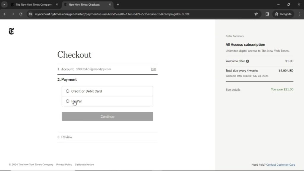
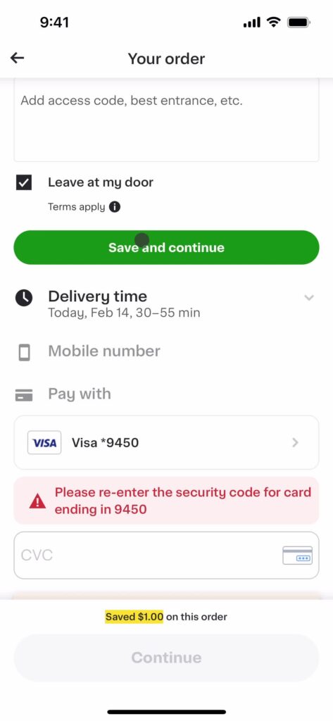
Accordion menus are common in e-commerce checkout pages but can be tricky to get right. It’s crucial for me to know if proceeding to the next section might lock me out from form fields within previous sections. This might prevent me from being able to review or edit previously entered information.
In my experience, it can be unclear if advancing to the next panel will prevent me from returning to previous sections. This uncertainty can lead to hesitation and distrust during the checkout process. Unclear navigation or the fear of being “locked out” can create frustration and hinder a business’s goal of seamless user experience and conversion.
On the Instacart checkout page above, the “Save and continue” button effectively guides users through each section. Doing so hides the section I was just working on, and the next section becomes visible. I can revisit completed sections by clicking on their headers, addressing any concerns I may have about accessing previously entered information.
I’ve also seen FAQ and help center pages with accordions, as users often don’t need to review each one of the answers. Accordions can also be ideal for mobile sites, as they reduce scrolling and improve content discoverability.
Outside of exploring accordion menu examples, gathering UI inspiration from various sources is essential. By studying successful implementations and creative ideas, designers can enhance their projects and deliver exceptional user experiences.
When To Avoid Accordions
Understanding when not to use accordions is also important, as certain scenarios may result in confusion or unnecessary effort for users. In my observations, I’ve identified several situations where accordions may not be the most effective approach, including:
- When users need most or all content: If users are likely to access multiple accordion items, consider displaying all content to avoid users having to click and expand repetitively. However, if headers can effectively summarize the information, accordions with clear headers might still be suitable for easy scanning and access.
- If there are accessibility limitations: If your team lacks the resources to make accordions accessible, opt for plain text instead. Accessibility is a crucial aspect of design, and it is important to ensure that all users can access your content.
- Complex or nested accordions: Avoid nesting accordions, which may create confusion and complexity. If your users might struggle to navigate a hierarchy of nested accordions, prioritize simplicity and clarity.
- Accordions with a large number of items: Although there isn’t a strict rule for the maximum number of accordion items, balance providing enough information with avoiding cognitive overload. If you have a large amount of content, consider employing alternative UI components for better organization.
- If the content is essential: If your content is crucial for users, avoid hiding it within an accordion, as it may go unnoticed. Content within accordions still contributes to search engine optimization (SEO) but might have less impact than content displayed prominently on the page.
Some alternative UI components I’ve seen you can consider employing instead include:
- Tabs: For displaying content in categories without the need for vertical scrolling,
- Expandable cards: For presenting individual items with additional details or actions
- Multi-step progress bars and steppers: For breaking down complex processes into manageable steps, and providing clear guidance and feedback to users.

The Impact of Accordions on SEO
While accordions improve usability and user experience, it’s essential to understand their implications for search engine optimization (SEO) in design. In this section, we discuss optimizing content-heavy pages without compromising search visibility.
Although content within accordions can still contribute to SEO, search engines may not give hidden content the same weight as visible content. To avoid potential ranking issues, ensure that essential information remains visible and avoid hiding it within accordions.
Exploring Accordion Web Design Examples
Accordions contribute significantly to user experience by efficiently organizing content and facilitating easy navigation. Understanding their proper use is essential to maximize their benefits. Stay informed of current design trends by exploring accordion web design examples in successful products to create engaging, user-friendly interfaces.
Page Flows offers a growing library of user flow recordings for finding interaction design ideas. Explore accordion UI examples and more on Page Flows to master accordion design and provide exceptional user experiences.