
The goal of a UI designer is to create positive experiences for users when they interact with a digital product. By integrating compelling, cohesive visual elements with a straightforward visual hierarchy, UI designers can create a seamless user experience.
Expectedly, you may wonder how a UI designer goes about creating such a seamless user experience. Like UX design, the field of UI design has golden rules that you should follow to create spectacular user interfaces.
These golden rules will serve as the focus of today’s actionable guide. Today, we shall explore UI design principles to help you thrive as a UI designer.
A user interface is the point of human-computer interaction.
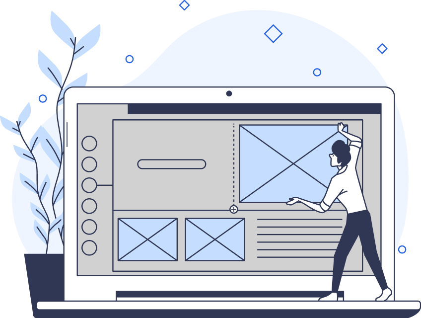
What Is a User Interface?
A user interface is the point where your users will interact with your digital product.
A user interface allows for seamless visual communication that the user can access and use to achieve their goals.
What Is User Interface Design?
Before we explore UI design principles, it’s essential to know what user interface design is.
So, what is user interface (UI) design?
User interface design refers to the process of building interfaces in both computer and software design.
UI design focuses on anticipating the users’ goals. By doing so, UI designers can ensure their interfaces exhibit certain design elements that help users achieve said goals.
With that said, you must design a user interface with cohesion and clarity in mind. Your users shouldn’t encounter a steep learning curve when navigating through your user interface. Instead, your designs should allow your users to rely heavily on their intuition to find desired content/information.
Thus, it falls on the UI designer to design a product’s look, feel, interactivity, usability, and behavior.

Common UI Elements: Knowing What Design Elements You Should Use
Knowing common UI elements is equally important as knowing about UI design principles. After all, you must know what you’ll work closely with in order to use them in an effective manner.
UI elements serve as the building blocks that make up a user interface. Typically, UI designers use UI elements to guide user interactions, present information, or enhance the aesthetic value of the interface.
You can categorize UI elements into the following four categories:
- Input Controls.
- Navigational Components.
- Informational Components.
- Containers.
Below, we’ve explored these four categories and the UI elements that fall into said categories.
Input Controls
Input controls enable users to input information into the digital product’s system.
Here are a few examples of input controls:
- Checkboxes: Checkboxes allow users to select one or more options from a predetermined list.
- Radio Buttons: Radio buttons allow users to select one option from a set of options. When selected, a radio button fills in as a circle with an inset.
- Toggles: A toggle switch acts as an on/off switch between two states. Toggles allow users to turn something on or off.
- Text Fields: Text fields allow users to enter text into a user interface.
Navigational Components
Navigational components help users move through a digital product’s web pages.
- Breadcrumbs: UI breadcrumbs serve as a secondary navigation scheme that helps users reach pages within an interface’s structure.
- Search Boxes: Search boxes allow users to enter words, letters, and terms in a web search engine.
- Icons: Like symbols, icons are small visual elements that represent functions, features, or content within a user interface.
- Navigation Menus: Navigation menus are lists of content categories presented as a set of links or icons. Typically, designers group these icons/links together with distinct visual styling.
Informational Components
Informational components share relevant information with users.
- Progress Bars: Progress bars provide the user with visual feedback concerning their progress with a task or process.
- Modal Windows: Modal windows are large UI elements that users must interact with to return to the main interface.
- Message Boxes: Message boxes interrupt the user while they perform an action. They appear as small pop-up windows that convey error messages or notifications that the user should know about.
- Notifications: UI designers convey notifications through a combination of textual content, icons, images, and even sound effects. Notifications focus the user’s attention on valuable information.
Containers
A container is a graphical element that organizes content within a user interface. Containers group related items/content together to provide an understandable visual hierarchy that the user can navigate through.
- Boxes: Boxes are rectangular containers that organize and group related items/content together within a UI’s layout.
- Accordions: Accordions allow users to collapse and expand sections of content.
- Tabs: Tabs enable users to switch between different types of content within a user interface.
- Panels: UI designers use panels to display and separate content in a visually distinct area of the user interface.
Good UI Design Principles That You Should Know
You know about UI design and the elements that you’ll use as a UI designer. Now, it’s time to supercharge your established knowledge base with good UI design principles.
Below, we’ve examined the most crucial principles of UI design.
Clarity
In UI design, clarity means employing recognizable features and elements that the users can use their intuition to interact with.
For example, you’ll know if you’ve adhered to this key principle if users can distinguish interactive elements from static elements.
You don’t have long to grab the user’s attention. Thus, you should ensure your product exhibits intuitive navigation, clearly visible buttons/icons, and consistent webpage layouts.

Hierarchy
A strong and straightforward visual hierarchy is a key principle of UI design.
A solid visual hierarchy imbues visual elements with an order of importance that makes content easier to consume for users.
To create a solid visual hierarchy, you must arrange your visual elements in a way that clearly emphasizes their importance. You must also ensure that the arrangement of your visual elements guides the user to take a desired action.
Here are a few tips to help you establish a clear visual hierarchy:
- Use bright colors—providing they suit your brand’s color scheme—to emphasize a visual element’s importance.
- Utilize large sizing to draw the user’s focus to important headlines and CTAs.
- Experiment with different font sizes and styles to establish a visual hierarchy.
- Employ negative space, otherwise known as white space. Negative space makes important elements stand out to the user.

Consistency
If users don’t know what to expect from your product, they’ll use knowledge of similar products to navigate through yours. For this reason, consistency is a crucial facet of good UI design.
With recognizable UI elements and predictable functions, users can quickly navigate through your user interface without confusion.
Although you may experience the temptation to ‘reinvent the wheel, ‘ it may prove detrimental to the user’s experience. Employ conventional UI elements and layouts so that the user can effortlessly rely on their intuition to navigate your UI.
Contrast
Utilizing contrasting colors and brightness isn’t just useful when trying to focus your users’ attention.
Using contrasting design elements also reinforces the navigational ease of your visual hierarchy and makes content easily readable.
Experiment with contrasting brightness and color schemes to optimize the visual intrigue and readability of your product.

Proximity
It’s natural to assume that UI elements within close proximity of each other are related in some way.
As a UI designer, you should derive insight from this assumption. Align closely related UI elements with similar functions to improve the fluidity of your user interface.
User Control
Enabling your users to take control of the interface is another essential quality of an exceptional user interface.
User control doesn’t just refer to making desired actions within your UI but also to undo any mistakes. This is especially important if your users make purchases from your UI.
To adhere to the user control principle, you should utilize modal windows and conventional undo/exit buttons. In doing so, you’ll enable the user to quickly recover from any errors made while avoiding additional, frustrating tasks.
Informative Feedback
Informative feedback allows users to know how the user interface interprets their actions.
Informative feedback should provide users with straightforward, concise, and timely information concerning the outcomes of their actions.
As a result, the user can feel more in control while interacting with your user interface. The more in control the user feels, the greater the user experience is overall.
Implementing progress bars is an effective way of providing informative feedback. Alternatively, you could utilize sound effects or vibrations to indicate that a user has completed a task within your UI.
Ultimately, you should allow your users to interpret your feedback and continue navigating to the next task with utmost clarity.
Accessibility
Designing your interfaces with every type of user in mind is not only morally right, it’s essential.
Accessibility is vital when ensuring that all users have an equal opportunity to engage with and enjoy your products.
Some of your target users may have cognitive, visual, or physical impairments that impact their experience with your product. It’s your job, as a UI designer, to ensure that users with disabilities can navigate through your UI.
Here are a few tips to help you create accessible user interfaces:
- Avoid visual clutter (unnecessary images, typography flourishes, etc.) to aid the user’s cognitive load.
- Add descriptive alt text to images for screen readers.
- Use appropriate color contrast ratios.
- Make your UI navigable via the keyboard.
- Utilize simple, readable fonts.
- Keep content clear and concise.

What Is Accessible Design?
To expand on the last principle, it’s important that you know precisely what accessible design is.
Accessible design refers to a design process that caters to the unique needs of users with disabilities.
You should consider the users who face visual, auditory, physical, and cognitive barriers.
By considering all user types and their unique circumstances, you’ll create a positive, universal user experience that everyone benefits from.
Peruse the Web Content Accessibility Guidelines (WCAG) to ensure that every one of your users can enjoy your interfaces.
UI Design Principles: Designing for Your Users’ Needs
Hopefully, what you’ve taken away from this article is how important it is to design with your users in mind.
User-centricity drives every UI element and principle that UI designers use in the modern digital landscape. Creating functional, accessible, and visually compelling user interfaces is imperative, but most importantly, your designs should resolve your user’s issues.
Remember to take the time to get to know your users on a psychological and emotional level. Utilize user research data to know your users’ motivations, beliefs, attitudes, needs, desires, and goals. By combining your knowledge of UI design with valuable insights from user research, you’ll undoubtedly create exceptional user interfaces.
Speaking of exceptional user interfaces, it’s time to see one in action to help you feel inspired. Meet Page Flows.
With over 4,200 recordings of tried and tested products, our designs reflect our dedication to our users. Over 1,000 happy customers from esteemed brands can vouch for us!
With Page Flows, you’ll learn what it looks like when designers effectively utilize an impressive, extensive, and user-oriented skill set. The professionals at Page Flows know how to create user interfaces that meet—and exceed—the users’ expectations.
Navigational ease, visual intrigue, and flawless functionality—these are just some of the qualities that we’ve mastered at Page Flows.
Above all, our adherence to UI design principles stands as a testament to our dedication to user-centricity. With Page Flows as your guide, you’ll experience consistent success whenever you create a user interface.
Get started today to access our growing library of user flow recordings and finally stay up-to-date with current design trends.