Onboarding is critical in engaging and retaining customers when designing a seamless user experience. By examining successful websites such as Amazon, we can uncover valuable insights that can inform and inspire our own design decisions.
In this article, I’ll explore Amazon onboarding and discuss some key takeaways that can help improve UX/UI design across various platforms. I’ll begin by discussing general onboarding best practices before diving into a more in-depth analysis of onboarding on Amazon.

Onboarding Best Practices: How To Engage Users
A well-designed onboarding process is crucial for user engagement, retention, and overall satisfaction. I’ve found the following to be generally pretty effective:
- Prioritize clarity: Guide users with clear instructions and intuitive design elements for effective sign-up and account creation processes.
- Offer optional onboarding: Let users explore the product before committing to sign up, allowing them to experience its value firsthand.
- Collect information progressively: Avoid frustrating and overwhelming users by collecting any data needed over time rather than asking question after question.
- Personalize the experience: Tailor onboarding based on user preferences and behaviors, including customized content and feature recommendations.
- Ensure consistent design: Maintain a consistent, responsive, and accessible design across various platforms and interfaces.
- Optimize performance: Ensure fast loading times and optimal performance during onboarding to avoid user frustration and potential abandonment.
- Gather feedback and iterate: Collect user feedback and analyze performance metrics to identify areas for improvement and enhance the overall experience.
By following these onboarding best practices, I’ve created processes that engage users, showcase product value, and encourage retention.

Factors That Elevate the Amazon User Experience
Several aspects of Amazon’s user experience (UX) I’ve found contribute to its success include the following:
- Personalization: Amazon effectively leverages data to personalize recommendations, promotions, and content for a tailored shopping experience.
- Efficient search and navigation: Amazon’s intuitive search and navigation features enable users to find or discover products quickly and easily.
- Streamlined checkout: Features like one-click ordering and seamless checkout make Amazon’s purchase experience convenient, increasing customer satisfaction.
- Customer support: Amazon’s dedication to customer service is evident through multiple support channels, fostering a positive user experience.
- Omnichannel: Creating a shopping experience across devices and interfaces allows for consistent web, mobile, and voice-enabled interactions.
Partially through its UX, Amazon has secured its position as the go-to platform for many customers. However, refining aspects such as visual design and accessibility could further elevate the overall experience.
A Deep Dive Into Amazon Onboarding
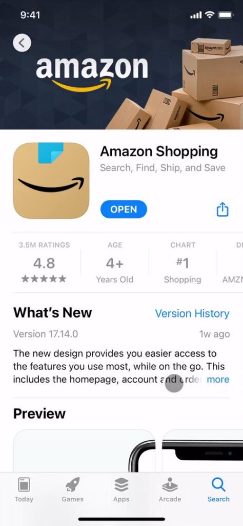
To gain insights into Amazon’s onboarding strategy, I examined the Amazon Shopping app. In the next few sections, I’ll explore various aspects of Amazon’s user experience design through a user onboarding journey beginning with account creation.
I’ll discuss the importance of consistency in language, UI elements, and visual cues, as well as clarity in instructions and navigation. Lastly, I’ll touch on the significance of a user-centric design to ensure a smooth and secure experience for all.
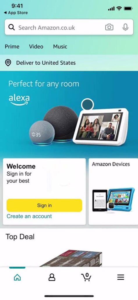
Empowering Users With Optional Onboarding
The app offers optional onboarding, allowing users to choose whether to explore the app’s features immediately or go through the onboarding process. By allowing users to skip onboarding, Amazon caters to both new and experienced users.
However, it’s important to balance user choice and ease of use. The placement of the sign-in and create account buttons on the homepage seemed somewhat random. A more logical and expected placement could ensure users can easily locate these essential functions and improve usability overall.
Sign-in and Account Creation
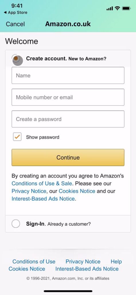
After tapping “Sign in,” I encountered a screen with “Create account” and “Sign in” options presented as radio buttons. While functional, this design choice felt somewhat unconventional.
Helpful features were present throughout the process to ensure intuitive navigation. For instance, a “Cancel” button in the upper-left corner indicated how to return to the previous page or cancel the current action.
Under “Create account,” I also found the “Show password” option presented as a checkbox to be somewhat unusual. Opting for a more widely recognized design pattern, such as an in-line toggle or eye icon, could improve user clarity.
While the app provides functional sign-in and account creation experiences, opportunities remain to refine the design and improve usability. Amazon can offer a more seamless experience by maintaining clear navigation and familiar patterns.

Balancing Security and User Experience
After tapping “Verify e-mail,” I encountered an unexpected “Solve this puzzle to create your account” prompt on the subsequent screen. Completing the puzzle, however, didn’t create the account; instead, it took me to the next phase of the onboarding process.
Maintaining concise and unambiguous copy throughout the design and testing process is crucial. By introducing steps in a logical and anticipated sequence, the user flow can remain uninterrupted, minimizing confusion and enhancing overall user experience.
The following verification screens abbreviate “One Time Password” as “OTP,” and Amazon initially presents the full term alongside the abbreviation. However, users may not be able to comprehend its meaning in an email or text if they aren’t actively looking at the app.
The pages offer helpful options for resending the OTP and for users to change their email address or phone number if needed. However, the repetition of “By creating an account…” on almost every screen causes visual clutter and contributes to redundancy.
It’s essential to find a balance between providing necessary information and maintaining a clean, user-friendly interface. A design system can be utilized to ensure consistency in patterns and reduce clutter, ultimately enhancing the user experience.
And while security measures are essential for user protection, striking a balance with user experience is also crucial. Refine the user flow, clarify copy, and employ a consistent design system to offer a secure, seamless account creation process.
Amazon Product Design and Branding
After completing the account creation process, I was directed to what appeared to be more of a settings page. The “Home” icon was indicated as selected in the navigation bar but was inconsistent with what “Home” was before I signed up.
This also left me confused as to what the “User” icon was in the navigation bar. Employing labels or more descriptive icons could have helped me better understand the various navigation options and their respective functions.
Overall, the app used a lot of teals, which didn’t immediately resonate with my experience as a primary website user. Ensure that design choices align with the brand identity and apply them consistently throughout the product. This way, you can reinforce the visual language and improve user recognition.
A distinct color gradient for loading effectively contrasts with the app’s teal color scheme and can draw attention to the loading process. Whether this color choice aligns with the brand’s overall aesthetic is hard to say. Exploring alternative, more on-brand solutions could help further strengthen the app’s visual identity.
Furthermore, the various “Back” and “Cancel” patterns used throughout the app further emphasize the need for a consistent design system. Maintaining uniformity across different app sections and sub-products can improve user experience and reinforce the brand’s identity.
Striking a balance between functionality and branding is key to a successful user experience. To create a cohesive user experience, implement a unified design approach, refine navigation elements, and ensure visual consistency.

Amazon Onboarding Retrospective
While the app’s onboarding has room for improvement, it effectively demonstrates many of the best practices mentioned above. By learning from these strengths and addressing areas for growth, designers can create more engaging and user-friendly experiences.
It’s paramount to balance functionality and user experience. By prioritizing clear instructions, consistent UI elements, and smooth user flows, designers can create products that cater to users’ needs.
Ultimately, a user-centric onboarding approach is crucial for creating successful products that resonate with the target audience and drive long-term engagement. Be sure to keep these principles in mind when designing your next product.
Amazon App Design vs. Amazon Website Design
Amazon’s website and app share many features but differ in user experience. Both platforms emphasize search functionality and user reviews, but the app offers a more compact and touch-friendly layout. For example, the website provides more comprehensive product information and advanced filtering options.
While both platforms maintain a consistent visual identity, they have distinct navigation patterns. Designers must consider each platform’s strengths and limitations to create a cohesive user experience across all touchpoints.
Amazon vs. Walmart
To evaluate another user onboarding example, I checked out the Walmart app. When I opened the app, I was greeted with a more traditional onboarding experience to help me personalize my shopping experience. In this case, the placeholder text adjusted its position as I typed, ensuring the label remained visible and helpful throughout the process.
As Walmart offers both in-person stores and online shopping, the app asked me to select my preferred shopping method. I could also sign in for the first time now, as the previous screens focused more on app onboarding over product onboarding.
After opting to shop on Walmart.com, I was met with an interface similar to Amazon’s homepage. However, Walmart included extra onboarding elements, such as navigation tips for first-time app users like myself. I also noticed that the navigation bar in the Walmart app included helpful labels, improving overall usability and clarity.
In conclusion, Walmart’s onboarding process focuses on guiding users through essential features and personalizing their experience based on their preferences. Overall, the app offers an engaging and user-friendly onboarding experience.

Leverage Amazon UX Design and More With Page Flows
Analyzing Amazon onboarding can provide valuable insights for designers seeking to create engaging and effective user onboarding experiences. Prioritize clarity, ease of use, and consistency while adapting designs for different platforms to resonate with the audience and drive engagement.
Get started today with Page Flows to stay current with design trends and discover new interaction design ideas. By studying successful product designs and iterating on their strengths, you can create engaging and user-friendly experiences that resonate with your users.