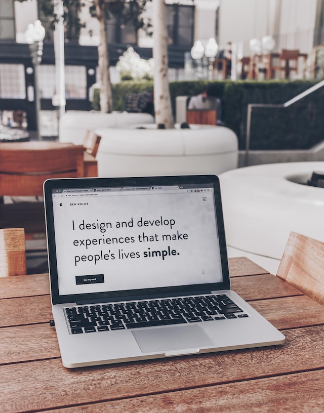
As a product content designer, I frequently work with product designers and marketers to design landing pages. I’m often asked how to design a landing page that actually converts. This is both an art and a science. Success requires a deep understanding of user behavior and design principles.
In this article, I will discuss the key elements of designing effective landing pages. Many confuse landing pages with home pages, but they serve very different purposes. Landing pages create crucial first impressions of your product or service. Getting them right can transform visitors into customers. So, let’s take a closer look at what makes a great landing page.
What Makes a Good Landing Page: Core Elements
The foundation of an exceptional landing page lies in understanding key principles that drive conversion. After years of testing and iteration, I’ve discovered that the best landing pages share common traits. Success comes from balancing aesthetics with user psychology and conversion optimization. Your landing page must connect emotionally while guiding users toward action.
Clear Value Proposition
Your value proposition determines whether visitors stay or leave. Start with a headline that immediately communicates the unique benefit of your product. Tell visitors why they should care about your offering. Make your message clear enough for quick understanding. Complex value propositions often lead to lost conversions.
Focused Messaging
Every element on your page should support one primary goal. Remove distractions that might pull attention from your main objective. Guide users through a single, clear narrative. Keep supporting messages aligned with your core value proposition. Clarity beats cleverness every time.
4 Effective Landing Page Strategies That Convert
Let’s explore what makes visitors click that button. After designing many landing pages, I’ve discovered some exciting patterns that work. Great landing pages feel more like an experience than a sales pitch.
1. Psychology of Conversion
Understanding how people think changed my entire approach to design. Visitors make snap decisions about your page in just a few seconds. I suggest using warm colors like orange or red for action buttons. Watch how changing one image can completely shift how people feel about your page. Testing different approaches will teach you more than any design theory.
2. Visual Storytelling
Visual storytelling is essential in design. The best landing pages feel like flipping through a beautiful magazine spread. Each visual element should guide your visitor’s eyes to the next section. I recommend you start with an attention-grabbing header image and copy that makes people want to learn more. Your design should create little moments of delight as users scroll down.
3. Social Proof Integration
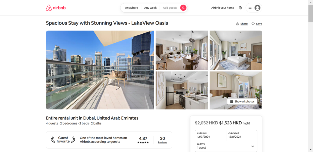
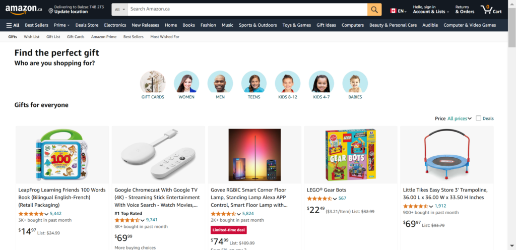
Check out how Airbnb places guest reviews right next to their property listings. Real photos of happy customers beat stock photography every time. Place testimonials strategically where visitors might need extra encouragement.
4. Building Trust
Remove anything that might make visitors hesitate or feel uncertain. In my experience, I have found that clear return policies and guarantees help visitors feel safe taking action. Watch where users pause during testing – that’s where you need trust elements.
Understanding Your Users: Research for Better Copy
User research often feels overwhelming when you’re just starting your landing page project. Many designers skip this crucial step because they think it requires complex methodologies or expensive tools. But in my decade of experience, I’ve found that simple research techniques often yield the most valuable insights for landing page copy.
The key is to start with basic conversations and build your understanding gradually. Your goal isn’t to gather mountains of data, but to understand the human beings who will read your copy.
Talk to Real Users
Start by having casual conversations with people who match your target audience. Ask them about their daily challenges related to your product or service. Listen carefully to the specific words and phrases they use to describe their problems. Write down stories they share about trying to solve these problems. These natural conversations will give you authentic language for your landing page.
Mine Customer Support
Your support team holds a treasure trove of insights about user needs and pain points. Schedule coffee chats with support staff to learn about common customer questions. Read through support tickets to understand how customers describe their challenges. Look for patterns in the language customers use when they’re frustrated or confused. These insights help you address concerns proactively in your landing page copy.

Conduct Market Research That Actually Helps
I recently dug into brand research strategies that elevate market presence, and it transformed how I approach landing page design. Understanding these broader brand principles helps you create pages that truly resonate.
Look at how your competitors talk to their users. Notice which words they use in their headlines. Study how they structure their landing pages. Pay attention to the imagery they choose. But don’t just copy – understand why their choices work.
Social media gives us amazing insights into what users actually want. Check out the comments on your competitors’ posts. Look for patterns in how people describe their problems. Notice which posts get the most engagement. These insights will make your landing page copy more authentic.
Try creating a mood board of brands you admire. Save screenshots of landing pages that catch your eye. Make notes about what draws you to certain designs. This collection will help shape your own unique approach.
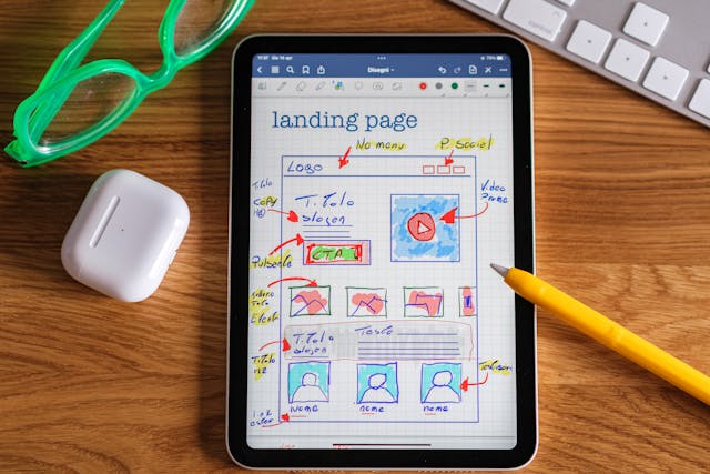
Best Landing Page Layouts for High Conversion
Through years of testing and optimization, I’ve discovered that certain layout patterns consistently outperform others. Understanding how to build a great landing page starts with these proven layouts. Marketing campaigns often succeed or fail based on fundamental layout decisions. The key isn’t just choosing a layout – it’s understanding why certain patterns work better than others. Your layout should create a natural path toward conversion.
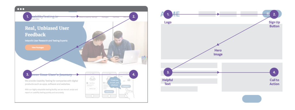
The Z-Pattern Layout
The Z-pattern follows natural eye movement patterns for western readers. Start with your key message in the top left area. Move across to supporting visuals or trust elements. Guide attention diagonally down through benefits and features. End with a compelling call-to-action in the bottom right.
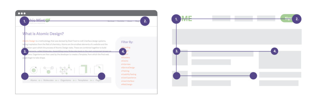
The F-Pattern Layout
Content-heavy pages benefit from the F-pattern structure. I suggest you place crucial information along the top horizontal area. Position key points along the left side in a vertical pattern. Use multiple CTAs throughout to capture interest at different stages. This pattern matches natural reading behavior.
Landing Page Templates: When To Use Them
While many designers prefer custom builds, landing page templates can provide a solid foundation. A landing page builder offers quick deployment for testing different approaches. The key lies in knowing when templates make sense and when custom design is necessary.
I have found that templates work best when customized thoughtfully to match your brand and goals. Understanding template limitations helps you make better design decisions.
Choosing the Right Template
Start with templates that match your conversion goals. Look for clean, professional designs that support your content strategy. Ensure the template offers enough flexibility for customization. Consider how well the template handles responsive design. Test template performance before committing.
Customize Your Strategy
Modify templates to align with your brand identity. Adjust layouts to support your specific content needs. Replace generic elements with custom photography and graphics. Maintain consistent spacing and typography throughout modifications. Test your customized template with real users.
Landing Page UX Design: From Concept to Launch
Designing effective landing pages requires a careful balance between creativity and conversion principles. Every design decision should support your page’s primary goal while creating an engaging user experience. I’ve found that the most successful landing pages combine beautiful design with clear user paths to action. Your design should guide visitors naturally toward taking action.
Finding Your Design Voice
Every brand deserves its own unique visual story on the web. I always start my design process by gathering inspiration from sites that catch my eye. Creating mood boards helps me explore different directions before committing to a specific style.
Sometimes, I’ll spend hours sketching rough ideas in my notebook before using any digital tools. This exploration phase helps me discover unique angles for each project.
Designing for Emotion
Color plays a crucial role in setting the right emotional tone for your responsive landing page. I choose my color palette based on the feelings I want to evoke in visitors. Typography choices can make your page feel professional, playful, or anywhere in between.
Adding subtle animations helps create moments of delight without overwhelming the user. The key is finding the right balance between personality and professionalism.
Landing Page Design Tips: From Good to Great
Designing landing pages often involves blending creativity with conversion principles. Many designers overlook simple improvements that could dramatically impact their results. Understanding these proven tips will help you avoid common pitfalls and create more effective pages.
Above the Fold Strategy
Your page’s first impression happens in milliseconds. I’ve found that cluttered above-the-fold areas consistently underperform compared to clean, focused designs. Users make snap judgments about whether to stay or leave based on what they see first.
Keep your initial view simple yet compelling enough to encourage scrolling.
Visual Flow Techniques
Creating a natural visual flow helps users navigate your content effortlessly. Start by establishing a clear hierarchy that guides eyes from one element to the next. Use directional cues like arrows or images of people looking toward important content.
White space isn’t empty space – it’s a powerful tool for directing attention. Strategic placement of elements can create an invisible path toward your call-to-action.
Landing Page Example: Breaking Down Success Stories
Studying successful landing pages provides insights you can’t get from theory alone. When I analyze great landing pages, I look beyond surface-level design choices to understand the strategic thinking behind them.
Uberdosis: Thoughtful Typography
The best examples show how to balance multiple competing priorities while maintaining focus on conversion goals. Every element on these pages serves a specific purpose, teaching us valuable lessons about effective design. The Uberdosis landing page shows how clean design and thoughtful typography can create impact. Their approach to white space and content hierarchy offers great lessons for designers.
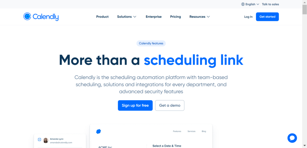
Calendly: Minimalist Mastery
Calendly’s product landing page demonstrates how powerful simplicity can be in landing page design. Their use of white space gives important elements room to breathe and stand out. Their typographic choices create a clear hierarchy without feeling overwhelming.
This approach shows how restraint often leads to stronger designs.
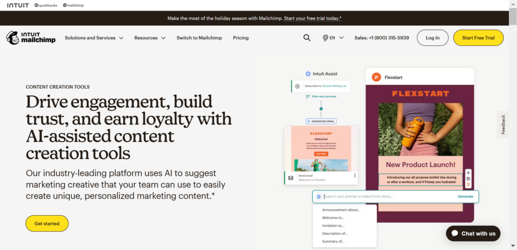
Mailchimp: Playful Innovation
Mailchimp’s landing page breaks conventional B2B design rules in the best possible ways. Their custom illustrations add personality while maintaining professionalism and clarity. The conversational copy feels like chatting with a knowledgeable friend rather than reading marketing material. Their consistent brand voice creates trust through authenticity rather than corporate speak.
Every element works together to make complex features feel approachable.
Landing Page Copy: Writing for Connection
The best landing page copy emerges from a deep understanding of your audience’s needs and desires. Every word should feel like it came from someone who truly understands their situation and challenges. I’ve found that the most effective landing pages speak directly to users’ emotional needs, not just their practical ones.
Many designers focus too much on features and specifications, forgetting that humans make decisions based on feelings first. Your copy needs to bridge the gap between what users want and what your product delivers.
Testing Your Copy With Users
Testing copy isn’t about finding the perfect words on your first try. It’s an iterative process that helps you understand how your message lands with real people. The feedback you receive might surprise you, but it will always make your copy stronger. Most importantly, testing helps you move beyond your own assumptions about what works.
Running Simple Copy Tests
Show draft versions of your copy to people who match your target audience. Ask them to read your page out loud and share their thoughts. Notice where they pause or seem confused while reading.
Watch for emotional reactions to different sections of your copy. Their natural reactions will guide your revisions.
Gathering Meaningful Feedback
Ask users to explain your product back to you after reading your landing page. Listen for gaps between what you wrote and how they interpret it. Notice which benefits they remember and which they forget.
Your navigation bar should guide users naturally through your content. Use their feedback to make your copy clearer and more memorable.
How To Design a Landing Page: Use Page Flows for Inspiration
I hope you’ve learned a lot from this article about how to design landing pages. Remember, designing effective landing pages becomes easier when you can learn from the best. At Page Flows, we help UX designers and product teams create better digital experiences through our extensive library of user flow recordings and detailed UX pattern analysis.
Our platform offers:
- Real-world examples from successful companies
- Detailed UX pattern breakdowns
- Step-by-step user flow recordings
- Regular updates with the latest design trends
If you’re wondering how to design a landing page that drives results, remember that success comes from continuous learning and iteration. Join thousands of designers and product teams who use Page Flows to inform their design choices and create better user experiences. Check out Page Flows now and start creating more effective landing pages today.