You’re learning about the world of user experience (UX) and have encountered the word “wireframe” several times. What is a wireframe, you ask? Many often come across this word as they explore, so use this article as a guide to learn about the basics of wireframing. An essential part of the design process, wireframes aid in how the final product will look and function. Let’s dig into what it is, when and why you use it, and some examples of UX wireframes.

Wireframes in the UX Design Process
The development of an app or website requires many phases or steps to get to the end product. A huge part of the UX design process requires research to understand user pain points and frustrations.
Using research data, designers might create customer journey maps and start structuring user and task flows. After that, designers use all the data and create documents to inform the next step in the design process — wireframing. So, what is a wireframe?
You can think of wireframes as skeletal structures used to guide how a feature or product will work and feel. A wireframe represents or outlines the structure or layout of an app or webpage. So, you will see buttons, navigation menus, and other interface components on wireframes.
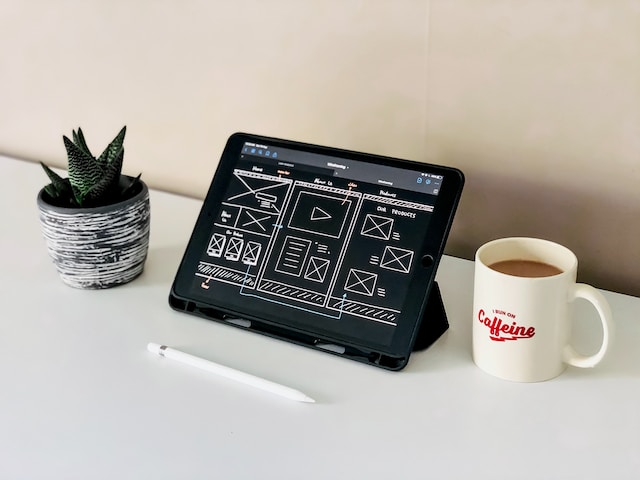
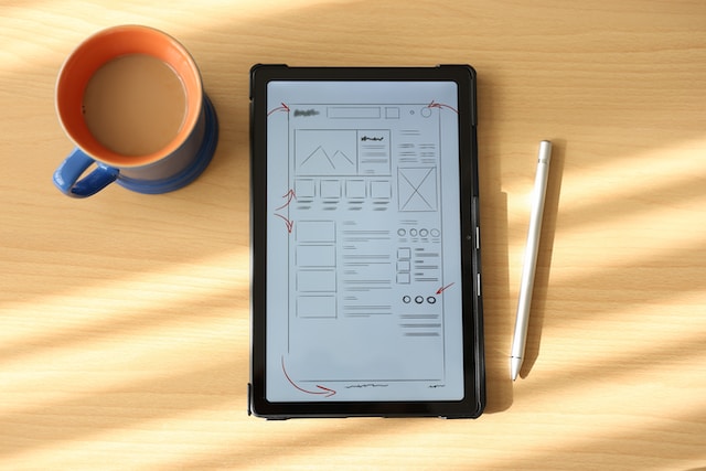
Designers may draw these wireframes on paper or outline them digitally using UX tools. Essentially, wireframes help product teams understand the basic structure of the product and how it will flow. Wireframes make it easy for stakeholders and other team members to discuss and iterate the overall layout and functionality. Used early on in the design process, wireframes play an essential role in providing a clear representation of the user interface.
What Is a Wireframe for a Website
Now, designers can create wireframes for apps, websites, smartwatches, and any other digital product. Just as architects create blueprints to build physical products, wireframes perform a similar function for digital products. So, what is a wireframe for a website?
A website wireframe outlines the basic structure and layout of the webpage. Creating these wireframes makes it easy to lay out where a share button might go, where the content area will be, and so much more.
A designer may sketch or design multiple wireframes to explore all possible layouts. This includes determining the placement of a search field, establishing the navigation menu setup, and more. Along with designing different layouts, wireframes illustrate how users will navigate a website. If a user presses this button, what will appear on the next web page?
Wireframes represent the basic structure of web pages. This outline makes it easy to visualize how the interface will look. This allows for a shared understanding of the website’s structure and functionality. Also, when stakeholders provide feedback, wireframes facilitate quick iterations. So, how do we create these wireframes?
How To Create Wireframes
Now that we know what a wireframe is and the purpose it serves, how do we create one? Creating wireframes varies widely from designer to designer. Personal preferences, project requirements, and the tools used to shape how designers carry out the process. Below, you’ll find a general guide on how to create wireframes:
- Define the purpose and scope: You don’t want to start creating wireframes without knowing what it is you are designing for. So, make sure you understand the goals of the project and what key features or content you need to focus on.
- Sketch ideas on paper: The first wireframes you want to design are on paper. Sketching layout ideas and focusing on just the structure and key elements allows you to explore all the possible options.
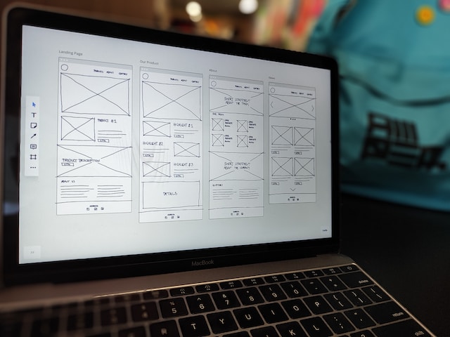
- Transfer sketches to digital wireframes: Now that you have discussed your paper wireframes with your team and stakeholders, choose a tool to turn those ideas into digital wireframes.
- Iterate digital wireframes: Once you’ve received feedback on the digital wireframes, iterate and improve your design. At this point, your team may also want more details added to the frames.
- Final hand-off: With approval, hand off your wireframes to the development team to see it slowly come to life.
Remember, wireframes serve as a visual representation of the structure and functionality of a digital product. Don’t get too tied down to visual details, as that will come later on. Also, don’t get too attached to your wireframes, as they will evolve with feedback and changes in project requirements.

Low-Fidelity Wireframes
We have to cover the basics of creating a wireframe, but let’s also go over the three different types of wireframes you might create or see.
Low-fidelity wireframes include sketches of web pages or apps or brainstorming layouts on paper. Commonly used early on in the design process, sketching low-fidelity wireframes brings a lot of value.
The Importance of Initial Sketches
Some designers may skip this step and create digital wireframes, but sketching allows you to brainstorm all the possible layouts. You can distinguish which ideas will not work and which you may want to explore further.
You might even think of new ways of structuring something through sketching since you get to see different ideas on paper. Also, iterating sketches is much easier and faster to edit than making changes on digital wireframes.
What To Sketch in Low-fidelity Wireframes
To make sure low-fidelity wireframes focus on the basic structure of a website or app, these sketches avoid detailed drawings. Rather, you will see common sketch elements for different components.
For example, instead of drawing a detailed image to display on an app screen, you would represent the intended image placement by drawing a box with an x through it. Buttons also follow a box shape with a CTA (call to action) inside. Later, while creating high-fidelity wireframes, designers add a shadow behind the box to indicate that it is a button.
Representing icons follow similarly to an image. It would be a circle or small square with an x through it to indicate that an icon would go in that spot on the screen. Since low-fidelity wireframes represent the bare bones, there is no need to create the text that will appear on the screen. So, instead of writing out the text on the wireframe, you can use a line to represent the text.
Remember, low-fidelity wireframes focus on the layout and structure rather than incorporating visual details. Also, at this stage, it is easy to test and iterate what may be the best layout for your users. Adding some details to the side of your sketches helps stakeholders and other team members understand the design.
Mid-Fidelity Wireframes
After obtaining approval for their low-fidelity wireframes, designers progress to refining the sketches. They give them a polished appearance using various tools. Mid-fidelity wireframes still focus on the layout and functionality of the app or website. Therefore, inputting a lot of details is not necessary.
At this stage, color also should not be a focus. The design team focuses on the user flow and overall page layout using black and white or grayscale in mid-fidelity wireframes.
Instead of using a line to represent text, one can use placeholder text, such as lorem ipsum. When placing text on mid-fidelity wireframes, there is no need to think about which typography to use. A generic font works well at this stage; later, the visual designer or design team can focus on the branding aspect. Even though designers do not select typography and colors at this stage, they can still focus on scaling the screens. This includes evaluating the visual hierarchy by considering the positioning of elements and spacing.
Just like with low-fidelity wireframes, mid-fidelity wireframes give a visual representation of the layout and flow of the app or website. At this stage, stakeholders and team members give feedback to improve the design before polishing it even further.

High-Fidelity Wireframes
Once designers receive the green light on their mid-fidelity wireframes, they design high-fidelity wireframes. Designers incorporate colors, typography, images, and other interface elements into the wireframes during this stage.
The wireframes start resembling what the final product will look like. There are no more instances of placeholder text or images. Also, designers polish these refined wireframes enough to create a prototype for user testing.
Depending on the size of the design team, UX designers may collaborate with visual designers or UI designers at this stage. Remember that the team must establish the product’s branding before creating the high-fidelity wireframes.
UX Wireframe Examples
Let’s look at some UX wireframe examples to make all of what we learned here easier to understand.
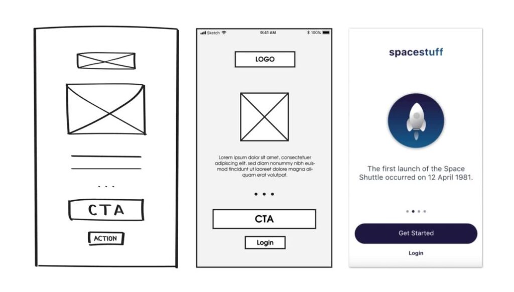
Let’s pretend we’re creating the onboarding screens for a fictional app about space. During onboarding, a sign-up screen is most likely necessary, so we will focus on just this particular screen for our example. Note that most designers create wireframes for an entire flow, not just one screen.
What are some elements we want on this sign-up screen? Probably a call-to-action button that makes it easy for users to sign up. Also, including the logo, an image, and some text may be valuable. Again, this is fictional, and you should design for your particular project goals.
Designers may sketch several different sign-up screens and get approval for one. Then, you would turn your low-fidelity sketch to mid-fidelity. Once the team marks the mid-fidelity wireframes with a stamp of approval, apply the visual design elements to the high-fidelity version.
In the picture above, you can see the transition from low to mid to high-fidelity wireframes. From sketching to using wireframing tools, you can create your next set of wireframes, too!
Get Inspired To Create Your Next Wireframe With Page Flows
Wireframes stand as a foundational blueprint in the realm of UX. These skeletal representations help ideas turn into clear and functional structures. Not only do they aid in visualizing the whole team, but they facilitate rapid iterations. This step in the UX design process helps refine and shape the product. To take high-fidelity wireframes closer to the final product, most teams will turn them into a prototype for user feedback. But that’s a whole other part of the UX design process.
Stay ahead of the curve with the latest design trends. Begin your wireframing journey today and turn your ideas into intuitive, user-friendly interfaces.
Ready to elevate your wireframing game? Unleash your creativity by exploring Page Flows, your go-to resource for crafting seamless user experiences. Dive into our expanding library of user flow recordings and get inspiration from proven products today.