Regardless of industry or size, all brands want the same thing—to stand out to their target audiences. And what better way to stand out than by employing designers to create the perfect color palette?
But for designers, creating a color palette takes more than just mixing random colors and seeing what works.
In today’s guide, we’ll show you how to make a color palette the right way.
What Is a Color Palette?
Let’s start by answering the ultimate question: What is a color palette?
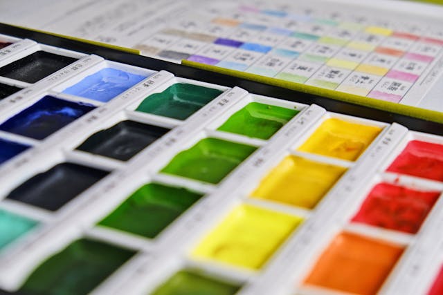
A color palette is a combination of colors that UI designers, graphic designers, and artists use during design projects.
In the case of UI design, to create a color palette is to create a more engaging user interface. But designers don’t just take a stab in the dark when it comes to creating color palettes. Imagine what the user’s experience would look like if they did.
Instead, they use color theory to help them establish a consistent brand identity and appeal to their target users.
Let’s talk a little more about the basics of color theory.
Color Theory: A Rundown of the Basics
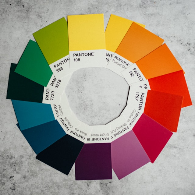
Sir Isaac Newton developed color theory when he created the first color wheel in 1666. And although we still use the color wheel model today, the original color wheel consisted of little detail. In other words, only primary, secondary, and tertiary colors took center stage.
Fast-forwarding to the present, we’ve fleshed out that color wheel. The modern color wheel contains more intricate color characteristics, such as hues, tints, shades, tones, and temperatures.
Below we have listed some of these color variants.
- Hues: A pure color that doesn’t contain any tints or shades. All primary and secondary colors are hues.
- Tints: A color that you make lighter by adding white.
- Shades: A color that you make darker by adding black.
- Tones: A color in which you add equal amounts of white and black (neutral grey).
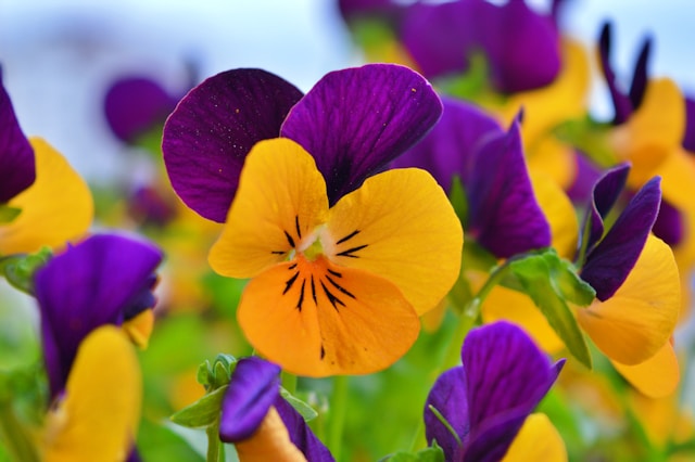
- Color temperatures: Temperature describes the warmth or coolness of a color. This means that you can use warm colors (red, orange, and yellow) or cool colors (green, blue, and purple). You can also opt for neutral colors (brown, black, and white).
Color Schemes vs Color Palettes
When you create a color palette, you need to know that color schemes and color palettes aren’t the same thing.
A color scheme describes ways in which a designer chooses and combines specific colors. However, color palettes refer to the colors that you choose based on your color scheme.
So, when it’s time for you to make a color palette, consider the following schemes:
- Monochromatic: In this scheme, you only use one color. It sounds pretty weird for a color scheme, right? But the idea is that you use the various tones of that singular color to create your color palette.
- Analogous: With analogous schemes, you’ll use three to five colors that sit next to each other on the color wheel.
- Complementary: For this scheme, you’ll use two colors that sit opposite each other on the color wheel.
- Split-Complementary: To achieve a split-complementary color scheme, you start with two complementary colors. Out of your pair, choose one color that you’d like to soften. Then, choose colors that sit on either side of that color.
- Triadic: Form an equilateral triangle on your color wheel. Then, look at the three colors that your triangle’s corners land on. These are the colors that you use in a triadic color scheme.
- Tetradic: For tetradic color schemes, you’ll choose four colors that are two sets of complementary pairs.
How To Make a Brand Color Palette
So, let’s get down to the nitty-gritty, how to make a brand color palette.
Below, we’ve revealed how to create a color palette that perfectly captures the essence of your client’s brand.
1. Getting To Grips With Color Psychology
Knowing the basics is a great first step. But knowing about color psychology will really help you establish a brand that users instantly recognize.
Color psychology is the study of how colors influence our moods and perceptions, making it a powerful marketing tool. For instance, red symbolizes excitement, passion, and love, while pink represents youth, playfulness, and romance.
The more you understand color and its symbolism, the easier it will prove to create effective palettes.
2. Conducting Crucial Research
You need to research your users and your competitors.
Utilize UX research methods to find out more about your users’ needs, wants, and expectations. This will help you get a better idea of how you should convey your brand to your target users.
Next, look at how your competitors are using color to reflect their brands. Examine their content for patterns and investigate how their users feel about their designs via user surveys or reviews.
Then, find out what sets your brand apart from theirs. This will help you determine how you can represent your uniqueness with color psychology.

3. Brainstorming Ideas
It’s time to ideate!
To find the right color schemes, create mindmaps or lists of all of the vital aspects of your brand. These keywords and characteristics will help you come up with the colors that will reflect your brand’s values.
Consider how you want your users to feel and what you want users to take away from your services. For instance, if you were selling gardening products, you could use a mix of floral colors.
No matter what you sell, pick your primary color – the color that people associate the most with your brand. Then, pick secondary colors that suit your brand’s main color, personality, and values. After consulting the color wheel and other palette tools, you’ll have a perfect color palette.
All you need to do now is create a brand style guide!
How To Create a Color Palette in Canva
Now, you know how to create a brand-specific palette. But that won’t do you much good if you don’t know how to create such palettes in your go-to tools.
Let’s start with one of the most popular toolboxes for designers and artists alike – Canva.
Below, we’ve discussed how to create a color palette in Canva.
1. Getting Set Up
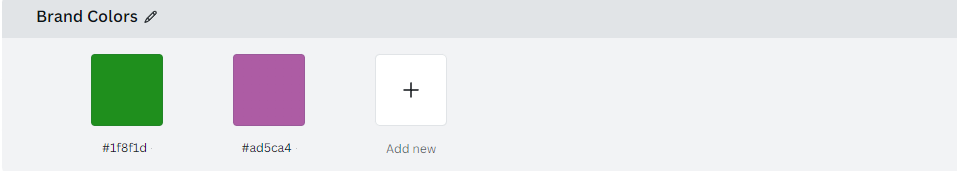
You’ll start by going to your Canva Pro account and clicking on the Brand Kit category. You can find this category on the sidebar menu on the left-hand side of the screen.
Once you click on that category, you’ll see a new dropdown menu containing options like Color, Logos, and Fonts. From here, you can either click on the Color category or scroll down the user interface.
2. Creating a New Palette
Under the Color Palettes section, you’ll see a small line of grey text that reads + Add new palette. Click on this option and name the palette. You will then see a white box with a + sign inside it. Click on this box, and a pop-up will appear near it. This pop-up contains a color wheel, sliders, and a HEX code.
Tip: HEX codes are a hexadecimal format that allows you to identify colors.
Simply move the small white circle around the color wheel or up and down the slider, if you prefer. By doing this, you’ll find the right color with virtually no effort.
If you prefer neither option, don’t worry, as you can easily input the correct HEX code in the pop-up, too.
Once you’re happy with the color, you can move on to the next blank box and repeat the process.
3. Applying Your Color Palette
Go back to the sidebar menu where you found the Brand Kit category.
This time, you are going to click on the category below it: Brand Templates. Then, all you have to do is pick a template. Once you’re happy with your choice, go to the upper half of the screen after clicking on a specific element.
You should see a small, colorful square at the top left of your template screen. Click on it and select any of the colors in your palette. Your chosen element will then change to the color within said palette.
Repeat this process until every element of your template looks how you want it to. Voila!
How To Create a Color Palette in Illustrator
Canva can’t take all of the spotlight, so let’s move on to Adobe Illustrator.
If you want to learn how to create a color palette in Illustrator, read our instructions below.
1. Starting With Moodboards
We recommend creating mood boards that contain colors or styles that inspire you. Afterward, you’ll start to see which colors best suit your objectives.
Pick one main color from your mood board – this will serve as the dominant color in your palette.
2. Creating Your Swatches
Now, you can open your digital mood board in Adobe Illustrator.
At this stage, you’re only creating swatches of your main color, so you’ll need the Eyedropper tool. From here, you should open up a new Artboard.
Use the Ellipse tool to create a circle in your chosen color. You’re going to need some space, so we recommend putting that circle on one side of your Artboard.
For now, focus your attention on the other, blank side of your Artboard.
Using the darkest or lightest shade (or opposite hue) from your mood board, create another circle.
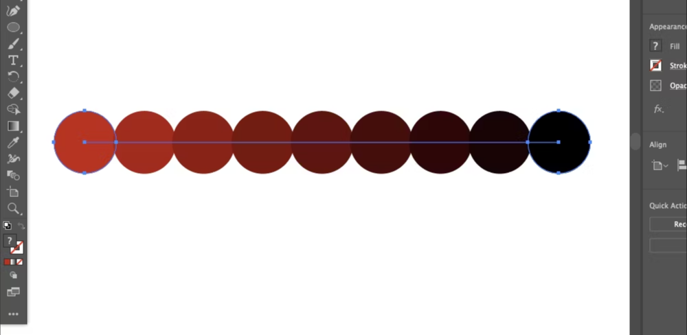
3. Blending Your Swatches
You have two very different swatches. Now, it’s time to blend them to create the most cohesive color palette possible.
Select your two swatches using the Selection tool while holding down Shift on your keyboard. Once you’ve done that, click Object > Blend > Make.
The result – you see a gradient of colors going from your first swatch to your second.
Let’s say you click on Blend Options in the Properties panel. You can explore how many colors exist between your two initial swatches. To separate these new swatches from one another without compromising their color, click Object > Blend > Expand.
If you want to separate the swatches even further, all you have to do is right-click and select Ungroup.
Now, you can take the best swatches and make a finalized color palette!
How To Create a Color Palette in Photoshop
Last but not least – Adobe Photoshop.
We’ve also explored how to create a color palette in Photoshop, and it’s easier than you think. Just follow these steps:
- Open Photoshop.
- Open the image from which you would like to take your sample colors.
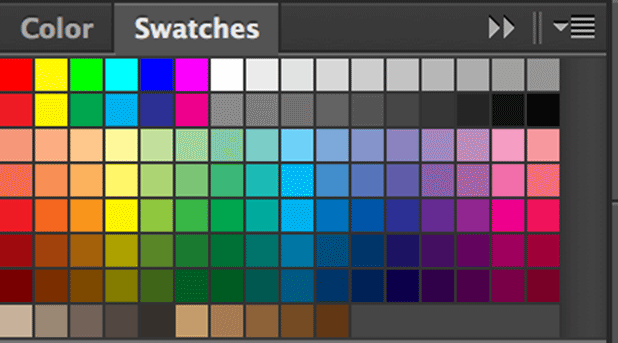
- Look to the Color Swatches panel in the top right-hand corner of your workspace. This is your default palette and appears as a group of squares in a grid formation.
- Delete any unfavorable color swatches by going to the hamburger menu in the top right-hand corner of your panel. A menu will appear, and you’ll need to click on the Preset Manager option.
- Left-click on the first color, select Delete and click Done.
- Activate your Eyedropper tool and click on the image’s color that you want to use.
- Move your Eyedropper to your empty Swatches panel, then left-click. You’ll now see the first swatch of your palette.
- Name your swatch and repeat the process until you have a full palette.
- Go into the Swatches dropdown menu and click on the Save Swatches option.
- Give your new color palette a name, and you’re good to go!
Creating a Color Palette: Using a Color Palette Generator
When in doubt, you can always experiment with a color palette generator.
Below, we’ve listed some of the best color palette generators to inspire your inner artist.
- Coolors
- Canva
- Adobe Color
- ColorSpace
- Colormind
- Khroma
How To Make a Color Palette: Final Thoughts
We hope that you feel more confident when creating stunning palettes.
Keep your client’s objective and target users in mind, and you can’t go wrong with your color palette! However, establishing a favorable brand identity requires more than aesthetic colors. You also need exceptional user flows. Enter Page Flows.
Page Flows hosts over 5,500 user flow recordings of successful products from respectable brands like Disney and Google. We also collect screenshots and emails when we record user flows so you can communicate with your users effectively!
With us, you won’t just watch new design trends unfold; you’ll learn how to create them.
So now that you know how to make a color palette, it’s time to learn how to perfect the user’s journey through your products.
Get started today to learn how to give your users the best digital experiences with your brand.