Every choice you make can affect how people use your app. Every detail matters, down to your colors, font, and more. This even includes how well you use the device’s own features.
But what are the most well-designed apps on iOS and Android? And what are the major red flags when making an app of your own? Find out in today’s guide!
Key Features of the Most Well-Designed Apps
Every app is unique, and each one has its own design philosophy. However, there are still a number of features and choices that showcase a designer’s priorities. Here are signs of strong UI and UX design in mobile apps:
- User-centered approach: The app must focus on the end user at every stage. This may mean getting user feedback. A good designer will always take this on board.
- Easy navigation: Good mobile apps are simple to use. They’ll let you quickly get from point A to point B. They should clearly display the pages you’ll use most often.
- Purposeful: Well-designed apps have a simple interface. Everything on the screen must have a reason to be there. If it doesn’t, the end result might be too “busy.”
- Adaptability: The app should adapt to other platforms with ease. This includes different screen sizes. Without this, the text could be too small to read on some devices.
- Uniform design: Similarly, the user interface must stay consistent at all times. Icons and buttons, for example, shouldn’t use the same logo to mean different features.
- Simple setup: New users must be able to set up the app with ease. If they can’t, this will stop them from using the app to its full potential.
- Clear error messages: An app must have clear visual elements for showing an error. It must explain what went wrong. If possible, it’ll tell the user how to fix it.
Why Good App Design Matters
When making an app, you’ll want to keep users engaged. They must be able to use the app and not run into any major problems. They’ll then be able to finish their tasks a lot faster.
Usability is at the core of successful app design. Someone must be able to get to grips with your app in no time. This again relies quite heavily on the setup process.
Without good onboarding, a user might not even know the app’s full suite of features. In extreme cases, they’ll struggle to use it at all.
A focus on user engagement will also keep users coming back. Depending on the app, it’ll even drive more sales. According to Jakob Nielsen, apps that spend 10% of their budget on UX boost sales by 83%.
No app should neglect the end-user experience. By embracing the signs of well-designed phone apps, you’ll only help your next release.
What Are the Most Well-Designed iOS Apps?
There are a wide range of apps which are only for iOS devices. They use the platform’s features to deliver the best possible app experience. Here are three examples of great iOS app design.
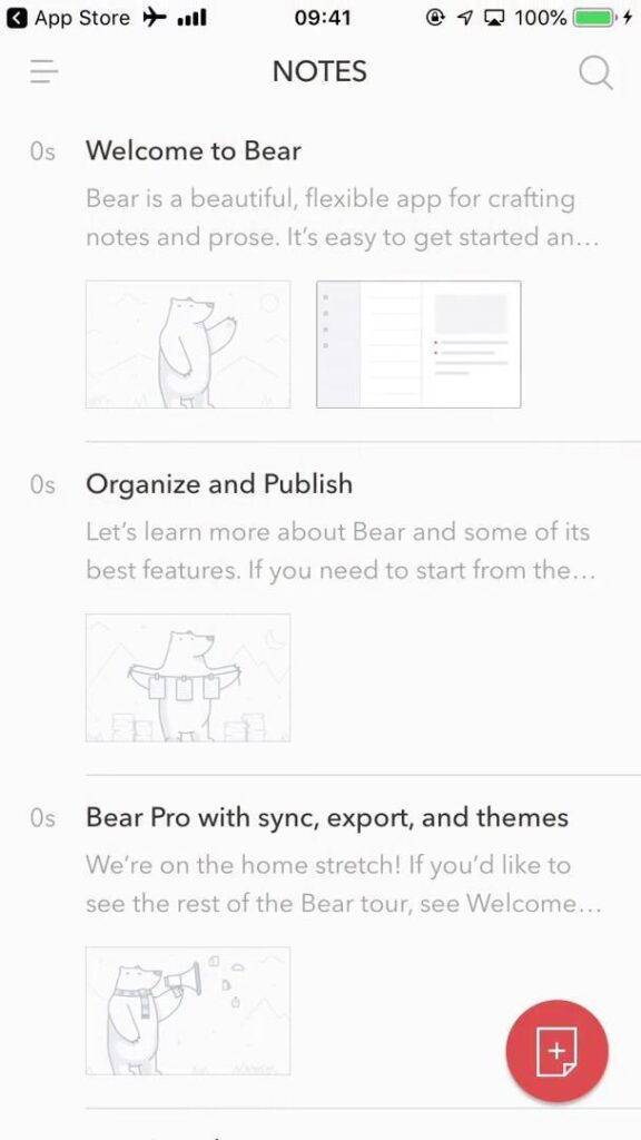
1. Bear
Bear is a simple note-taking app only on iOS. It boasts a clear design with various color scheme options. The notes work via tags, making it easy to categorize everything.
The app’s premium option also allows full iCloud syncing. From the ground up, it makes use of Apple’s Human Interface Guidelines.
2. Things
Many see Things as one of the best task management apps. The app’s minimalist design is a major part of this. It also integrates well with other iOS features.
For example, messages you set in the Things app will be available via Apple Reminders. It also syncs to other Apple devices.
3. Darkroom
This photo editing app connects directly to Apple’s gallery. This means users won’t need to add pictures manually. They can also use Siri Shortcuts to automate their tasks.
The clean UI fits well within the iOS ecosystem. Its mobile-first design also lets people use the app entirely with their thumb.
What Are the Most Well-Designed Android Apps?
Android phones also have apps that rely on the operating system’s features. Here are three key examples of great Android mobile app UI design.
1. Tasker
This app lets users automate their own phone’s tasks. They’ll then have a lot more control over the device’s features. This means it integrates with the phone’s API.
You can place tasks as widgets on the home screen. Tasker’s app factory even lets users export projects as separate apps.
2. Niagara Launcher
This app replaces the Android home screen. Niagara Launcher has a strong focus on one-hand design. This means anyone can more easily use it on-the-go.
Niagara Launcher relies on Android’s more open home screen design. Its customization options on this front allow it to maintain an immersive experience.
3. Solid Explorer
Solid Explorer helps users better and more easily manage their files. This uses the device’s file system access. Its sleek interface perfectly suits Google’s Material Design goals.
The app’s dual-pane file management is ideal for devices with bigger screen sizes. However, it’s also perfectly scalable for smaller phones.
How an App’s Industry Affects Design Standards
Apps all have different priorities. What counts as good design in one field might not be the same for another. For example, a fitness app may focus more on gamification. This helps people track their progress while working out.
Similarly, banking apps will have stronger security than many other apps. This doesn’t mean the other apps aren’t secure enough for their usual tasks. Banking apps, however, will be handling a user’s private details.
Retail apps will also use a sales-centric design. Every detail will aim to drive the user towards the checkout process. This includes highlighting offers at key points of the user funnel.
There are some design principles that are consistent across every field. For example, all mobile apps need a strong visual hierarchy. They must clearly signpost the most important elements.
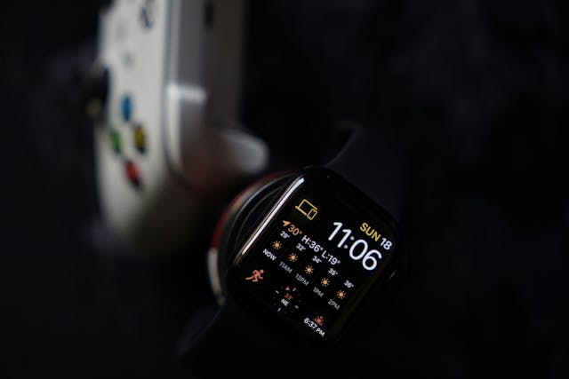
Case Study: Most Well-Designed Weather Apps
Let’s look more closely at a specific field. This helps us highlight design choices that bring these apps together, while making sure each one’s unique. With this in mind, here are four of the best weather apps.
1. AccuWeather
This app places its MinuteCast feature front and center. This lets people access up-to-date data as soon as they boot it up.
Like any well-designed app, it also has good customization. Users only see the stats (humidity, wind speed, etc.) that are relevant to them.
2. The Weather Channel
With the Weather Channel, users can get notifications for specific weather events. This is really helpful if their plans depend on clear skies.
One of the app’s core interactive elements is its Maps features. Users can see real-time weather patterns via satellite and radar.
3. Yahoo Weather
Yahoo’s weather app puts a strong focus on visuals. For example, it uses Flickr backgrounds to show your current weather conditions.
For ease of access, users can check their weather almost tap-free. You can seamlessly switch between locations and see more details just by scrolling.
4. Weather Underground
Weather Underground uses information from real users to help its forecasts. This makes its data more accurate and turns the app into a community.
The UI is clean and accessible, though power users have more options. This includes air quality details and past weather data.

Finding Inspiration for App Design
Good UI inspiration can come from anywhere, no matter your industry. Any of the above options could help you bring your next app idea to life.
To this end, it helps to look at UX case studies and user flows. These can show you exactly how popular apps fixed common design problems.
Even the most well-designed apps run into roadblocks. Checking how other devs and designers approach the issue is often a big help. Case studies, in particular, include a written outline of their design process.
Your users’ needs should be at the heart of any app. In many ways, this will be the North Star of an app designer’s approach. To check this, carry out user interviews or get someone to test your prototype.
Common App Design Red Flags: What To Look Out For
Strong app design isn’t just about ticking certain boxes. It’s also about avoiding common pitfalls. Here are seven key red flags to watch out for when making an app:
- Cluttered interface: A busy UI will try to fit too much on the screen at once. This doesn’t just make navigation harder. It also causes high cognitive load. It is better to have a simplified design.
- Too much white space: If your app has a lot of empty space, this can distract users. It’s important you only use this in moderation to help readability.
- Limited onboarding: It’s hard to strike the right balance with an app’s setup. Don’t hold the user’s hand too much, but make sure they know the main features.
- Overuse of animations: Technological advancements make flashy graphics easier than ever for phones to handle. Using too many of them can still slow the app down.
- Slow loading: On this note, make sure the app loads quickly. If it takes more than just a few seconds, users will get impatient. They might stop using the app entirely.
- No clear feedback: Pressing a button should give the user feedback right away. Without this, they won’t know if the app even noticed their input.
- Poor scaling: The app must scale to different devices. Many of these will have different screen sizes. If your app doesn’t adapt, text or buttons could be too small.

Design a Great App With Page Flows
Most well-designed apps follow certain design principles. Learning these will really help you put a great app together.
However, it may be more helpful to see these design choices for yourself. Page Flows can show you how popular and niche apps alike set out their UI.
Our user flows highlight exactly how an app’s features all fit together. Try Page Flows today, and get great inspiration for your next project.
Frequently Asked Questions
What makes an app well-designed?
Great mobile app designs keep the user in mind at every stage. They’re visually appealing, but never at the cost of functionality. Users must be able to navigate and actually use the app with ease.
What are some examples of well-designed apps?
Plenty of popular apps stand out as great design examples. Slack, Notion, Duolingo, Figma, and PayPal each fill their niche incredibly well. They all mix intuitive interfaces with useful features.
What is a good app color scheme?
The right color scheme for your app should fit your branding. If your logo has vibrant colors, this is worth keeping i
Is UI or UX more important in app design?
Both of these are key for any successful app. In many ways, they overlap. How you design your UI will affect how easy it is for people to use.