With my years of UX practice, I learned that the most important thing in designing is to first understand user psychology. When you’re able to step into the user’s shoes, your designs will come more naturally by being able to address the user’s goals, needs, habits, and concerns.
This is true in the world of online shopping. In physical stores, I can touch and interact with products. But when I shop online, stores have to use different things to guide me through buying. By looking at how online and offline shopping are different, I can create online checkout experiences that feel natural and persuasive. This can boost sales and make customers happy, so they keep coming back.
In this article, I’ll be taking a deep dive into e-commerce checkout best practices. First, I’ll review the psychology of shopping, cover essential design patterns, and then discuss the user flow considerations that drive conversion. I will also explore e-commerce website designs. So, let’s dive right in!

The Psychology of Shopping Online vs. in Person
Let’s first discuss how shopping is different online and in person. Understanding the differences will be crucial for designing effective checkout experiences.
In physical stores, I’m motivated by instant gratification. I can see and touch products. Customer service is almost always available to answer my questions. I can walk away immediately with a purchase without waiting for delivery.
Online, I’m drawn in by convenience, selection, and good prices. I can buy things anytime, anywhere. However, since I can’t see the products, I have to rely on product info and pictures. If I’m unsure or think there’s a risk, I might not buy anything. To trust an online store, I look for honesty, reviews, and security badges. I want detailed product descriptions and clear policies.
With all of this in consideration when designing e-commerce checkouts, we can better understand the user’s mental model to cater to specific personas. We have to make sure that there’s enough information and transparency to guide the user forward.
How To Set Clear Expectations From the Start
When I shop online, I want to have a positive experience that leads to a successful purchase. It’s important for online retailers to set clear expectations from the beginning. This starts with giving me transparent and detailed product information.
I want to see high-quality images and read comprehensive descriptions. Any relevant specs or dimensions should also be included. Here is additional information I include in my checkout designs.
1. User reviews
These sections are also valuable to me. They provide social proof and insights from other customers. This helps me feel more confident in my purchasing decisions. It reduces the risk of disappointment or returns later.
2. Q&A sections
Besides product information, retailers should also prepare me for a smooth checkout process. They should provide clear information on pricing, shipping options, and return policies early on. By addressing common questions and concerns upfront, retailers can reduce my hesitation or abandonment later.
3. Progress bars
Progress bars and small helpful text can guide me toward completing my purchase. A progress bar shows me how many steps are left in the checkout process. This helps reduce my anxiety and encourages me to finish. Confirmation messages and estimated delivery dates build trust and excitement around my purchase.
4. Delivery time
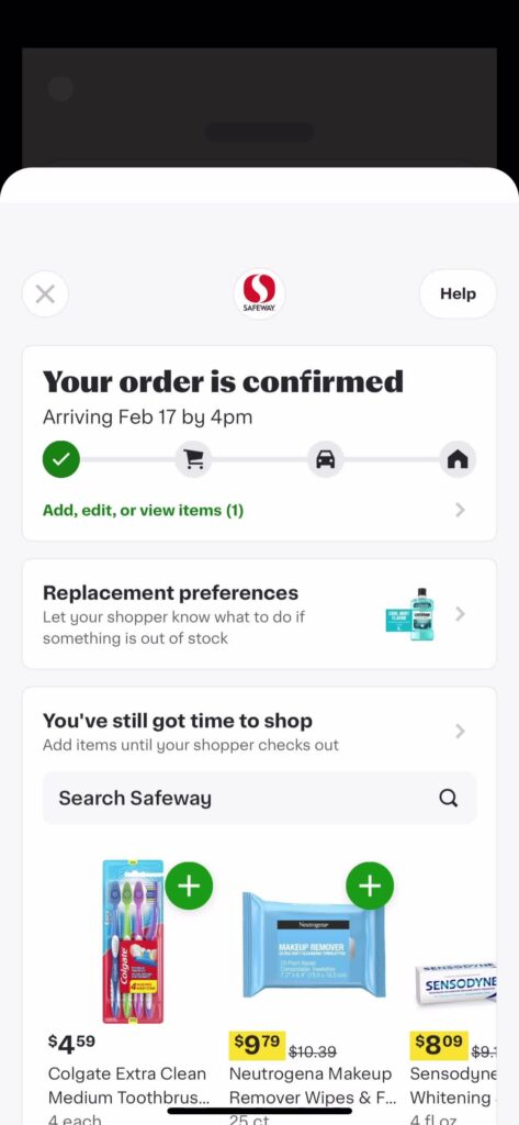
Lastly, setting clear expectations around delivery and fulfillment is crucial for my satisfaction and loyalty. Online retailers should be transparent about estimated shipping times and any potential delays. They should provide real-time tracking information to keep me informed and engaged after my purchase. Safeway does this well by using a progress bar and a clear microcopy of delivery time.
By setting clear expectations and communicating proactively about fulfillment, retailers can ease my worries and build trust. This creates a positive experience after my purchase that encourages me to buy again and recommend the retailer to others.
Essential Checkout Design Patterns That Drive Results
Let’s briefly look at a few best practices for e-commerce checkouts. Through years of testing and iteration, I’ve identified several checkout design patterns that consistently perform well across different industries and user demographics. The most effective UI checkout designs share these characteristics:
- Prominent call-to-action buttons that stand out visually
- Clear visual hierarchy that guides users through the process
- Minimal distractions with removed navigation and footer elements
- Smart form layouts that reduce cognitive load
- Consistent spacing and alignment for improved scanning
- Mobile-first considerations for thumb-friendly interaction zones
3 Ways To Reduce Checkout Abandonment
In my work on e-commerce sites, I’ve seen how checkout abandonment can be a big problem. The average abandonment rate is around 70%. That’s a lot of lost sales. Here are some ways to encourage users to complete the checkout process.
1. Set Clear Steps With Minimal Distraction
Busy checkout steps can cause distraction, for example, offering other similar products users may like. Too many choices or steps can cause decision fatigue. It makes people give up. Simpler checkout processes with clear next steps can help.
2. Remove Friction for a Smoother Experience
Friction is anything that slows me down during checkout. Multi-page checkouts, slow loading, and confusing navigation are all friction points. They make me more likely to abandon my cart. Removing friction creates a smoother experience.
3. Be Upfront About All Costs
Unexpected costs, like hidden fees or high shipping, have definitely made me abandon purchases before. It feels misleading and makes me trust the retailer less. Being upfront about all costs is important.
Core E-Commerce Checkout Best Practices That Drive Conversion
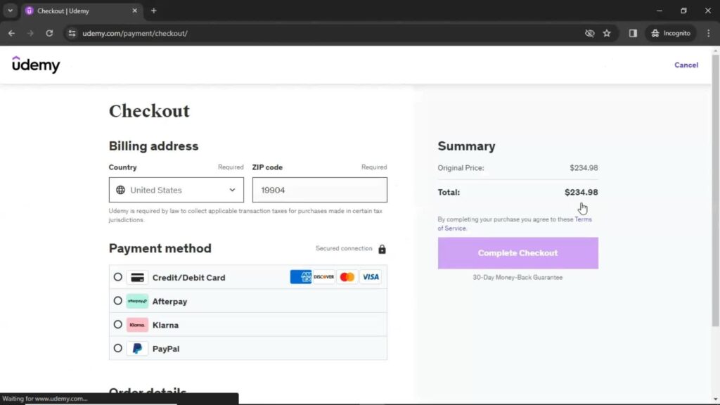
Now that we have a better grasp of the customer journey let’s take a look at practical strategies for e-commerce checkouts. The first thing that pops to my mind is providing different payment methods like Udemy. Below are some other core techniques I use to create checkouts that align with user psychology and drive results.
Create an Intuitive, Linear Checkout Flow
A successful checkout is clear and intuitive. It guides users towards completion with minimal friction. I minimize the number of steps and form fields. I use clear calls to action and visual cues. I break up complex processes into smaller, manageable chunks.
Cater to Different User Preferences and Needs
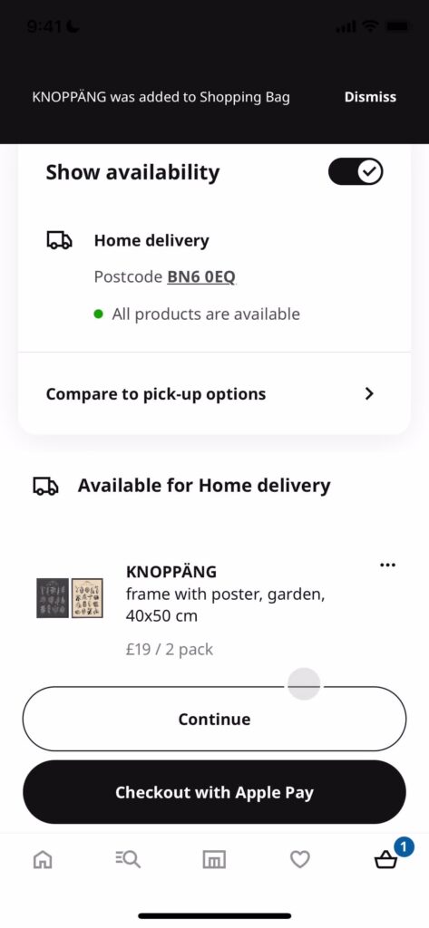
Customers have different preferences for payment methods, shipping, and account creation. To maximize conversions, I try to cater to as many preferences as possible. One example is offering home delivery and pick-up options, like Ikea.
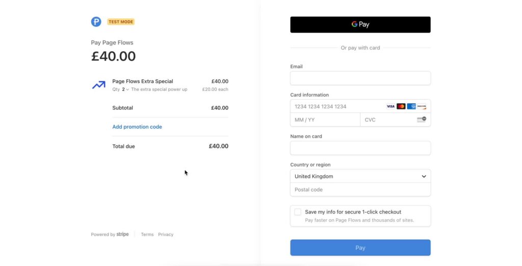
I offer multiple payment options like credit cards, PayPal, and digital wallets. I provide a guest checkout for users who don’t want an account. I use saved information to streamline repeat purchases.
Optimize Checkout UX for Mobile
More and more users are shopping on mobile devices. I prioritize a mobile-first approach to checkout design. I simplify the process even further for designing UI for the smaller screen. Like Shein’s mobile experience, I design for larger tap targets and easier form navigation.
I minimize typing and scrolling. Mobile users are often on the go and have shorter attention spans. I create a fast, easy, frictionless checkout experience.
Provide Reassurance and Reinforcement
Buying online can feel like a leap of faith. I provide reassurance and reinforcement throughout the checkout process. I use trust badges and security badges to signal safety. I provide clear error handling and real-time validation.
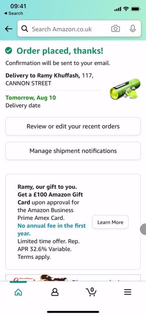
I use microcopy to confirm successful form submissions and guide users. Amazon provides a picture of the product, delivery address, and expected delivery date on their confirmation page.
Identify and Address Potential Roadblocks
Even small obstacles can lead to abandonment. I proactively identify and address potential roadblocks. I ensure form fields are clearly labeled and easy to understand. I provide options to save billing and shipping info for future purchases like Stripe. I offer one-click or express checkout for repeat customers.
Encourage Completion with Persuasive Design
In addition to removing barriers, I use persuasive design techniques to encourage purchase completion. I create a sense of urgency or scarcity, like “Only 3 left in stock!” I use social proof, like “Over 1,000 happy customers.”
I offer incentives like discounts, free shipping, or bonus items. I tap into psychological principles like loss aversion and fear of missing out. This motivates customers to take action and complete their purchases.
Ensure Visible Price Breakdown
Yes, this is so important I must mention it again. Hidden shipping costs are conversion rate killers. I always ensure that the total price breakdown is visible throughout the checkout process, with clear labels for each component, including any discount codes that might be applied.
How To Build Trust Through E-Commerce Checkout Flow
The post-purchase phase is equally important for building long-term customer relationships and driving repeat business. Here are some key strategies I consider when designing a post-purchase experience.
1. Provide Confirmation and Closure
After completing a purchase, customers want reassurance that their order was successful. They want to know that they can expect to receive their items as promised. Confirmation pages and transactional emails play a key role in providing this closure and setting expectations around the next steps.
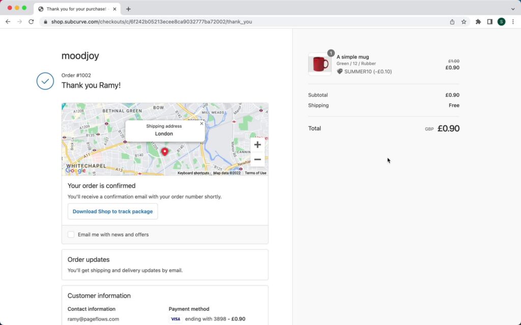
These touchpoints should include clear order details, an estimated delivery date, and any relevant tracking information, as well as clear calls to action for what the customer should do next (e.g. “Track your order,” “Shop for related items,” etc.). Shopify does this well by using a map to confirm the delivery address as well as a reminder of total fees.
2. Nurture the Customer Relationship
Beyond the sale, the post-purchase phase is also an opportunity to nurture the customer relationship and encourage ongoing engagement with the brand. This can include things like providing thoughtful onboarding and product education materials, offering personalized recommendations based on the customer’s purchase history, and proactively reaching out with support or troubleshooting information to address potential issues before they arise.
3. Gather Insights to Optimize Designs
E-commerce retailers should also use the post-purchase phase as an opportunity to gather insights and feedback that can inform future optimizations. This can include things like post-purchase surveys, product reviews, and user testing to identify areas for improvement and gain a deeper understanding of customer needs and preferences.
By continuously gathering and analyzing this feedback, retailers can make data-driven decisions that improve the overall customer experience and drive long-term success.
4. Close the Loop with Customer-Friendly Policies
Finally, e-commerce retailers must have a clear and customer-friendly returns process in place to close the loop on the post-purchase experience. A smooth and hassle-free returns experience can actually strengthen customer trust and encourage repeat business, even if the initial purchase wasn’t quite right.
By offering easy returns, clear communication, and proactive support throughout the process, retailers can turn a potentially negative experience into an opportunity for customer recovery and long-term loyalty.
Here is my personal checklist when I’m considering e-commerce checkout flow best practices:
- A complete order summary
- Shipping address verification
- Delivery time estimates
- Clear next steps
- Order tracking information
- Customer service contact options
Emerging Trends To Improve the E-commerce Checkout Experience
With the advancement in artificial intelligence (AI) and progress in other technologies, I’m seeing several emerging trends in e-commerce checkout design:
- Voice-guided checkout experiences
- AR-powered product verification steps
- Biometric payment confirmation
- Social proof integration during checkout
- Real-time inventory validation
While these features may initially seem exciting, I would reconsider the long-term impact on inclusivity, accessibility, and privacy.
Take Your Checkout Experience to the Next Level With Page Flows
I know that designing an effective e-commerce checkout experience requires a deep understanding of the psychological principles. By recognizing the key differences between online and offline shopping mindsets, anticipating and addressing common barriers to conversion, and providing clear communication and support throughout the process, retailers can create checkout experiences that align with customer needs and expectations.
Whether you’re a veteran or a beginner, understanding checkout psychology and best practices can help you create experiences that convert and delight customers. Put these e-commerce checkout best practices into action and see the impact on your bottom line.
At Page Flows, we help designers and product teams create better user experiences through our extensive library of UX pattern analysis and checkout. Ready to transform your checkout experience? Explore the Page Flows detailed UX pattern library and checkout flow analysis today.
Frequently Asked Questions
Which checkout flow design is most effective?
A linear, progressive checkout flow typically performs best, breaking the process into clearly defined steps. The most effective designs minimize form fields, maintain visual continuity, and keep users informed of their progress throughout the process.
How do I make a good checkout page?
Focus on minimizing distractions, displaying shipping options clearly, showing security indicators, and providing real-time validation. The key is reducing friction points while maintaining user trust through transparent pricing and clear progress indicators.
What is the best converting checkout in the world?
Amazon’s checkout process consistently achieves the highest conversion rates through their one-click ordering, stored payment information, and clear delivery expectations. However, the best approach depends on your specific audience and product type.