
In the UI/UX industry, things change as technology evolves. Even when you think you know everything about your job, something new will come up. In recent years, dark mode design has emerged as a new battle to contend with.
Designing for low-light modes isn’t just inverting the colors you use on a regular design. In fact, there are several factors you need to consider to make your design pop. What’s more, if you don’t consider things like readability, it can negatively impact the user experience.
Here’s everything you need to know.

What Is Dark Mode Design?
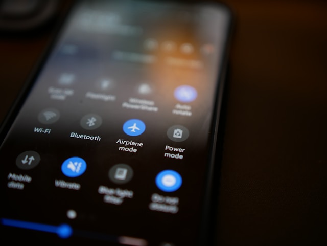
Dark mode refers to a low-light mode that users can activate on their device. It reverses the default white background to make the background black or dark gray.
While dark mode app design might seem like a modern convention, the dark background color dates back to early computers. Monochrome monitors used green text on a black background, conserving energy and preventing overheating.
However, since then, white has become the most common background for most devices. Initially, designers perceived black text on a white background to be more legible and natural.
Once again, the tables have turned and many users like to apply a dark theme to their devices. They do this for a variety of reasons, whether it’s aesthetic or practical. Regardless of their reasoning, designers now need to know how to design for dark mode. This way, they can provide their users with ample options for using their product.
Why Use Dark Mode Colors?
Switching to dark mode colors has a variety of advantages for users.
- Reduces eye strain: Dark mode can prevent eye strain, especially in low-light situations or in the evening. It reduces the amount of blue light produced by the screen, which is why it’s beneficial for the user’s eyes.
- Conserves battery life: On devices with OLED or AMOLED screens (laptops or smartphones), dark mode can save battery. The screen only lights up the pixels needed to display content, and using fewer pixels means using less power.
- Enhances aesthetics: Some users simply prefer the look of dark-mode website design. It can provide an elegant, luxurious feel for some sites and apps.
- Develops perception: In some situations, dark mode can reduce reflection from the screen. As a result, there’s a higher differentiation between the components and the background. It can make it easier to see what you’re looking for.
- Boosts user satisfaction: By providing more control over the user’s view, dark mode design can improve the UX. Users may also perceive products offering a dark theme as more innovative or modern.
Do You Need To Know How to Design Dark Mode UI?
With these benefits in might, it’s easy to see why dark mode UI design is so appealing. But is it a necessity for all designers? In short, for most modern apps and websites, it’s a good idea to learn how to design dark mode UI.
The vast majority of entertainment UIs have dark themes these days. This includes Smart TVs, mobile phones, game consoles, and so on. Users wind down with a lot of these devices in the evening, which makes low-light contexts common.
Many consumers are health-conscious and may feel concerned about Computer Vision Syndrome (CVS). One study discovered that more than 83% of Americans spend over two hours a day using digital devices, with 60.5% experiencing symptoms of eye strain.
In other words, to protect your users, it’s wise to introduce a dark theme. Ask yourself the following question: when will users be engaging with your product? You can create dark mode to:
- Support the user’s health during evening use
- Create a striking look
- Project a feeling of elegance or luxury
- Create a sense of power, mystery, or intrigue
- Focus and guide the user’s attention

How To Design for Dark Mode: Tips and Best Practices
Now, it’s time to learn how to design for dark mode. There are several factors you need to consider to make your dark theme pop. Here are nine best practices to keep in mind.
1. Be Careful With Pure Black
You might think that a black background is the natural choice for dark mode. However, pure black (#000000) can look harsh in contrast with other colors. It can also create pixelation or ghosting effects on OLED/AMOLED screens.
Instead, opt for dark greys or tinted blacks, reserving pure black for accents.
Similarly, you should avoid most pure colors. Pure white (#FFFFFF) can also create too much contrast in dark mode, leading to eye strain.
2. Alter Your Color Palette
Not all colors work well in dark mode. Even if they work with a dark background, they can convey slightly different meanings. For example, green can look less eco-friendly on a black background. Meanwhile, other colors might look more striking or aggressive if they’re too bright.
Adjust your color palette to suit the background. Try reducing the saturation, brightness, and opacity of your colors. In particular, opacity can make a big difference. So, when it comes to text, choose dim whites and light grays.
3. Focus on Difference
In dark mode, differentiation is your best friend. You need to create a difference between the background and the text, icons, and pictures. Try using WebAIM’s Difference Checker to judge the differentiation.
Ideally, your theme should meet the WCAG 2.0 and 2.1 rules. These are voluntary standards that you should consider upholding for accessibility purposes.
Remember, it’s harder to calibrate colors against a dark background than it is with light themes, so pay close attention.
4. Test Your Design
As with any UI/UX, it’s important to test your design again and again. Test it on different devices, screen types, lighting conditions, and so on. That way, you can ensure that your design works and provides a great experience for as many users as possible.
5. Use Negative Space
Often, designers talk about using ‘white space.’ This isn’t quite applicable to dark mode. Instead, you need to use negative space.
Simplicity is a key tenet of UI design. The more minimalist the interface, the easier it is for users to find what they’re looking for. It makes the page more scannable and easier to process, creating a better UX.
So, where possible, maintain the negative space.
6. Don’t Forget Brand Identity
Branding can be a difficult, time-consuming process. When you create a dark theme, your branding will look slightly different. As we mentioned, you may need to adjust your color palette and images.
However, this doesn’t mean that you have to lose your brand identity. Try out different methods, such as preserving your logo’s color and desaturating other UX elements. Generally, you should try to find a balance between transmitting your brand identity and making your dark theme pop.
7. Avoid Shadows
In many UI designs, shadows create an elevation effect. However, this doesn’t work as well in dark mode. If you want to use shadows, don’t make them darker than the background or it can be confusing. In fact, most users won’t even notice it.
Also, don’t use a shadow that’s lighter than the object itself. Doing so creates a confusing, distracting interface.
8. Adjust the Images
You’ll also need to adjust any images that appear on the page. Make sure they have an appropriate contrast and brightness for the background. Otherwise, they could cause eye strain or distract the user.
9. Provide a Choice
Dark mode might present an opportunity to create sleek, elevated interfaces. However, they’re not for everyone. Make sure you provide your users with a choice between light and dark themes. That way, you can give them control over their experience and improve the UX.
Make sure it’s easy to switch between light and dark modes with an obvious toggle.

Dark Mode Examples To Inspire You
It can be helpful to check out some dark mode examples that inspire you. Here are five examples to start.
- Dark Mode Design: The clue is in the name of this site. It showcases a range of dark-mode websites with an extensive library for you to browse.
- Masterclass: This site features bright text that stands off the page on a black background. It’s a real ‘masterclass’ in dark mode web design.
- Instagram: You can view Instagram’s feed in either light or dark mode. Users can seamlessly switch between modes and receive a great UX in both settings.
- WhatsApp: This messaging app maintains its branding when you switch between modes. Its classic green message bubbles still appear, providing seamless branding. However, its dark mode coloring has a fantastic contrast that makes it easy to view in low light.
- Spotify: The sleek, dark background is a key part of Spotify’s brand identity. It’s actually the default for this brand.
Designing Emails for Dark Mode
Apps and websites are just part of the puzzle. There’s also the small matter of designing emails for dark mode. Some mailing apps allow dark mode, which means that some users will view your marketing materials this way.
Some email clients change the UI to dark mode, but it doesn’t impact the HTML. So, the email looks exactly the same. This includes:
- Apple Mail
- Gmail (desktop version)
- AOL
- Yahoo mail
Apple doesn’t change color modes if you omit the dark mode meta tags from the HTML. If you do include them but don’t input any styles, Apple Mail performs a partial invert.
Essentially, if you want users to view your dark mode emails with optimal settings, here’s how.
- Optimize your logo and images: Add a translucent outline to transparent PNGs with dark text. This protects the logo in case of partial or full-color inverts. Or, make a dark-mode logo.
- Enable dark mode in email client user agents: Include the correct metadata in your <head> tag. This ensures that dark mode works for any subscribers with dark mode turned on.
- Add dark mode for @media: You can even add a dark mode media query in your HTML. Add (prefers-color-scheme: dark) in your embedded <style></style> section to activate it.
- Always test: Email clients change their settings all the time. So, make sure you test every email to check that it works in dark mode. That way, you’ll get the best results every time.
Get Inspiration From Dark Mode Websites
When you know how to do dark mode design, it’s not too complicated a process. That said, you can learn a lot from looking at the best dark-mode websites online.
Page Flows is a helpful resource for finding UI design ideas, including for dark mode. Get started today to access our growing library of user flow recordings and finally stay up-to-date with current design trends.