As a UX designer, I love how Gantt charts represent project timelines. A well-designed Gantt chart is a game-changer for project managers and teams. It provides quick insights into progress, roadblocks, and critical paths.
In this deep dive, I’ll explore Gantt chart design fundamentals. I’ll share tips for making beautiful and functional Gantt charts that enhance UX. I’ll also showcase stunning Gantt chart examples that highlight this essential project management tool. Let’s dive in!
What Is a Gantt Chart?
Gantt charts may look very similar to product roadmap or timelines. A typical Gantt chart communicates basic information like the product requirements (outputs) with expected completion time (release dates). The two defining elements of Gantt charts:
- Represent a linear schedule
- Capture task dependencies.
A Gantt chart can help a team set a plan that details how and when they will complete a project. While a Gantt chart focuses on outputs (x numbers of features to deliver), a road map focuses on outcomes (metrics that reflect business success).
A Gantt chart can often be part of an agile roadmap since it’s easier to visualize the key milestones to track progress.
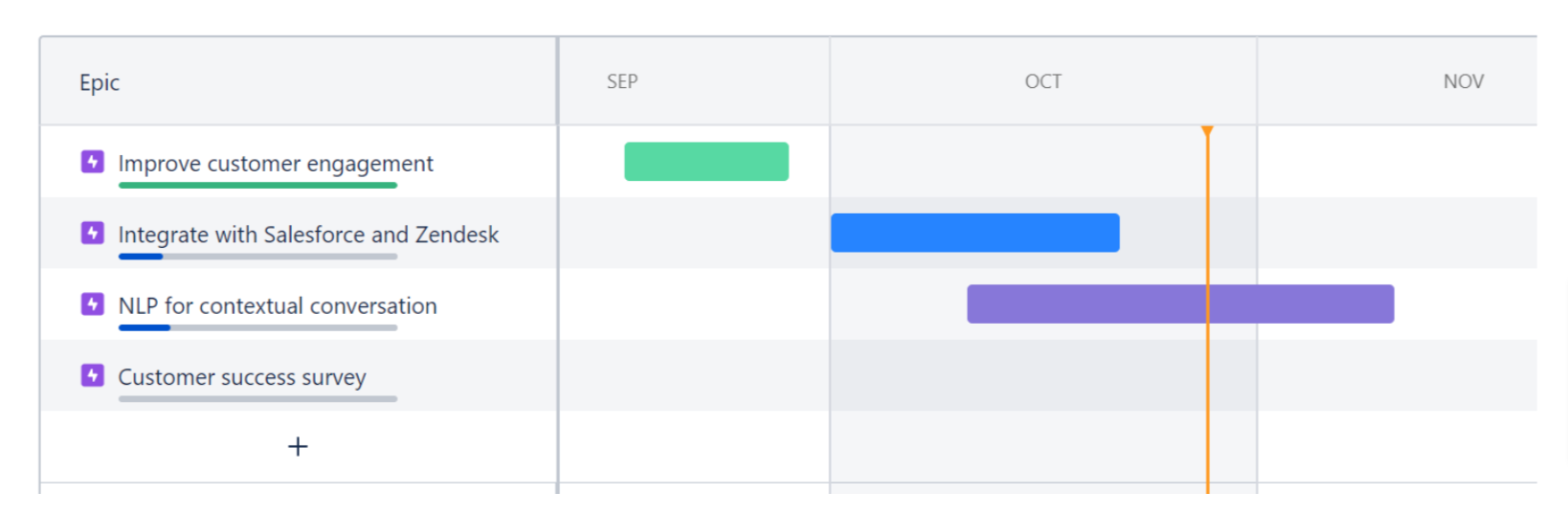
1. The Initial Product Roadmap
Teams often start with business outcomes to gain a high-level understanding of outcomes. A well-defined vision acts as a directional compass that helps you stay focused on the functional value of every feature.
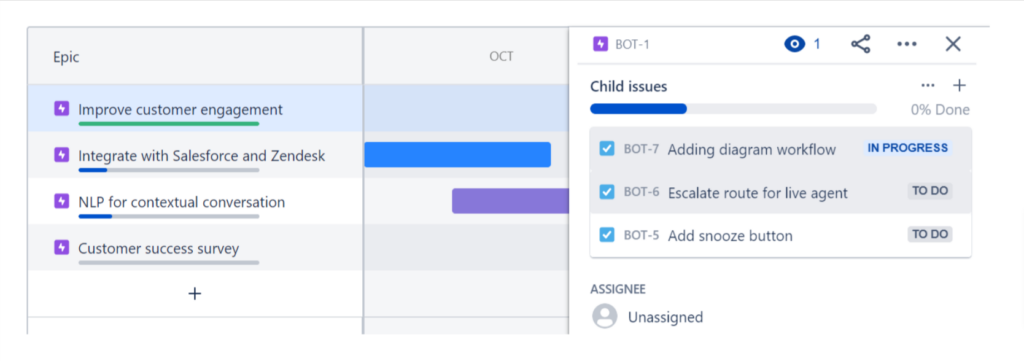
2. Adding Child Issues
By creating child issues under each business outcome, teams are more able to set realistic timelines and allocate resources efficiently while staying close to business goals.
3. Gantt Chart as the Roadmap
Now that the high-level business metrics, child issues, and timelines are all in one place, teams can make adjustments based on changing needs and requirements.
Grasp the Basics of Gantt Chart Design
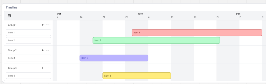
Before diving into advanced Gantt chart design techniques, I will review the core elements of a Gantt chart. At its simplest, a Gantt chart is a bar chart that provides a visual representation of a project schedule. The chart usually includes:
- Tasks or activities, listed vertically on the left
- Dates or time intervals displayed horizontally across the top
- Task bars representing each task’s duration, with the bar length corresponding to the task’s timespan
- Dependencies between tasks, shown with arrows or lines connecting related bars
- Milestones, indicated by symbols like diamonds or triangles
By combining these elements, a Gantt chart provides a clear overview of a project timeline. It makes it easy to track project progress, identify potential issues, and keep stakeholders aligned. Understanding these fundamental building blocks is key to learning how to design a Gantt chart that meets your project’s needs.

Pick the Right Gantt Chart Tool
To create a professional-looking project management chart, you need the right chart tool. While you can make a basic Gantt chart in Excel or Google Sheets, I recommend using dedicated task management apps that have Gantt charts that offer more advanced chart features and customization options.
Some popular Gantt chart tools include:
- ProductPlan
- Smartsheet
- GanttPRO
- TeamGantt
- Wrike
When evaluating Gantt chart tools, I always look for features like drag-and-drop editing, templates, collaboration capabilities, and integrations with other project management software I may be using, such as Jira or Asana. I have found that the right tool can make all the difference in creating a Gantt chart web design that’s both visually appealing and easy to maintain.
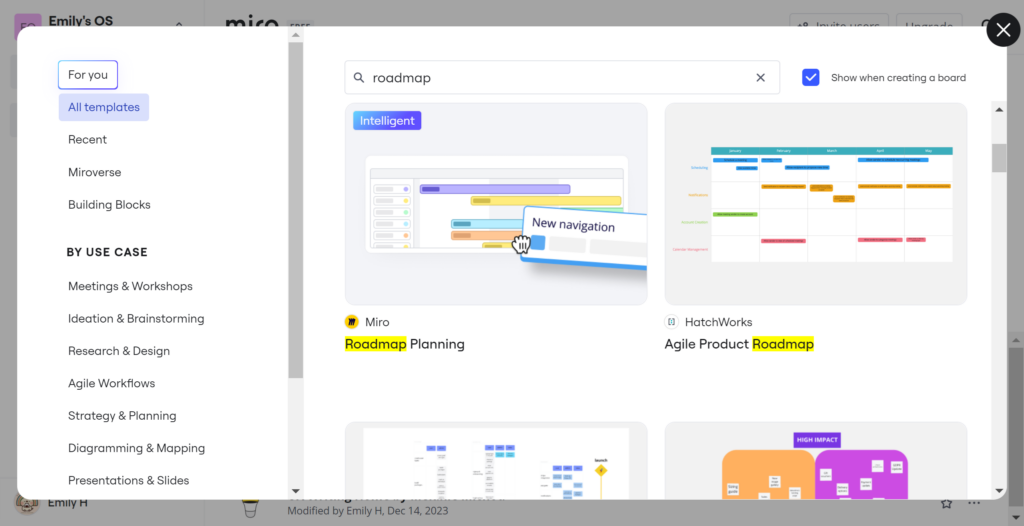
Harness Gantt Chart Roadmap Templates
A Gantt chart roadmap template is a pre-designed layout that jumpstarts your Gantt chart creation. Templates are often optimized for specific use cases, like product development or event planning. They frequently include built-in best practices for Gantt chart design.
I have found that using a Gantt chart roadmap template offers several key benefits, such as:
- Saves time and effort by providing a customizable foundation.
- Ensures best practices by leveraging experienced designers’ expertise.
- Maintains consistency across multiple projects or teams.
- Facilitates communication with a clear, visual project overview.
By leveraging Gantt chart roadmap templates, I can create professional, effective Gantt charts more efficiently while still tailoring them to my specific needs.
How To Design a Gantt Chart
One thing I always keep in mind is the flexibility of product roadmaps to turn into a Gantt chart and vice versa. When designing a Gantt chart, I always recommend designers to first explore existing templates.
Templates provide a solid foundation with carefully chosen colors, fonts, and layouts. They are optimized for readability and visual impact. Once you decide on a template, you can start customizing it to your brand.
When customizing your Gantt chart template, I suggest to keep these tips in mind:
- Use a limited color palette to avoid clutter and highlight key info.
- Choose clean, legible fonts for labels and legends.
- Use icons and visual cues to convey meaning and guide users.
- Allow for interactivity and customization, like zooming and filtering.
- Test your design with real users and iterate based on feedback.
By following these tips and using Gantt chart roadmap templates, you can create stunning, effective Gantt charts that take your project management to the next level.
Key Factors for Designing a Usable Gantt Chart
When designing a Gantt chart, I always keep the end user in mind. I ensure to create a chart that is both visually appealing and functional. Here are some key factors I consider and that you should take into account:
- Identify your target audience and their needs. Are you designing for project managers, team members, executives, or all of the above? Understanding your users’ roles, responsibilities, and pain points will help you create a chart that meets their specific needs.
- Choose the right level of detail. Too much detail can make a chart cluttered and difficult to read, while too little detail may not provide enough information to be useful. Strike a balance by including only the most essential tasks, milestones, and dependencies.
- Use consistent formatting and styling. Establish a clear visual hierarchy using consistent colors, fonts, and icons to help users quickly identify different types of information. Avoid using too many colors or font styles, which I have found can be distracting and confusing.
- Make the chart easy to navigate and interact with. Include features like zooming, filtering, and search to help users quickly find the information they need. Make sure these features are intuitive and easy to use, even for users who may not be familiar with Gantt charts.
- Test and iterate based on user feedback. Once you’ve created your Gantt chart, share it with a group of users and gather their feedback. Use this feedback to refine and improve your design, making sure it meets the needs of your target audience.
By keeping these considerations in mind and following best practices for Gantt chart UI design, you can create charts that are both beautiful and functional, helping your team stay organized and on track throughout the project lifecycle.
Best Practices for Gantt Chart UI Design
Now that I’ve covered the basics, I will explore the best practices for crafting a Gantt chart UI that’s both beautiful and user-friendly. Here are a few key principles that I keep in mind.
Embrace Simplicity and Legibility
One of the biggest challenges with Gantt charts is avoiding visual clutter, especially as projects grow in scope and complexity. To keep your project management chart readable, use a clean, simple design with plenty of white space between elements.
Stick to a limited color palette, using color strategically to highlight key tasks or milestones rather than assigning a different color to every bar. I always choose a legible font for labels and legends, and I make sure the text is large enough to read easily. By prioritizing simplicity and legibility, you can create a beautiful Gantt chart design that users will love.
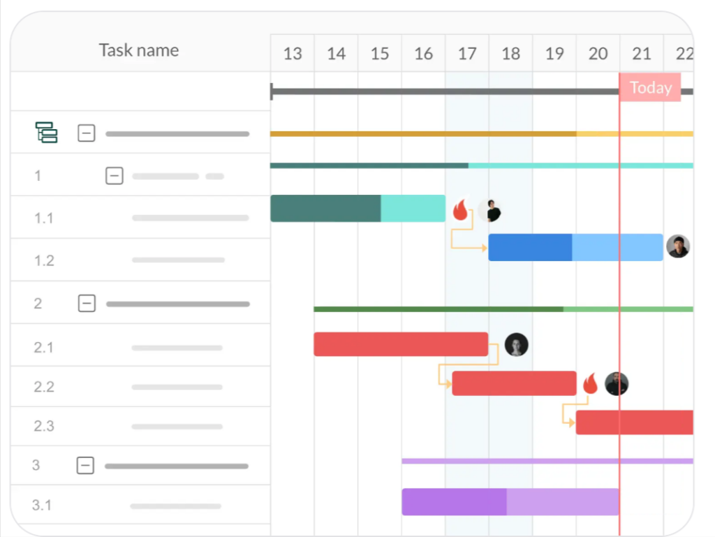
Employ Intuitive Visual Cues
To help users quickly grasp the meaning of different chart features, I use intuitive visual cues like icons, shapes, and colors. For example, I might use a green bar to represent a task that’s on track, a yellow bar for a task at risk, and a red bar for a task that’s behind schedule.
Similarly, using arrows or lines to show dependencies between tasks can help clarify relationships and highlight potential bottlenecks. Just be sure to use these visual aids judiciously to avoid overwhelming the user. Learn more about how you can optimize UI design.
Incorporate Interactivity and Customization
A static project management chart can provide a high-level project overview, but an interactive chart that allows users to drill down into details can be even more powerful. Consider adding chart features like:
- Zooming in and out to view different time scales
- Filtering tasks by assignee, status, or other criteria
- Expanding and collapsing task hierarchies
- Adjusting task dates and durations with drag-and-drop editing
By giving users control over how they view and interact with the chart, you empower them to find the insights they need quickly and easily.
Beautiful Gantt Chart Design: Gantt Chart Examples To Learn From
To spark your creativity, let’s look at some stunning Gantt chart examples from around the web. These examples showcase beautiful Gantt chart design in action. They demonstrate how thoughtful UI choices can elevate a simple project timeline into a powerful communication tool.
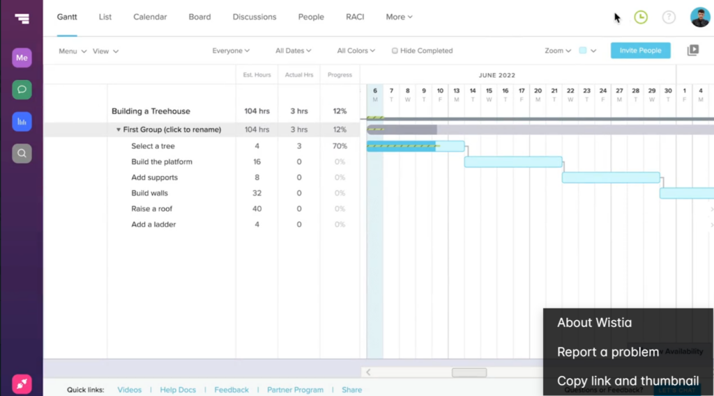
Miro’s Gantt Chart Template
I have found that Miro, the popular online whiteboarding tool, offers a sleek Gantt chart template perfect for agile teams. The chart features a minimalist design with bold, high-contrast colors and clean lines. Task bars are color-coded by status, with icons indicating milestones and dependencies between tasks.
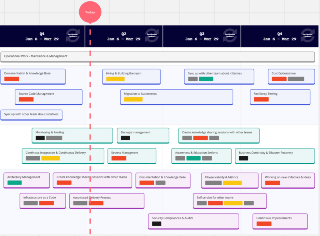
TeamGantt’s Colorful Project Timeline
TeamGantt‘s Gantt chart tool is known for its vibrant, colorful charts that I believe are as fun to look at as they are functional. The tool’s default chart template uses a bright, cheerful color palette, with each task bar assigned a unique hue.
While this approach might not work for every project, it can be a great way to inject some personality into an otherwise dry project timeline. I use colors strategically, grouping related tasks together and using shades that are easy to distinguish from one another.
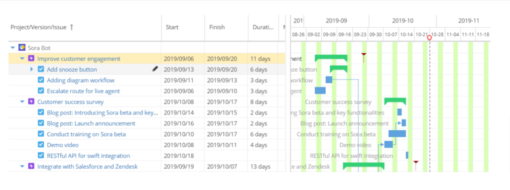
GanttPRO’s Comprehensive Roadmap View
For a more comprehensive visual representation of your project, check out GanttPRO’s Gantt chart roadmap template. This view combines a high-level timeline with a detailed task breakdown, giving stakeholders a bird’s-eye view of the project while still allowing them to drill down into specifics.

Design Your Own Gantt Chart: Putting It All Together
Ready to create your own stunning project management chart? Here are some final tips from me:
- Start with a clear project plan. Break down tasks into manageable chunks. Identify dependencies between tasks and milestones.
- Choose a Gantt chart tool that meets your needs. This could be a simple spreadsheet or dedicated software with advanced chart features.
- Keep your design clean and simple. Use color, icons, and other visual aids strategically to convey meaning without overwhelming the user.
- Allow for interactivity and customization. Give users the ability to view the chart in different ways and drill down into details as needed to track project progress.
- Get feedback from your team and stakeholders. Iterate on your design until you have a Gantt chart that everyone finds useful and easy to understand.
Remember, the key is to prioritize clarity, simplicity, and usability at every step.
Boost Project Management With Page Flows
If you’re looking for more Gantt chart example inspiration, check out Page Flows, a powerful platform for creating, managing, and collaborating on user flows, task flows, and more.
With Page Flows, you can easily map out your project’s key steps and dependencies. The platform integrates with popular project management tools like Jira and Asana, making it easy to incorporate your flows into your existing workflows. Sign up for a free trial today and start creating beautiful, functional flows that keep your team on track and your users engaged.