When designers create excellent UX designs, they make products that combine seamless functionality, compelling aesthetics, and customer satisfaction.
But when UX designers fail at their designs, they create confusing, unhelpful, or unengaging products that users don’t need.
That brings us to today’s guide – UX fails. In this guide, you’ll learn what bad UX is and the common UX mistakes you should always avoid making. We’ll also reveal some tips for creating a user experience that increases conversion rates and brand loyalty.

What Is Bad UX?
Bad UX design occurs when designers fail to satisfy the needs of real users. This can mean that the final product doesn’t resolve the users’ problems or simply frustrates and confuses them.
Of course, many factors can lead to bad app design or bad website design, including the following:
- A poor understanding of target users
- Counterintuitive navigation
- Convoluted or cluttered user interfaces
- A confusing lack of visual or structural consistency
- A poor, slow system performance
- A disregard for user feedback
- Inadequate or no accessibility
UX Design Fails: Common UX Mistakes To Avoid
From the previous section, you have a general idea of what causes bad UX design. Let’s explore some of these UX pitfalls further.
Below, we’ve revealed some of the most common UX mistakes you should definitely avoid.

Insufficient User Research
User research provides designers with valuable insights about their users and their needs, desires, motivations, expectations, and pain points.
Without this knowledge, you can’t empathize with your users, especially if you base your understanding of your users on assumptions. As a result, you’ll create products that your target users don’t want or need.
The solution:
Combine your business’s goals with your target users’ most pressing frustrations to create a solid problem statement. This may involve researching your competitors.
Then, invest in suitable UX research methods to uncover the user-centric insights you need to resolve that problem statement.
You would also benefit from creating user personas to contextualize and represent your target users. Then, you can leverage user empathy mapping techniques to add emotional context to your personas.
Confusing Navigation
Confusing navigation is the death of usability; inconsistent layouts and unfamiliar navigational aids will frustrate your user. Worst of all, it’s likely that they’ll abandon your product and leave negative reviews.
The solution:
Establish a clear visual hierarchy that effectively communicates the order of importance for your product’s visual elements. Once you have established a visual hierarchy, make sure it’s consistent across every user interface.
Additionally, you should use navigational aids that are familiar to your users, like drop-down menus, search bars, and breadcrumbs.
By using navigational aids that users recognize, you’ll allow them to rely on their intuition for navigation. Overall, this leads to a smoother user flow.
Speaking of user flows, you should map out the various routes your users may take when interacting with your product. By doing this, you’ll be able to identify and refine any areas of friction within the user’s navigation.
Cluttered UI
Visually cluttered user interfaces distract the user from their goals and increase cognitive overload.
Essentially, user interfaces with too many visual elements or information make navigation incredibly difficult.
The solution:
Carefully consider the elements that the user needs to see for every screen within your product. Select only the most essential features to display and then experiment with UI design principles (specifically proximity).
The proximity principle revolves around the idea that designers group related components for intuitive navigation together. This principle will help you utilize your screen’s real estate in the most efficient way.
In addition to proximity, you should also use white space or negative space.
White space refers to the empty space between design elements. Using white space will help you emphasize your essential visual elements and reduce the users’ cognitive strain.
Poor Onboarding Experiences
The user onboarding process is usually the first interaction the user has with your products, which is why it’s crucial. A bad onboarding process fails at user engagement, often overloads the user with information, and can lack good pacing.
The solution:
Invest in user journey mapping techniques to determine how users begin, conduct, and finish their interactions with your product. You should also leverage the data from your user research to see where users are struggling during their onboarding experiences.
From there, you should focus on the elements that will ease your users through the onboarding process. Think interactive walkthroughs, tooltips, and checklists.
You could also adopt an incremental approach to onboarding. With this approach, you reveal information at relevant points in the user’s initial interaction. Doing this means you won’t overwhelm the user with information they are likely to forget.
Lastly, inject some fun into your onboarding to increase user engagement. Consider implementing gamified elements, interesting animations, and personalized content. After all, just because the onboarding process is necessary doesn’t mean it has to be mundane.
Disregarded User Feedback
Your user’s feedback is one thing you need to improve the user-centricity of your products. When designers ignore user feedback, they miss the opportunity to refine improvements.
The result? Steadily declining retention and engagement rates.
The solution:
Conduct user surveys frequently during the design process and after the product’s launch.
Once you have actionable data, you then need to analyze it, looking for recurring patterns in the participants’ responses. With feasible improvements in sight, you can act on them and iterate your designs.
By doing this, you’ll establish your business as one that genuinely cares about its users’ experiences.
Tip: Make sure to notify your users when you release updates.
Inadequate Accessibility
Poor accessible design excludes users with cognitive and physical difficulties. Not only is this morally wrong, but it’s actually illegal.
The solution:
Carefully read the Web Content Accessibility Guidelines (WCAG) 2.2 and design accordingly.
In these guidelines, you’ll find out how you can make your product’s visual, audial, typographic, and navigational elements accessible.
Below, you’ll find a few basic tips to help you ensure your designs are accessible to all users. You should:
- Allow for customizable, scalable UI elements.
- Utilize high-color contrast.
- Use readable typographic elements.
- Provide captions for videos and text-to-speech options.
- Offer keyboard navigation.
- Conduct accessibility audits frequently.

A Lack of Responsiveness
Responsive design involves creating user interfaces that can adapt to a range of different devices and screen sizes.
When designers don’t consider responsive design, they don’t create a universal experience for all users. Consequently, they don’t meet all of their user’s needs and actually perpetuate a sense of implausability and unprofessionalism.
The solution:
Assume the role of the user as they use their mobile phones. Typically, they will use their thumbs to navigate a mobile app. Keep this in mind as you design the product’s information architecture.
You should also conduct usability tests across various devices and screen sizes to identify areas of improvement.
Learning From Famous UX Fails
Now that you know about the usual UX fails that designers make, it’s time to see them in action.
Below, you’ll find a few examples of famous UX fails.
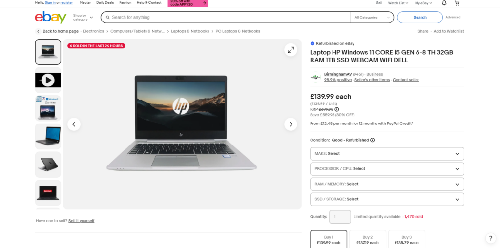
eBay’s Product Pages
eBay is an online marketplace that we chose as a UX fail because of its overwhelming product pages.
From the image above, you can see how eBay crams their product pages full of copious amounts of information. This not only prolongs the user’s shopping experience, but it contributes to cognitive overload.
What’s more, a lot of the text on the screen is quite small. This small text can prove a difficult reading challenge, especially for users with visual impairments.
Additionally, the visual hierarchy doesn’t prioritize the information users who are shopping typically need to see above all else.
For instance, alternative payment methods (PayPal Credit) flaunt small, easily missable text. But an indication as to how many other customers have bought the same product is highlighted with bright red colors.
This draws the user’s focus as if it were a CTA. In actuality, this piece of information isn’t essential to the user’s shopping experience.
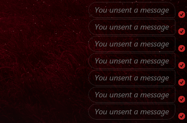
Facebook Messenger
Facebook Messenger is Facebook’s instant messaging service, and it’s one of our examples due to its deletable messages.
When you delete a message on Facebook messenger, you have the option to remove the message for you or everyone. On paper, this is a great feature that allows users to correct typos/delete messages sent to the wrong recipient.
But since everyone can see that when you’ve deleted a message, it defeats the point of deleting it at all. What’s more, it can cause moments of suspicion or friction between the user and their peers.
Since UX aims to resolve the users’ issues – and this could potentially create some – it’s a design fail.
FAQs
How many websites fail at UX?
You’d be surprised to know that a high percentage of websites out there, if not most of them, fail at UX and do not deliver adequate user experience designs.
How can you identify bad UX within your business?
Generally, there are five telltale signs that your business is suffering from bad UX, including the following:
-Impulsive, baseless design decisions
-The overuse of components like colors, fonts, and icons
-Inconsistent system responses to the user’s actions
-Overwhelming/counterintuitive navigation
-Visually “busy” and structureless UI design
What is the biggest mistake in UX?
Arguably, the biggest mistake you could make in UX is designing an uneven balance between functionality and aesthetic value. Aesthetics should not dominate functionality and vice versa.
It’s also worth noting that another major UX fail is not empathizing with target users or implementing their feedback.
UX Fails: Prevent Mistakes in Your UX Design by Using Page Flows
There’s value in looking at examples of bad UX design. After all, they’re essentially guidelines that show you what to avoid doing during the UX design process. However, the main thing is that you focus on the ways in which you can create good user experiences.
Learning from user-centric, proven products is a great way to do that. You’ll need Page Flows to find such products. Page Flows is where you’ll find over 7,000 recordings and over 110,000 screenshots that detail crucial user flows.
Our resources comprise common but essential user flows, such as user onboarding and completing purchases. They also cover dozens of successful brands and diverse industries, from education to entertainment.
Our goal is to help designers master intuitive user navigation by taking inspiration from past successes. Unlike UX fails, we know what it takes to create a user experience that your target demographics will never forget.
Get started today to learn what it looks like when you avoid common UX mistakes!