
Universally, the goal of UX and UI designers is to create digital products that offer seamless, intuitive user experiences.
From meticulous UX research to valuable UI/UX design principles, high-quality user experiences drive every major and minor design decision. A design decision that often doesn’t receive the same prominence as other design elements is affordances.
Although a small facet of user-centric digital interfaces, these help designers craft a frictionless, consistent user experience.
For this reason, you should know what affordances in design are and how to use them. In today’s guide, we’ll address just that. In addition to addressing the meaning, we’ll also reveal the specific types. Most importantly, we’ll reveal how you can effectively use them to optimize your users’ experiences.
What Are Affordances in UX Design?
At first glance, affordances in UX design seem like a relatively complex concept. However, in actuality, they simply reflect intuitive navigability, and every UX designer will benefit from understanding and optimizing them.
So, what are affordances in UX design?
Affordances in design refer to the characteristics/physical appearance of an object. What’s more, these characteristics indicate how you can use said object, allowing designers to imbue interactive elements with intuitive functionality.
They transcend the boundaries of the digital landscape, and it’s likely that you’ve already encountered several of them. For instance, let’s look at a physical object—a button in an elevator. Naturally, you know that you can push the button to get where you need to be. In essence, the likelihood of an individual pushing that elevator button is the button’s affordance.
Through the lens of UX/UI design, designers utilize affordances to show users what they should do during their interactions. Affordances diminish the need for instructional labels, copy, and images, making human-computer interactions virtually seamless.
Concerning user-centricity, affordances help users understand the capabilities they have while completing a task on a website/mobile app.
Thus, when implemented effectively, they reinforce intuitive design practices, increase your conversion rates, and drive user engagement.
Affordances vs Signifiers: Is There a Difference?
Given an affordance’s role in simplifying a graphical user interface, it’s important to know precisely what affordances are. With this in mind, it’s equally important to know precisely what they are not. Specifically, it’s vital that you can differentiate them from signifiers.
So, what are signifiers?
Designers use signifiers after they have implemented affordances into their designs. Then, they will give subtle, intuitive visual clues as to how the user can interact with them. Designers know these visual clues as signifiers.
To clarify further, signifiers can take the form of explicit textual information, color, lighting, and even audial embellishments. For instance, let’s say you saw a greyed-out button within a user interface that is usually a bright blue color. The signifier (the grey color) conveys to the user that they can’t complete an action when they press that button.
Simply put, signifiers are visual cues that emphasize the presence of an affordance. Therefore, going forward, you should visualize affordances and signifiers as two integral cogs of the same machine. They go hand-in-hand with one another to make a UI easily navigable and clarify the user’s capabilities to the user.
The Types of Affordances Every Designer Needs To Know
Since affordances act as psychological shortcuts, they have complexities and intricacies that deserve further explanation.
Below, we’ve explored the different types to help you understand them further.
1. Explicit Affordances
Explicit affordances are a UX designer’s best friend as they suit users who aren’t tech-savvy. Almost anyone can understand and follow explicit affordances because they utilize an object’s physical appearance to convey visual cues.
Ultimately, they reveal precisely how users must interact with a specific design element.
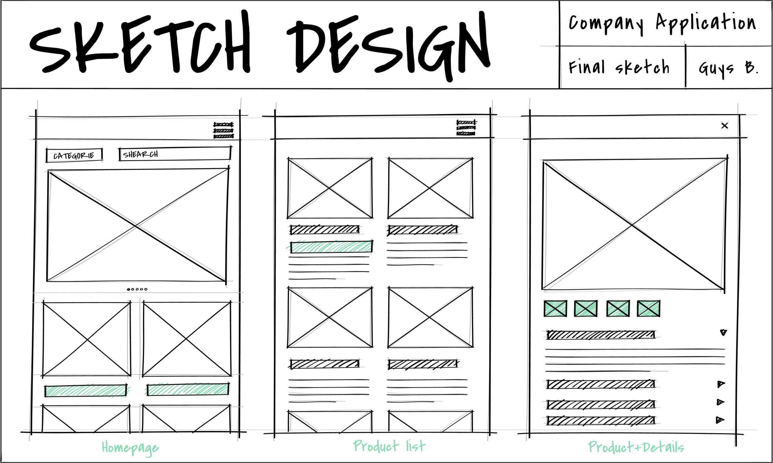
Using an earlier example, digital buttons that resemble physical buttons afford pushing.
2. Hidden Affordances
Hidden affordances, or implicit affordances, are not immediately obvious or visible to the user. The only way a user can interact with an affordance is after completing a specific action.
A great example of a hidden affordance is a drop-down menu. In the case of drop-down menus, the user can’t see the menu items until they click on the parent tab.
UX designers use hidden affordances to reduce visual clutter in an already ‘busy’ user interface.
3. Pattern Affordances
Nearly every brand/digital product uses pattern affordances because it allows users to utilize their previous experiences with similar products. Pattern affordances help users navigate easily by using familiar design elements.
A perfect example of pattern affordance is the use of a brand’s logo on a website. Most users know to click on a brand’s logo to return to a site’s homepage.
Thus, these patterns diminish the user’s learning curve when interacting with a new user interface.
4. Metaphorical Affordances
Metaphorical affordances utilize real-life objects as metaphors for complex actions that users can make.
A great example of a metaphorical affordance is the envelope icon that represents sending an email.
Due to metaphorical affordance’s mimicry and use of the connotations behind physical objects, users can infer valuable meaning. Specifically, they’ll know which actions said affordances would allow them to make based on which physical object they mimic.

5. Negative Affordances
Negative affordances suggest that users cannot interact with a certain design element because it is inactive.
Greyed-out buttons are perfect examples.
Overall, these are incredibly useful when the user must complete certain actions in a particular order.
6. False Affordances
False affordances are something that every designer should avoid when creating frictionless, understandable user experiences.
Simply, they appear to afford one action but actually afford another action or no action at all.
An example of a false affordance would appear as a blue piece of underlined text that doesn’t carry a hyperlink.
How Do Designers Use Affordances in Interaction Design?
To make the best use of these in your own digital products, you should know how designers commonly employ them.
Below, we’ve assembled a list of common affordances within the world of interaction design.
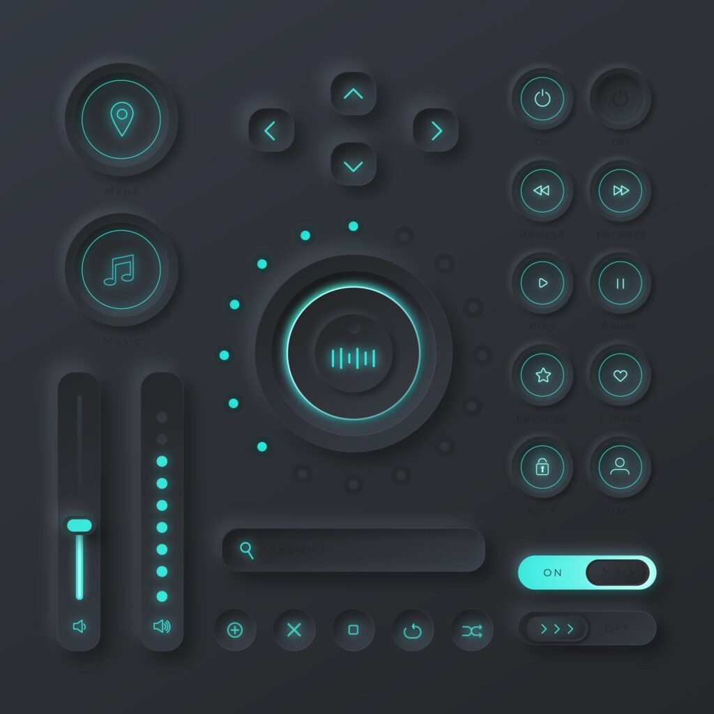
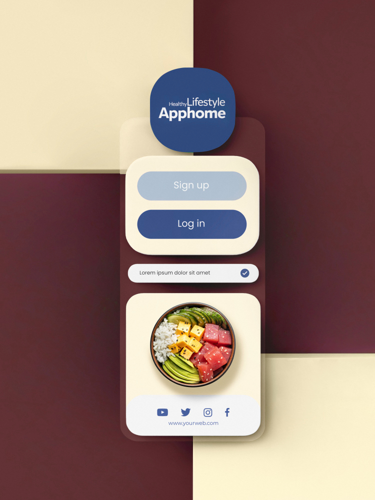
1. Buttons
Concerning visual affordances, buttons are one of the most common design elements that both users and designers associate with interactivity.
To create an effective affordance when creating digital buttons, you need to consider the following visual elements:
- Shape
- Color
- Shadows and highlights
- Contrast
- Copy (optional)
Combining these visual elements will help you create a digital button that resembles a physical button. By creating realistic digital buttons, you can avoid creating implicit affordances whereby the user doesn’t perceive a clickable button.
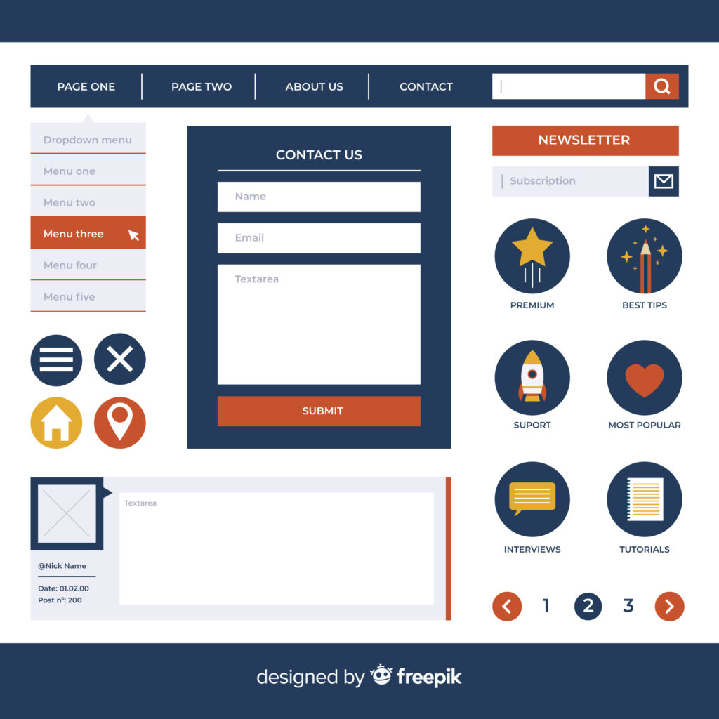
2. Input Fields
Needless to say, input fields indicate to a user that they can enter data. Typically, users know that they are looking at an input field due to its conventional rectangular shape.
Additionally, another recognizable quality of an input field affordance is the italicized copy within the field. This text makes it perfectly clear what information the user needs to provide.
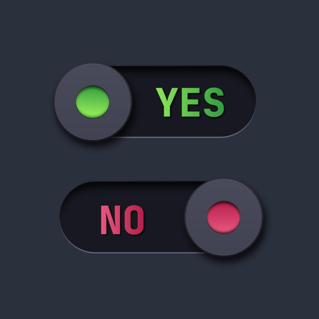
3. Animations
Animated affordances celebrate visual, and even fun, fluidity because they mimic realistic motion. For instance, a designer could animate a simple toggle switch to move when clicked/tapped. Consequently, when pressed, that toggle switch will make a movement resemblant to a swipe or push.
This motion (usually accompanied by a color change) shows the user that something is on or off.
How You Can Design Effective Affordances
When utilized effectively, affordances can reduce the user’s cognitive load, which, in turn, reduces the risk of user errors. Needless to say, minimizing the possibility of user errors is a guaranteed means of improving the user’s experience.
That being the case, we would like to help you implement these in your designs effectively. Below, we’ve arranged some useful tips and tricks that you can use to ensure intuitive navigation.
- Prioritize the user above all else and conduct thorough user research to familiarize yourself with their needs, goals, and contexts.
- Don’t feel the pressure to reinvent the wheel. Instead, utilize conventional design patterns/elements that users are already familiar with.
- Use signifiers to provide more information about the affordances that you’ve designed.
- Don’t turn essential information into an implicit affordance.
- Experiment with different sizing techniques to determine which ones users naturally prioritize.
- Ensure that they are simple, straightforward, and clear.
- If you need to rely on copy to create effective affordances, make sure that you use plain, direct language.
- Closely adhere to UX design principles and the laws of UX to guide your affordance designs.

Affordances in Design: Designing for Frictionless User Experiences
The key takeaway from this guide is that the quality of the user’s experience drives successful UX design. Given this fact, it’s become essential that UX designers adopt user-centric practices.
However, many brands and design teams adhere to user-centric practices, making it increasingly difficult to be original as UX evolves. As a result, modern UX designers have to scrutinize and optimize every minor detail that could influence the user’s experience.
In order to optimize the user’s experience effectively and consistently, you’ll need some design inspiration. Meet Page Flows.
Page Flows works alongside over 1000 happy customers, including Google, Disney, and Booking.com.
What makes such esteemed brands rely on us for design inspiration? We offer a solid knowledge base of tried and tested, effective user flows. With Page Flows, you’ll see how successful brands prioritize their users at every stage of the user’s journey.
What’s more, we offer design solution inspiration across multiple industries. From Apple Music to Amazon, we have helped successful brands learn the importance of affordances in design. With Page Flows by your side, you will too!
Get started today to access our endless supply of user flow recordings, screenshots, and collected emails!