Calendars, calendars, everywhere. Whether you’re designing a productivity tool, a social media scheduling app, or a booking platform, calendars are everywhere. What often goes unnoticed is just how much thought goes into creating an intuitive, aesthetically pleasing, and functional calendar design.
In this article, I’ll discuss how to craft a calendar UI tool that not only looks great but also delivers an exceptional user experience. This will be useful for designers looking for inspiring design ideas or anyone interested in improving their UX/UI design skills.
Why Calendar Design Matters for UX/UI Designers
My first encounter with calendar design was with a travel booking website. I thought, “How hard could it be? Just arrange some dates using auto layout, right?” Even better, save time by grabbing it from a known design system like Google Material Design 3. I was so wrong. I quickly realized that calendars are such an essential part of the user’s journey. If you don’t consider the context and think in the shoes of the user, the whole user experience can crumble.
Calendars are often used to organize appointments, track events, and manage time. A poorly designed calendar can frustrate users, causing them to abandon tasks. On the other hand, a well-designed calendar can enhance the flow, making interactions smoother and more efficient. Whether it’s on a mobile app or a desktop, the calendar is often the heart of task management and scheduling interfaces.
The challenge is to create a calendar user experience that doesn’t overwhelm users with complexity but instead provides clarity and ease of use. It’s about balancing form and functionality in design. So, let’s explore what makes an effective calendar UI design.
4 Key Principles of Calendar UX Design
I’ve learned that designing an intuitive calendar UI requires a clear understanding of how users perceive and interact with time. When done right, your design will make users’ lives easier by simplifying how they navigate dates, set schedules, and manage time-sensitive tasks. Here are some key principles I always keep in mind when approaching a new calendar UX design.
1. Simplicity Above All
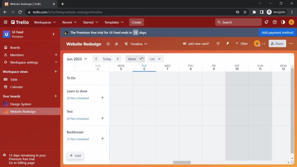
One of the first things I do is strip the interface down to its essentials. A cluttered calendar design can be overwhelming, so it’s important to avoid adding too many features or visual elements. The simpler the design, the more usable it becomes. Trello is a great example of a minimalist yet feature-rich design. The user can view and interact with events, color-code them, and even set reminders without feeling overwhelmed.
2. Responsive Design
Something I’ve noticed is that users often switch between devices—using their phones for quick checks and their desktops for more in-depth scheduling. Therefore, making your calendar responsive is critical. The UI should adapt seamlessly to any screen size. Whether it’s a mobile app, tablet, or desktop, the calendar should look and perform just as well.
3. Clear Navigation
One feature I always include in my designs is clear navigation cues. Users need to know how to move between days, weeks, and months without getting lost. Adding arrows, swipe gestures, or scroll functionality makes it intuitive. Apple’s iOS Calendar handles this perfectly with its swipe gestures, allowing users to effortlessly move through dates.
4. Customization Options
I’m a big believer in giving users the ability to personalize their calendars. Customizable calendar design templates allow users to tweak things like colors, time zones, and even views. This is something I’ve seen work well in platforms like Google Calendar, where users can customize how their calendars look and function.
By sticking to these principles, designing calendars can become less of a challenge and more of an enjoyable process.
Drawing Inspiration From Successful Calendar Interfaces
Whenever I have a designer’s block, I turn to successful calendar designs to see what works and why. Great calendar interfaces are not just functional but also visually engaging. Here are a few examples I’ve come across that are worth taking a closer look at.
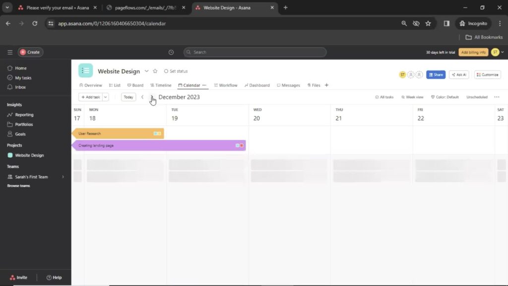
Asana’s Minimalist Design
For team management, Asana’s calendar is one of my favorites. The way it uses a minimalist design while allowing for drag-and-drop scheduling is a masterclass in simplicity and function. Its calendar UX makes it easy for users to organize tasks without getting bogged down by cluttered interfaces. Check out Asana’s user flow screenshots for a more in-depth experience.
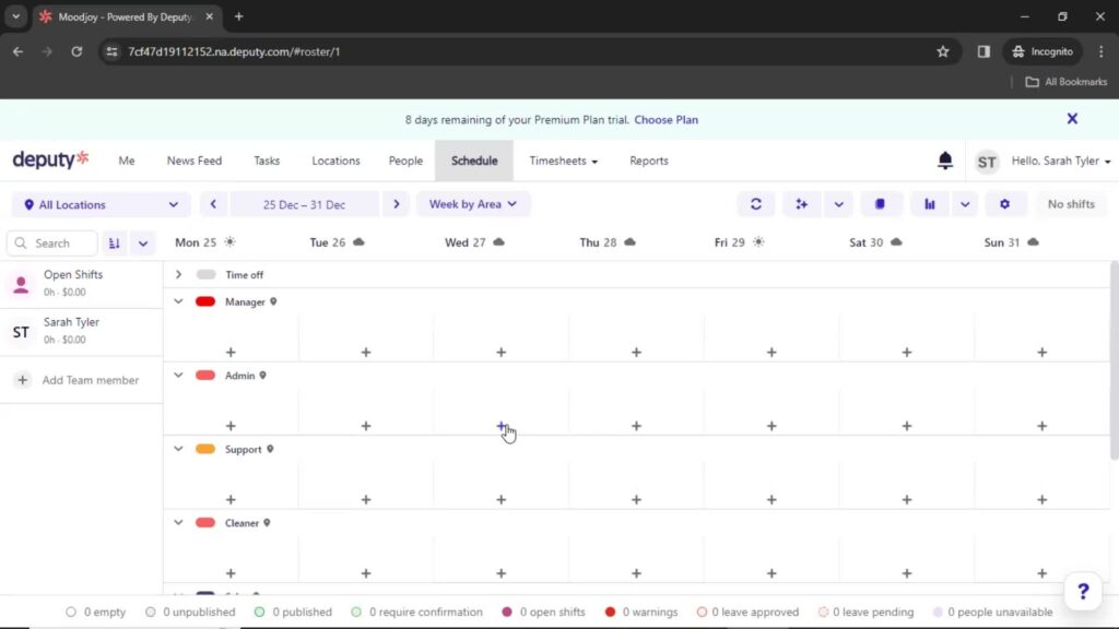
Deputy’s Way of Balancing Aesthetics With Functionality
Another impressive example is the Deputy calendar, which is designed for scheduling employees. What I like is the color-coding system, which instantly communicates the status of each schedule, whether it’s a work shift or a special event. This makes it incredibly user-friendly, especially when managing large teams. Check out the collection of Deputy’s onboarding screenshots.
Asana and Deputy’s calendar examples not only inspire but also show the importance of balancing design aesthetics with practical functionality. For more detailed user flows and design inspirations, check out Page Flows’ calendar section for a treasure trove of design ideas.
Additionally, if you’re looking to explore team management apps, Page Flow reveals the best team management apps that you can use to simplify your project design process.
4 Best Practices for Calendar Interface Design
In my own work, I’ve found that calendar design often comes down to how well the interface balances functionality and aesthetics. Here are a few tricks I’ve picked up along the way that can help you improve your calendar UI design.
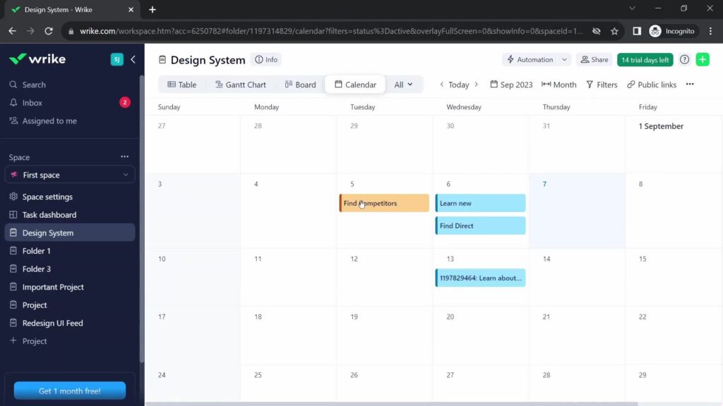
1. Highlight Important Dates
One of the easiest ways to help users manage their time is by highlighting important dates with color codes or icons. This makes it easier for them to quickly identify key events without scrolling through endless data. Wrike does a great job of this, allowing users to customize their tasks and events.
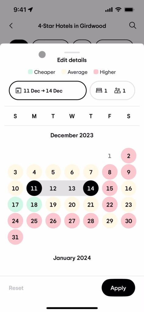
2. Make Date Range Selection Easy
Whether users are booking vacations or planning projects, giving them an intuitive way to select a date range is essential. TripAdvisor is a great example of how to do this right. It visually displays price ranges along with dates, making the booking process effortless for users. For implementation, I usually incorporate click-and-drag functionality to easily change dates or duplicate events.
3. Allow for Calendar Syncing
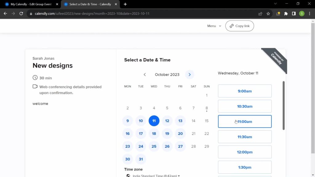
Another must-have feature in today’s digital world is the ability to sync with external calendars like Google or Outlook. I’ve learned that users expect to be able to manage their personal and professional schedules in one place.
Syncing options make it easy for them to do just that without having to toggle between multiple apps. I love how syncing Calendly with my Google Calendar helps to avoid meeting conflicts. It also converts time zones automatically for both meeting hosts and participants.
4. Accessibility Matters
Finally, one of the things I’ve started focusing on more is accessibility. Making sure your calendar is usable for everyone, including those who rely on screen readers, is critical. Adding keyboard shortcuts or voice commands is a great way to ensure that your design is accessible to a broader audience.
By incorporating these best practices and usability heuristics, you can ensure your calendar UI is both functional and user-friendly.
How To Implement Functionality Without Sacrificing Design
In my experience, balancing design and functionality is one of the biggest challenges in calendar UI design. It’s easy to get caught up in making something that looks amazing. However, it’s crucial to ensure it works just as well. Here are a few features I’ve found can elevate both design and functionality.
Drag-and-Drop Events
This is one feature I always aim to include because it simplifies the user’s ability to reorganize their schedule. Whether they’re rearranging tasks or moving appointments, the ability to drag and drop gives them more control.
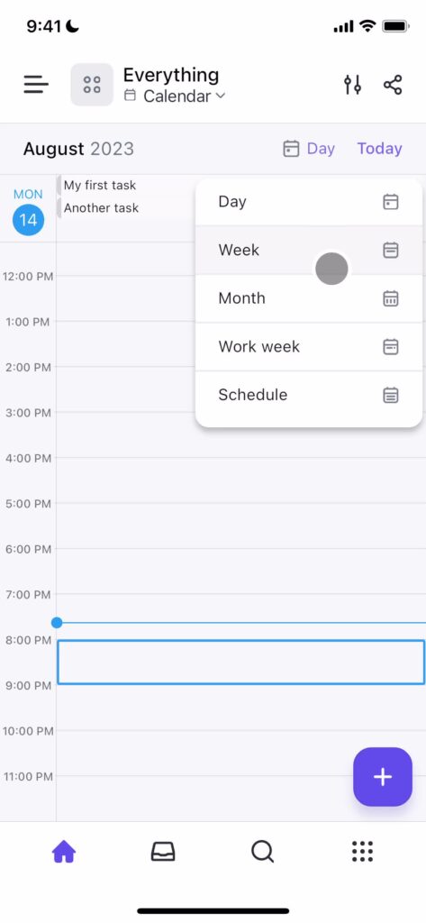
Multiple View Options
I’ve noticed that different users have different needs when it comes to viewing their calendar. Some prefer a daily view, while others need to see the entire month. Offering multiple view options—such as daily, weekly, and monthly toggles—provides flexibility. ClickUp demonstrates this feature in action.
Real-Time Notifications
Notifications and reminders are crucial for any functional calendar. Whether it’s a push notification on their phone or an email reminder, these small touches ensure users never miss an important event.
These features add layers of functionality that don’t compromise the design’s overall simplicity and elegance. Another consideration when designing calendars is whether the user can manually enter the date. You can read more about date-input form fields UX guidelines by NNGroup.
Website Calendar Design Ideas for Specific Use Cases
Calendars are used across a variety of applications, and the design should adapt to the use case. Here are a few website calendar design ideas to check out.
Appointment/Task Scheduling
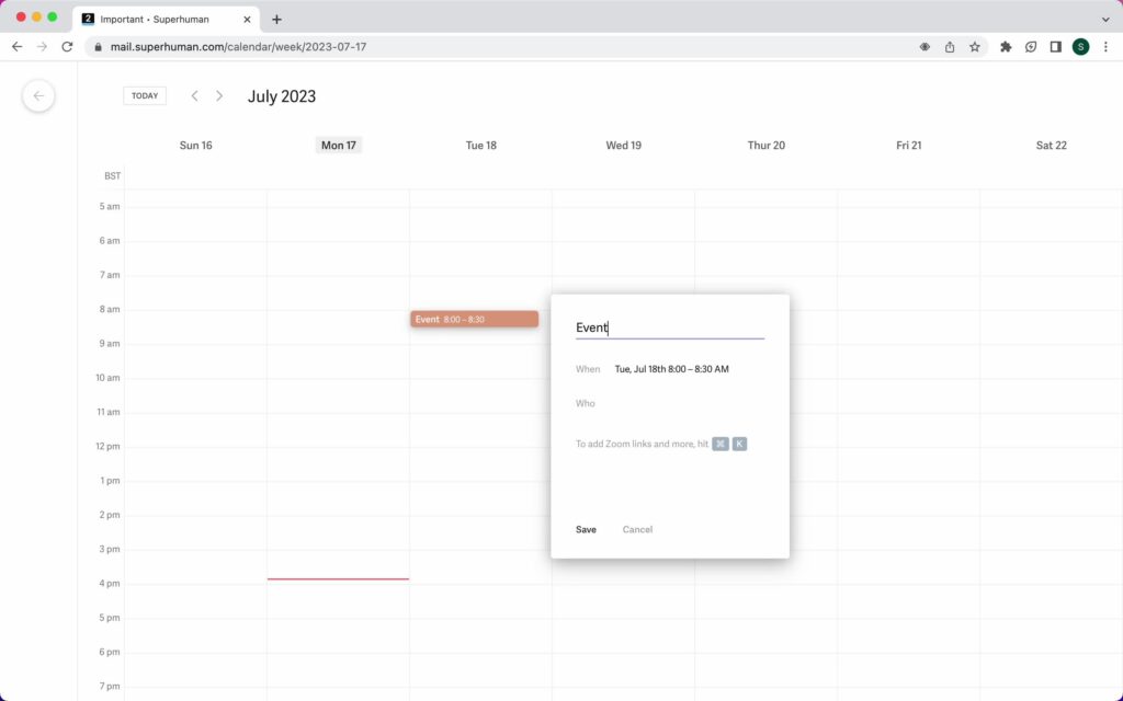
A simple, clear layout is essential for booking appointments and scheduling tasks. I love how Superhuman incorporates clean lines and ample white space, allowing users to focus solely on the task at hand.
Event Planning
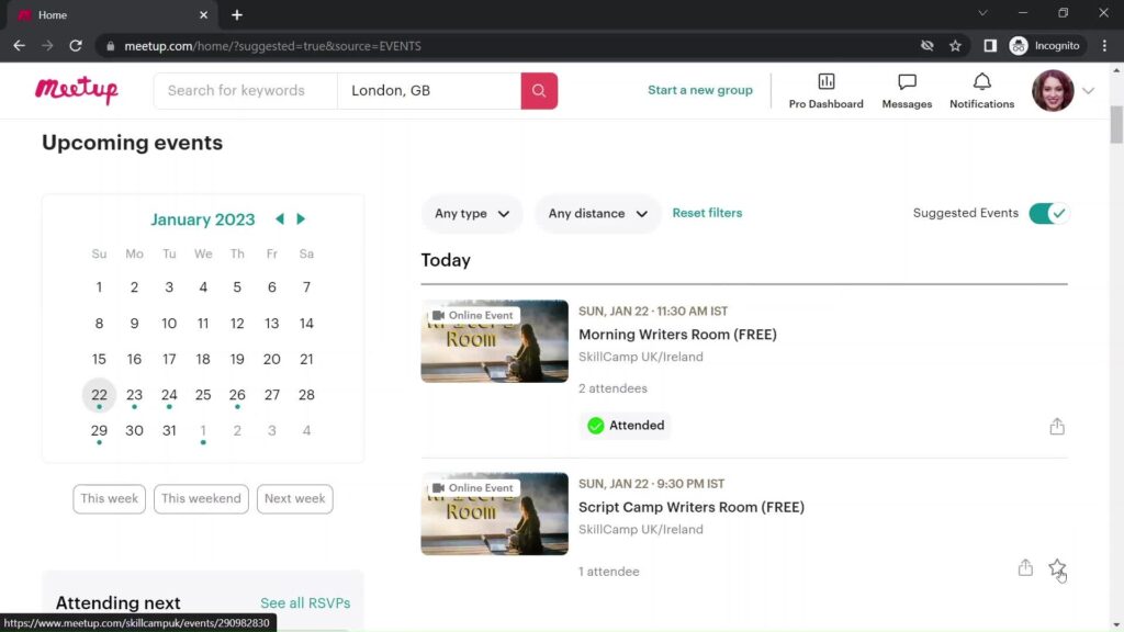
When designing for event planning, like concerts or conferences, the calendar needs to provide more details like event descriptions, locations, and links. A standout feature in these designs is RSVP integration, which enhances user interaction and event management, such as Meetup.
Social Media Post Scheduling
For social media marketers, scheduling tools are a lifeline. Calendars for this use case need a clear, easy-to-navigate interface that allows users to tag social media posts and filter by platform. Incorporating visual previews of scheduled posts is a great way to ensure everything is aligned.
Focus on Usability and Customization for Calendar Design
At the end of the day, calendar design is all about the user. If users find it easy and enjoyable to interact with your calendar, they’re more likely to continue using your product. In my experience, the best way to enhance the user experience is by focusing on usability and personalization.
For example, offering customizable views and features, like syncing with external platforms, gives users a sense of ownership over their calendars. This not only improves engagement but also builds loyalty, as users feel the product is tailored to their specific needs. Creating a seamless customer experience by integrating personalized calendar features can boost user satisfaction and retention.
Elevate Your Product With Calendar UI Design and Page Flows
Designing a functional and aesthetically pleasing calendar is one of the most important tasks for UX/UI designers. By focusing on the right balance between design and functionality, you can create a calendar that enhances the user experience and increases engagement.
If you’re looking for more calendar design or any design inspiration, Page Flows is an excellent resource. Our library of user flow recordings can give you valuable insights into how top companies design their calendars and other interface elements. Whether you’re a designer looking for ideas or someone who wants practical UI tips, Page Flows is a great place to start.
Ready to elevate your designs? Get started today and gain access to our growing library of user flows, helping you refine your calendar UI for maximum impact.