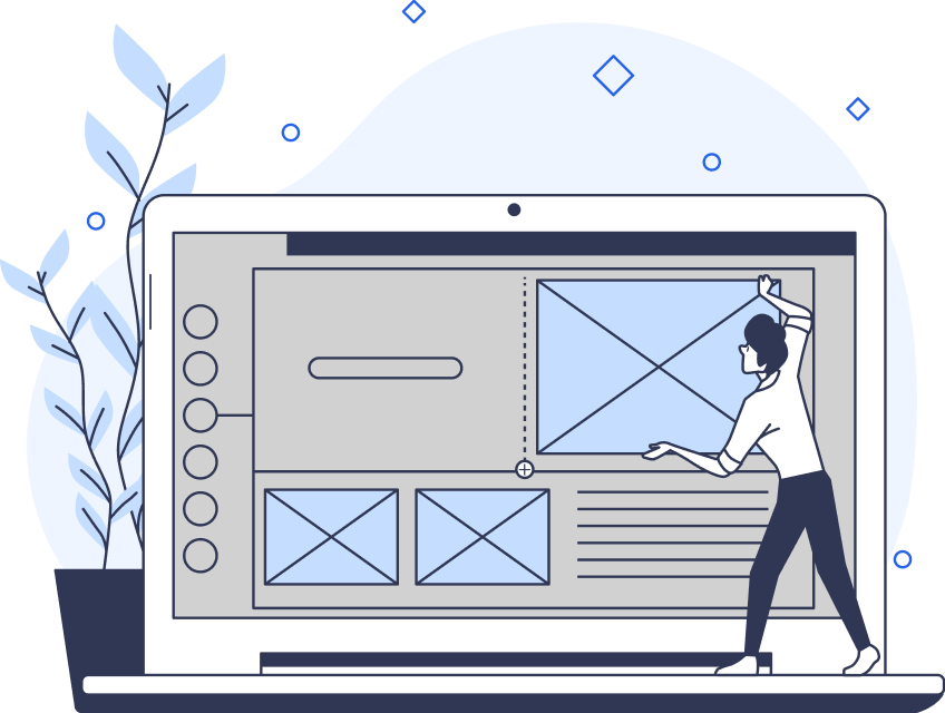
When UX designers talk about rhythm in design principles, it usually concerns the fluidity of visual elements.
With design rhythm, designers can influence where the user looks first, where they pause, and how long they pause.
As a UX/UI designer, it’s your responsibility to create user interfaces that are accessible, functional, and enjoyable. The principles of design rhythm allow you to fulfill that responsibility effectively time after time.
In today’s guide, you’ll learn about all of the design principles that affect design rhythm.
1. The Design Principle of Contrast
An excellent way to capture the user’s attention is to employ visually intriguing, contrasting visual elements.
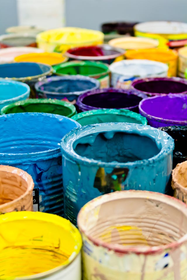
Contrast refers to how adjacent elements exhibit different visual characteristics, like color or size, which makes them stand out.
Aside from aesthetic reasons, UX designers also use contrast to create accessible user interfaces. An ineffective use of contrast can make particular typographic elements challenging to read, especially for users with visual impairments. Expectedly, an effective use of contrast can diminish such obstacles for users with disabilities like visual impairments.
A good example of contrast in digital design is when designers use a colorful CTA button against an achromatic webpage.

2. Balance in the Rhythm Principles of Design
Balance is a design principle that helps UX and UI designers understand the impact of visual weight.
From the colors and shapes you use to the typography and patterns you construct, every element exhibits visual weight.
Some elements are ‘heavier’ than other elements, meaning that they demand more attention from your users. It’s important to note that differences in visual prominence aren’t a bad thing. In fact, you should use elements with distinct visual weights, like how you’d use contrasting visual elements.
The important thing is that you arrange those elements in a way that promotes a sense of balance. By arranging your webpage’s visual elements with balance in mind, you’ll create a sense of cohesiveness, making your UI navigable.
UI designers often utilize two different types of balance: symmetry and asymmetry. Symmetrical designs convey a sense of quiet stillness, harmony, and stability. In contrast, asymmetrical designs evoke the user’s excitement and curiosity.
Although asymmetrical designs seem more intriguing, it’s wise to ensure they suit your brand’s identity appropriately before you use them.

3. The Emphasis Principle of Design
Similarly to how you’d utilize contrast, UX designers use emphasis to grab the user’s attention.
You could emphasize almost any visual element, including buttons, images, and even links. Proficient designers emphasize elements that influence a user’s journey and make the user’s experience more straightforward and enjoyable.
In most cases, designers emphasize the most essential content within a particular webpage. Although, it’s worth mentioning that you can also deemphasize elements to reduce the impact of certain content. For instance, designers often use small typographic elements to indicate a social media platform’s comment sections.
Ultimately, when employing the emphasis principle in your own designs, identify important content and think bigger, brighter, and bolder.
4. Enhancing Balance: Proportion Principles in UX Design
When improving balance, proportion is a great tool. Proportion in UX design refers to the relationship between visual elements with regard to their size and visual weight.
As a principle, proportion helps generate consistency, hierarchy, and visual rhythm within a digital design. For this reason, it’s imperative you approach the proportions of your visual elements with the goal of balance in mind.
However, having read our exploration of the balance principle, you know that balance doesn’t mean using elements of equal size. Equally proportioned visual elements don’t drive the user’s engagement with your product. At the same time, the overly unique proportioning of visual elements creates dissonance.
To avoid either eventuality, you should ensure that the visual elements you’ve enlarged/emboldened are essential to the user’s journey.
Just think: larger elements are more important, and smaller elements are less important.
Tip: Consider the unique contexts of the users who will utilize your product’s user interfaces. Different devices have different screen sizes, which may require you to tweak your use of proportions.
5. The Principle of Hierarchy in Design Rhythm
Visual hierarchy helps you determine the order in which your users absorb and process your product’s content.
UX/UI designers establish a visual hierarchy by designing and arranging elements in such a way that conveys their significance.
A visual hierarchy consists of eight visual components:
- Size: Users tend to notice larger elements first, as we’ve discussed.
- Color: Bright colors attract the user’s attention more than muted colors.
- Contrast: As you know, dramatic contrasts garner more attention.
- Alignment: Elements that don’t align stand out against elements that do align.
- Repetition: Reused visual elements can imply that certain types of content relate to one another.
- Proximity: Users naturally believe certain elements appear related to one another when they seem grouped closely together.
- White Space: The empty space around design elements draws the user’s eyes to them.
- Texture: Richer textures appear more compelling than flat textures.
By strategically implementing those eight components, you can influence your user’s perception of your product. Thus, you can guide them to their desired content quickly and virtually effortlessly.
6. Repetition in Design: A Key Design Rhythm Principle
Repetition in design simply refers to the complete or partial reuse of particular design elements.
Repetition in a digital product breeds consistency, which, in turn, makes it easier for users to intuitively navigate said product.
Whether you intend to reinforce concepts or unify a range of distinct visual elements, repetition will help you do so.
You can repeatedly use almost any design element, including the following:
- Typefaces
- Lines
- Fonts
- Textures
- Shapes
- Colors
7. The Design Principles of Rhythm
Interestingly, the rhythm principle of design is similar to rhythm in the context of musical compositions.
Precisely, the way the space between musical notes creates rhythm mimics the way the space between repeated elements creates rhythm.
It’s good to know about the main five different types of rhythm, which include:
- The random rhythm
- The regular rhythm
- The alternating rhythm
- The flowing rhythm
- The progressive rhythm
As its name suggests, random rhythms are too unpredictable for the users to identify a pattern.
Regular rhythms display the same spacing between each visual element with no anomalies.
Users can discern a consistent, repeating pattern from alternating rhythms. However, it’s worth noting that there are variations between the visual elements in an alternating rhythm. A perfect example of an alternating rhythm is the black and white squares on a chessboard or a 1-2-1-2 pattern.
Flowing rhythms follow organic bends and curves, creating natural patterns that mimic realistic motion.
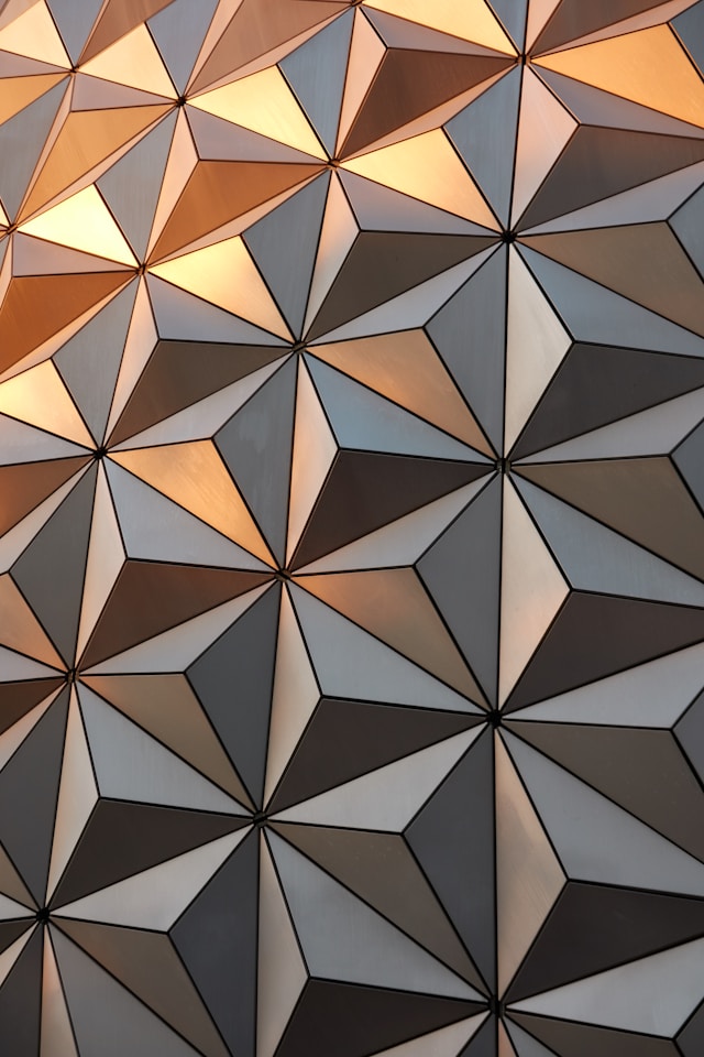
Designers can create progressive rhythms by changing one characteristic of a visual element as it’s repeated. For instance, you could design a series of triangles, each one becoming more blue as you iterate its design.
Overall, UX/UI designers utilize design rhythms to evoke a particular emotional response from their users.
8. The Pattern Principle of Design Rhythm
Humans have an innate ability to recognize repeated visual elements, categorizing them into patterns. By incorporating/creating patterns within your UIs, you’ll prompt your users to become familiar with your product’s UI design quickly.
Thus, overall, incorporating patterns into your user interfaces allows for intuitive navigation.
Best of all, creating visual patterns is incredibly straightforward because it’s simply the repetition of specific design elements.
Tip: Patterns can also refer to standardized, conventional design elements like navigation menus on the upper half of the screen.
9. The Principle of White Space
White space, or negative space, refers to areas of a webpage/user interface that don’t include any design elements.
Although you may feel the need to use as many impactful visual elements as you can, we don’t recommend it. A user interface with too many visual elements will appear cluttered and too confusing for your users to navigate.
White space allows you to choose which elements you incorporate thoughtfully. Consequently, you’ll end up creating user interfaces that only exhibit visual elements that will directly enhance the user’s experience.
Additionally, white space can help to highlight specific content or visual elements, making them easier to identify.

10. Movement as a Principle of Design Rhythm
As a UX design principle, movement is a means of guiding the user’s eye through a predetermined compositional flow.
This principle dictates that you should first guide your users’ eyes to the most crucial element of your user interface. You should then make it so that the user’s eyes focus on the next most important element and so on.
Through carefully planned positioning, contrast, and other elements that we’ve discussed already, you can guide your user’s eyes as intended.
11. The Principles of Design Variety
The principles of design variety aim to help designers create visual intrigue within their user interfaces.
By showing a variety of colors, images, shapes, and so on, you can increase the enjoyability of your digital product. However, utilizing variety for the sake of adhering to a design principle will not suffice.
Your use of variety should strengthen existing elements within your designs, enhancing your designs’ aesthetic value.
12. The Unity Principle of Design
When you throw elements together haphazardly for the sake of design variety, contrast, or even hierarchy, you disregard design unity.
To help designers avoid the pitfalls of cluttered or random designs, the unity principle of design emerged.
In design, unity means ensuring that every visual element has a clear, cohesive relationship with one another. By designing with unity in mind, you’ll ensure that vital concepts, content, and brand values appear in an understandable way.
13. The Harmony Principle of Design
Like unity, the harmony principle of design speaks to cohesion and clarity.
However, harmony in design focuses more on establishing a balanced, consistent, overall mood, style, or theme.
In other words, every element you use, both individually and collectively, should evoke the intended emotional response from your users. This is how you establish a voice and tone that users will synonymize with your brand.
The Principles of Design Rhythm: Refining Your User Interfaces
Hopefully, you’ve found the confidence to create your own enjoyable rhythms from our exploration of the design rhythm principles.
Beyond that, we hope that you understand that how you use one principle will affect the appeal of other principles. For this reason, we encourage you to experiment with each of them to understand which emotional responses they can evoke. Above all, we recommend that you always keep harmony in mind as you experiment with different visual elements.
On the topic of harmonious designs, you’ll need some inspiration to help you create your own. Consider Page Flows.
Page Flows is the home of over 5,100 recordings and over 83,000 screenshots of successful products!
Working alongside the likes of Google and Disney, we know what it takes to create seamless user flows! From onboarding to making purchases, we know how to turn a typical user’s journey into a meaningful digital experience.
With us, you’ll have access to everything you need to emulate the success of the giants in the UX world! Regardless of industry, we’ll provide a solid foundation of knowledge that you’ll find valuable throughout your entire career!
Regarding the principles of design rhythm, we’ve got you covered there too! Page Flows will show you what it looks like when a digital product adheres successfully to the design rhythm principles.
Get started today to access our endless abundance of user flow recordings, screenshots, and emails!