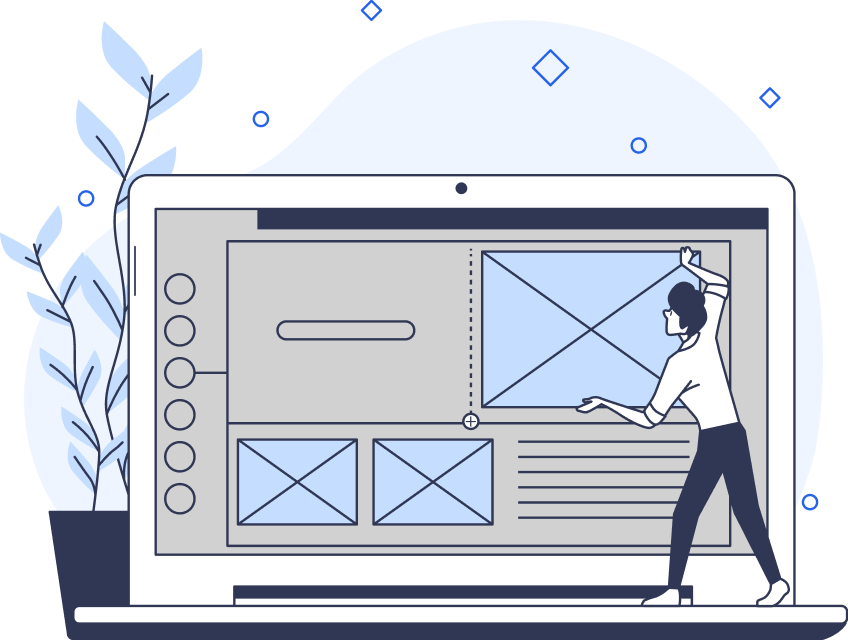
Whether you’re designing mobile applications or websites, user experience is paramount. One of the most important usability heuristics involves keeping things familiar. After all, Jakob’s Law states that users spend most of their time on sites (or apps) other than yours. Using relevant mobile design patterns can help you ensure that your app is intuitive for users.
From intuitive navigation to engaging user flows, mobile design matters can guide you through the design process. Let’s explore popular patterns in more detail.
8 Tried-And-Tested Mobile App Designs
When it comes to mobile app designs, there are several conventions that make things easier for your users. Here are eight design patterns for mobile applications that you can consider.
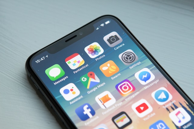
1. The Tab Bar
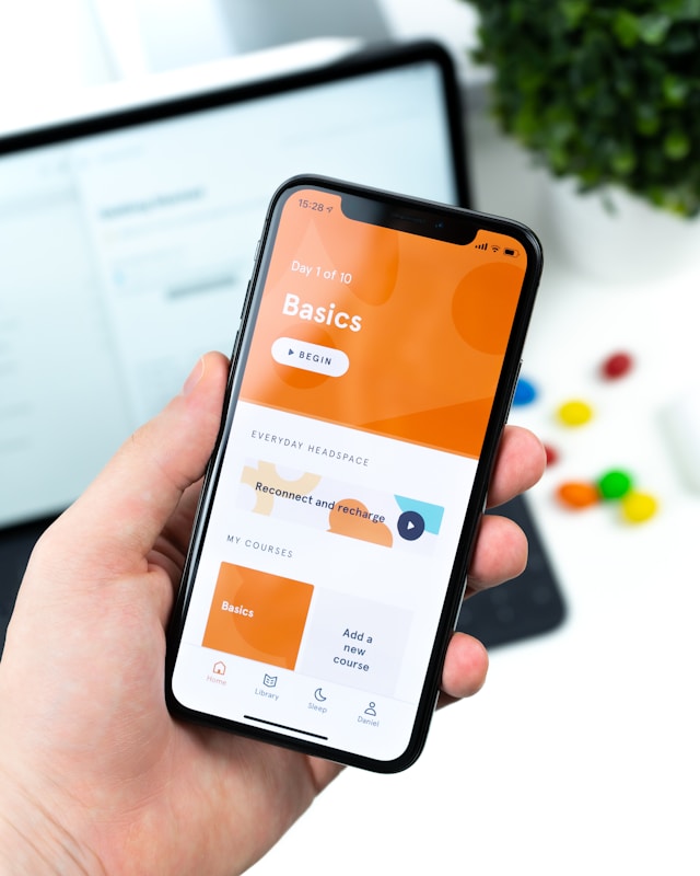
On most apps, you’ll notice a navigation bar at the bottom of the screen. Here, you’ll see different icons that show a different section of the app. The user simply needs to tap here to navigate to the right screen.
Some apps place the navigation bar at the top. However, many apps place it at the bottom. Here, it’s more accessible for users who find it difficult to reach the top of the screen.
Following this convention makes it easy for users to navigate. By sticking to tradition, your users know what to expect when opening a new app. They’re safe in the knowledge that there will be a toolbar at the bottom. Plus, with simple navigation, it’s easy for them to explore and get where they need to go.
2. The Navigation Drawer
Another common mobile design pattern is the navigation drawer. This is a navigation menu that slides out from one side of the screen to provide more options.
The user makes the menu appear by swiping from the edge of the screen. It’s sort of like opening a drawer.
The best part about this design is that it saves screen space because the menu isn’t permanent. Nevertheless, it’s easy for the user to access it when they need to.
Many popular apps use this design, including Facebook and Gmail.
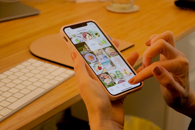
3. The Grid
Social media apps often make use of the grid format. This layout arranges items in a grid, which users explore by swiping. They can usually tap on an item to expand it or take an action.
Think of Instagram’s profile screen, for example, and its grid of photos. Here, the user can tap on each photo to expand it and see the extra information, like captions and tags.
You’ll also see this design with e-commerce apps, as it’s useful for displaying visual information.
4. The List
Meanwhile, the list view organizes information into a list. This is often a vertical list that fits easily onto a mobile screen. The user swipes to explore the list. Then, when they want to expand something and learn more, they can tap it.
The list format is ideal for more text-based information. Still, you can display it in a condensed format. Consider messaging apps, for example, like iMessage. The user can browse through a list of conversations with a small preview of each.
Often, list views come with a search feature to help users find what they’re looking for.
5. Cards
If you like more fun, aesthetically pleasing design patterns, try cards. Each card displays a small, self-contained piece of information. They can also contain text, images, and even interactive elements.
The best part is that there are many ways to display cards. You can use a grid or a stack layout, depending on your preference. Some apps even use a slideshow-like layout where users can swipe.
Cards make it easy for users to scan information quickly, but they also contain a wealth of information. They’re also interactive, which can create a more engaging user experience.
6. The Floating Action Bubble (FAB)
A floating action bubble, or FAB, appears above the other content on the screen. This button is great for providing users with quick access to an action they might take frequently.
So, no matter where the user is in the app, they can always perform the action because of the FAB. It’s ideal for apps where users are consistently performing the same action, such as adding an item to a list. E-commerce apps can also use FABs to hold the shopping cart. Or, social media apps often have a plus icon the user can click to add a new post.
The FAB is a fun and interactive element that enhances UX by making the user’s goal easier to achieve.
7. The Splash Screen
The splash screen is a fancy term for the loading screen. For example, when you enter an app and see a little animation that appears before you get to the homepage.
Sometimes, this seems like a minor detail. However, the splash screen can add a lot to the user experience. For one, the user knows that the app is doing something, which helps them to avoid frustration.
Plus, by adding animations, design teams can make it fun. It’s a simple way to enhance brand recognition, too, by adding your colors and logo. When designing your app, don’t overlook the splash screen.
8. Swipe To Refresh
Swipe-to-refresh is a common design pattern you find in a lot of apps. Essentially, this design pattern involves swiping down from the top of the screen to refresh the app. This reveals new content that’s up-to-date.
You’ll often see this with social media apps and news apps anywhere with real-time information. Many cellphone users use these apps all the time, so it’s a familiar convention. As a result, it provides an intuitive way to access new content. Furthermore, the user doesn’t have to navigate to a new screen to access the content. It’s quick, efficient, and logical.
Many app designers add animations and sound effects to this design. This creates a more interactive and playful experience that can also enhance brand recognition.
What’s a UX Pattern Library?
Depending on the app you’re creating, you can use a variety of these elements. Either way, you need to start collating a pattern library that you’ll use for your project.
A UX pattern library is a catalog of mobile patterns that you’ll use for your products. Patterns have recurring solutions that solve your design problems, hence their name. Think of it as a collection of common designs you use throughout the project.
You can also use pattern libraries for user interfaces. Here, you can collect a range of patterns for designs like icons, labels, buttons, and more. Design teams use pattern libraries to collate everything from simple elements like these to more complex ones.
Think of the card design mentioned above, for example. A design team can build the card design using elements from their pattern library. Then, the card itself becomes a part of the pattern library.
So, whenever you design a new screen, you can go into your pattern library to find your existing elements. This includes both the UI elements and the UX designs. Then, you can add them together to build the new interface.
Using pattern libraries can really help you save time. After all, with frequent app updates, you might need to build new screens regularly. A pattern library helps you to streamline this process and work quickly. Plus, it helps you enhance your brand consistency.
Sometimes, you can use existing pattern libraries to start your designs. Check out the following, for example.
1. Lovely UI
Lovely UI is an excellent pattern library with plenty of UI elements to browse. This includes badges, buttons, and more. These patterns work for both iOS and Android, which makes them ideal for app design.
There’s a built-in RSS feed so that you can browse UI patterns to your heart’s content. You can search for relevant elements using the navigation system and filters.
There’s even a tab on the app that tracks the latest trends in interface design.
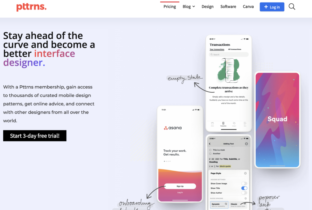
2. Pttrns
Pttrns is a large library with a huge variety of mobile designs. Again, it includes Android and iOS, but it also has patterns for Watch and iPad. You can filter the results to find exactly what you’re looking for, but all the entries appear in timeline order.
This means that, as you scroll, you can see how interface trends have changed over time.
3. UX Archive
Finally, UX Archive is a pattern library for iOS. This tool has several features, including the ability to browse workflows and create your own. However, it also has an animated pattern library. The patterns are for both iOS and Android devices.
If you have any awesome ones you want to share, you can submit them to UX Archive, too. You can see other contributors by checking out the ‘Featured’ tab.
What Is a Design System?
We also need to answer this question: what is a design system? A design system is a set of standards that govern your design. A design system creates visual consistency across your interfaces and even other channels.
Essentially, a design system catalogs all of your design components. So, when it comes time to create a new screen, you already have all the elements. This speeds up the process and streamlines the workflow.
It’s similar to a pattern library. However, a design system also contains the instructions and principles for you to implement the designs coherently. So, you’ll need both if you want to design a great app.
Why Use Pattern Libraries/Design Systems for Mobile Navigation?
The question remains: why use pattern libraries to help you build your mobile navigation flows? You could start from scratch and build your own. However, there are several advantages to checking out existing pattern libraries during the research phase.
For mobile UX design patterns, libraries are a great resource. The world of UX changes regularly, but libraries can help you check out the latest design trends. As a result, you can build an app that’s competitive.
Similarly, mobile UI design patterns can help to inspire you. Of course, you need to build a product that’s unique in order to stand out. That said, there’s no harm in taking inspiration from what design teams have come before. Instead of reinventing the wheel, you can leverage pattern libraries to understand pre-established solutions.
Here are some of the other benefits of using pattern libraries.
- Saves time: Pattern libraries can help you save time by providing a bank of material. Whenever you need to add a new feature, you immediately have inspiration at your fingertips.
- Promotes consistency: Taking inspiration from existing patterns can help you maintain consistency. You’ll see how other apps maintain their branding throughout the UX/UI.
Creates an intuitive experience: Often, pattern libraries stem from existing conventions. Following them means that you can create an intuitive experience for your users, improving the overall UX.
Find the Best App Designs at Page Flows
If you’re looking for UI design inspiration, it always helps to look at the best app designs. Whether you’re looking for mobile design patterns or app user flows, you can find them at Page Flows. Our library of flow recordings can help you find mobile app design ideas and spark your creativity.
So, when you’re looking for design inspiration, why not learn from proven products? Get started with Page Flows today to see more user flow recordings and stay up-to-date with UX trends.