User interface (UI) design is integral to helping you create digital products that are user-friendly. So, understanding the key UI terms will help you to improve your app’s usability. If you’re a UI designer, read on for a deep dive into navigating the world of UI design more effectively by understanding the different terms used in this field.
What is UI?
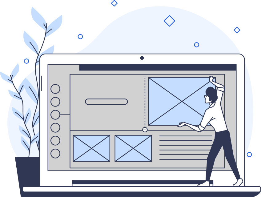
UI design involves the visual and interactive elements with which users interact with digital products. This includes both websites and software applications. It encompasses everything from buttons and icons to layout and color schemes.
UI design principles focus entirely on the look and functionality of a product. This works to ensure that the software both looks good and has a responsive design.
Understanding Basic UI Concepts
With over 94% of first impressions focusing on design, it’s essential to get it right the first time. Here’s a quick overview of the basics of UI (if you don’t know them already). We’re covering everything from UI vs UX and how UI keeps users satisfied.
UI vs. UX
User interface and user experience (UX) are interchange terms, but they represent different aspects of design.
UI is a subset of UX. UX covers the entire journey a user takes with a product. UI focuses more on the product’s interactive and visual aspects. UX is all about researching user needs, creating personas, and mapping out user journeys. UI deals with concrete elements like buttons, typography, color schemes, and layout.
A well-designed UI will help to improve UX by making the product more accessible and enjoyable to use.
The Role of UI in User Satisfaction
UI is crucial for keeping users happy. It ensures that interactions are intuitive and feel seamless.
Well-designed UX is all about helping users navigate a product easily. This works to reduce frustration and improve the overall experience. The key aspects of UI contributing to user satisfaction include:
- Clear labels, consistent icons, and straightforward navigation help users understand and use the product without confusion.
- The interface should react quickly to user inputs. It needs to provide immediate feedback on actions like clicks or form submissions.
- Visual appeal matters; a pleasing color palette, harmonious typography, and balanced layout contribute to an overall positive impression.
- A good UI considers the needs of all users, including those with disabilities. Features like keyboard navigation and screen reader compatibility can all help with this.

The Impact of UI on Usability
Usability testing helps to measure how easily your users can work while using a product. Good UI improves the usability of your digital products by:
- Providing clear navigation: A well-structured navigation menu allows users to find information quickly and easily. Proper labeling and logical grouping of items help streamline how the user navigates the product.
- Minimizing cognitive load: A simple and intuitive interface reduces the mental effort of using the product. This includes avoiding unnecessary features and focusing on core functionalities.
- Offering consistency across elements: Consistency in design elements, like buttons and icons, helps users reduce their learning time.
- Effectively using visual hierarchy: Organize information in a way that reflects its importance. That way, users can quickly find what they need. You can do this through size, color, and how you position your UI elements.

Why You Should Know the Main UI Terms?
There are several main UI terms you need to understand to take your design elements to the next level. Most successful UI designers are proficient in using these UI design terms to create successful projects.
Even though you may find it challenging to implement those terms perfectly into your design at first, you should remember that practice makes perfect. You should first familiarize yourself with what these terms mean and then focus on using them in your designs.
Key UI Elements and Components Terms
In this section, we include the most common UI terms you will use in your designs. Whatever project you are working on, whether it is a mobile app or website, these components are essential for a good user experience.
They include the following:
- Buttons: Buttons are what you click to make something happen. There are main buttons for important actions and secondary buttons for less important ones.
- Icons: Icons are small pictures that show what something does or represents. They help you understand what to do without needing extra words.
- Navigation menu: A navigation menu is a list of links or options, usually found at the top or side of a page. It helps you move between different parts of a website or app.
- Forms: Forms are where you enter information in input fields, like your name or email. They include boxes for typing text, checking options, and choosing one answer from a list.
- Radio buttons: Radio buttons are round options that let you pick just one choice from a list. They’re often for forms when you need to select only one answer.
- Modals: Modals are pop-up windows that show up on top of the main screen. They ask you to do something, like fill out a form or confirm an action.
- Tooltips: Tooltips are small boxes that appear when you hover over something. They give you extra details about what you’re looking at.
- Horizontal lines: These are lines that separate different parts of a page. They help organize content and make it easier to read.
- Dropdown menus: Dropdown menus show a list of options when you click on them. They keep the page neat by hiding options until you need them.
- Sliders: Sliders let you adjust settings by moving a control left or right, like changing the volume or brightness.
- Progress bars: Progress bars show how much of a task you’ve done. For example, how much of it is downloading or how far along you are in a form.

UI Layout and Structure Terms
Your UI layout is another essential feature that enhances a user’s experience. So, we have listed the following layout and structure terms to help you achieve that in your project and offer your users an easy-to-navigate interface.
Grid Systems
Grid systems are like invisible lines that help organize things on a page, making sure everything lines up neatly. There are different types, such as fixed, fluid, and responsive grids.
Using a grid system will improve the visual structure of your webpage, making it far easier to navigate. By aligning all your elements to your grid system, your content will be far more organized and proportional.
Responsive Design
Responsive design makes sure a website looks good and works well on all types of devices. This includes phones, tablets, and computers. It adjusts to fit different screen sizes.
Responsive designs must include flexible layouts and images so the user can always enjoy a seamless viewing experience. It shouldn’t matter what device they’re using.
Visual Hierarchy
Visual hierarchy is how you arrange elements to show what’s most important. It helps guide you through the content, making it easy to see what to focus on first.
An effective visual hierarchy will strategically use size, color, contrast, and placement to draw attention to key areas.
Margins and Padding
Margins are the space outside the edges of an element, while padding is the space inside the edges. Both help with spacing and layout to keep things looking neat.
This not only improves readability but it makes the layout more balanced and pleasing to the eye. Controlling spacing helps designers make the overall design look sleek rather than cluttered.
Aspect Ratio
Aspect ratio is the relationship between the width and height of something, like an image or video. Keeping the right aspect ratio makes sure it doesn’t look stretched or squished.
By maintaining the correct proportions, images and videos will stay high-quality and have a bigger overall impact.
Grid Columns
Grid columns are vertical lines in a grid system that help organize content. They keep things evenly spaced and aligned.
They allow for a more structured approach to a layout design. Content is divided into sections that designers can easily manage and adapt when needed.
Breakpoints
Breakpoints are specific screen sizes where the design changes to look good on different devices. They help the layout adjust to fit various screen sizes.
Using breakpoints helps designers to create far more flexible layouts that respond perfectly to device dimensions.
Fold
The fold is the part of a webpage you can see without scrolling. Important information goes above the fold so people can see it right away.
Placing calls to action above the fold will capture the user’s attention immediately. It encourages them to engage more with the web design.

Interactive Design Terms
Creating an engaging and intuitive interface using UI is a must when working on apps or websites. The user must be able to navigate easily through the different components while also having fun.
A UI design that makes this process complex can cause someone to turn elsewhere to find what they are looking for.
Here are some of the most common interactive design terms:
- Microinteractions: Small animations or effects that happen when you do something, like a button changing color when clicked.
- Feedback: The response from the interface after an action, such as a button changing color or showing a spinner while loading.
- Affordance: Design features that show how to use something, like a button that looks clickable. It helps users understand what actions they can take.
- Usability testing: Watching real users use a product to find problems and improve the design. It ensures the interface is easy to use.
- Hover states: Visual changes that happen when you move your cursor over an element, giving hints about what you can do.
- Focus states: Visual changes showing that an element, like a text field, is active. This is important for navigating with a keyboard.
- Gestures: Touch actions like swiping or pinching are used on mobile devices to interact with apps and websites.
- Loading indicators: Visual signals, like spinning icons, that show something is happening, like a file being uploaded.
- Drag and drop: A feature that lets you move items around by clicking and dragging them. Useful for organizing files or customizing layouts.
- Error messages: Alerts that tell you when something goes wrong and often suggest how to fix the problem. They help improve the user experience.
Accessibility in UI Terms
In this section, we have listed terms you need to familiarize yourself with if you want to make your UI designs accessible. These terms may be a bit more challenging than the rest of our article, but they are an essential part of UI design.
Color Contrast
The difference between text color and background color. High contrast makes text easier to read, especially for people with vision problems.
It helps to improve the overall legibility of text and other elements for all users, especially in low light.
Alt Text
Descriptive text for images that read out loud to help visually impaired users understand what the image is about.
It provides a textual alternative to visual content so all users can comprehend the information being conveyed in images. They should be concise yet descriptive.
Keyboard Navigation
Using only the keyboard to move around and interact with a website or app. This is important for people who can’t use a mouse.
Keyboard navigation allows users to access and interact with all the elements in your web design. All they need to do is use keyboard commands.
ARIA (Accessible Rich Internet Applications)
Special labels and attributes that make web content easier for assistive technologies, like screen readers, to understand.
They provide additional context and information about assistive technologies, which can improve the user experience for people with disabilities.
Tab Order
The order in which you move through interactive elements (like buttons) when pressing the Tab key. It needs to be set up correctly for easy navigation.
This is particularly crucial for users who rely on keyboard navigation. This means that all interactive elements are in sequence and maintain a logical flow.
Screen Reader Compatibility
Designing elements so they work well with screen readers, helping users who are visually impaired.
It involves structuring web content so it’s easily interpretable by screen reading software. This includes using a semantic HTML and providing more descriptive headings.
Accessible Forms
Forms that are easy to fill out for everyone, including people with disabilities. They should have clear labels and focus indicators.
You’ll also need to provide clear and concise instructions or error messages. The form fields must be compatible with a keyboard.
Skip Navigation Links
Links that let users skip past repetitive sections and jump straight to the main content, making navigation faster and easier.
It’s a way for users to bypass repetitive content like menus and jump straight into your main content. This saves time and makes it less of an effort to navigate through different web pages.
Text Resizing
Ensuring that text is larger without messing up the layout is important for users with poor vision.
Responsive design techniques and relative units of measurement, like ems, will ensure text resizing works with your design.
Accessible Media
Providing captions, transcripts, and audio descriptions for videos and other media so everyone can access the information.
Captions provide text for audio content, while transcripts are a textual version of video content. Audio descriptions describe all your visual elements in a video.
UI Design Processes and Tools Terms
The following terms refer to the typical design processes used when making a UI design. If you have been working with UI for a while, you should be familiar with these terms.
However, if you are a beginner in this field, ensure that you understand these terms thoroughly, as you will most likely be hearing about them and using them every time you start a UI project.
Here are some common UI design processes and tools terms you will come across as a UI designer:
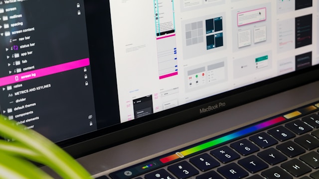
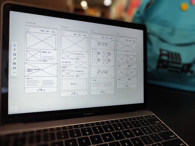
- Wireframing: Drawing simple, basic layouts of a website or app to plan how your structure will look.
- Mockups: High-quality designs that show what the final version of the website or app will look like, including colors and layout.
- User flows: Diagrams showing the steps users take to complete tasks on a website or app. They help plan how users will interact with the product.
- Style guides: Documents that describe the visual details of a design, like colors, fonts, and button styles. They ensure a consistent look across the product.
- Responsive grids: Layout systems that change to fit different screen sizes, making sure the design looks good on phones, tablets, and computers.
- Front-end development: The process of building the visual part of a website or app using programming languages like HTML, CSS, and JavaScript.
FAQs
What does UI mean in computer terms?
UI, in computer terms, refers to the design elements and components that allow users to interact with a digital product. It includes visual components like buttons, menus, and icons.
Why do I need to know UI terms?
Knowing UI terms helps in designing user-friendly interfaces, improving communication with developers, and ensuring a consistent and effective user experience. It’s essential for anyone involved in digital product design and development.
What is the difference between UI and UX?
UI focuses on the visual and interactive aspects of a product. UX encompasses the overall experience and satisfaction a user has with the product.
How does responsive design work?
Responsive design ensures a UI looks and functions well on different screen sizes and devices by adapting layouts and elements. This involves using flexible grids, images, and CSS media queries.
What are UI kits used for?
UI kits provide pre-designed components and templates that help designers build interfaces quickly and consistently. They include elements like buttons, forms, and icons.
Practice Your UI Terms and Get Help With Your Next Project With Page Flows
Understanding UI terminology will help you create user-friendly digital products, every time. Whether you’re designing a website or a software application, mastering these terms will help to improve your skills. It will also improve communication within your team.
For more guidance on how to use different UI terms and inspiration, consider using Page Flows to explore UI design patterns and examples. Start your next UI project with confidence and clarity—download Page Flows today!