UI and UX designers shape a user’s visual perception of a digital product by optimizing an array of individual elements. Elements such as images, colors, spacing and proportions, hierarchy, shapes, and typography can alter the way users perceive products drastically.
For this reason, no designer can overstate the importance of a visual design that caters to the laws of human perception.
In today’s guide, we’ll reveal how you can use visual elements to cater to the laws of human perception. Specifically, we’ll explore the Gestalt Principles of Design. By knowing these principles of perception, you will create user interfaces that combine user-friendly functionality with compelling visual intrigue.
What Are the Gestalt Principles of Design?
It’s incredibly crucial that you understand the Gestalt Principles of Design. These principles serve as the foundation for every visual element that UX and UI designers implement into their products.
When implemented effectively, the Gestalt Principles can significantly increase the aesthetics and functionality of a digital product.
So, what are the Gestalt Principles of Design?
Simply, they are principles/laws of human perception that describe how the human brain naturally groups similar elements together. Beyond this, they also describe how the human brain recognizes patterns and simplifies complex images when we perceive objects.
Designers employ the Gestalt Principles to organize their product’s content and information architecture effectively. As a result, both UX and UI designers can ensure their user interfaces are aesthetically engaging and easily navigable.
The Origins of the Gestalt Grouping Principles
The Gestalt Grouping Principles revolve around human psychology, which is an incredibly vital facet of UX design and UI design. Understanding users’ mental models leads to empathy, which, in turn, leads to user-centricity.
That being the case, we believe that every designer should familiarize themselves with the origins of the Gestalt Principles.
In the early 20th century, German psychologist Max Wertheimer published his paper on phi motion. Many consider this seminal paper as the emergence of the Gestalt Principles. An intriguing focal point of academic discussion, Wertheimer’s work would go on to develop further. Other German psychologists – Kurt Koffka and Wolfgang Köhler – expanded on Weitheimer’s idealogy.
The three psychologists aimed to understand how people make sense of the complex things they see and hear. In their search for understanding, they identified humankind’s natural compulsion to find order in disorder.
From this notion, six principles emerged. However, as time went on, newer principles joined Weitheimer’s initial ideology.
Nowadays, the Gestalt Principles include the following:
- The Principle of Emergence
- The Principle of Closure
- The Principle of Common Region
- The Principle of Continuation
- The Principle of Proximity
- The Principle of Multistability
- The Principle of Figure/Ground
- The Principle of Invariance
- The Principle of Pragnanz
- The Principle of Similarity
- The Principle of Symmetry and Order
- The Principle of Common Fate
To help you utilize these principles, we’ve explored them thoroughly below.
1. The Gestalt Principle of Emergence
The law of emergence serves as the fundamental principle of the Gestalt theory.
The principle of emergence states that we experience the world automatically and unconsciously. In other words, we commit very little effort when it comes to analyzing our surrounding environments to configure whole objects.
Essentially, this principle describes how meaningful visual elements can appear from a scene/image instantaneously. It speaks to our lack of conscious effort to identify the whole object. Rather, a whole image can emerge in our minds because we determine what we see from a specific visual characteristic.
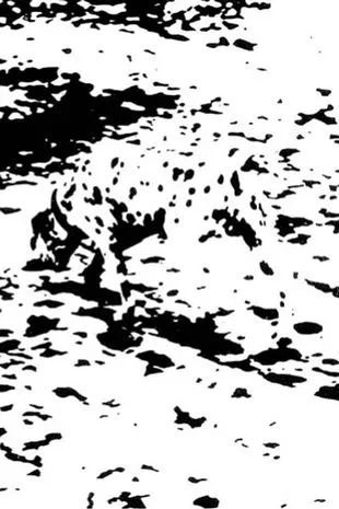
An Example of the Emergence Gestalt Principle
The image above is an optical illusion that displays a Dalmatian dog sniffing the ground. Instead of interpreting each splotch separately, we can immediately identify the dog from a collection of smaller black splotches. We can also visualize the dog from how the other black splotches appear around its silhouette.
In other words, the Dalmation emerges from our perceptual experience of an otherwise seemingly random scene/image.
2. The Gestalt Law of Closure
The Gestalt law of closure, or reification, refers to humankind’s compulsion to see a complete image or shape.
When we look at a complicated assortment of visual elements, we naturally look for an easily recognizable pattern.
Thus, when we see an image or shape that has missing parts/lines, we’ll naturally add those missing parts to our minds. We do this unconsciously to simplify the visualization of the whole image or entity. As a result, it’s easier to recognize any prevalent patterns.
An Example of the Closure Gestalt Principle
A great example of the closure Gestalt principle is the WWF’s logo.
Despite the WWF’s artistic omissions of certain lines, we can immediately determine that their logo utilizes a panda bear.
In this case, our brains automatically fill in the missing sections. Unknowingly, we do this to visualize the entirety of the panda, recognizing the intended pattern.
Without this automatic perceptual experience, this logo is actually just a complex assortment of irregular, black shapes.
3. The Gestalt Principle of Common Region
Common region principles relate to the connotations of closeness among visual elements.
What this means is that we perceive visual elements that are in the same closed region as one group. We assume that because certain visual elements occupy the same region, they share a common characteristic or purpose.
ALT: A close-up of YouTube’s sidebar, displaying a user’s homepage and the trending page.
An Example of the Common Region Gestalt Principle
A good example of the common region principle is YouTube’s sidebar. Webpages like YouTube’s homepage, trending page, and subscription page exist within the confines of its lefthandside navigation bar.
Due to distinct color schemes and icons, the user can automatically separate that ‘region’ from YouTube’s other content. What’s more, the said web pages share a common functionality – to lead users to find desirable content. Evidently, YouTube’s UI designers have utilized the common region principle to streamline the user’s journey toward their goals.
4. The Gestalt Law of Good Continuation
Continuity principles are incredibly useful for UX and UI designers looking to create fluid user experiences.
The law of good continuation states that our eyes will follow the smoothest, simplest path when viewing lines. Thus, we naturally group elements that seemingly follow a continuous path in a specific direction.
Whether we observe differing paths, lines, or curves of a design, we prefer to perceive a continuous flow of visual elements.
Even if an obstacle obstructs the line’s visibility, we will follow the path that we perceive to be there.
For this reason, designers tend to place a series of related items in a line. As a result, their users’s eyes will go from one item to the next seamlessly.
An Example of the Continuation Gestalt Principle
You likely found it easier to look at the lines on the lefthand side of the image.
Instinctively, we look at lines with a preconceived notion of fluidity. Thus, we choose to follow either the straight or curved path as opposed to following its more confusing counterparts.
5. The Gestalt Principle of Proximity
Similar to the UI design principle of the same name, the proximity principle relates to spacing within a visual design.
Simply, the proximity principle posits that we perceive items that are close to one another as functionally related.
Needless to say, we then regard items that appear separated or further away as functionally unique elements.
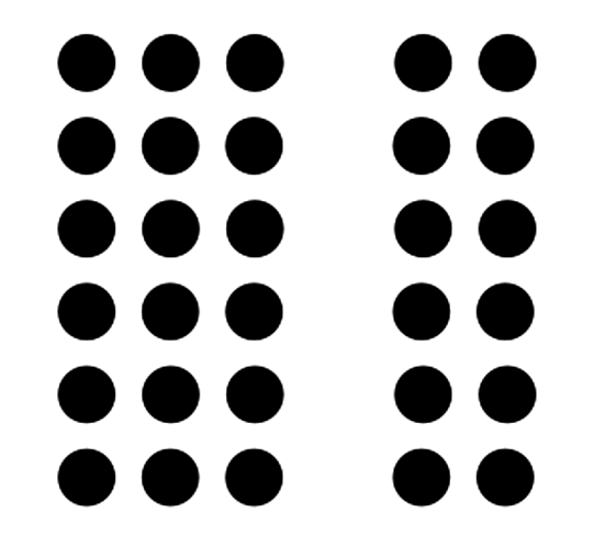
An Example of the Proximity Gestalt Principle
Although all of the circles in the image above are the same size and color, we perceive them as different. This is because of the proximity principle.
By utilizing the Gestalt proximity principle, UX designers allow users to intuitively follow their product’s intended structure.
6. The Gestalt Law of Multistability
The law of multistability dictates that we can sometimes perceive an image to actually be two images simultaneously. What’s more, we can also switch between which variation of the image that we see, like an on/off switch.
Some know this phenomenon as an ambiguous perceptual experience that allows for two unstable, unrelated interpretations. We know the sensation we feel as we switch between the two interpretations of multistability.

An Example of the Multistability Gestalt Principle
The duck/rabbit illusion is one of the most popular examples of multistability.
You either can see a duck or a rabbit, but you can’t see both at the same time. You’ll also notice that you have no control when it comes to switching between the two interpretations of the illusion.
7. The Gestalt Principle of Figure-Ground
The figure-ground principle serves as a cognitive function that allows us to identify visual prominence.
It’s a concept that enables a person to focus their attention on a figure rather than the background behind it. Whatever we perceive to exist in the foreground of an image or screen is the figure. Contrastingly, whatever we perceive to exist in the background of an image or screen is the ground.
We innately perceive certain objects to exist either in the foreground or background. This concept applies even if it’s not clear whether an object is in the foreground or the background.
In our minds, the object will either stand out prominently in the foreground or fall into the background.

An Example of the Figure-Ground Gestalt Principle
This image is a perfect example of the figure-ground principle. Why? You probably noticed the white Apple logo before noticing the silhouette of Steve Jobs behind it.
It’s arguable whether or not you should perceive Steve Jobs as behind the logo or in front of it. However, the main thing is that you saw the Apple logo foremost.
Therefore, this image encapsulates the significance of the figure-ground principle within UX design. By employing this principle, your users will know what they should focus on and, thus, how to achieve their goals.
It’s also worth mentioning that many have made the mistake of confusing the figure-ground principle for the multistability principle. Although they both relate to visual prominence, there is one key distinction between the two principles — stability. In most cases, the foreground and background of an image/screen are stable. The figure-ground law also tends not to allow for multiple, drastically unrelated interpretations, like how the multistability principle does.
8. The Gestalt Law of Invariance
Essentially, the Gestalt law of invariance alludes to the way we perceive basic shapes regardless of their style.
Style, in the context of basic shapes, refers to different variations of the following:
- The shape’s rotation
- The shape’s translation
- The shape’s scale
- The distortion of the shape
- How stretched or warped the shape appears
- The use of lighting and shadow within the shape’s visual makeup
- The shape’s elastic deformations
The invariance principle states that we can still recognize a basic shape independent of factors like the ones listed above.
Without our ability to recognize visual elements, regardless of any changes in their form, navigating daily life becomes impossible.
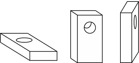
An Example of the Invariance Gestalt Principle
As you can see above, there are three different variations of the same object. It’s likely that you immediately recognized that all three shapes represent the same box with a hole in it.
Even though the image conveys three different visual shapes, you know that it is the same object regardless. This is the invariance principle in action. This image showcases our ability to see beyond stylistic variation to experience the real shape behind it.
9. The Gestalt Principle of Prägnanz
The Prägnanz principle states that we will automatically perceive and interpret ambiguous or complex images in the simplest possible way.
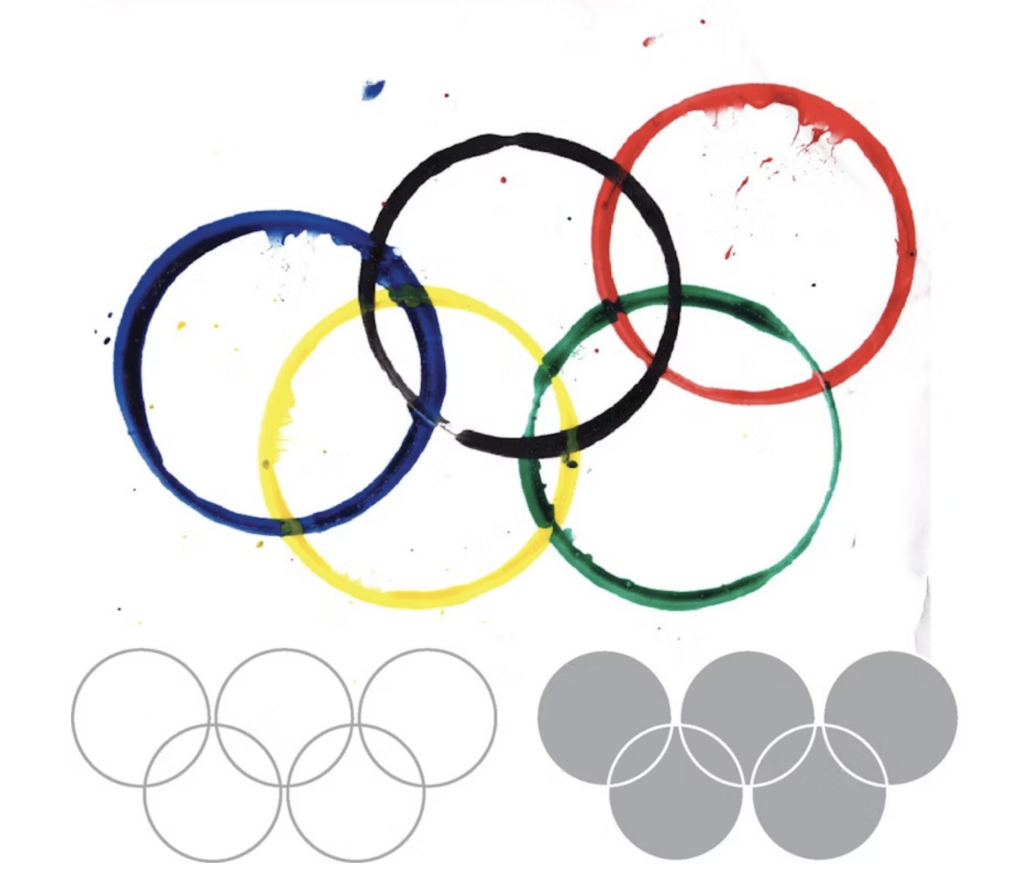
An Example of the Prägnanz Gestalt Principle
One of the most common examples of the Prägnanz principle is the Olympic logo.
Instead of interpreting the Olympic logo as a series of connected lines, we typically see five overlapping circles.
We perceive the Olympic logo as such because of our partiality for simplicity. In essence, it demands less cognitive effort to think of the logo as five overlapping circles.
10. The Gestalt Principle of Similarity
The principle of similarity states that when items share a visual characteristic like color or shape, we’ll deem them as related.
What’s more, when we see items that appear similar to one another, we tend to assume they have similar functions.
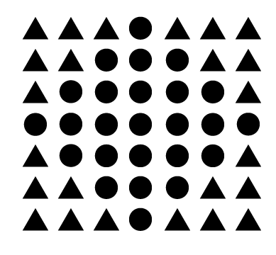
An Example of the Similarity Gestalt Principle
This image perfectly mirrors the similarity principle.
Naturally, we assume that all circular items are related and all triangular items are related. Why? Simply because the two distinct groups represent the two of the same shapes.
11. The Gestalt Law of Symmetry and Order
The law of symmetry and order claims that people perceive symmetrical visual elements as a unified collective.
Symmetry conveys a sense of order and rightness that the human brain finds satisfying.
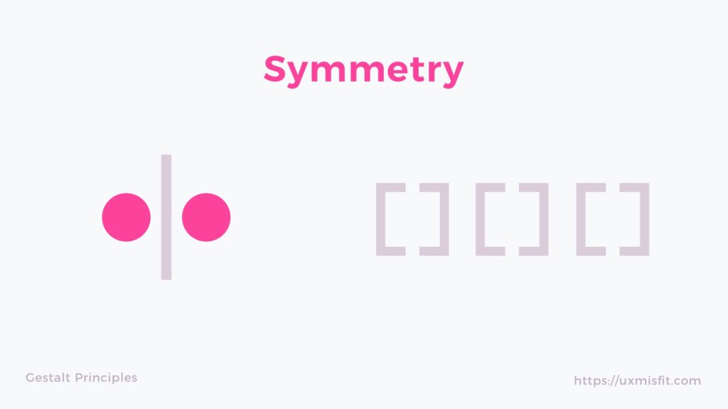
An Example of the Symmetry and Order Gestalt Principle
As you can see from the UXMisfit image above, symmetry speaks to visual cohesion, allowing the viewer to recognize patterns instantly.
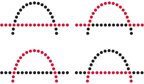
12. The Gestalt Principle of Common Fate
The Gestalt principle of common fate states that we perceive objects that move in/face the same direction as related.
Whether visual elements share the same motion or orientation, we instinctively unify said visual elements in our minds.

An Example of the Common Fate Gestalt Principle
From this image, we naturally assume that the three white arrows are in unison with one another.
Why is that the case? Yes, their colors are the same, but it’s their orientation that symbolizes unity in our minds. The common fate principle dictates that because the arrows share the same ‘motion,’ they belong in the same category.
The Gestalt Laws and Principles: Understanding Visual Perception
The key takeaway is that human psychology and visual perception play a crucial role in the user’s overall experience. The way we perceive the visual design of a product will influence how we approach it during the interaction.
From our exploration of the Gestalt Design Principles, you can see the power of even the most minor visual details.
From spacing to symmetry and everything in between, every small visual-oriented decision you make will alter the user’s experience. With this in mind, it’s important to always bear in mind what kind of experience you want users to have.
On the note of intuitive interactions, you’ll need some inspiration to guide you as you experiment with the Gestalt principles. Meet Page Flows.
Page Flows hosts over 5,000 recordings of proven products and vital user flows!
When designing vital user flows like onboarding, you need a solid knowledge of inspiration. Fortunately, Page Flows provides just that.
What’s more, we offer design solution inspiration across multiple industries – from Spotify to Slack and everything in between.
We learned from the Gestalt Principles of Design how important small visual details can be. Now, we and our collections of user-centric emails and recordings can show you just how impactful they are!
Learn from our success; start today to access our hub of user flow recordings, screenshots, and emails!