Game UX and UI design are integral to the success of the playing experience that video games offer their players.
It’s then no surprise that designers strive to create and optimize their video game’s interface elements. One of the most notable UI elements that a game designer will work on is the game’s HUD.
That brings us to the topic of today’s guide – game HUD. In this article, you’ll learn the meaning, practices, and principles behind a game’s HUD. Through our discussions, you’ll know what it means to optimize a HUD for an exceptional player experience.
What Is a HUD in Video Games?
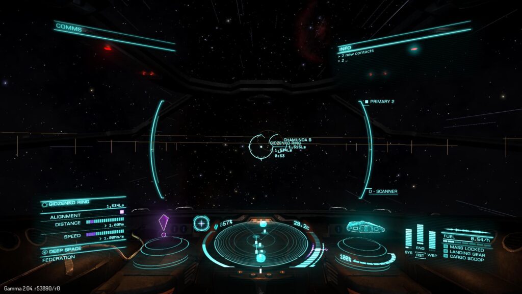
A HUD, or heads-up display, is a visual element that communicates information to the player. It’s a part of the game’s user interface, and the information it conveys often relates to the playable character’s state.
Below, we’ve listed a few common HUD elements you may recognize from your favorite games.
- A health bar
- A mana/energy bar
- A timer/in-game time
- Weapons/amount of ammunition
- A mini-map
- A speedometer (you’ll usually find these in games that include player-operated vehicles)
- A player’s score
- A compass
- A cross-hair
From these elements, you can recognize one commonality between them all – they are always visible to the player. This distinction is what separates a HUD designer’s responsibilities from a UI designer’s.
With the exception of informational/navigational aids like instructions and icons, a game’s UI design exists outside of the gameplay. In contrast, a game’s HUD is what the player can constantly see during their interactions with a game.
Game HUD Design Principles You Should Know
Like how any website or mobile app follows UI design principles, HUD design has principles that HUD designers should utilize.
In this section, you’ll find the game HUD design principles you need to create player-centric heads-up displays.

1. Effortless Readability
Arguably, faultless readability is one of the most important principles in HUD design. After all, the HUD will be constantly present during gameplay, so players must be able to understand it clearly.
Make sure any text is easily discernible and that any icons and their functions are familiar to the player. In order to do this, it’s best to use high-contrasting colors, fonts, and icons that the player expects to see.
For instance, it’s commonplace to see health bars in video games that have red or green colors.
Another aspect of readability to consider is de-cluttered screen space. You don’t want your HUD to overwhelm players visually, so choose your HUD elements carefully.
2. Consistency
Maintaining consistent colors, fonts, and the overall style of your HUD is paramount to the player’s immersion.
Design your HUD with the game’s narrative and genre in mind. If your HUD changes at any point, make sure it makes sense within the game’s story and world.
You should also ensure that the placement of your HUD remains consistent across different interfaces. This will help players quickly learn where to look for crucial information.
3. Visual Hierarchy
Visual hierarchy refers to how designers arrange visual elements to communicate their importance to the target users/players. Designers typically emphasize the importance of elements with the strategic use of size, color, contrast, proximity and repetition.
With HUD design, important visual elements like health bars are typically larger and brighter. This is because the character’s health directly affects the game’s playability.
On the other hand, less important visual elements like in-game money or time are usually smaller and less demanding.
This is something to bear in mind going forward with your own designs.
4. Accessibility
One of a designer’s main duties is to ensure your games don’t exclude players with physical and cognitive difficulties.
In the context of HUD design, accessibility revolves around the colors and sizes of HUD elements predominantly. You should allow players the ability to change the size and colors of elements for the most accessible, enjoyable experience.
7 Best Game HUD Design Practices
Now that you know about the design principles of HUD design, it’s time to learn about HUD design practices.
Below, we’ve revealed some of the best game HUD design practices that you should adopt in your design process.
- Allow the players to customize the proportions and positioning of the game’s HUD elements.
- Research your target players and find out as much as you can about their needs, wants, and pain points.
- Prioritize the information that the player needs to see.
- Make sure your HUDs don’t hinder or obstruct the player’s gameplay.
- Maintain visual and thematic consistency.
- Keep responsive design when designing for smaller screens.
- Test and iterate your HUD designs frequently.
Game HUD Examples To Inspire You
To point you in the right direction, we’ve revealed some of our top game HUD examples below.
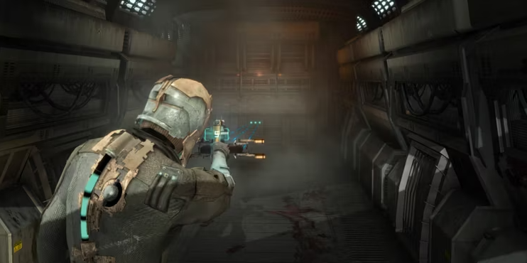
Dead Space
We can’t talk about exceptional heads-up displays without mentioning Dead Space.
Celebrating a completely diegetic HUD, Dead Space conveys vital HUD elements like health and stasis bars via the protagonist’s suit. This intelligent HUD design allows players to fully immerse themselves in Dead Space’s world completely obstruction-free.
Beyond immersion, thanks to the “health bar’s” bright, vibrant color – which contrasts the dark environments – it’s immediately recognizable. This is not only a great use of visual hierarchy, but it’s cyan color also suits the futuristic, cosmic theme.
What’s more, as the player upgrades the suit (and Isaac’s health), the HUD adapts flexibly. Put differently, the player will see additional nodules within the suit when they upgrade it.
Ultimately, Dead Space’s HUD perfectly encompasses immersion, engagement, and flexibility.
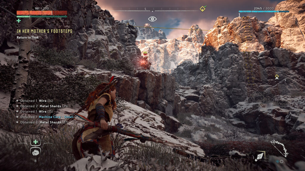
Horizon Zero Dawn
Horizon Zero Dawn is another great example of a game with good HUD design.
What’s impressive about Horizon Zero Dawn’s HUD is the amount of information it contains without being obstructive. Within HZD’s heads-up display, the player can see the following:
- The protagonist’s health (red) and medicine (green)
- The player’s current quest
- The compass
- A stealth icon
- The player’s level and amount of XP
- Waypoints
- Weapons and ammunition
Given all of that information, it’s incredible that the game’s HUD doesn’t hinder the game’s playability. In essence, this HUD is an excellent example of an effective use of proportions and proximity.
What’s more, the icons (the plus signs for extra medicine pouches and the alert eye for stealth) are incredibly familiar. This familiar iconography allows for a more intuitive playing experience and makes the visually “busy” HUD more digestible for players.
FAQs
What does HUD stand for in games?
One of the most common abbreviations in the gaming industry, HUD stands for heads-up display.
What is HUD in games?
Heads-up displays, in the context of gaming, refer to elements within a game’s user interface that are always visible.
This heads-up display will nearly always convey information to the player that relates to the playable character’s state or items.
Why is it called HUD?
Interestingly, the concept of a HUD comes from the aviation industry. In modern aircraft, the information a pilot needs is positioned above them.
So, a pilot would need to position their heads upwards to view the display of said information. This is where the term “heads-up display” comes from.
Game HUD: Use Page Flows To Get Ideas for Your Designs
Ultimately, the key takeaway is that you should design your game’s heads-up display based on the player’s expectations and preferences. In other words, you must design with user-centricity in mind.
A good way to implement user-centricity and game UX in your designs is to learn from proven products. That’s why you need Page Flows. It is the hub of thousands of inspirational resources that every designer who wants to master user flows needs.
We document user flows from a range of essential user interactions, industries, and successful brands like Google and Booking.com.
We encourage every designer to not reinvent the wheel but to learn from it to become a reputable designer. Like how a game HUD is vital to the playing experience, our resources are vital to seamless user navigation. But don’t take our word for it – see for yourselves.
Go to Page Flows today to discover what it looks like when a designer masters intuitive user navigation!