Wireframes are integral to the UX design process. Without them, designers wouldn’t be able to test and refine their product’s information architecture and overall UI layout.
Given how important a well-structured user interface is to the user experience, it’s not surprising that designers utilize different wireframes.
In today’s guide, we’ll focus on low fidelity wireframes. We’ll address the definition and advantages of lo-fi wireframes. We’ll also settle the low fidelity vs high fidelity wireframe matter. Keep reading to learn more!
What Are Lo-Fi Wireframes?
Low-fidelity wireframes serve as rough sketches that a product development team would use to visualize a digital product’s UI structure.
Since these basic wireframes are little more than simple sketches, they focus solely on a product’s core functionality.
For that reason, lo-fi wireframes contain simple design elements like basic shapes and image placeholders. After all, the goal of a low-fidelity wireframe is not to outline the product’s visual design.
Instead, UX designers leverage lo-fi wireframes to clarify/validate a user interface’s layout and its navigational ease for future designs.
Low Fidelity vs High Fidelity Wireframes: Key Differences
Now that you know what a low-fidelity wireframe is, it’s time to discuss what it is not. After all, different types of wireframes help designers achieve different goals.
To ensure that lo-fi wireframes will help you achieve your goals, it’s best to compare them to their high-fidelity counterparts. Let’s start by defining a high-fidelity wireframe.
High-fidelity designs faithfully reflect the finalized version of a digital product.
Unlike low-fidelity wireframes, they are realistic and contain a lot of detailed design elements. These elements often include interactive features like buttons, brand-specific designs, color schemes, and typographic elements.
For that reason, creating high-fidelity wireframes requires a deeper understanding of target users than creating low-fidelity wireframes.
Another key difference is that because lo-fi wireframes are so basic, designers can create them using a pencil and paper. With more complex high-fidelity wireframes, designers often need to rely on digital tools like Figma.
The Benefits of Creating a Low Fidelity Wireframe
Although it may be an undetailed, quick sketch, a lo-fi wireframe can offer UX designers many significant advantages.
We’ve explored some of these advantages below to help you maximize the potential of your own lo-fi wireframes.
- They are quick and easy to create, edit, and iterate.
- Because they are quick to create, you can also quickly receive helpful feedback, ensuring your designs meet users’ expectations.
- They help you identify structural/navigational issues early, potentially saving you valuable time and resources.
- Their readable, easily understandable composition allows for simple cross-functional collaboration.
- They lack the detailed elements of UI design, helping designers focus solely on the product’s functionality and structure.
How To Create Low Fidelity Wireframes
Now, let’s assume the role of the UX designer and discuss how to create wireframes.
Below, we’ve provided a step-by-step guide to help you learn how to create low fidelity wireframes.
1. Assembling Your Research
No design process would be successful without research. This goes for both user research and competitor research.
With user research, you must learn as much as possible about your users’ desires, needs, expectations, and pain points. This will help you clarify the steps your users will take to complete their goals within your wireframe and product.
Doing this will also help you define the core functionalities that your wireframe/product must display to guide those goals.
With competitor research, you aim to find out what your users love (and don’t love) about similar products. This will help you more accurately tailor your wireframe’s layout to your users’ preferences.
2. Combining Your Research & Your Objectives
With thorough research in your arsenal, you need to revisit your business’s objectives.
Ask yourself the following questions:
- What are my business’s goals, and how will my wireframe help achieve them?
- Which of the users’ problems am I trying to solve with my wireframe?
- How will my wireframe improve upon my competitor’s designs?
Asking questions like these will help you align your research data with your business’s goals, resulting in more valuable wireframes.
Ultimately, you should base the elements of your wireframe on satisfying your users’ and business’s needs.
From here, you can start to brainstorm and list the must-have components of your wireframe.

3. Selecting Your Wireframing Tools
As we mentioned earlier, you can create your lo-fi wireframes with a pencil and paper if you prefer.
You can also use wireframing software like Balsamiq and Sketch if you want to produce clean, low-fidelity wireframes quickly.

4. Sketching Your Wireframe
Now, you need to create a basic layout for your wireframes. We recommend starting by ensuring your sketches match the size of the users’ devices.
After all, you wouldn’t create layouts that resemble a computer screen if you’re working on mobile app design.
With the right layout, you can then create basic shapes and placeholders to represent different design elements. For instance, you can use small rectangular boxes for CTAs and small circles for buttons.
We also suggest leveraging visual hierarchy to arrange your elements based on their importance to user navigation.
5. Building Upon Your Wireframes
Once you have a series of lo-fi wireframes, we recommend adding labels to every section and element. This will make your wireframes easy for fellow designers and stakeholders to understand.
You could even annotate your wireframes to explain complex functionalities and user interactions.
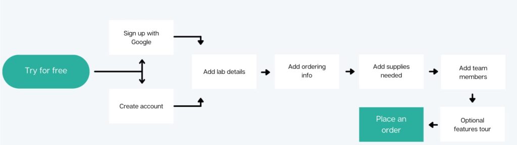
Tip: Create user flows to go alongside your wireframes. User flows map out the steps users must take to complete in-product goals/tasks. Using them will help you spot any missing crucial elements within your wireframes.
6. Receiving Feedback & Refining
The last step involves sharing your finished wireframes with your design team, stakeholders, and even users to receive valuable feedback.
With this feedback, you can identify and fix any areas of improvement, allowing you to iterate your wireframes effectively.
After as many iterations as necessary, you’ll have a polished, low-fidelity wireframe and can move on to creating high-fidelity wireframes!
Low Fidelity Wireframes: Examples To Learn From
To make sure you’re on the right track, we’ve provided a few low fidelity wireframe examples below.
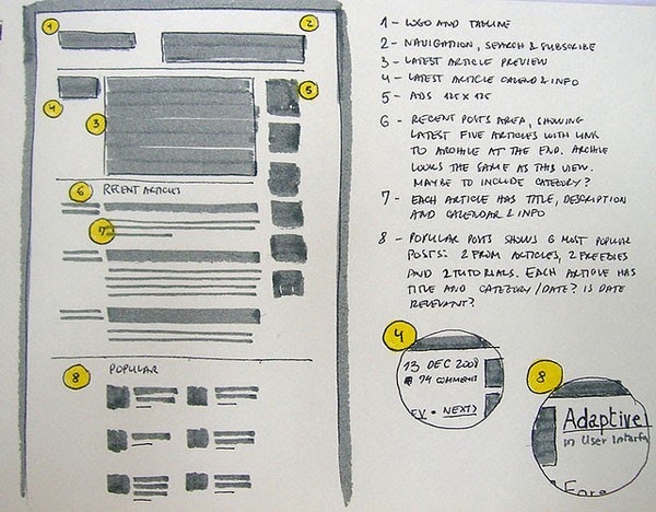
Example 1
It’s easy for a wireframe to become unreadable when it’s full to the brim of scrawly annotations.
In this example, the designer keeps the annotations separate from their wireframe. On paper, this idea may seem confusing. After all, how will fellow designers and stakeholders know which annotation matches a particular element?
But this designer brilliantly combats this problem. They use shapes, numbers, and colors to match design elements/sections with their annotations.
So, not only is the wireframe’s layout perfectly clear with shapes and placeholders, but their rationale is also easily understandable.
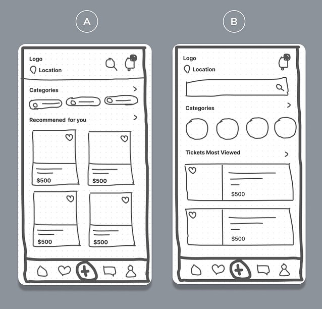
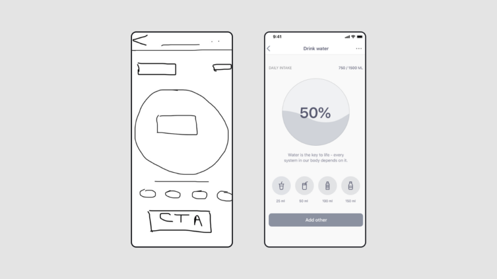
Example 2
This example comprises two lo-fi wireframes for a mobile app.
What’s great about this example is that the designer prioritizes design elements according to their limited screen space. By only using the most crucial elements, the designer ensures a seamless navigational experience for the user.
Additionally, this wireframe is easily readable – and it’s not just because of its basic shapes and concise labels. It also displays familiar, recognizable shapes like hearts and speech bubbles to resemble interactive elements.
This helpful addition removes the need for annotations and makes cross-functional collaboration much simpler.
FAQ
What are low-fidelity wireframes?
Low-fidelity wireframes serve as incredibly basic blueprints for a user interface’s information architecture.
They are simple sketches that lack detail, focus primarily on functionality, and help designers outline the user’s in-product navigation.
How do you decide whether to use low-fidelity or high-fidelity designs?
Due to how quickly you can produce them, you can create low-fidelity prototypes at any stage in the design process. Typically, however, designers will use lo-fi wireframes the most during the design process’s early stages to validate the product’s structure.
In contrast, designers tend to create high-fidelity prototypes nearer to the end of the design process. This is because high-fidelity prototypes closely mirror the final iteration of a digital product.
How long should it take to create a low-fidelity wireframe?
Creating a low-fidelity wireframe for a singular user interface should only take you a few minutes. Creating, editing, and receiving feedback for all of your product’s lo-fi wireframes generally takes a couple of hours or less.
Create Top Low Fidelity Wireframes With Tutorials From Page Flows
Hopefully, you now feel more confident when creating your own lo-fi wireframes. The main thing to remember is to steer clear of too much detail. Too much detail will distract you from validating your product’s structure, layout, and navigational ease.
Another great way to optimize your product’s navigational ease is to learn from proven products. This is where Page Flows comes in.
Page Flows hosts a vast amount of inspirational resources, including recordings, screenshots, and emails from email marketing campaigns. We base our resources on one crucial aspect of user navigation: user flows.
From signing up to following and subscribing, we document every user flow your product could ever need. What’s more, our resources come from an impressive range of popular industries and successful brands, including Amazon and ASOS.
We collect these resources so that every designer has a solid base of inspiration by their side throughout their career. Like low fidelity wireframes, our resources serve as the foundation of the next must-have products.
Use Page Flows now to learn what it takes to master the art of intuitive user interactions!