- AI chat
- Accepting an invite
- Account settings
- Act of kindness
- Activity log
- Adding a course
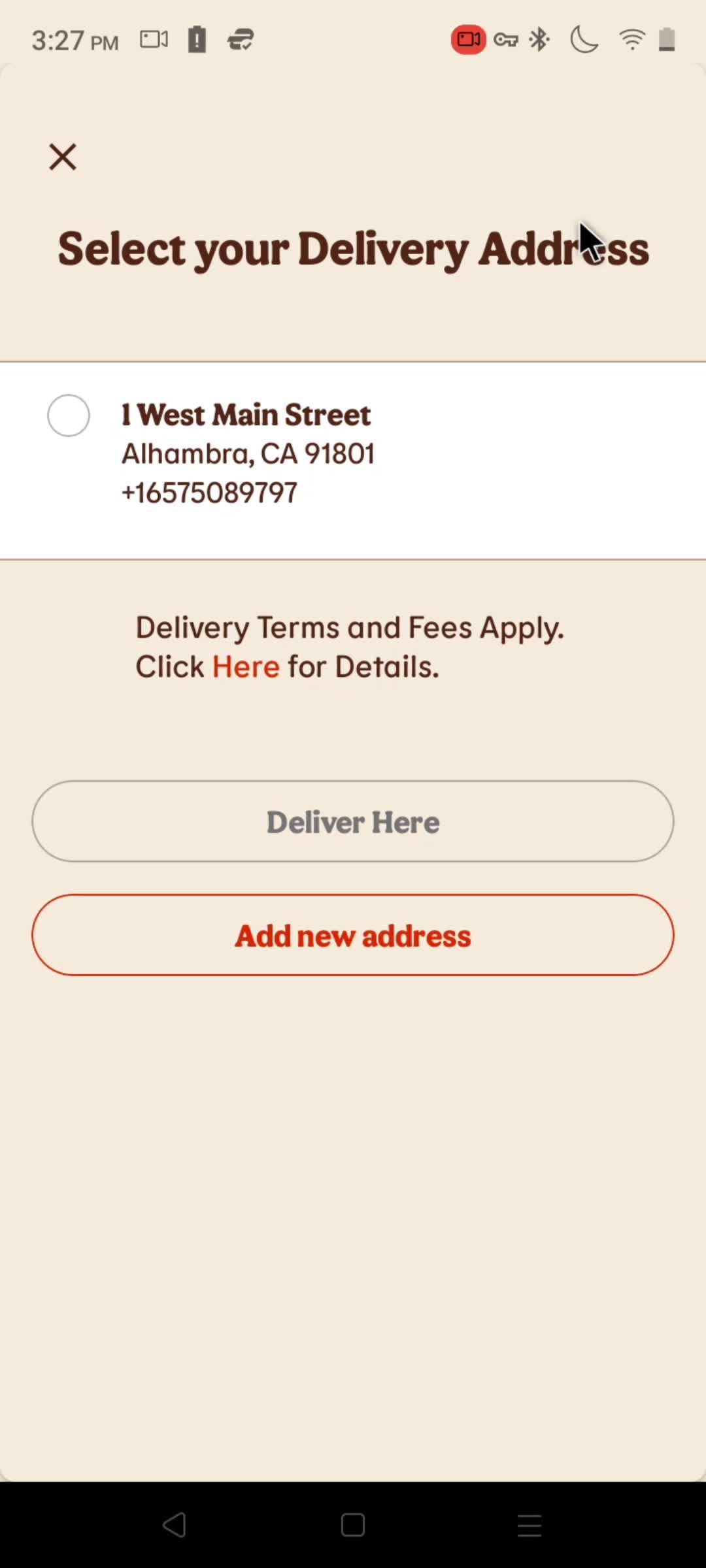
- Adding a delivery address
- Adding a friend
- Adding a journey
- Adding a member
- Adding a new card
- Adding a payment method
- Adding a project
- Adding a reflection
- Adding a section
- Adding a subject
- Adding a subtask
- Adding a vehicle
- Adding an account
- Adding an activity
- Adding an address
- Adding an employee
- Adding billing address
- Adding collaborators
- Adding comments
- Adding connections
- Adding departments
- Adding email contact
- Adding files
- Adding filter
- Adding goals
- Adding holidays
- Adding mentions
- Adding new portfolio
- Adding payment details
- Adding postal address
- Adding preferences
- Adding session
- Adding shipping address
- Adding stories
- Adding tags
- Adding to cart
- Adding to favorites
- Adding to question bank
- Adding traveler's details
- Adding vocabulary
- Adjusting preferences
- Advice and Tips
- Analytics/Stats
- Applying for a job
- Asking a question
- Badges
- Becoming a guardian
- Becoming a seller
- Bidding
- Blocking a user
- Board settings
- Booking a ride
- Booking a room
- Booking free classes
- Browsing Tiktok studio
- Browsing by subjects
- Browsing meals
- Browsing templates
- Browsing videos
- Buying a gift card
- Buying something
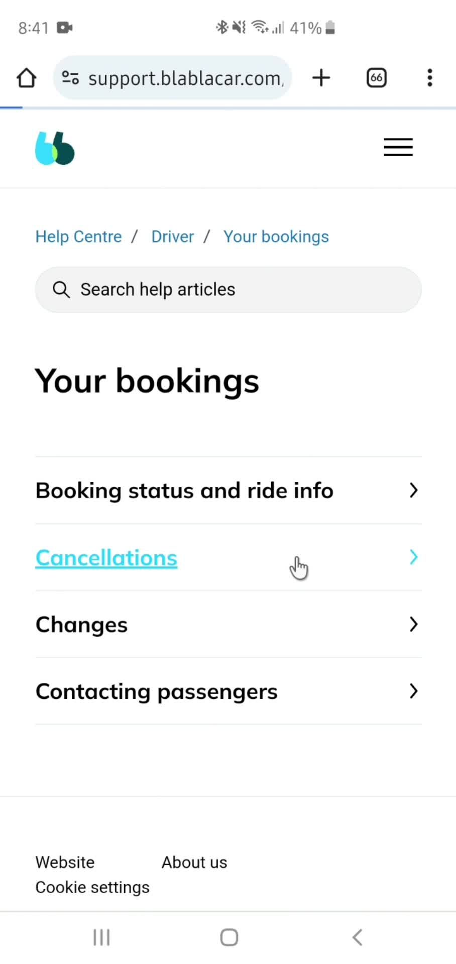
- Cancelling a booking
- Cancelling an order
- Cancelling info download
- Cancelling your subscription
- Changing Bitmoji outfit
- Changing password
- Changing schedule
- Chat bot
- Chatting
- Chatting with Coach Avo
- Choosing a tag
- Choosing courses
- Claiming my code
- Clearing search history
- Clocking in
- Closing your account
- Commenting
- Completing a level
- Completing a plan
- Configuration settings
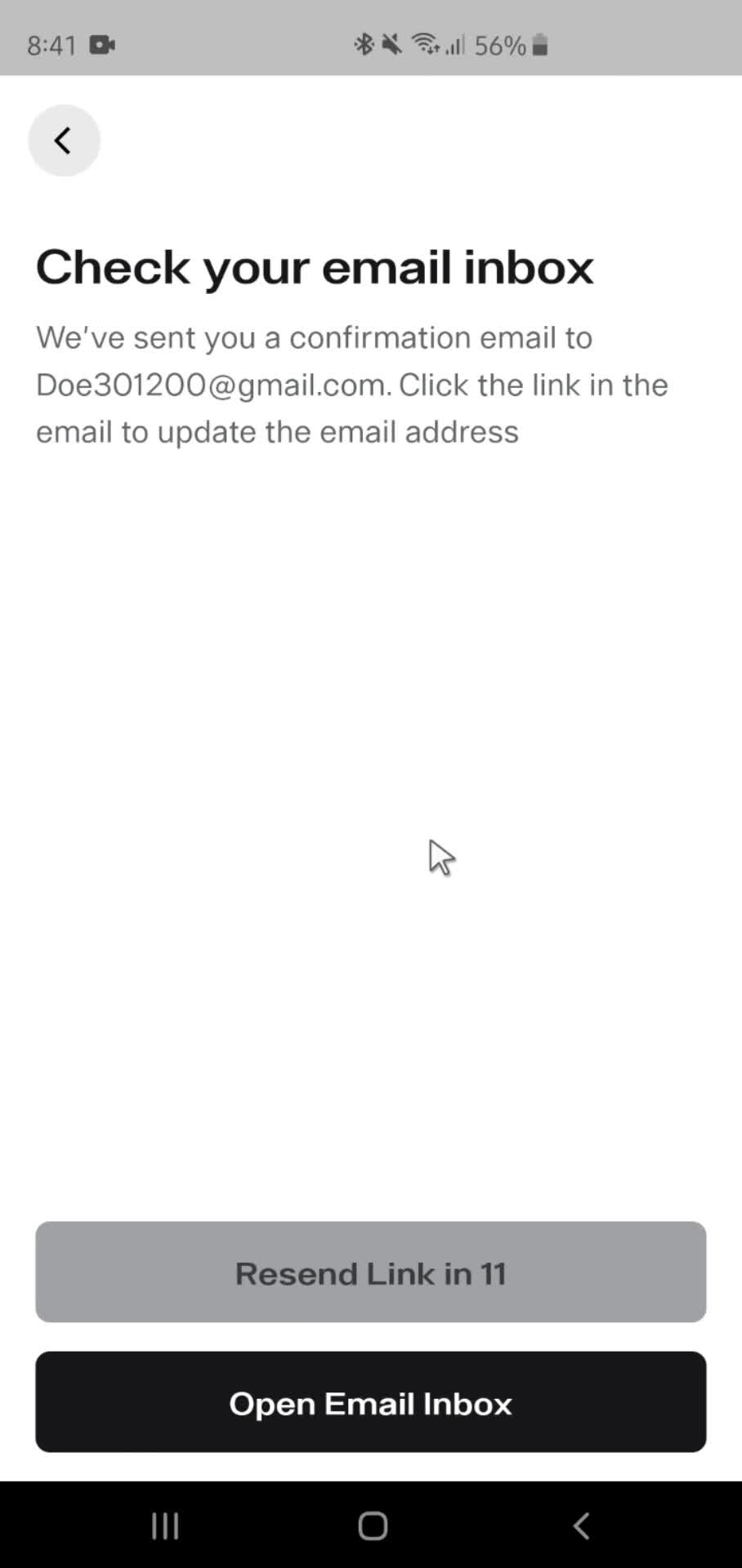
- Confirming email address
- Connecting a calendar
- Connecting to a computer
- Connecting to communities
- Creating AI persona
- Creating a board
- Creating a budget
- Creating a business account
- Creating a calendar
- Creating a card
- Creating a challenge
- Creating a channel
- Creating a class
- Creating a collection
- Creating a document
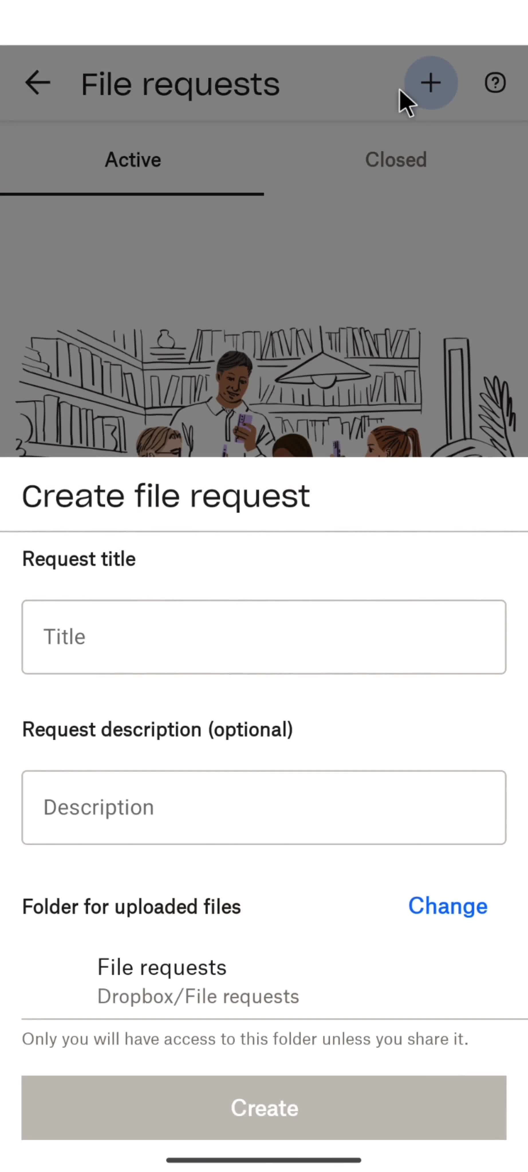
- Creating a file request
- Creating a folder
- Creating a group
- Creating a group chat
- Creating a new post
- Creating a new topic
- Creating a new view
- Creating a playlist
- Creating a post
- Creating a pot
- Creating a project
- Creating a story
- Creating a task
- Creating a template
- Creating a voice
- Creating a wallet
- Creating a wishlist
- Creating an activity
- Creating an event
- Creating an image
- Creating card defaults
- Creating countdown
- Creating flashcard set
- Creating memories
- Creating shortcuts
- Creating topic from an example
- Customizing snap
- Deleting AI data
- Deleting a document
- Deleting a list
- Deleting a post
- Deleting a project
- Deleting a story
- Deleting a vehicle
- Deleting an activity
- Deleting billing address
- Deleting card details
- Deleting chat history
- Deleting collection
- Deleting comments
- Deleting conversations
- Deleting countdown
- Deleting goal
- Deleting history
- Deleting items
- Deleting posts
- Deleting question bank
- Deleting scheduled meeting
- Deleting tasks
- Deleting topics
- Deleting traveler's details
- Deleting your account
- Discovering content
- Discovering goal ideas
- Discovering solutions
- Downloading
- Downloading data
- Downloading your info
- Dropping a class
- Duplicating a document
- Editing a document
- Editing a goal
- Editing a task
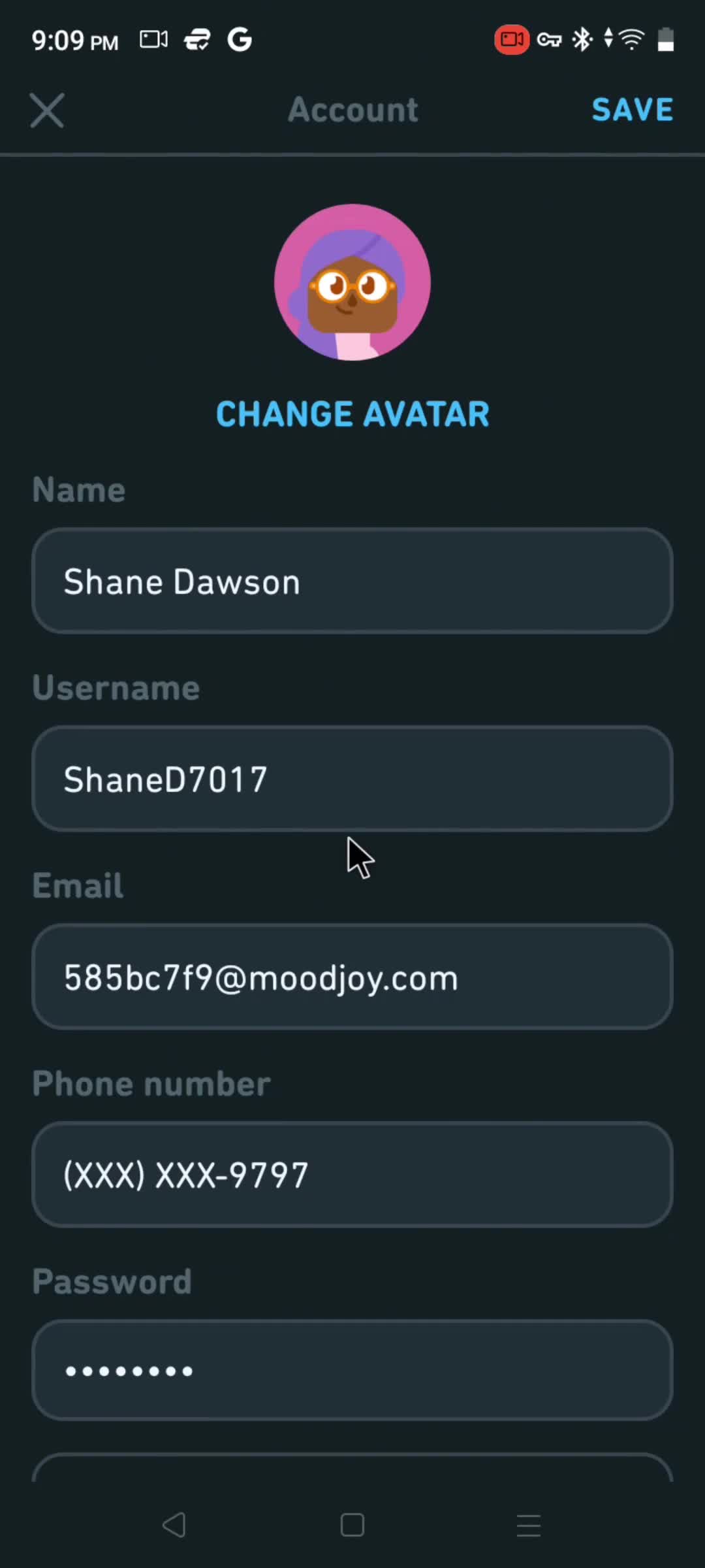
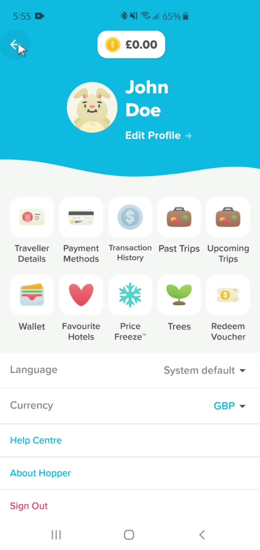
- Editing personal info
- Editing work timing
- Email notification settings
- Enrolling in a course
- Exporting conversation
- Exporting data
- Filtering and sorting
- Finding a recipe
- Finding flights
- Finding hotels
- First aid kit
- Following a user
- Following someone
- Freezing your account
- General browsing
- Generating AI artwork
- Generating study guide
- Giving feedback
- Help center
- Hiding posts
- Inviting a teammate
- Inviting people
- Joining a challenge
- Joining a community
- Joining a group
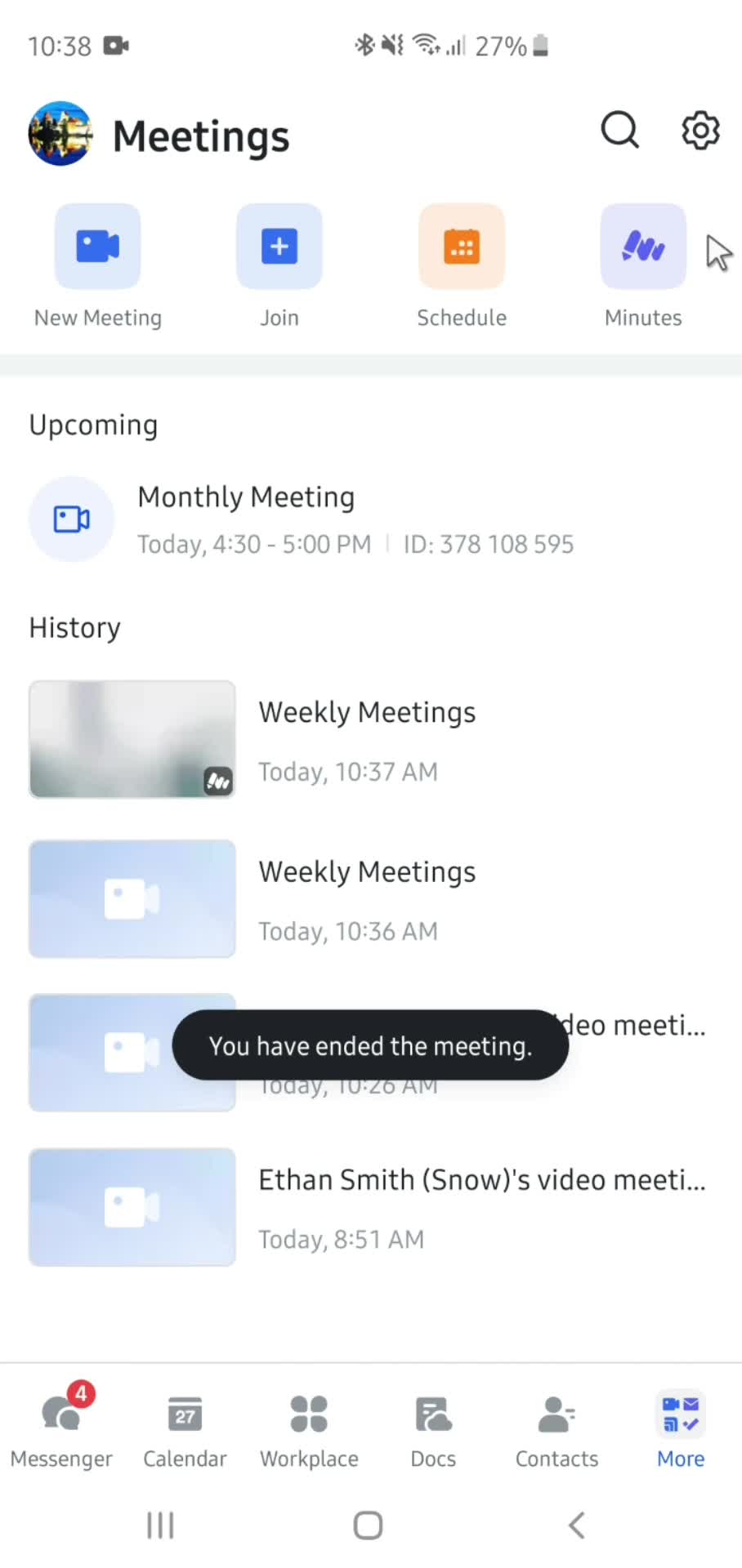
- Joining a meeting
- Joining a workspace
- Joining an event
- Joining live classes
- Joining workouts
- Leaderboard
- Learning
- Leaving a challenge
- Leaving a review
- Liking posts
- Linking a card
- Listening to soundscapes
- Listing a property
- Logging in
- Logging out
- Logging your food
- Logging your weight
- Managing accounts
- Managing files
- Managing flashcards
- Managing history
- Map search
- Meditation
- Meeting settings
- Messaging a seller
- Messaging the host
- Movements
- Moving a photo
- Moving a task
- Moving pages
- Notification settings
- Onboarding
- Ordering delivery
- Ordering something
- Power ups
- Quests
- Rating a transcript
- Recording a conversation
- Redeeming a promo code
- Redeeming an offer
- Refer and earn
- Reflections
- Removing card details
- Removing favorites
- Removing items
- Removing items from cart
- Removing payment details
- Renaming a conversation
- Renaming a file
- Renaming a section
- Renaming a topic
- Reordering a section
- Reporting a listing
- Reporting a post
- Reporting a snap
- Reporting a user
- Reporting a video
- Reporting an issue
- Reports
- Reposting
- Resetting password
- Restoring deleted conversation
- Returns
- Reviewing
- Saving
- Scanning
- Scanning a document
- Scanning products
- Scheduling a meeting
- Scheduling a workout
- Searching
- Sending gifts
- Sending messages
- Sending tips
- Setting a PIN
- Setting a goal
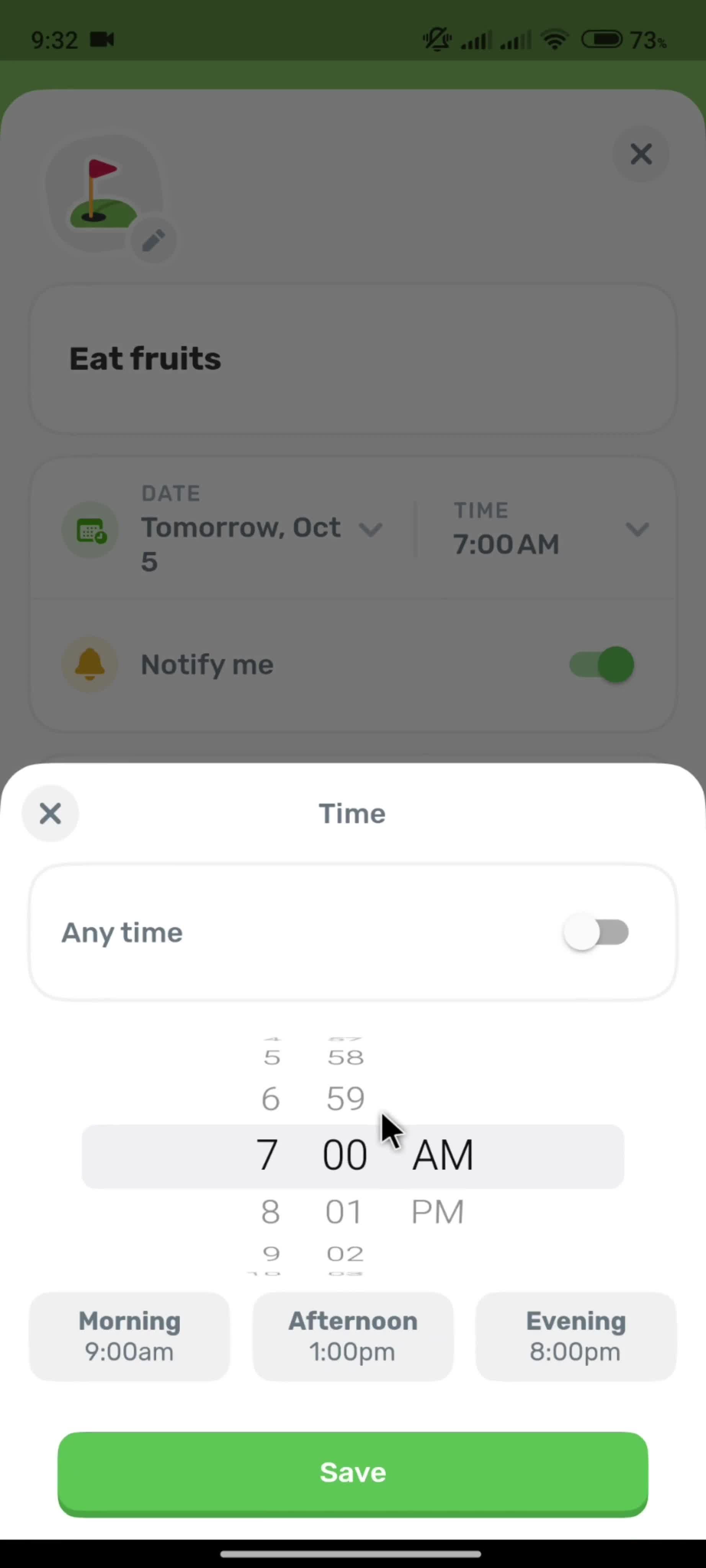
- Setting a reminder
- Setting goals
- Setting timer
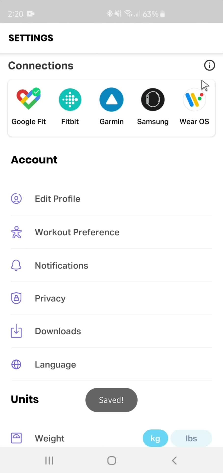
- Settings
- Sharing
- Sharing a post
- Sharing a video
- Sharing profile
- Shopping
- Shopping list
- Shopping settings
- Singles meditation
- Skills meditation
- Sleep meditation
- Starting a fast
- Starting a lesson
- Starting a meeting
- Starting a run
- Starting an activity
- Starting exercises
- Submitting a bug report
- Subscribing
- Switching accounts
- Taking quizzes
- Tasks
- Training plans
- Turning on teenage mode
- Unblocking users
- Unfollowing a user
- Unfollowing someone
- Unfreezing your account
- Unhiding posts
- Unsaving
- Updating delivery address
- Updating organization profile
- Updating preferred store
- Updating profile background
- Updating profile picture
- Updating profile settings
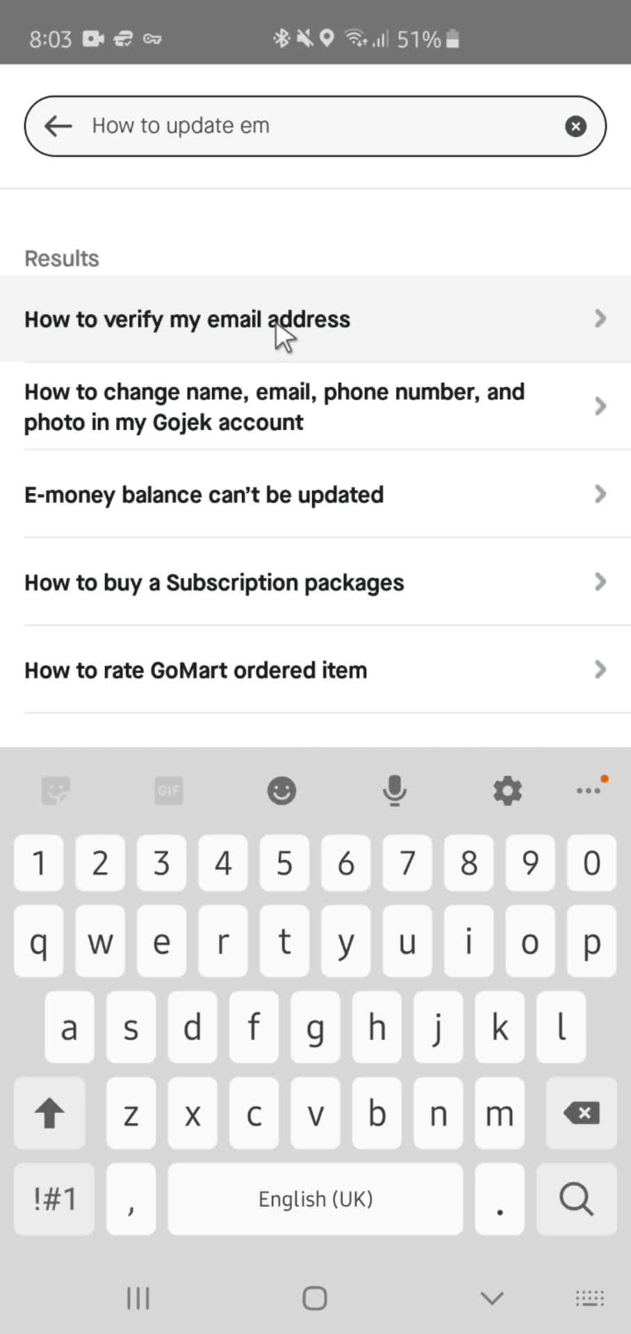
- Updating your email
- Updating your profile
- Upgrading your account
- Upgrading your subscription
- Uploading a folder
- Uploading files
- Uploading photos
- Uploading progress
- Using AI
- Using AI snaps
- Using plugins
- Using template
- Using workplace
- Verifying email address
- Visual search
- Watching videos
- 1Password
- 5miles
- ASOS
- Airbnb
- Airtable
- AllTrails
- Amazon
- Amie
- Anchor
- Any Distance
- Appinio
- Apple Music
- Apple TV
- Artifact
- Asana
- Asos
- Audiomack
- Autotrader
- BBC iPlayer
- Babbel
- Balance
- BandLab
- Bandcamp
- BeReal.
- Bear notes
- Bet365
- Big News
- Binance
- Blinkist
- Bloom & Wild
- Bolt
- Booking.com
- Brainly
- Breaker
- Breathwrk
- Breethe
- Breeze
- Brief
- Bring
- Buddy budget
- Bumble
- Busuu
- CRED
- Cafe X
- Calendar Buddy
- Calendly
- Calm
- Calory
- Candy Crush
- Canva
- Capital One
- Careem
- Caria
- Carrot weather
- Cash App
- Cash Coach
- Castro
- Caviar
- Chase
- ChatGPT
- Chime
- Chineasy
- Citymapper
- ClassPass
- Clay
- Clearpay
- ClickUp
- Clubhouse
- Clue
- CoinMarketCap
- Coinbase
- Coolors
- Craft
- Craft.do
- Craigslist
- Crypto.com
- Curve
- DICE
- Daily Random Facts
- DailyBean
- Dasher
- Day One
- Days
- Deliveroo
- Depop
- Discord
- Discz
- Disney+
- Docusign
- Done
- DoorDash
- Dott
- Dropbox
- Drops
- DuckDuckGo
- Duolingo
- Duolingo Math
- Dusk
- ESPN
- Elevate
- Endel
- Etsy
- Eventbrite
- Evernote
- Expedia
- Expensify
- FT Edit
- Feedly
- Finch
- Finimize
- Fishbrain
- FitOn
- Fitbit
- Fitbod
- Fiverr
- FlipKart
- Flipd
- Flo
- Foodvisor
- Forest
- Freetrade
- GitHub
- Glo
- Glovo
- Glow
- Gmail
- Go-Jek
- GoFundMe
- Goat
- Gojek
- GoodRx
- Goodreads
- Google Classroom
- Google Photos
- Gopuff
- Gorillas
- Grab
- Greg
- Groupon
- Grubhub
- Gumroad
- Gumtree
- Gymshark
- Gyroscope
- H&M
- HQ Trivia
- HabitBox
- Hallow
- Head Model Studio
- Headspace
- Headway
- Hey
- Hims
- Hinge
- Hipmunk
- Honey
- Honk
- Hopper
- Hostelworld
- HotelTonight
- Houzz
- HubSpot CRM
- Hulu
- Hype
- IFTTT
- IGTV
- IKEA
- IRL
- Indeed
- Instacart
- Job Today
- Jour
- Jump Bikes
- Kahoot
- Kayak
- Kickstarter
- Klarna
- Klook
- Lake
- Lark
- Leeloo AAC
- Lemon8
- Lemonade
- Letgo
- Life360
- Lifesum
- Lime
- Linktree
- Lucid
- Luminary
- Lyft
- Lyst
- Mailchimp
- Marriott Bonvoy
- Masterclass
- Me+
- Mealime
- Medium
- Memrise
- Mercari
- MetaMask
- Microsoft Copilot
- Microsoft Loop
- Microsoft Teams
- Milkshake
- Mimo
- Miro
- Moises
- Momondo
- Monese
- MoneyCoach
- Moneybox
- Monument Valley
- Monzo
- Moonpig
- Music Bash
- MyFitnessPal
- N26
- Nebula
- Netflix
- Nike Run Club
- Noom
- Notability
- Notion
- OKX
- OfferUp
- Oku
- Omada
- Opal
- OpenSea
- OpenTable
- Otter.ai
- Over
- Overcast
- Paired
- Paper by WeTransfer
- Paramount+
- PayPal
- Peloton
- Phantom
- Photomath
- PicsArt
- PictureThis
- Plane finder
- Planta
- Playhouse
- Plum
- Pocket Casts
- Portal
- Poshmark
- Postmates
- Prime Now
- QuickBooks
- Quizlet
- Quora
- Racket
- Rally
- Redbubble
- Reflectly
- Relive
- Remembear
- RetailMeNot
- Revolut
- Revolut Business
- Robinhood
- Rosetta Stone
- Rover
- Ryanair
- SNKRS by Nikes
- Salesforce
- Sanvello
- Scribd
- Sephora
- ShareTheMeal
- Shazam
- Shein
- Shell
- Shop
- Shpock
- Shuffles
- ShutEye
- Signal
- Skillshare
- Skyscanner
- Slack
- Sleeper
- SmartGym
- Smule
- Snapchat
- Snax
- SoundCloud
- Spark
- Splice
- Spotify
- Square
- Starbucks
- Starling
- StockX
- Stoic
- Strava
- Structured
- Stylekick
- Substack
- Sweatcoin
- Swiggy
- TIER
- TalkIn
- Tangerine
- Target
- Telegram
- The Fabulous
- The New York Times
- The Wonder Weeks
- Threads
- Ticketmaster
- Tide.fm
- Tiimo
- TikTok
- Time
- Tinder
- TodayTix
- Todoist
- Too Good To Go
- TouchNote
- Trainline
- Trello
- Tripadvisor
- Trivago
- Trunk Club
- TunnelBear
- Turo
- Twitch
- Uber
- Uber Eats
- Udemy
- Unfold
- Universe
- Unsplash
- Uptime
- Uxcel
- VSCO
- Vacasa
- Venmo
- Vimeo
- Vinted
- Vrbo
- WW (Weight Watchers)
- Wallapop
- Walmart
- Warby Parker
- Wattpad
- Waze
- Wealthsimple
- Webex
- Whale
- Whatnot
- Wikipedia
- Wisdom
- Wise
- Withings Healthmate
- Wolt
- Xero
- Yelp
- YouTube
- YouTube Music
- Yuka
- Zara
- Zenly
- Zero
- Zillow
- ZipRecruiter
- Zocdoc
- Zoho CRM
- Zola
- Zomato
- Zoopla
- eBay
- eToro
- factoTime
- foodpanda
- theSkimm
- thredUP
- Airbnb
- Asana
- Babbel
- Badoo
- Balance
- BlaBlaCar
- Blinkist
- Burger King
- Claude
- Clay
- Clay - Story Templates
- DailyBean
- Dropbox
- Duolingo
- Finch
- FitOn
- Gauth
- Gojek
- Gumroad
- Hims
- Hootsuite
- Hopper
- Instacart
- Lark
- Marriott Bonvoy
- Microsoft Copilot
- Miro
- Nike Run Club
- Notion
- OKX
- Otter.ai
- Picniic
- Quibi
- Quizlet
- Redbubble
- Revolut
- Shein
- Shell
- Simple: Weight Loss Coach
- Slack
- Snapchat
- Spotify
- Strava
- TalkIn
- Target
- TikTok
- Todoist
- Trello
- Turo
- Uxcel
- Walmart
- Wealthfront
- Webex
- Whale
- Whatnot
- Zero
- Zocdoc
- factoTime
- Baremetrics
- Binance
- Cash App
- Chase
- Clearpay
- Crypto.com
- Curve
- Expensify
- Finimize
- Freetrade
- Klarna
- Lemonade
- Moneybox
- Monzo
- N26
- PayPal
- Plum
- QuickBooks
- Revolut
- Robinhood
- Square
- Stripe
- SumUp
- Venmo
- Wealthsimple
- Wise
- Xero
- YNAB
- eToro
- Airtable
- Amie
- Any.do
- Asana
- Beehiiv
- Charma
- ClassDojo
- Clearbit
- ClickUp
- Clockwise
- Coda
- ConvertKit
- Craft
- Crisp
- Day One
- Docusign
- Drip
- Dropbox Paper
- Flodesk
- Front
- Gamma
- Ghost
- Grammarly
- Hashnode
- HelloSign
- Homerun
- Honey
- Jasper
- Jotform
- Journey
- Klaviyo
- Mailchimp
- Microsoft Loop
- Notion
- Productboard
- Raycast
- Reflect
- Substack
- Superhuman
- SurveyMonkey
- SurveySparrow
- Todoist
- Toggl Track
- Twist
- Typeform
- Writesonic
- Airbnb
- BlaBlaCar
- Bolt
- Booking.com
- Citymapper
- Dott
- Expedia
- Go-Jek
- Going
- Gojek
- Grab
- Hopper
- Hostelworld
- HotelTonight
- Jump Bikes
- Kayak
- Klook
- Lime
- Lyft
- Marriott Bonvoy
- Ryanair
- Skyscanner
- TIER
- Touch Stay
- Trainline
- Tripadvisor
- Turo
- Uber
- Vrbo
- Waze
- Bubble
- ClickFunnels
- Duda
- Ghost
- Glide
- Launchaco
- Leadpages
- Shopify
- Squarespace
- Teachable
- Unbounce
- Universe
- Webflow
- Wix
- WordPress
- Babbel
- Busuu
- ClassDojo
- Coursera
- Drops
- Duolingo
- Duolingo Math
- Elevate
- Headway
- Kajabi
- Memrise
- Mimo
- Pluralsight
- Podia
- Quizlet
- Scribe
- Seesaw
- Skillshare
- Teachable
- Udemy
- Uptime
- BeReal.
- Clay - Story Templates
- Disney+
- Hopin
- Hulu
- Kick
- Netflix
- Now TV
- Quibi
- Shudder
- TouchNote
- Twitch
- VEED.IO
- VideoAsk
- Vidyard
- Vimeo
- Wistia
- YouTube
- BeReal.
- Beacons
- Bumble
- Buy Me a Coffee
- Circle
- Clay
- Clubhouse
- Discord
- GoFundMe
- Hallow
- Hashnode
- Kick
- Kickstarter
- Patreon
- Racket
- Shuffles
- Snapchat
- Threads
- TikTok
- Twitch
- Burger King
- Caviar
- DoorDash
- Foodvisor
- Glovo
- Go-Jek
- Gojek
- Gopuff
- Gorillas
- Gousto
- Grab
- Grubhub
- Instacart
- Just Eat
- OpenTable
- Postmates
- Too Good To Go
- Uber Eats
- Wolt
- Yelp
- foodpanda
- Blinkist
- Breaker
- Bumble
- Calm
- Caviar
- Clay
- Descript
- ESPN
- Fibery
- Foodvisor
- Freetrade
- Glovo
- Goat
- Grubhub
- Gyroscope
- Hinge
- Homerun
- Hootsuite
- HotelTonight
- Jump Bikes
- Lifesum
- Monzo
- Moonpig
- Picniic
- Postmates
- Quora
- Rainforest
- Remote
- Shein
- Sweatcoin
- Tide.fm
- Tinder
- Too Good To Go
- Transistor
- Wayyy
- Wealthsimple
- Whatnot
- Whereby
- Zero
- Zola
- ASOS
- Airbnb
- Amazon
- Beacons
- Booking.com
- Clearpay
- Craigslist
- DICE
- Depop
- Dollar Shave Club
- EE
- Etsy
- Fiverr
- Glovo
- Goat
- Gopuff
- Gorillas
- Groupon
- Grubhub
- Gumroad
- IKEA
- Indeed
- Instacart
- Klaviyo
- Meetup
- Mercari
- Moonpig
- OfferUp
- Otta
- Poshmark
- SNKRS by Nikes
- Shein
- Shop
- Shpock
- TouchNote
- Udemy
- Vinted
- Wallapop
- Walmart
- Whatnot
- Zola
- eBay
- thredUP
- Amplitude
- Better Stack
- Cloudflare
- GitHub
- Jira
- Linear
- Pluralsight
- Rainforest
- Raycast
- Replit
- Trustpilot
- Twilio
- Uxcel
- AllTrails
- Balance
- Calm
- ClassPass
- Clue
- DailyBean
- FitOn
- Fitbit
- Fitbod
- Flipd
- Flo
- Foodvisor
- Glo
- Glow
- Gyroscope
- Headspace
- Lifesum
- Me+
- MyFitnessPal
- Nike Run Club
- Noom
- Reflectly
- Sanvello
- ShutEye
- Strava
- Sweatcoin
- WW (Weight Watchers)
- Withings Healthmate
- Yuka
- Zero
- 1Password
- Ahrefs
- Aircall
- Airtable
- Amplitude
- Any.do
- Arc.dev
- Asana
- Baremetrics
- Basecamp
- Beehiiv
- Bitly
- Box
- Bubble
- Buy Me a Coffee
- Bynder
- Calendly
- Canny
- Circle
- Clearbit
- ClickFunnels
- ClickUp
- Clockwise
- Cloudflare
- Coda
- ConvertKit
- CopyAI
- Craft
- Customer.io
- Deputy
- Descript
- Docusign
- Dovetail
- Drip
- Dropbox
- Dropbox Paper
- Duda
- Eventbrite
- Evernote
- Fathom
- Figma
- Flodesk
- Framer
- Front
- Fullstory
- GatherContent
- Ghost
- GitHub
- Glide
- GoDaddy
- Grammarly
- Gumroad
- Guru
- Harvest
- Height
- HelloSign
- Help Scout
- HoneyBook
- Hootsuite
- Hopin
- Hotjar
- HubSpot CRM
- InVision
- Indeed
- Interact
- Intercom
- Jasper
- Jira
- Jotform
- Kajabi
- Klaviyo
- Lark
- Launchaco
- Leadpages
- Linear
- Linktree
- Litmus
- Loom
- Mailchimp
- Make.com
- Mercari
- Microsoft Teams
- Miro
- Mixpanel
- Monday
- Nolt
- Notion
- Otta
- PandaDoc
- PayPal
- Pipedrive
- Pitch
- Playbook
- Podia
- PostHog
- Process Street
- Productboard
- QuickBooks
- Quill
- Rainforest
- Raycast
- Reflect
- Replit
- Retool
- Salesforce
- SavvyCal
- Scribe
- Shopify
- Slack
- Slite
- Softstart
- Soundtrap
- Spline
- Sprig
- Square
- Squarespace
- Squarespace Scheduling
- Stripe
- SumUp
- Sunsama
- Superhuman
- SurveyMonkey
- SurveySparrow
- Tally
- Tango
- Teachable
- Todoist
- Tome
- Touch Stay
- Transistor
- Trello
- Twilio
- Typeform
- Unbounce
- Universe
- VEED.IO
- VideoAsk
- Vidyard
- Waitwhile
- Webflow
- Whereby
- Whimsical
- Wistia
- Wix
- Wrike
- Writesonic
- Xero
- YNAB
- Zapier
- Zendesk
- Zoom
- AI
- Accordion
- Achievements
- Action menu
- Activity feed
- Add address
- Add payment details
- Agree to terms
- Alert
- Alert bar
- Animation
- Article
- Audio player
- Audio recording
- Autocomplete
- Banner
- Bottom drawer
- Bottom sheet
- Breadcrumbs
- Button
- Calendar
- Canvas
- Captcha
- Card
- Carousel
- Categories
- Chart
- Chat
- Chat bot
- Checkbox
- Checklist
- Color picker
- Comment input
- Comments
- Complete name
- Confetti
- Confirm
- Confirmation
- Countdown
- Credit card input
- Crop image
- Dashboard
- Date input
- Date picker
- Day picker
- Discount
- Drag and drop
- Drawing tools
- Dropdown
- Email field
- Emoji
- Empty state
- Error state
- Feed
- Filter
- Form
- Graph
- Grid
- Guide
- Guide popover
- Guide prompt
- Height input
- Hero header
- Horizontal scroll
- Icon
- Illustration
- Image gallery
- Image upload
- Input
- Instructions
- Kanban board
- Keypad
- List
- Loading indicator
- Location search
- Map
- Masonry
- Media controls
- Menu
- Modal
- Multi-select
- Multiple choice question
- Navigation
- Newsletter opt-in
- Notification indicator
- Number input
- Number step input
- Onboarding tasks
- Overlay
- Page Indicator
- Pagination
- Password input
- Password validator
- Permissions
- Phone number input
- Pie charts
- AI
- Accordion
- Action menu
- Add payment details
- Alert
- Animation
- Article
- Audio player
- Banner
- Bottom drawer
- Bottom sheet
- Breadcrumbs
- Button
- Calendar
- Canvas
- Card
- Chart
- Chat
- Chat bot
- Checkbox
- Checklist
- Comment input
- Confetti
- Confirm
- Confirmation
- Countdown
- Date picker
- Drag and drop
- Dropdown
- Email field
- Emoji
- Empty state
- Error state
- Feed
- Filter
- Form
- Graph
- Grid
- Guide
- Guide popover
- Guide prompt
- Height input
- Hero header
- Horizontal scroll
- Icon
- Illustration