- Accepting an invite
- Account settings
- Action items
- Activate cash back
- Activity feed
- Adding 1-on-1 workspace
- Adding Slido on Zoom
- Adding a candidate
- Adding a candidate pool
- Adding a child
- Adding a client
- Adding a company
- Adding a custom domain
- Adding a deal
- Adding a document
- Adding a list
- Adding a member
- Adding a movie to up next
- Adding a new business
- Adding a new class
- Adding a new job
- Adding a new opportunity
- Adding a new organization
- Adding a new site
- Adding a package
- Adding a page
- Adding a payee
- Adding a payment method
- Adding a phone number
- Adding a product
- Adding a project source
- Adding a recipient
- Adding a referrer
- Adding a role
- Adding a signature
- Adding a sponsor
- Adding a stamp
- Adding a student
- Adding a travel arranger
- Adding a traveler
- Adding a user
- Adding a vehicle
- Adding a veterinarian
- Adding a website
- Adding airports
- Adding an account
- Adding an address
- Adding an appointment
- Adding an employee
- Adding an item
- Adding apps to server
- Adding attachments
- Adding billing address
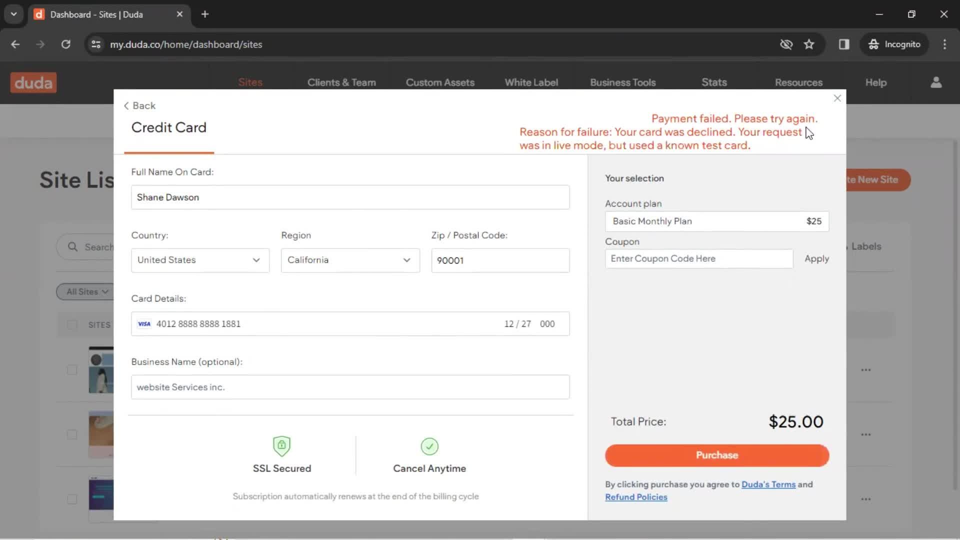
- Adding card details
- Adding categories
- Adding comments
- Adding company websites
- Adding customer to waitlist
- Adding customers
- Adding departments
- Adding disqualification reasons
- Adding document field
- Adding envelope custom fields
- Adding expenses
- Adding extensions
- Adding files
- Adding goals
- Adding group workspace
- Adding guest name
- Adding income
- Adding job stages
- Adding leads
- Adding new category
- Adding new query library
- Adding new skills
- Adding password
- Adding payment details
- Adding permission profile
- Adding photos and videos
- Adding screening questions
- Adding services
- Adding shipping address
- Adding skill keywords
- Adding slido to Teams
- Adding social links
- Adding songs to a playlist
- Adding staff
- Adding tags
- Adding templates
- Adding testimonials
- Adding to bookings
- Adding to cart
- Adding to collections
- Adding to favorites
- Adding to student journal
- Adding transactions
- Adding workspace database
- Adding workspace icon
- Adjusting preferences
- Alerting a customer
- Analytics/Stats
- App directory
- App marketplace
- Applying as a candidate
- Applying as a company
- Applying for a job
- Applying for arc vetting
- Applying for author verification
- Applying for refund
- Approval workflows
- Approving leave
- Approving portfolio posts
- Approving time sheets
- Approving timesheet
- Archiving
- Archiving classes
- Asking a question
- Assigning a candidate
- Assigning an activity
- Attending an event
- Backing a project
- Becoming a seller
- Blocking a user
- Booking a call
- Booking a class
- Booking a demo
- Booking a rental car
- Booking a room
- Booking a table
- Booking an activity
- Booking an appointment
- Booking an event
- Booking consultation
- Booking transport
- Bookmarking
- Boosting a fundraiser
- Brand styles
- Broadcasting a stream
- Browsing FAQ
- Browsing documentation
- Browsing jobs
- Browsing movies
- Browsing resources
- Browsing services
- Browsing the library
- Building a chat bot
- Business sign up
- Buying a gift card
- Buying a ticket
- Buying crypto currency
- Buying something
- CRM
- CSV import
- Calendar view
- Canceling Dropbox for teams
- Canceling a booking
- Canceling a reservation
- Cancelling a booking
- Cancelling an appointment
- Cancelling an event
- Cancelling an invite
- Cancelling an order
- Cancelling your subscription
- Careers site settings
- Categorizing transactions
- Changing account owner
- Changing account type
- Changing an applicant stage
- Changing display
- Changing language
- Changing password
- Changing school
- Channel
- Chat
- Chat bot
- Chat settings
- Chatting
- Checking deals
- Checking in
- Choosing a teacher
- Claiming your online store
- Class settings
- Clearing play history
- Closing job posts
- Closing registration
- Closing your account
- Code editor
- Combining study sets
- Commenting
- Communication settings
- Comparing deals
- Completing a level
- Completing an assignment
- Configuring contracts
- Connecting a calendar
- Connecting a wallet
- Connecting payment provider
- Connecting social media
- Contacting members
- Content tuning
- Converting currency
- Copying a hiring badge code
- Copying inspiration
- Create a membership site
- Creating README
- Creating a QR code
- Creating a bill
- Creating a board
- Creating a budget
- Creating a business account
- Creating a calendar
- Creating a campaign
- Creating a career page
- Creating a channel
- Creating a collection
- Creating a community
- Creating a company
- Creating a content snippet
- Creating a course
- Creating a design
- Creating a discount code
- Creating a discussion
- Creating a document
- Creating a drip campaign
- Creating a flowchart
- Creating a folder
- Creating a form
- Creating a funnel
- Creating a gift card
- Creating a giveaway campaign
- Creating a group
- Creating a group class
- Creating a heatmap
- Creating a job post
- Creating a knowledge base
- Creating a landing page
- Creating a lead magnet
- Creating a lifecycle insight
- Creating a list
- Creating a live event
- Creating a map
- Creating a mastodon account
- Creating a meetup
- Creating a monetized account
- Creating a new class
- Creating a new insight
- Creating a new repository
- Creating a new study set
- Creating a new tag
- Creating a new theme
- Creating a new view
- Creating a note
- Creating a page
- Creating a paper document
- Creating a playlist
- Creating a podcast
- Creating a poll
- Creating a pop-up
- Creating a post
- Creating a presentation
- Creating a private note
- Creating a process
- Creating a product tour
- Creating a progress bar
- Creating a project
- Creating a prototype
- Creating a publication
- Creating a purchase order
- Creating a questionnaire
- Creating a quiz
- Creating a quote
- Creating a receipt
- Creating a registry
- Creating a reminder
- Creating a report
- Creating a resume
- Creating a retention insight
- Creating a role
- Creating a schedule
- Creating a segment
- Creating a sentiment tracker
- Creating a server template
- Creating a shortlink
- Creating a showcase
- Creating a stickiness insight
- Creating a support article
- Creating a survey
- Creating a task
- Creating a team
- Creating a template
- Creating a timer
- Creating a to-do list
- Creating a video
- Creating a website
- Creating a wireframe
- Creating a workflow
- Creating a workspace
- Creating alerts
- Creating an account
- Creating an action
- Creating an activity
- Creating an ad
- Creating an advert
- Creating an app
- Creating an application
- Creating an article
- Creating an assignment
- Creating an audio recording
- Creating an auto reply email
- Creating an automated end of day message
- Creating an automation workflow
- Creating an email campaign
- Creating an email list
- Creating an event
- Creating an event type
- Creating an excel spreadsheet
- Creating an interaction
- Creating an invoice
- Creating categories
- Creating collection of events
- Creating connections
- Creating content
- Creating email template
- Creating event template
- Creating feedback template
- Creating guides
- Creating heartbeat
- Creating incident
- Creating modifiers
- Creating new AI presentation
- Creating new apps
- Creating new canned responses
- Creating new contact
- Creating new contract
- Creating new dashboard
- Creating new data
- Creating new issue
- Creating new lead
- Creating new model
- Creating new opportunity
- Creating new resources
- Creating new vault
- Creating promo codes
- Creating saved messages
- Creating saved reply
- Creating slido
- Creating status page
- Creating trips
- Creating user paths insight
- Current developments
- Custom branding
- Customization settings
- Customizing a project
- Customizing appearance
- Customizing code
- Customizing domain
- Customizing email invitation
- Customizing workspace
- Daily planning
- Daily shutdown
- Deactivating extensions
- Deactivating user
- Deactivating your account
- Deleting a channel
- Deleting a contract
- Deleting a document
- Deleting a map
- Deleting a playlist
- Deleting a presentation
- Deleting a project
- Deleting a publication
- Deleting a server
- Deleting a story
- Deleting a team
- Deleting a tweet
- Deleting a user
- Deleting a workspace
- Deleting an assignment
- Deleting an organization
- Deleting apps
- Deleting card details
- Deleting contexts
- Deleting conversations
- Deleting created form
- Deleting data
- Deleting designs
- Deleting files
- Deleting folder
- Deleting group
- Deleting packages
- Deleting personal data
- Deleting project source
- Deleting resources
- Deleting saved address
- Deleting space
- Deleting tasks
- Deleting workflow
- Deleting your account
- Departments
- Depositing funds
- Developers
- Disabling your account
- Disconnecting devices
- Disconnecting integrations
- Discovering content
- Discussions
- Display settings
- Donating
- Downgrading your account
- Downloading
- Downloading a contract
- Downloading a movie
- Downloading a report
- Downloading data
- Downloading songs
- Drawing
- Driver signup
- Duplicating
- Duplicating a document
- Duplicating a note
- Duplicating a post
- Duplicating folder
- Editing
- Editing a contract
- Editing a fundraiser
- Editing a video
- Editing a workflow
- Editing activities
- Editing apps
- Editing columns
- Editing created form
- Editing dashboard
- Editing departure airport
- Editing group details
- Editing home layout
- Editing job details
- Editing log in method
- Editing message template
- Editing roles
- Editing tracks
- Editing username
- Editing workspace
- Email courses
- Employer onboarding
- Enabling 2FA
- Enabling Slido on Webex
- Enabling dark mode
- Enabling invisible mode
- Enriching data
- Exchange
- Excluding from your taste profile
- Exploring community
- Exploring discoverable server
- Exploring magazine
- Exporting a flowchart
- Exporting contacts
- Exporting data
- Exporting design
- Exporting helpdesk articles
- Exporting media
- Feature request
- Filling in a form
- Filtering
- Filtering and sorting
- Filtering listings
- Finding a Hotel
- Finding an agent
- Finding and replacing
- Finding candidates
- Finding cars
- Finding cruises
- Finding flights
- Finding hotels
- Finding packages
- Finding things to do
- Following a topic
- Following a user
- Following an artist
- Forecasting
- General browsing
- Generating job insights
- Generating job match analysis
- Generating resume review
- Getting AI support
- Getting add-ons
- Getting directions
- Giving feedback
- Group booking
- Grouping to-do list
- Help center
- Hiding workspace
- Identity verification
- Importing
- Importing a story
- Importing contacts
- Importing data
- Importing from Mailchimp
- Importing helpdesk articles
- Insights
- Install app
- Installing a plugin
- Installing a widget
- Installing add-in
- Installing extensions
- Integrating
- Integrations
- Inventory Management
- Investing
- Inviting a teammate
- Inviting candidates to apply
- Inviting members
- Inviting people
- Joining a course
- Joining a folder
- Joining a group
- Joining a school
- Joining an event
- Joining as an agent
- Joining waitlist
- Keyboard shortcuts
- Lead assignment rules
- Learning
- Learning the basics
- Leaving a group
- Leaving a review
- Leaving an interview review
- Library
- Liking songs
- Listening
- Listing a product
- Listing a property
- Listing a service
- Logging in
- Logging in and logging out
- Logging out
- Making a restaurant reservation
- Making an announcement
- Managing
- Managing applicants
- Managing applications
- Managing blog
- Managing candidates
- Managing collection settings
- Managing feedback
- Managing files
- Managing folders
- Managing groups
- Managing locations
- Managing orders
- Managing payroll
- Managing roles
- Managing roles and permissions
- Managing students
- Managing support
- Managing team
- Managing users
- Managing your library
- Marking a listing as visited
- Marking a movie as watched
- Marking not interested
- Meditation
- Meeting note
- Merging tags
- Messaging boards
- Messenger settings
- Mini player
- Mobile apps
- Moving designs
- Moving files
- Note taking
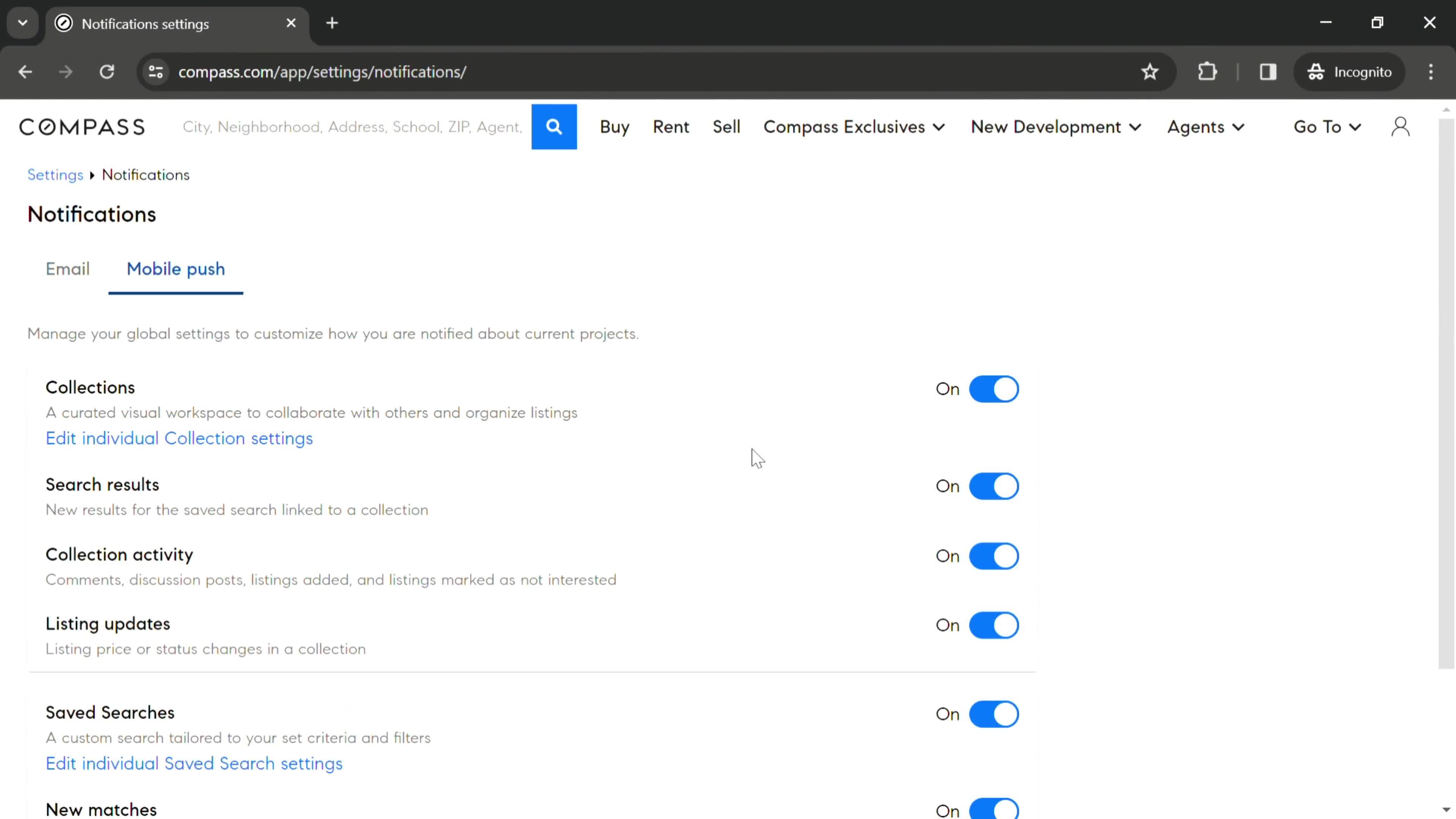
- Notification settings
- Notifications
- Objectives
- Offers
- Onboarding
- One-on-one meetings
- Order history
- Ordering food
- Ordering groceries
- Ordering something
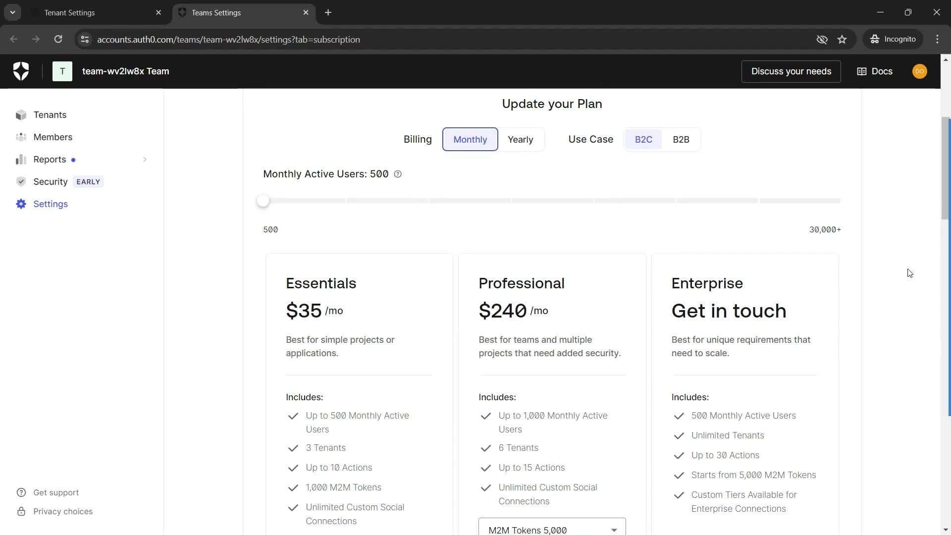
- Organization and billing settings
- Page setup
- Password reset
- Pausing your subscription
- Paying
- Payment methods
- Payment plans
- Personal settings
- Pinning a post
- Pinning a story
- Pinning artist
- Planning a trip
- Posting updates
- Presenting
- Privacy settings
- Progress
- Project plan note
- Publishing
- Publishing to social
- Rating a candidate
- Reactivating membership
- Reactivating your account
- Recording a conversation
- Recording a payment
- Recording a video
- Recording audio
- Recording meeting
- Recording visitors
- Recording your screen
- Recovering playlist
- Redeeming a promo code
- Referrals
- Referring a friend
- Refunding
- Reminders
- Remixing a project
- Removing a member
- Removing a payment method
- Removing a traveler
- Removing card details
- Removing favorites
- Removing starred content
- Renaming a document
- Renaming a project
- Renaming apps
- Renaming folders
- Renaming presentations
- Renaming workspaces
- Reporting a group
- Reporting a job
- Reporting a post
- Reporting a repository
- Reporting a user
- Reporting an issue
- Reporting content
- Reports
- Reposting
- Reposting a tweet
- Requesting a service
- Requesting a signature
- Requesting a tour
- Requesting feedback
- Requesting info
- Requesting payment
- Requesting time off
- Rescheduling an appointment
- Resetting class and family codes
- Resetting password
- Restoring a document
- Restoring a note
- Restoring deleted files
- Restoring your account
- Retention analytics
- Reviewing the profile of a candidate
- Saved trips
- Saving
- Saving a building
- Saving a listing
- Saving a search
- Saving jobs
- Schedules
- Scheduling a meeting
- Scheduling a message
- Scheduling an interview
- Scheduling interviews
- Scratch pad
- Screening
- Searching
- Searching car rentals
- Searching projects
- Security settings
- Segmenting
- Sending
- Sending an email
- Sending currency
- Sending messages
- Setting a goal
- Setting a reminder
- Setting alerts
- Setting email status
- Setting goals
- Setting rules
- Setting target audience
- Setting up 360 review
- Setting up interview availability
- Setting up messaging channels
- Setting up timesheet
- Setting up your linktree
- Settings
- Sharing
- Sharing a file
- Sharing a folder
- Sharing a fundraiser
- Sharing a story
- Sharing a tweet
- Sharing access
- Sharing an activity
- Sharing an event
- Sharing report
- Sharing workspace as a template
- Shopper signup
- Shortcuts
- Signing a document
- Signing in and out
- Signing out on all browsers
- Signing up
- Sketching
- Sorting
- Sources
- Spendings
- Split testing
- Starring content
- Starting a course
- Starting a fundraiser
- Streaming together
- Submitting a proposal
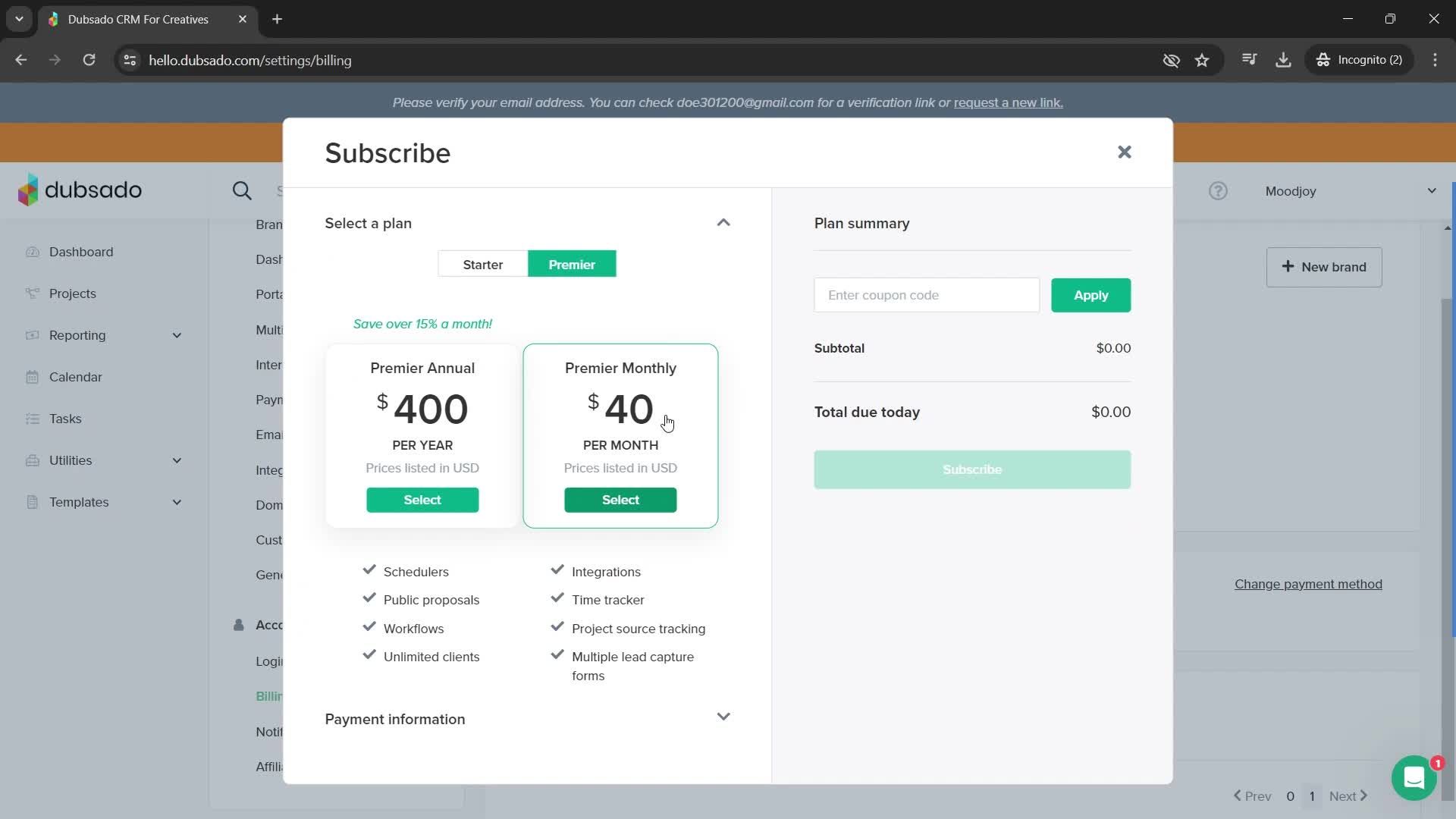
- Subscribing
- Subscriptions
- Support
- Suspending a user
- Switching workspace
- Syncing integrations
- Tagging
- Taking a course
- Taking a photo
- Taking attendance
- Tasks
- Teacher signup
- Team settings
- Testing emails
- Time tracking
- Timeboxing
- Topping up
- Tracking expenses
- Transferring a project
- Transferring ownership
- Unblocking users
- Unfollowing a user
- Unhiding workspace
- Uninstalling plugin
- Updating account information
- Updating billing contact
- Updating booking messages
- Updating company details
- Updating company information
- Updating company profile
- Updating delivery address
- Updating email preferences
- Updating interface logo
- Updating payment settings
- Updating profile picture
- Updating social media accounts
- Updating travelers information
- Updating your email
- Updating your personal info
- Updating your pet profile
- Updating your profile
- Upgrading your account
- Upgrading your subscription
- Uploading a contract
- Uploading files
- Uploading media
- Uploading resume
- Uploading tracks
- Using AI
- Using AI help desk
- Using AI tools
- Using an invite link
- Using template
- Verifying account
- Version history
- Video calls
- Viewing a fundraiser
- Viewing event chat
- Viewing lyrics
- Viewing queue
- Watching a movie
- Watching videos
- Weekly planning
- Whiteboards
- Workspace settings
- Writing 360 review
- Writing a blog
- Zelle settings
- Zoom integration
- 1Password
- 5miles
- ASOS
- Airbnb
- Airtable
- AllTrails
- Amazon
- Amie
- Anchor
- Any Distance
- Appinio
- Apple Music
- Apple TV
- Artifact
- Asana
- Asos
- Audiomack
- Autotrader
- BBC iPlayer
- Babbel
- Balance
- BandLab
- Bandcamp
- BeReal.
- Bear notes
- Bet365
- Big News
- Binance
- Blinkist
- Bloom & Wild
- Bolt
- Booking.com
- Brainly
- Breaker
- Breathwrk
- Breethe
- Breeze
- Brief
- Bring
- Buddy budget
- Bumble
- Busuu
- CRED
- Cafe X
- Calendar Buddy
- Calendly
- Calm
- Calory
- Candy Crush
- Canva
- Capital One
- Careem
- Caria
- Carrot weather
- Cash App
- Cash Coach
- Castro
- Caviar
- Chase
- ChatGPT
- Chime
- Chineasy
- Citymapper
- ClassPass
- Clay
- Clearpay
- ClickUp
- Clubhouse
- Clue
- CoinMarketCap
- Coinbase
- Coolors
- Craft
- Craft.do
- Craigslist
- Crypto.com
- Curve
- DICE
- Daily Random Facts
- DailyBean
- Dasher
- Day One
- Days
- Deliveroo
- Depop
- Discord
- Discz
- Disney+
- Docusign
- Done
- DoorDash
- Dott
- Dropbox
- Drops
- DuckDuckGo
- Duolingo
- Duolingo Math
- Dusk
- ESPN
- Elevate
- Endel
- Etsy
- Eventbrite
- Evernote
- Expedia
- Expensify
- FT Edit
- Feedly
- Finch
- Finimize
- Fishbrain
- FitOn
- Fitbit
- Fitbod
- Fiverr
- FlipKart
- Flipd
- Flo
- Foodvisor
- Forest
- Freetrade
- GitHub
- Glo
- Glovo
- Glow
- Gmail
- Go-Jek
- GoFundMe
- Goat
- Gojek
- GoodRx
- Goodreads
- Google Classroom
- Google Photos
- Gopuff
- Gorillas
- Grab
- Greg
- Groupon
- Grubhub
- Gumroad
- Gumtree
- Gymshark
- Gyroscope
- H&M
- HQ Trivia
- HabitBox
- Hallow
- Head Model Studio
- Headspace
- Headway
- Hey
- Hims
- Hinge
- Hipmunk
- Honey
- Honk
- Hopper
- Hostelworld
- HotelTonight
- Houzz
- HubSpot CRM
- Hulu
- Hype
- IFTTT
- IGTV
- IKEA
- IRL
- Indeed
- Instacart
- Job Today
- Jour
- Jump Bikes
- Kahoot
- Kayak
- Kickstarter
- Klarna
- Klook
- Lake
- Lark
- Leeloo AAC
- Lemon8
- Lemonade
- Letgo
- Life360
- Lifesum
- Lime
- Linktree
- Lucid
- Luminary
- Lyft
- Lyst
- Mailchimp
- Marriott Bonvoy
- Masterclass
- Me+
- Mealime
- Medium
- Memrise
- Mercari
- MetaMask
- Microsoft Copilot
- Microsoft Loop
- Microsoft Teams
- Milkshake
- Mimo
- Miro
- Moises
- Momondo
- Monese
- MoneyCoach
- Moneybox
- Monument Valley
- Monzo
- Moonpig
- Music Bash
- MyFitnessPal
- N26
- Nebula
- Netflix
- Nike Run Club
- Noom
- Notability
- Notion
- OKX
- OfferUp
- Oku
- Omada
- Opal
- OpenSea
- OpenTable
- Otter.ai
- Over
- Overcast
- Paired
- Paper by WeTransfer
- Paramount+
- PayPal
- Peloton
- Phantom
- Photomath
- PicsArt
- PictureThis
- Plane finder
- Planta
- Playhouse
- Plum
- Pocket Casts
- Portal
- Poshmark
- Postmates
- Prime Now
- QuickBooks
- Quizlet
- Quora
- Racket
- Rally
- Redbubble
- Reflectly
- Relive
- Remembear
- RetailMeNot
- Revolut
- Revolut Business
- Robinhood
- Rosetta Stone
- Rover
- Ryanair
- SNKRS by Nikes
- Salesforce
- Sanvello
- Scribd
- Sephora
- ShareTheMeal
- Shazam
- Shein
- Shell
- Shop
- Shpock
- Shuffles
- ShutEye
- Signal
- Skillshare
- Skyscanner
- Slack
- Sleeper
- SmartGym
- Smule
- Snapchat
- Snax
- SoundCloud
- Spark
- Splice
- Spotify
- Square
- Starbucks
- Starling
- StockX
- Stoic
- Strava
- Structured
- Stylekick
- Substack
- Sweatcoin
- Swiggy
- TIER
- TalkIn
- Tangerine
- Target
- Telegram
- The Fabulous
- The New York Times
- The Wonder Weeks
- Threads
- Ticketmaster
- Tide.fm
- Tiimo
- TikTok
- Time
- Tinder
- TodayTix
- Todoist
- Too Good To Go
- TouchNote
- Trainline
- Trello
- Tripadvisor
- Trivago
- Trunk Club
- TunnelBear
- Turo
- Twitch
- Uber
- Uber Eats
- Udemy
- Unfold
- Universe
- Unsplash
- Uptime
- Uxcel
- VSCO
- Vacasa
- Venmo
- Vimeo
- Vinted
- Vrbo
- WW (Weight Watchers)
- Wallapop
- Walmart
- Warby Parker
- Wattpad
- Waze
- Wealthsimple
- Webex
- Whale
- Whatnot
- Wikipedia
- Wisdom
- Wise
- Withings Healthmate
- Wolt
- Xero
- Yelp
- YouTube
- YouTube Music
- Yuka
- Zara
- Zenly
- Zero
- Zillow
- ZipRecruiter
- Zocdoc
- Zoho CRM
- Zola
- Zomato
- Zoopla
- eBay
- eToro
- factoTime
- foodpanda
- theSkimm
- thredUP
- &Open
- 100ms
- 1Password
- 99designs
- A.Team
- ASOS
- Abstract
- AbstractOps
- Accord
- Ada
- AddEvent
- Adyen
- Ahrefs
- Air
- Airbnb
- Aircall
- Airtable
- Algolia
- AllTrails
- Allbirds
- Alto
- Amazon
- Amie
- Amplemarket
- Amplitude
- Anchor
- And Co
- Anima
- Animalz
- Anvil
- Any.do
- Apostrophe
- AppLovin
- Apple & Banana
- Apple TV
- Approve API
- Apron
- Aptible
- Arc.dev
- Arcade
- Arctos
- Arrows
- Artboard Studio
- Aryel
- Asana
- Ask Nicely
- Aspire Themes
- Assembled
- Atoms
- Avocode
- Awesomic
- Axeptio
- Baboon
- Balsa
- Bannerbear
- Bard
- Baremetrics
- Base
- Basecamp
- Beacons
- Bear notes
- Beau
- Bedtime Stories
- Beehiiv
- Bell Curve
- Bell care
- Better Stack
- Bidsketch
- Binance
- Biron Themes
- BitClout
- Biteable
- Bitly
- Bitpay
- Blaze
- Blink
- Blinkist
- Blue Apron
- Blush
- Bonjoro
- Bonusly
- Bookblock
- Booking.com
- Box
- Brave
- Breadcrumbs
- Breaker
- Breef
- Breezy HR
- Brightback
- Brightside
- Brill
- Browser London
- Browserless
- Brushfire
- Bubble
- Buddy
- Buildkite
- Bulb
- Burrow
- Butter
- Buy Me a Coffee
- Bynder
- Caava Design
- Calconic
- Calendly
- Calm
- Cameo
- Candy Crush
- Canny
- Canopy
- Canva
- Capacities
- Capital One
- Capsule
- Careerist
- Carrd
- Carrot
- Carrrot.io
- Case Study Buddy
- Casper
- Catalant
- Catalyst
- Causal
- Caviar
- Cenario
- Charma
- ChartMogul
- Chase
- ChatGPT
- Chimp Essentials
- Churn Buster
- Circle
- CircleCI
- City Innovate
- Claap
- Clari
- ClassDojo
- ClassPass
- Claude
- Clay
- CleanShot X
- Cleanvoice
- Clearbit
- Clearbrain
- Clearpay
- Cleverstack
- ClickFunnels
- ClickUp
- Clockwise
- Cloudflare
- Clover
- Clubhouse (now Shortcut)
- Cocoon
- Coda
- Cohere
- Coil
- Coinbase
- Coletiv
- Comatch
- Common Room
- Compass
- Composer
- Conference Badge
- Consider
- Contractbook
- ConvertKit
- Copilot
- CopyAI
- Coupler
- Coursera
- Cover
- Craft
- Crazybaby
- Crisp
- Cronitor
- Crossbeam
- Crosscut
- CrunchLabs
- Culdesac
- Cushion
- Customer.io
- Daily Harvest
- Damn.vc
- Datagran
- Deel
- Deepgram
- Deliveroo
- Deputy
- Descript
- Digismoothie
- DigitalOcean
- Discord
- Disney+
- Dive
- Docusign
- Dollar Shave Club
- Doopoll
- Dopt
- Dovetail
- Dr Martens
- Drift
- Drip
- Dropbox
- Dropbox Paper
- Dscout
- Dubb
- Dubsado
- Duda
- Dukaan
- Duolingo
- Duplikit
- Dwellito
- EE
- Easle
- Eaze
- Eduflow
- Eight Sleep
- Elai
- Electric.ai
- Elementor
- Elevio
- Embark
- Emergence
- Emojics
- Epidemic Sound
- Equals
- Eraser
- Etsy
- Eurostar
- Eventbrite
- EverAfter
- Evernote
- Evervault
- Evil Martians
- Expedia
- Expert360
- Faire
- Fairmint
- Faraday
- Fastly
- Fathom
- Feathery
- Feedr
- Feedsauce
- Fi
- Fibery
- Figma
- Finary
- Finery
- FitOn
- Fiverr
- Flatfile
- Flipsnack
- Flodesk
- Fluent
- Fly.io
- Focus Lab
- Fold
- FoodID
- Foodvisor
- Formcarry
- Foundation
- Frame.io
- Framer
- Freddy Feedback
- Freetrade
- Front
- Frontloops
- Fuelfinance
- Fulcrum
- Fullstory
- Gamma
- GatherContent
- Gatsby
- GeoSpark
- GetResponse
- Getsafe
- Gett
- Ghost
- Giftbit
- Girlboss
- GitBook
- GitHub
- Gitlab
- Gitpod
- Glean
- Glide
- Glimpse
- Glitch
- Glovo
- Gmelius
- Gnome
- GoCardless
- GoDaddy
- GoFundMe
- Goat
- Going
- Golden
- Gong
- Good & Co
- Goodreads
- Gorgias
- Gousto
- Grab
- Grammarly
- GraphCMS
- Gremlin
- Groupon
- Grubhub
- Guestboard
- GuildQuality
- Gumroad
- Guru
- Gusto
- Gyroscope
- HTTPie
- Habito
- Haiku
- Hairqare
- Handwrytten
- Happy tools
- Harvest
- Hashnode
- Haus
- Havr
- HeadsUp
- Headspace
- Height
- HelloSign
- Help Scout
- Herald
- HeroThemes
- Hey
- HeyForm
- HeyTaco
- Hims
- Hired
- Hitchd
- Homerun
- Honey
- HoneyBook
- Hootsuite
- Hopin
- Hostelworld
- HotelTonight
- Hotjar
- HubSpot CRM
- Hue
- Hugo
- Hull
- Humble Dot
- Hustle
- Hyperakt
- Hypercontext
- Hyperping
- IFTTT
- IMG.LY
- IRL
- Ideanote
- Impossible Foods
- InVision
- Indeed
- Indiegogo
- Industrial Strength Marketing
- Insightly
- Inspired
- Instaaa
- Instacart
- InsureandGo
- Interact
- Intercom
- Involve.me
- Iterate
- Jasper
- Jira
- Jotform
- Journal
- Journey
- Juicy Marbles
- Jump Bikes
- June
- Juro
- Just Eat
- Justin Jackson
- Kajabi
- Keap
- Kensho
- KgBase
- Kick
- Kickresume
- Kickstarter
- Kiito
- Kitekraft
- Klarna
- Klaus
- Klaviyo
- Klook
- Knak
- Knowadays
- Kuali
- Ladder
- Lago
- Lambda School
- Lasso
- Launchaco
- Layer
- Lazy
- LeadIQ
- Leadpages
- LeaksID
- Leave me alone
- Legalsite
- Lemon Squeezy
- Lemon.io
- Lemon8
- Leon
- Lessonly
- Level
- Libra
- Lickability
- Life Calendar
- Life360
- Lifesum
- Linear
- Linktree
- Litmus
- LiveReacting
- LiveRecover
- Liveblocks
- LogSnag
- Logojoy
- Logology
- Lola
- Looka
- Lookback
- Loom
- Lovevery
- Lucidchart
- Ludus
- Lugg
- Lunch Money
- Luxury Presence
- Lyft
- Lyric
- MadKudu
- Made
- Magic.link
- MagicBell
- Mailbrew
- Mailchimp
- Make.com
- Makelog
- Makeswift
- Managed By Q
- Manual
- ManyPixels
- Marta Benet
- Matter
- Maybe
- Maynuu
- Maze
- Medium
- Meetup
- MeisterNote
- Mercury
- Mergify
- Message Bird
- MetaMask
- Microsoft Copilot
- Microsoft Loop
- Microsoft Teams
- Mighty Networks
- Milanote
- Mindstamp
- Mine
- Miro
- Mixpanel
- Moltin
- MonSpark
- Monaru
- Monday
- Monese
- Monograph
- Monument Valley
- Monzo
- MoonClerk
- Moonpig
- Mouseless
- Moze
- Mr Yum
- Mural
- Mutiny
- Mymind
- Nectafy
- NerdWallet
- Netflix
- Neuro
- Newsletter Glue
- Newton
- NitroPack
- Nolt
- North
- Northstar
- Not Pot
- Notably
- Notion
- Notiv
- Now TV
- Numeric
- Oddit
- Officekit
- Oh Dear
- Okta
- Olvy
- Omni
- OnJuno
- One Switch
- OpenPhone
- OpenSea
- Openland
- Optimizely
- Optix
- Otis
- Otta
- Otter
- Otter.ai
- Output
- Outreach
- Outseta
- Owner
- Oyster
- PandaDoc
- Pandora
- Paperlike
- Parcel
- Pastel
- Patreon
- Pause
- PayPal
- Payhawk
- Pearmill
- People Data Labs
- Pep
- Percy
- Persona
- Petal
- Phantom
- Picniic
- Pico
- Pine
- Pinger
- Pinpoint
- Pipe
- Pipedrive
- Pipefy
- Pitch
- Pixelmatters
- Plainflow
- Playbook
- Playdate
- Pluralsight
- Plus
- Plutio
- Pocket Casts
- PocketSmith
- Podia
- Podsights
- Point
- Polly
- PopKit
- PostHog
- Postmark
- Postmates
- Pow wow
- Pressful
- Prezi
- Primer
- Privacy.com
- Process Street
- ProcessKit
- Productboard
- ProfitWell
- Progression
- Projector
- Prose
- ProtoPie
- Proton
- Proven
- Pulse
- Purple Carrot
- Qonto
- Qualified
- QuickBooks
- Quill
- Quip
- Quizlet
- Quokka
- Quuu
- Qwilr
- Railway
- Rainforest
- Rainforest Pay
- Ramp
- Raycast
- Razorpay
- Reach.live
- Readymag
- Realtime Board
- Rebank
- Recast.studio
- Recon Infosec
- Recurrency
- Reel paper
- Refactoring UI
- Refiner
- Reflect
- Relate
- Relayed
- Remake
- Remote
- Rent The Backyard
- Replit
- Reply.io
- Resoundly
- Responsa
- Retool
- Rev.com
- Revolut
- Rezi
- RightMessage
- RippleMatch
- Rippling
- Riverside.fm
- Rivian
- Roadmap
- Robin AI
- RotaCloud
- Rover
- SQRL
- Salesforce
- Sanity
- SavvyCal
- Scratchpad
- Scribe
- SeedInvest
- SeedLegals
- Seesaw
- Segment
- SelectQ
- Semplice
- Sendinblue
- Sendspark
- Senja
- Sephora
- ServiceTitan
- Setter
- Shape
- Share My Insights
- Shein
- Shop
- Shopify
- Shudder
- Sidemail
- Sidesupply
- Significa
- Silo
- Simba
- Simple Thread
- Simplesat
- Sip
- Sizzy
- Sked Social
- Sketch
- Skiff
- Skyscanner
- Slab
- Slack
- Slash
- Sleeknote
- Slice
- Slidebean
- Slido
- Slite
- Smith AI
- Softr
- Softstart
- Sonantic
- Sonder
- Sonos
- SoundCloud
- Soundtrap
- Soylent
- SpareHire
- Sparkbox
- Special Projects
- Specify
- Spectrum
- Speechify
- Spell
- Spendesk
- Spline
- Spoke
- Spotify
- Sprig
- Sprout Social
- Square
- Squarespace
- Squarespace Scheduling
- Stark
- Statamic
- Storetasker
- Stream
- Stripe
- Substack
- SumUp
- Summit
- Sunday
- Sunsama
- Supademo
- Super
- Superdense
- Superhuman
- Supermedium
- Superpeer
- Superside
- SurveyMonkey
- SurveySparrow
- Survicate
- Swarmia
- Sweatcoin
- Swimm
- Swit
- Tability
- Tailscale
- TalkIn
- Talkbase
- Talkshow
- Tally
- Tandem chat
- Tangerine
- Tango
- Taskade
- Taster's Club
- Teachable
- TeamGantt
- Teamtailor
- Telegram
- Tempest
- Tempo
- Terzo
- Testimonial.to
- Tettra
- ThankView
- The Graph
- The New York Times
- The Sill
- Threads
- Thumbtack
- Ticket Tailor
- Ticketmaster
- Tidio
- TinyMerch
- Toast
- Todoist
- Toggl
- Toggl Track
- Tome
- Too Good To Go
- Toptal
- Toucan
- Touch Stay
- Trainline
- Transistor
- Transit
- Treblle
- Trello
- Trevor
- Tripadvisor
- Trust & Will
- Trustpilot
- TryNow
- TunnelBear
- Tushy
- Twigdoo
- Twilio
- Twist
- Twitch
- Tydo
- Typeform
- UXPin
- Uber
- Uber Eats
- Udemy
- Ugly
- Ugmonk
- Uizard
- Unbounce
- Unflow
- Unicorn
- Unscreen
- Unspiration
- Up
- Upflow
- Uploadcare
- Upstatement
- Upwork
- Urlbox
- Uscreen
- UserLeap
- Userflow
- Usersnap
- Uxcel
- V.One
- VAE
- VEED.IO
- Vanta
- Vapid
- Vectary
- Vercel
- VidGrid
- VideoAsk
- Vidyard
- Vimeo
- Viostream
- Virgin Trains East Coast
- Virtuat
- Visual Sitemaps
- VisualEyes
- Vocal Video
- VoiceForm
- Voiceflow
- Vouch
- Vrbo
- Vue Cinemas
- Waitwhile
- Walmart
- Wander
- Warmy
- Wave.video
- Wavium
- Waydev
- Wayflyer
- Wayyy
- Wealthsimple
- WebEye
- Webex
- Webflow
- Weld
- Wesat
- Whereby
- Whimsical
- Willo
- Windsor
- Wise
- Wistia
- Wix
- Woodpecker
- WordPress
- Work & Co
- WorkOS
- Wrike
- Writer
- Writesonic
- Xero
- Xperiencify
- YNAB
- Yac
- Yahaha
- Yelp
- Yotpo
- YouCanBookMe
- YouTube
- Yousign
- Zammad
- Zapier
- Zemedy
- Zenbooker
- Zendesk
- Zero
- Zeroheight
- Zeroqode
- Zestful
- Zillow
- ZipRecruiter
- Zocdoc
- Zoho CRM
- Zola
- Zoom
- ZoomInfo
- Zwerm
- bCast
- bff.co
- folk
- foodpanda
- marco.fyi
- n8n
- vCita
- überdosis
- Baremetrics
- Binance
- Cash App
- Chase
- Clearpay
- Crypto.com
- Curve
- Expensify
- Finimize
- Freetrade
- Klarna
- Lemonade
- Moneybox
- Monzo
- N26
- PayPal
- Plum
- QuickBooks
- Revolut
- Robinhood
- Square
- Stripe
- SumUp
- Venmo
- Wealthsimple
- Wise
- Xero
- YNAB
- eToro
- Airtable
- Amie
- Any.do
- Asana
- Beehiiv
- Charma
- ClassDojo
- Clearbit
- ClickUp
- Clockwise
- Coda
- ConvertKit
- Craft
- Crisp
- Day One
- Docusign
- Drip
- Dropbox Paper
- Flodesk
- Front
- Gamma
- Ghost
- Grammarly
- Hashnode
- HelloSign
- Homerun
- Honey
- Jasper
- Jotform
- Journey
- Klaviyo
- Mailchimp
- Microsoft Loop
- Notion
- Productboard
- Raycast
- Reflect
- Substack
- Superhuman
- SurveyMonkey
- SurveySparrow
- Todoist
- Toggl Track
- Twist
- Typeform
- Writesonic
- Airbnb
- Bolt
- Booking.com
- Citymapper
- Dott
- Expedia
- Go-Jek
- Going
- Gojek
- Grab
- Hopper
- Hostelworld
- HotelTonight
- Jump Bikes
- Kayak
- Klook
- Lime
- Lyft
- Marriott Bonvoy
- Ryanair
- Skyscanner
- TIER
- Touch Stay
- Trainline
- Tripadvisor
- Uber
- Vrbo
- Waze
- Bubble
- ClickFunnels
- Duda
- Ghost
- Glide
- Launchaco
- Leadpages
- Shopify
- Squarespace
- Teachable
- Unbounce
- Universe
- Webflow
- Wix
- WordPress
- Babbel
- Busuu
- ClassDojo
- Coursera
- Drops
- Duolingo
- Duolingo Math
- Elevate
- Headway
- Kajabi
- Memrise
- Mimo
- Pluralsight
- Podia
- Quizlet
- Scribe
- Seesaw
- Skillshare
- Teachable
- Udemy
- Uptime
- BeReal.
- Clay - Story Templates
- Disney+
- Hopin
- Hulu
- Kick
- Netflix
- Now TV
- Quibi
- Shudder
- TouchNote
- Twitch
- VEED.IO
- VideoAsk
- Vidyard
- Vimeo
- Wistia
- YouTube
- BeReal.
- Beacons
- Bumble
- Buy Me a Coffee
- Circle
- Clay
- Clubhouse
- Discord
- GoFundMe
- Hallow
- Hashnode
- Kick
- Kickstarter
- Patreon
- Racket
- Shuffles
- Snapchat
- Threads
- TikTok
- Twitch
- Burger King
- Caviar
- DoorDash
- Foodvisor
- Glovo
- Go-Jek
- Gojek
- Gopuff
- Gorillas
- Gousto
- Grab
- Grubhub
- Instacart
- Just Eat
- OpenTable
- Postmates
- Too Good To Go
- Uber Eats
- Wolt
- Yelp
- foodpanda
- ASOS
- Airbnb
- Amazon
- Beacons
- Booking.com
- Clearpay
- Craigslist
- DICE
- Depop
- Dollar Shave Club
- EE
- Etsy
- Fiverr
- Glovo
- Goat
- Gopuff
- Gorillas
- Grubhub
- Gumroad
- IKEA
- Indeed
- Instacart
- Klaviyo
- Meetup
- Mercari
- Moonpig
- OfferUp
- Otta
- Poshmark
- SNKRS by Nikes
- Shein
- Shop
- Shpock
- TouchNote
- Udemy
- Vinted
- Wallapop
- Walmart
- Whatnot
- Zola
- eBay
- thredUP
- Amplitude
- Better Stack
- Cloudflare
- GitHub
- Jira
- Linear
- Pluralsight
- Rainforest
- Raycast
- Replit
- Trustpilot
- Twilio
- Uxcel
- AllTrails
- Balance
- Calm
- ClassPass
- Clue
- DailyBean
- FitOn
- Fitbit
- Fitbod
- Flipd
- Flo
- Foodvisor
- Glo
- Glow
- Gyroscope
- Headspace
- Lifesum
- Me+
- MyFitnessPal
- Nike Run Club
- Noom
- Reflectly
- Sanvello
- ShutEye
- Strava
- Sweatcoin
- WW (Weight Watchers)
- Withings Healthmate
- Yuka
- Zero
- 1Password
- Ahrefs
- Aircall
- Airtable
- Amplitude
- Any.do
- Arc.dev
- Asana
- Baremetrics
- Basecamp
- Beehiiv
- Bitly
- Box
- Bubble
- Buy Me a Coffee
- Bynder
- Calendly
- Canny
- Circle
- Clearbit
- ClickFunnels
- ClickUp
- Clockwise
- Cloudflare
- Coda
- ConvertKit
- CopyAI
- Craft
- Customer.io
- Deputy
- Descript
- Docusign
- Dovetail
- Drip
- Dropbox
- Dropbox Paper
- Duda
- Eventbrite
- Evernote
- Fathom
- Figma
- Flodesk
- Framer
- Front
- Fullstory
- GatherContent
- Ghost
- GitHub
- Glide
- GoDaddy
- Grammarly
- Gumroad
- Guru
- Harvest
- Height
- HelloSign
- Help Scout
- HoneyBook
- Hopin
- Hotjar
- HubSpot CRM
- InVision
- Indeed
- Interact
- Intercom
- Jasper
- Jira
- Jotform
- Kajabi
- Klaviyo
- Lark
- Launchaco
- Leadpages
- Linear
- Linktree
- Litmus
- Loom
- Mailchimp
- Make.com
- Mercari
- Microsoft Teams
- Miro
- Mixpanel
- Monday
- Nolt
- Notion
- Otta
- PandaDoc
- PayPal
- Pipedrive
- Pitch
- Playbook
- Podia
- PostHog
- Process Street
- Productboard
- QuickBooks
- Quill
- Rainforest
- Raycast
- Reflect
- Replit
- Retool
- Salesforce
- SavvyCal
- Scribe
- Shopify
- Slack
- Slite
- Softstart
- Soundtrap
- Spline
- Sprig
- Square
- Squarespace
- Squarespace Scheduling
- Stripe
- SumUp
- Sunsama
- Superhuman
- SurveyMonkey
- SurveySparrow
- Tally
- Tango
- Teachable
- Todoist
- Tome
- Touch Stay
- Transistor
- Trello
- Twilio
- Typeform
- Unbounce
- Universe
- VEED.IO
- VideoAsk
- Vidyard
- Waitwhile
- Webflow
- Whereby
- Whimsical
- Wistia
- Wix
- Wrike
- Writesonic
- Xero
- YNAB
- Zapier
- Zendesk
- Zoom
- AI
- Accordion
- Achievements
- Action menu
- Activity feed
- Add address
- Add payment details
- Agree to terms
- Alert
- Alert bar
- Animation
- Article
- Audio player
- Audio recording
- Autocomplete
- Banner
- Bottom drawer
- Bottom sheet
- Breadcrumbs
- Button
- Calendar
- Canvas
- Captcha
- Card
- Carousel
- Categories
- Chart
- Chat
- Chat bot
- Checkbox
- Checklist
- Color picker
- Comment input
- Comments
- Complete name
- Confetti
- Confirm
- Confirmation
- Countdown
- Credit card input
- Crop image
- Dashboard
- Date input
- Date picker
- Day picker
- Discount
- Drag and drop
- Drawing tools
- Dropdown
- Email field
- Emoji
- Empty state
- Error state
- Feed
- Filter
- Form
- Graph
- Grid
- Guide
- Guide popover
- Guide prompt
- Height input
- Hero header
- Horizontal scroll
- Icon
- Illustration
- Image gallery
- Image upload
- Input
- Instructions
- Kanban board
- Keypad
- List
- Loading indicator
- Location search
- Map
- Masonry
- Media controls
- Menu
- Modal
- Multi-select
- Multiple choice question
- Navigation
- Newsletter opt-in
- Notification indicator
- Number input
- Number step input
- Onboarding tasks
- Overlay
- Page Indicator
- Pagination
- Password input
- Password validator
- Permissions
- Phone number input
- Pie charts
- AI
- Accordion
- Action menu
- Activity feed
- Add address
- Add payment details
- Agree to terms
- Alert
- Alert bar
- Alerts
- Animation
- Audio player
- Autocomplete
- Banner
- Breadcrumbs
- Button
- Button group
- Buy buttons
- Calendar
- Canvas
- Captcha
- Card
- Carousel
- Chart
- Chat
- Checkbox
- Checklist
- Code snippet
- Color picker
- Comment input
- Comments
- Comparison table
- Complete name
- Confetti
- Confirm
- Confirmation
- Contextual menu
- Countdown
- Credit card input
- Crop image
- Dashboard
- Date picker
- Discount
- Drag and drop
- Dropdown
- Elements
- Email field
- Emoji
- Empty state
- Error state
- Feed
- Feedback prompt
- File upload
- Fill up form
- Filter
- Flowchart
- Form
- Form builder
- Gantt chart
- Graph
- Grid
- Grid list
- Guide
- Guide popover
- Hero header
- Horizontal scroll
- Hotspot
- Hover
- Icon
- Illustration
- Image gallery
- Image upload
- Inbox
- Input
- Kanban board
- Label
- Leaderboard
- List
- Loading indicator
- Location search
- Log in
- Map
- Masonry
- Menu
- Messages
- Modal
- Multi-select
- Multiple choice question
- Navigation
- Newsletter opt-in
- Notification indicator
- Number range input
- Number step input
- Onboarding tasks
- Overlay
- Page Indicator
- Pagination
- Password input
- Password validator


