How you approach your logo design will determine how your target audience perceives your brand. With the right design and the best fonts for logos, you can establish a brand that speaks to credibility, trustworthiness, and visual consistency.
With that in mind, it’s no surprise that UI designers put a lot of effort into creating memorable logos. After all, every curve, color, and geometric shape impacts the emotional response your users experience.
In today’s guide, we’ll explore various typefaces and logo styles to help you find the best font for a logo. We’ll also reveal how to choose the perfect logo for your brand!
Exploring the Different Typefaces
To find the best fonts for logo design, you need to first look at the most popular typeface styles.
Below, we’ve discussed these typeface styles in more detail.
1. Serif Typefaces
You can recognize serif fonts just by looking at the end of each letterform in the serif typeface family. In other words, with serifs, you’ll see small strokes/flicks at the end of each letter.
Serif fonts can make a brand appear more credible, professional, and authoritative. That’s why you’ll often encounter serif fonts when reading newspapers or books.
Examples of serif fonts include Times New Roman, Cambria, and Georgia.
You may also recognize the popular brands that use serif logo fonts – Vogue, Honda, and Rolex, to name a few.
2. Sans-Serif Typefaces
“Sans-serif” simply means “without serifs,” meaning you won’t find any additional flourishes at the end of sans-serif letterforms.
Brands that use sans serif fonts typically do so because they are easily readable and mimic simple handwritten styles. They are also perfect for conveying a modern, casual brand identity.
Classic examples of sans-serif fonts include Helvetica, Futura, and Arial. As for brands who use sans-serif fonts for their logos, look to Microsoft, Google, and Spotify.
3. Script Typefaces
Script fonts mimic cursive and calligraphic handwriting. They celebrate elegant, stylish flourishes and fluid strokes that create a connective flow from letter to letter.
If you want to combine elegance and sophistication with the personal touch of handwritten font styles, script fonts are perfect. Just think of the appeal of popular script fonts like Allura, Alex Brush, and Grand Hotel.
Popular brands that use script fonts for their logos include Kellogg’s, Barbie, and Coca-Cola.
4. Display Typefaces
A display font serves as the best font for logo designs that want to capture the user’s attention. Display fonts come in a variety of shapes and sizes, but they speak to unique boldness and visual intrigue.
It’s for that reason that many brands use display fonts for titles, banners, and advertising materials like business cards.
Radley, Roclette Display, and Halvert are all great examples of eye-catching display fonts. For brands that use display fonts in their logos, think Disney, McDonald’s, and Lego.
5. Monospaced Typefaces
Monospaced fonts differ from other fonts in terms of spacing and proportions. Specifically, they utilize letters that share the same width and take up equal amounts of horizontal space.
Businesses will typically use monospaced fonts for their clean, readable appearances and vintage, typewriter-esque aesthetics. Fonts like Courier, Inconsolata, and Monaco all belong to the monospaced typeface family.
Brands like Coursera, Typeform, and WordPress all make use of monospaced fonts.
Examining the Different Types of Logos
Now that you know about the trendy fonts that are dominating the web, it’s time to focus on logos specifically.
There are many different ways to design a logo. Some logos – like those that use emblems or mascots – don’t even contain any letterforms at all.
However, since we are focusing on finding the best font style for logo designs, we’ll only discuss typographic logo varieties.
Wordmark Logos
Wordmark logos comprise a brand’s name only – there are no pictorial additions like symbols or emblems with these logos.
To create a wordmark, all you need is your company’s name and some unique typography elements and flourishes. For instance, a vintage fashion brand may design every vowel in its brand’s name to have a polka dot pattern.
Ultimately, when you customize each letterform to suit your brand’s identity, you turn your company’s name into a memorable logo.
We recommend using wordmark logos if you’re a new brand that many users don’t know about.
Examples of wordmark logos include Wix, FedEx, and Google.
Letterform Logos
Letterforms are one-letter logos, and a solitary letter usually takes the form of a brand’s first initial.
To make these logos stand out, designers will often experiment with bold colors, geometric shapes, intriguing patterns, and three-dimensionality.
Letterform logos are also flexible and scalable, making them perfect for app icons. Keep this in mind when it comes to mobile app design.
We recommend using letterform logos if your brand is already widely recognizable.
Examples of letterform logos include McDonald’s, Netflix, and Pinterest.
Lettermark Logos
Lettermark logos are just like letterform logos, except they use multiple letters instead of one. They often serve as abbreviations for a brand’s initials.
To make an impact with a lettermark logo, you must carefully consider stroke widths, weights, styles, and spacing.
If your company has a long or complex name, we recommend using a lettermark logo for simplicity.
NASA, HBO, and H&M are all brands that utilize lettermark logos.
Combination Mark Logos
Aptly named, a combination mark logo combines graphic elements with text. For instance, you can combine your logo’s text with an icon, image, or symbol.
Combination mark logos are very popular due to their versatility. You can create and apply many different iterations of these logos to various contexts, such as web and mobile applications.
We recommend using these logos when you need to establish widespread brand recognition or are creating products for multiple devices.
Pepsi, NBC, and Mastercard are all examples of brands that leverage combination marks to stand out to their target audiences.
How To Choose the Best Font for Your Logo
Let’s get down to business – how to choose the best font for your logo.
Below, we’ve revealed the steps you should take to create the best logo fonts for your brand.
1. Understanding Your Brand’s Identity
To find the perfect font for your brand, you must re-familiarize yourself with it.
Go back to your brand’s core values, goals, and identity and brainstorm a list of adjectives that accurately reflect them. A good way to go about this is to ask yourself the following questions:
- Is my brand more modern or traditional?
- Do I want to appear casual or authoritative to my target users?
- What is unique or quirky about my brand that I can emphasize in my typography?
- Should I use parody logos to enhance user engagement?
Asking these questions will make it easier for you to choose the right logo design and typeface for your brand.
2. Accommodating Your Target Users
You want users to remember your brand for the right reasons.
So, conduct thorough user research to learn more about your users’ needs, desires, and expectations when it comes to typography. The findings will help you tailor your logo fonts to their preferences.
This, in turn, will help you establish positive brand recognition, enhance user engagement, and stand out against your competitors.

3. Assembling Your Inspirations
Now, it’s time to find some inspiration, and the best way to do that is to assemble mood boards.
You can create mood boards for just about any visual element, including colors, patterns, strokes, and even typeface styles. With your mood board serving as your guideline, you can start ideating font choices.
It’s also worth researching your competitor’s font choices. By researching your competitors, you can see what is – and isn’t – working about their typographic elements.
You may even expose areas of improvement that you can refine during your own design process.
4. Consulting Typography Principles
Like how UI designers rely on UI design principles, you must also implement typographic principles into your designs.
Expectedly, many of the UI design and typography principles overlap, like visual hierarchy, consistency, alignment, white space, and contrast.
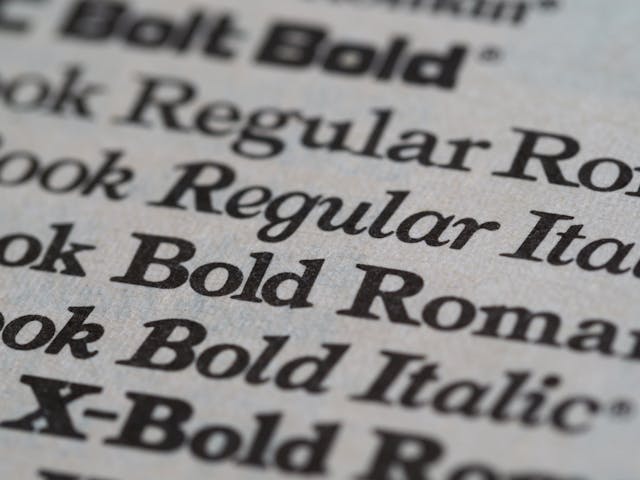
Some principles are unique to typography, like emphasis (capitalization, italics, and bold), scannability, and readability.
Most importantly, however, you must adhere to the principle of accessibility. Accessibility in design means making sure all users, regardless of physical or cognitive capability, can access and enjoy your products.
Tip: Read through the Web Content Accessibility Guidelines (WCAG) 2.2 to ensure your font is accessible to all users.
5. Experimenting With Font Styles & Characteristics
You have the foundations for excellent font design in place; it’s time to unleash your creativity.
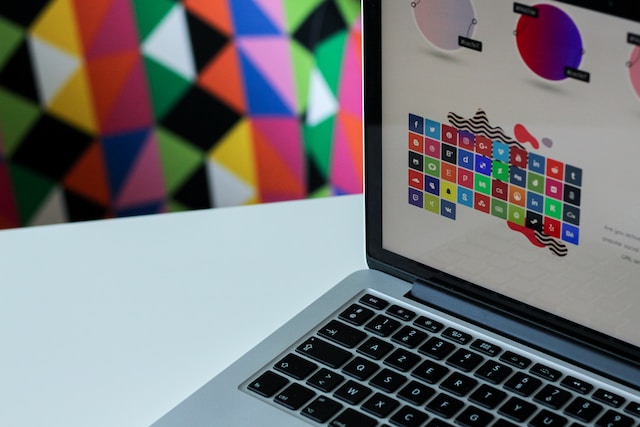
Peruse font creation tools like FontForge and Glyphs and create multiple iterations of your font. These iterations could use different visual elements, such as contrasts and proportions, or even different logo styles.
If you want to create a combination mark logo, we recommend using Abobe Illustrator for your engaging icons and illustrations.
Whichever tool you use, have fun with your designs. After all, you want your logos to be unique and memorable.
Tip: If you are stuck in a rut, you can always rely on font generators like FontSpace for inspiration.
6. Testing & Refining
The last step involves sharing your prospective logo fonts with your design team, stakeholders, and users.
If you have several final outcomes, we advise that you conduct A/B tests or preference tests. Doing so will help you find the best version of your logo’s typography.
After testing, you’ll have a wealth of actionable feedback. Implement this feedback, make any necessary refinements, and create new iterations that incorporate your improvements. By the end of this process, you’ll have a perfect font for your logo!
Top-Notch Typography: Tips for Your Logo Designs
With our guide, you have a solid reference for designing engaging font logos. That said, the more inspiration you have, the better your logo designs will be.
That’s why we’ve assembled our top logo font design tips below.
- Learn about color theory and color psychology; your color choices will impact your users’ emotional responses to your logo.
- Design with simplicity as one of your top priorities.
- Ensure your designs are scalable, both within the digital landscape and in terms of merchandise.
- Only use a maximum of two different fonts.
- Make sure your font is readable, especially for users with visual impairments.
- Use design trends cautiously – trends come and go, and you want your logo to appear timeless to enhance recognizability.
- Conduct thorough research to make sure your designs don’t infringe on existing copyrights or trademarks.
- Create a brand style guide for your logo designs to help your design team replicate your work.
What Is the Best Font for a Company Logo?
After everything you’ve read so far, you’re probably wondering, “What is the best font for a company logo?”
Of course, there is no definitive answer to this question. That said, we have compiled our top picks for the perfect fonts that will encapsulate your brand’s identity, such as:
- Professional fonts: Garamond, Baskerville, Brandon Grotesque, and Oswald
- Quirky fonts: Mohr Rounded, Caramel Macchiato, Masqualero, and Banthers
- Casual fonts: Della Respira, Montserrat, Nunito, and Vonca
- Edgy fonts: Leoscar, Odachi, Potra, and Nordic
- Romantic fonts: Shaping Heart, The Acres, Magique, and Retrips
Examples of Brands That Use Logo Fonts Effectively
To help you further, we’ve explored some of the best examples of logo fonts from reputable brands.
American Express
American Express’s logo makes use of a boldly outlined, bright sans-serif font that speaks to a trustworthy brand identity.
American Express’s use of bold letterforms makes it appear like a reliable, strong-natured brand. Since American Express is a financial services corporation, emphasizing this aspect of its identity is extremely clever.
But, as if to not deter potential customers, they use a sans-serif font to add a personal touch to their logo.
What’s more, the color choice (bright blue) is perfect since blue colors elicit feelings of stability and calmness.
Overall, American Express’s logo design helps potential customers perceive them as helpful, user-centric, and credible.
WWF
The WWF combines the best qualities of combination mark and lettermark logo designs.
In terms of lettermark qualities, they demonstrate their understanding of their users’ need for simplicity. It’s concise, bold, and dark, which allows for better contrast with its white background and, thus, enhanced readability.
The WWF realizes that its lettermark logo alone isn’t enough to drive user engagement and recognizability. That much is evident in the implementation of their classic panda illustration, which follows the Gestalt principle of closure.
Thanks to an intriguing illustration and a simple, bold font, the WWF’s logo is one of the most recognizable designs.
FAQ
What are the best fonts for logos?
There is no definitive answer to this question. That said, many brands use fonts like Helvetica Now, Proxima Nova, and Garamond for their logo designs.
Which fonts are best for luxury brands?
Many luxury brands opt for fonts like Futura by Paul Renner and Bodoni by Giambattista Bodoni. Other popular luxury fonts include Rollsgate Luxury, Didot, Magnat, Cador, Malligoe, and Adelaide.
Which fonts look the most professional?
Fonts like Calibri, Garamond, Times New Roman, and Arial are go-to’s for designers who want to achieve a professional look. Their sleek, clean lines contribute to their sophisticated visual appeal.
Best Fonts for Logos: Get Top Ideas on Page Flows
We hope that with the information in our guide you can find and leverage the perfect font for your logo.
You must base your font choices primarily on your brand’s visual identity and your users’ expectations. But needless to say, you’ll need more than great, trendy fonts to meet those expectations.
You’ll also need to offer your users intuitive, effortless in-product navigation, and that’s where Page Flows enters the fray.
With Page Flows, you have an impressive wealth of user flow recordings and screenshots to inspire your designs. Our resources detail every flow you could ever need to bring to life, including general browsing and purchasing goods.
What’s more, our resources come from a range of diverse, successful brands and thriving industries, from AI to airlines.
Enhance the best fonts for logos with seamless user navigation – that’s how you make a lasting impression on your users.
Get started today to find an abundance of valuable, inspirational resources that will stay with you throughout your career!