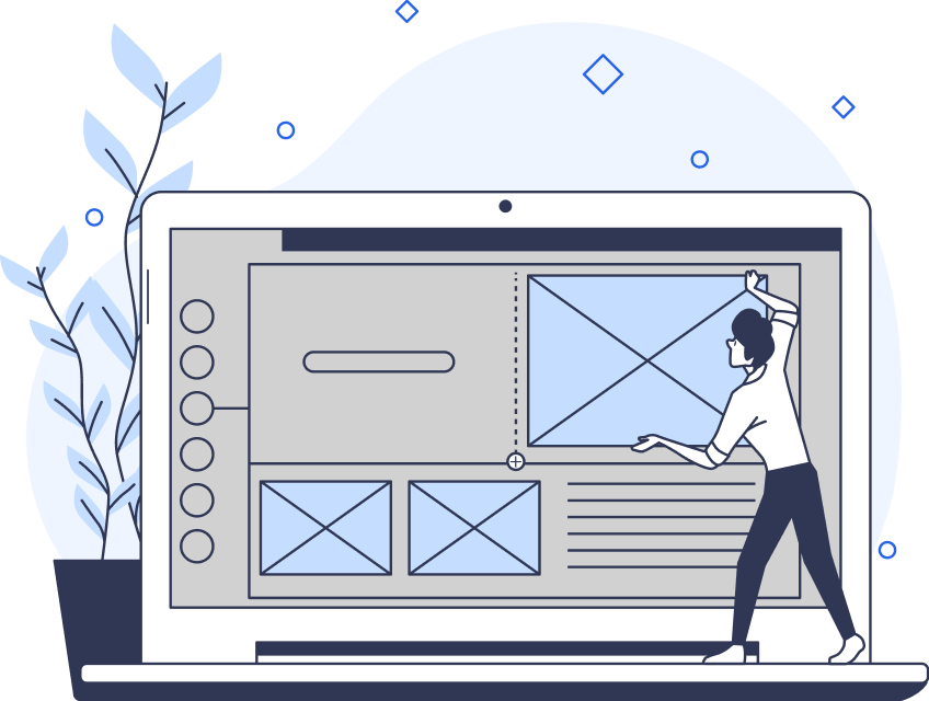
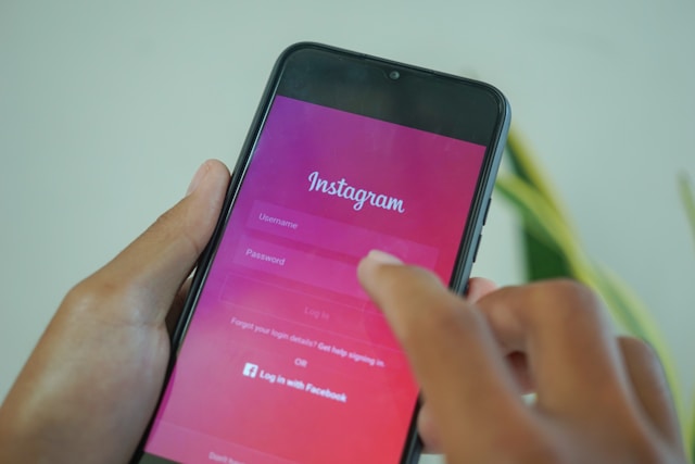
Your login page design serves as one of the first points of contact between your users and your digital products.
Beyond that, however, an effective login page can set the tone for the entirety of the user’s experience. For that reason, it’s essential to know how to optimize your login UI design.
In today’s guide, we’ll discuss precisely how you should go about improving your login screens for your users.
Onboarding vs Login Flow: Understanding the Difference
Before we discuss anything that relates to login page UI, we must settle the onboarding vs login flow debate.
A login flow guides your users through the login process, enabling them to go on to access your product. Conventionally, users have to input personal details like their name, email address, and password during their login flows.
Your users should consider your login flows as seamless and intuitive. Thus, your login screen UI should convey consistency through the use of traditional input fields and layouts. Put differently, design with your users’ past experiences in mind.
Your onboarding flow, however, shouldn’t necessarily follow traditional onboarding flows so strictly.
Your onboarding flow consists of multiple steps that showcase your product in action. The goal of any onboarding flow is to teach users how to use a product. Thus, you should tailor your onboarding flow to the unique processes within your products that users need to know.
Overall, login flows grant users access to the product, while onboarding flows teach them how to use it. For that reason, your onboarding flow should always come after your login flow.
What the Modern Login Process Looks Like in 2024
Now you know what a login flow isn’t. It’s time to look at what a modern login flow consists of in 2024.
Below, we’ve explored the many different ways the modern user can log in to a digital product. By knowing how you can mold your product’s login process, you’ll design better, user-centric login flows.
- Username & Password: The user simply has to create a unique username and a strong password to access the product.
- Social Login: Social logins allow users to log in to a digital product/service using certain social media accounts. Typically, the social media accounts users can use to log in to their accounts are Facebook, Google, and Twitter.
- Two-factor Authentication: Two-factor authentication speaks to strengthened security, which is why it’s becoming more common nowadays. With two-factor authentication, a user must provide two forms of identification to access a system. Usually, users must provide their password and a one-time code sent to their mobile phone.
- Biometrics: Biometric logins request physical characteristics from their users to access a product, including fingerprints and facial recognition. Designers typically include biometric logins in their mobile app designs.
- Magic Links: Magic links are unique links that users can access via their emails. As a form of passwordless login, all users need to do is click on the link to log in.
The Components of the Perfect, User-Centric Login Screen
To master the UI design of a login screen, you need to know what the best login screens consist of.
Here are the most essential design elements of a straightforward, intuitive login screen.
1. Branding
Given that login screens also act as the user’s first impression, it’s the best place to include brand-specific design elements.
By using brand-specific design elements, like logos, titles, and introductory textual content, you can immediately establish visual consistency and familiarity.
Branding also provides the user with context as to what kind of product they are logging in to.

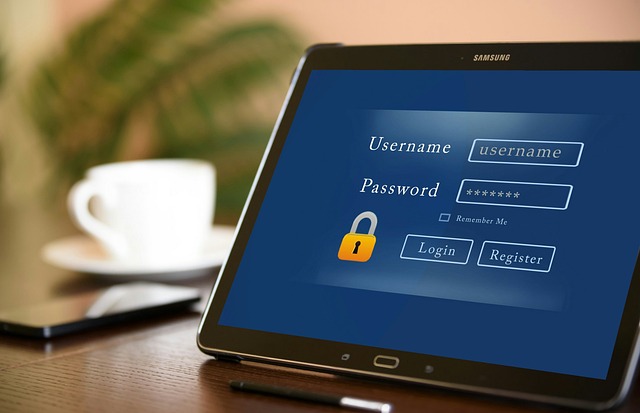
2. Username/Email Field
You must provide fields that allow users to input their usernames or email addresses.
We recommend implementing an email field instead of a username field, as email addresses are usually easier to remember.
3. Password Field
Password fields allow users to enter their passwords.
By now, you know that there are many ways to grant users access to your product from the login screen. However, whether you experiment with biometrics or social logins, we recommend that you still provide an option for conventional logins.
By doing so, you’ll adhere to the UI design principle of consistency by utilizing components from the user’s past experiences.
Tip: Always add a show/hide password toggle so users can ensure their passwords are correct.
4. ‘Forgot Password’ Link
You should provide a ‘Forgot Password’ link that can help users reset their passwords if they forget it.
You’ll demonstrate to the user that you care about accommodating their needs and resolving their pain points.
5. Login Button
The login button is your users’ CTA during the login process. You can label your CTAs with phrases like ‘Login’ or ‘Continue.’
However you label your label button, it’s crucial to design it with contrast in mind. Make your login button stand out against other elements by using different colors, shapes, or proportions.
Your goal is to make your CTA visible to the user so that they can complete the login process seamlessly.
6. ‘Remember Me’ Checkbox
A ‘Remember Me’ checkbox provides users with the option to remain logged in even after they close the website/app.
While this is a helpful feature, it’s imperative that you get explicit consent from the user before storing login details. For that reason, never make it the default option for the checkbox to appear as already ticked.
Allow the users to make that choice and customize their own login process.
7. Validation
If the user enters an invalid email address or password, you must make it evident to them.
The most common way UI designers do this is by highlighting the borders of the input fields with red colors. Additionally, UI designers also place red text underneath the highlighted input fields, reading phrases like ‘Please enter valid email address.’
8. Error Messages
During the login process, error messages typically indicate to the user that their login details are incorrect.
This message should consist of 1-2 short, clear sentences and should stand out against other design elements like your CTAs.

9. Spacing
Another UI design principle you should consider is the proximity principle. We naturally assume that elements that appear close to one another are related.
For that reason, we suggest creating three sections on your login screen. You should have one section for brand-specific elements, one for input fields, and one for CTAs/login buttons.
Tip: Place your ‘Forgot Password’ link near your password field.
10. Responsive Design
It’s best to always keep responsive design in mind when designing any website or app.
In other words, your login screens should appear just as straightforward and intuitive on electronic devices that have smaller screens.
Unveiling Essential Secrets: The Best Practices for Login Screens
To help you further, we’ve revealed some of the best practices that designers follow when creating login screens.
- Allow for social logins.
- Don’t lengthen the login process by asking for password confirmation.
- Visually indicate when users press the Caps Lock button.
- Provide instant input validation to save users time when logging in to their accounts.
- Clarify the requirements for password length and strength immediately.
- Allow users to switch between logging in and signing up on the same screen.
- Briefly explain to users why their passwords or email addresses are invalid.
- Provide ‘Forgot Password’ links and ‘Remember Me’ checkboxes.
- Use color, images, and brand-specific UI elements to drive visual intrigue.
- Always design with accessibility in mind.
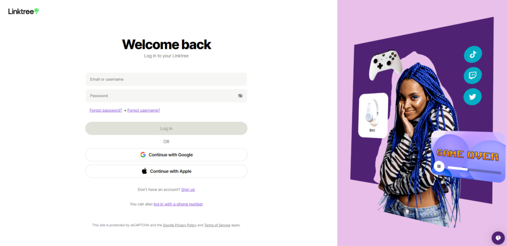
An Exploration of the Linktree Login Flow
Now you know the ins and outs of a user-centric login screen. Why not take inspiration from effective login screens in action?
Linktree allows its users to create landing pages that contain multiple links to their social media accounts, websites, and blogs. Linktree is also one of the examples we’ll examine today, given that the Linktree login process is seamless.
We’ve listed some of the best features of Linktree’s login screen below.
- It has a bold, visually prominent, and inviting welcome message.
- It provides helpful links to users who have forgotten their password or username.
- It allows for social logins via Google and Apple.
- It contains a visually exciting image.
- It allows users to toggle between visible and concealed passwords.
- It allows users to switch between logging in and signing up on the same screen.
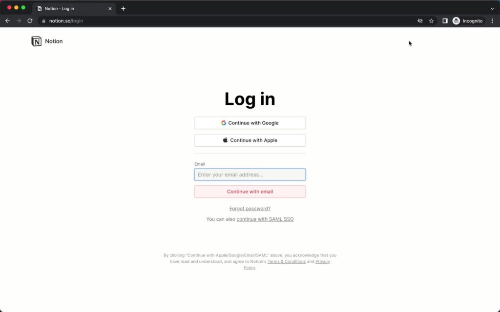
An Analysis of the Notion Login Flow
Notion offers its users a singular space to ideate, write, and plan, perfect for task management and note-taking. In other words, Notion is an AI-driven workspace that you can use for almost anything. Let’s look at the Notion login flow.
Like we did with Linktree, we’ve listed the most effective components of Notion’s login screen.
- It has a two-sentence message that summarizes what you can use the product for: ‘Think it. Make it.’
- It uses a lot of negative space to help focus the user’s attention.
- It allows for social login via Google and Apple.
- It breaks up the login process by not immediately asking for a password.
- Its CTA/login button is incredibly easy to find due to its high-contrast, bright blue color.
Learning From More of the Best Login Screen Examples
Here are a few more excellent login screen examples to inspire you.
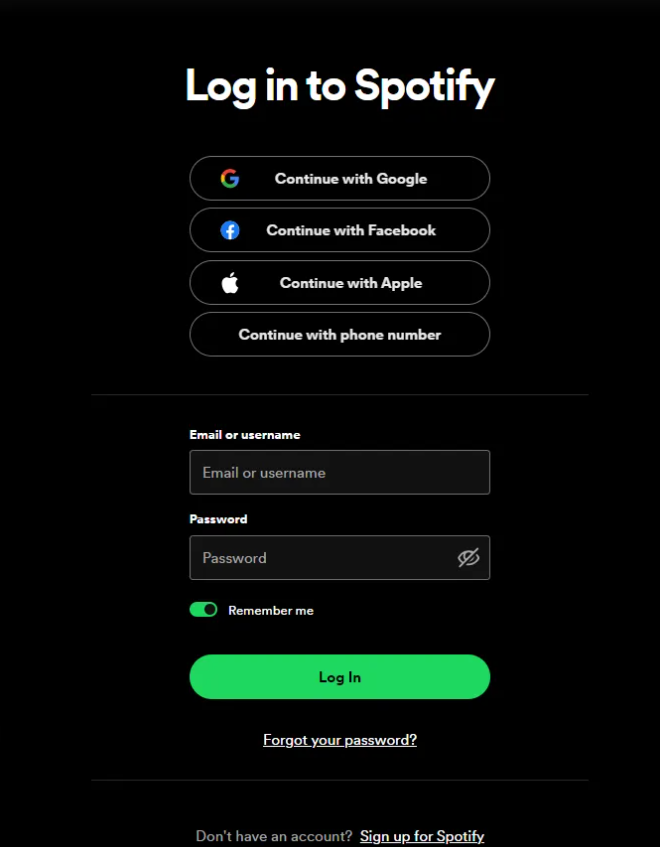
1. Spotify
Spotify’s login screen demonstrates its designers’ awareness of design trends, showcasing an aesthetically pleasing dark mode design. Dark mode helps reduce eye strain and exhibits a contrast that adheres to accessible design practices.
Spotify’s dark design allows users to easily spot essential functions like the ‘Remember Me’ toggle and ‘Forgot your password?’ link. What’s more, Spotify’s bright green ‘Log in’ CTA button helps to establish brand consistency and familiarity.
Most importantly, Spotify’s login screen allows for social logins and even logins via the user’s phone number or email address.
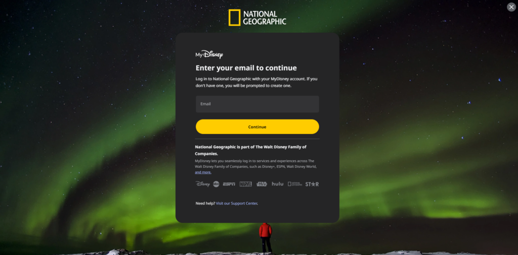
2. National Geographic
National Geographic’s login screen stands as a testament to brand consistency, utilizing a stunning image of the aurora borealis.
Besides nature-related images, National Geographic’s login process appears in incremental steps so as not to overwhelm the user.
After submitting your email and password, National Geographic will send you an email containing a verification code. By including two-factor authentication, National Geographic’s designers showcase their dedication to security.
What’s more, if its users struggle to log in, National Geographic’s login screen offers the option of a one-time passcode.
Login UI Design: Concluding Thoughts
As commonplace login screens are, they don’t have to appear as mundane chores to your users.
Login screens must make a lasting, positive impression. Design with clarity, conciseness, and visual engagement in mind, and you can’t go wrong.
On the topic of designing with visual engagement in mind, you should take inspiration from successful products. Consider Page Flows.
Page Flows is the home of nearly 5,200 user flow recordings that detail the most effective user journeys. What’s more, we record user flows from a range of diverse industries and revered brands like Vimeo, Disney, and Google.
We provide designers with a reliable knowledge base and consistent inspiration, all without clogging up their inboxes!
Additionally, we collect emails when we record user flows so that you know precisely how to communicate with your users.
Like superior login UI design, we know how to celebrate user-centricity.
Get started today to create better user experiences with every step of the user’s journey.