
Every UI designer wants to deliver a compelling, meaningful user experience to their target users. To achieve this goal, they’ll learn as much as they can about good UI design.
But it can be just as helpful to learn about bad UI design and common UI mistakes. For that reason, we’ll discuss the ins and outs of bad UI design across several different digital products.
Bad UI Design: Website Design
Let’s start with bad website design. Below are the most common characteristics of all lackluster website user interfaces.
Cluttered Layouts
A cluttered layout and a poor user experience go hand-in-hand because visual clutter hinders users from achieving their goals. Webpages that are jam-packed with copious amounts of information, imagery, and ads overwhelm users, contributing to unnecessarily high bounce rates.
Thankfully, this pitfall is relatively easy to avoid. You need to remove any visual element that doesn’t add value to the user experience. You should also use UI design principles like proximity to enhance your design’s sense of cohesion and clarity.
Treat negative space as your best friend; it’s a crucial component of an easy-to-follow visual hierarchy.
Complex Navigation
Speaking of intuitive visual hierarchies, websites that don’t utilize them definitely count as bad UI design websites. Poor website navigation often involves hidden/complex menus, indiscernible links, and no order of visual importance or emphasis.
To simplify your product’s navigation, you should familiarize yourself with your users’ expectations when interacting with a website. For instance, nearly every website user will expect navigation menus and search bars at the top of the website’s homepage.
You should also ensure that your links are immediately identifiable as clickable links with underlines and contrasting colors. To establish navigable visual hierarchies, you should implement contrasting visual elements like color, size, scale, typography, spacing, and alignment.
We naturally deem bigger, bolder, and brighter elements as more important than their smaller, more muted counterparts. This is why you need to emphasize elements that are most valuable to the user’s experience.
Illegible Typography
It’s understandable why you’d want to implement experimental typographic elements into your user interfaces. Creative typography is trending, after all.
The downside of unique typography is that it can compromise the legibility of your textual content. And we don’t need to tell you how frustrating letterforms can impact your users’ engagement.
Instead of discouraging you from using experimental typography, we’d like to show you how you can combine creativity with readability. Start by avoiding visually “busy” background design and ensuring you use high color contrasts.
We also recommend that you use experimental letterforms sparingly, reserving them for things like headlines and promotional materials. Additionally, you’ll want to strike the right balance between uniqueness and familiarity. For instance, if you’re using warped or distorted effects, you’d benefit from retaining conventional letter shapes and kerning.

Invisible CTAs
Every UI designer knows that creating compelling, visible CTAs is crucial to great user interface design.
With bad website UI design, users will struggle to spot a CTA because it blends in with the overarching design. Alternatively, if you have too many CTAs on one page, you’ll likely fail to increase your conversion rates.
To incentivize users to respond to your CTAs, you need to conduct user research. Your research will provide insight into the users’ preferences, allowing you to personalize your CTAs accordingly.
It’s also a good idea to leverage high-contrasting colors that reflect your brand’s identity. This will make your CTAs more visible while simultaneously facilitating brand recognition.
Visual Inconsistency
If you don’t use your visual elements consistently, you’ll struggle to motivate users to trust your brand.
Imagine a website that uses different, clashing color schemes, varied fonts, and dissimilar icons on each webpage. A design like that likely wouldn’t instill you with much confidence in the brand’s professionalism.
To maintain visual consistency, we suggest creating a brand style guide so that you can easily replicate your designs.
And if you’re not sure of which visual styles or elements you want to use, don’t worry. You can always conduct A/B tests with your users to determine which of your ideas are most effective.
Bad UI Design: Mobile App Design
Now, we’ll shift focus to mobile devices and the telltale signs of bad mobile app design.
Poor Onboarding Screens
Bad mobile onboarding UI design is arguably easier to achieve than poor website onboarding user interface design. Just think, you don’t have much screen estate to work with, but you still have lots of information to communicate.
Many designers stuff their app screens with this information to streamline the user onboarding process. Although quick onboarding processes are generally good, this is a mistake, especially within a mobile application.
You need to accommodate smaller screens by taking an incremental approach to the onboarding process. Leverage progressive disclosure because this will allow you to de-clutter your app’s user interfaces.
Best of all, you can still streamline your onboarding flow as you do this. All you need to do is prioritize essential design elements, remove visual flourishes, and limit your use of forms.
You won’t even need to compromise your onboarding flow’s engaging qualities. Use animated microinteractions and context-dependent tooltips to maintain user engagement.

Insufficient Wireframing
Your mobile app’s wireframes will allow you to visualize the layouts and elements it needs to be functional and aesthetic. However, many designers focus too heavily on balancing design elements with smaller screen estates.
Consequently, they end up neglecting the importance of mapping out their user flows, too.
So, before creating wireframes, you need to focus on the in-app paths your users will take to complete their goals. Consider how each segment of your user base will use your app and design with fluid navigation in mind.
This will not only increase user enjoyment but also improve the accuracy of your wireframes and subsequent user interfaces.
Small Tap Targets
We’ve all tried to remove a pop-up with a tiny “X” icon and ended up on an unwanted page. It may be a minor inconvenience, but it still negatively impacts the user experience.
Tiny tap targets – or tap targets that are too close together – make mobile apps much harder to use and navigate.
For that reason, you need to ensure your tap targets are big enough and spread out enough. Make your tap targets 48x48dp (at least) with spacings of no less than 8dp.
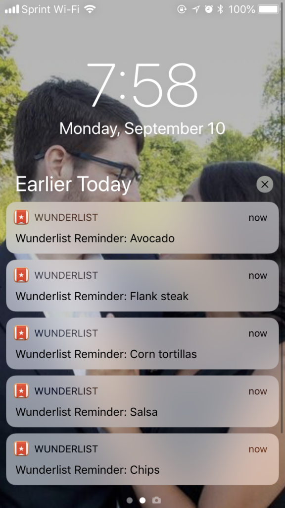
Excessive Notifications
Mobile notifications aren’t inherently a sign of poor UI design, but an excessive amount of them is.
In fact, receiving one push notification a week can cause 10% of users to disable your app’s notifications, according to the Business of Apps. So, as a designer, you need to approach your mobile app’s notifications with caution.
Bad app user interfaces don’t just overwhelm their users with too many notifications. Their notifications are also intrusive, covering desired elements or content. Combine that with tiny tap targets, and your users will likely abandon your app altogether.
You should only send meaningful, timely notifications and allow users to customize the frequency and type of notifications they receive.
Lack of Accessibility
Accessibility is crucial, regardless of the platform your users utilize to interact with your products.
Only inadequate apps disregard accessibility, neglecting to provide screen readers, alt texts, subtitles for videos, voice commands, and adjustable fonts.
Not only should you provide those things, but you should also consider how your visuals can enhance accessibility. For instance, you should avoid low-contrast color schemes that contribute to eye strain for visually impaired users.
Tip: Consult the Web Content Accessibility Guidelines (WCAG) 2.2.
Bad UI Design: Game Design
It’s time to explore the final part of the trilogy of bad UI design: game user interfaces that compromise playability.
Overwhelming HUDs
Like how bad websites have cluttered layouts, bad game UI design often contains chaotic HUDs.
Poor game HUDs are full to the brim with icons, bars, maps, text, and notifications. Not only are these types of HUDs overwhelming for players, but they actually obstruct their view of the game’s world.
Like any visually confusing digital product, the solution is to build a strong visual hierarchy and consistent grid system. Consider which elements the player needs the most, like maps and health bars. Then, you should arrange these elements within your grid without compromising the player’s view of the game’s environment.
You should also group similar items together. For instance, most players will expect to see a health bar alongside a stamina or mana bar.
Frustrating Inventory Systems
If your game’s inventory system becomes harder to navigate as the player collects more items, you’ll end up frustrating them.
Bad inventory systems lack intuitive categorization, filtering options, and comparative stats between equipped and unequipped items.
To avoid this, we recommend conducting card sorting sessions to understand how your target players would naturally categorize items. This will allow you to implement an inventory system that your players can navigate using their intuition alone.
Allow your players to filter through items based on the item’s type and rarity using concise text and clear icons.
Unclear Maps
Your game’s maps show players where they can go and where they should go with helpful markers.
As you can imagine, inadequate game maps will either not contain helpful markers or contain markers that are indistinguishable. You need to make every marker within your game’s map unique from one another, using different colors, shapes, and labels.
Spacing is also crucial here, especially for games with fast travel options. If your markers overlap and your players fast-travel to the wrong location, they’ll sit through multiple loading screens unnecessarily.
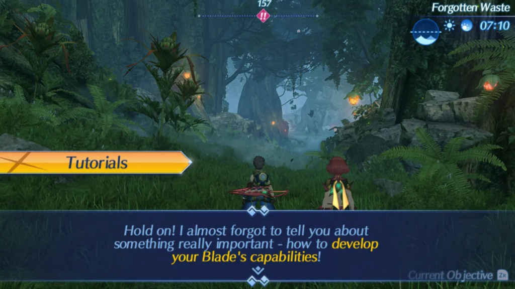
Overuse of Text
When a game’s user interface relies too much on text to communicate information, the player will likely lose interest. Most of the time, the only time a player will encounter lots of text is during the game’s tutorial.
During the tutorial stage, you need to empathize with the player. Would you want to spend a lot of time absorbing information that you’re likely to forget?
Or would you rather learn what you need to do when you need to do it? Many players enjoy learning a game’s mechanics this way, and you should accommodate those preferences.
Best of all, you don’t even need text to acquaint your players with your game. You can use fun voice-overs or animations that would make your game’s mechanics even easier to remember.
Lack of Customization
Gamers love customization because it gives them a chance to make their playing experience more personal to them.
So, when a game’s UI design doesn’t allow for customization, it robs the player of an additional layer of personalization.
In other words, you should give your players some control over their user interfaces. Allow players to resize and reposition user interface elements according to their preferences.
You should also enable players to customize their HUDs. You can do this by implementing toggle switches that the player can use to hide/reveal UI elements. You can even allow players to change the color scheme of their HUDs so they align with their preferred styles.
Bad UI Design Examples To Learn From
Designers typically seek out good UI/UX design examples to inspire them. Today, we’re focusing more on bad UI design examples to show you what making UI mistakes actually looks like.
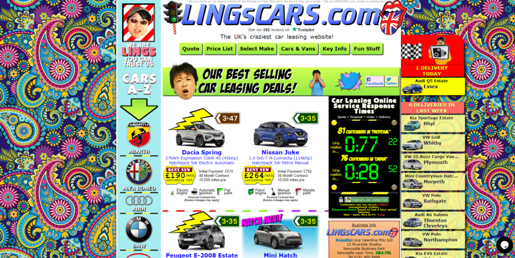
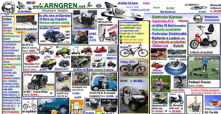
1. Ling’s Cars
Ling’s Cars is a classic example of a website that is full of too many clashing UI elements.
On the homepage alone, you’ll experience an overwhelming mismatch of colors, images, GIFs, fonts, and patterns. What’s more, because there are so many discordant visual elements, any useful text has to be smaller to accommodate them.
Much of this text is actually too small to read and headache-inducing, which poses problems for users with visual impairments. It’s definitely memorable, but not for the right reasons.
2. VaporCalc
VaporCalc is a mobile application that, like Ling’s Cars, suffers from small, unreadable text.
However, aside from font size issues, the app’s visual design is pretty underwhelming. There are hardly any colors and no animations or fun microinteractions to engage the user. To an outsider, this lack of visual flair translates to a disregard for user-centricity and professionalism.
Additionally, because there is hardly any use of contrasting colors, shapes, or proportions, the app’s visual hierarchy isn’t discernible.
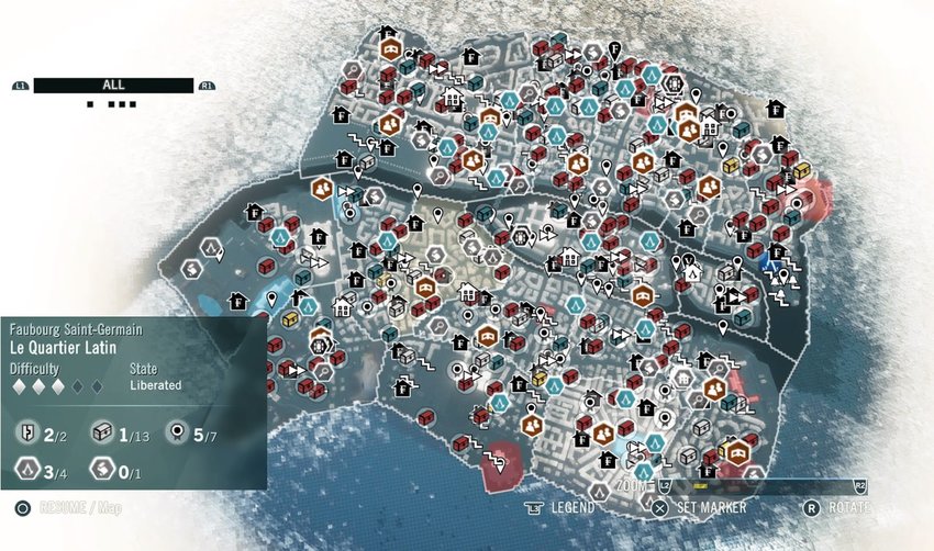
3. Assassin’s Creed Unity
Assassin’s Creed Unity made it to our list of less-than-ideal UI design examples due to its map.
As you can see, Unity’s map is complete with small, overlapping icons, some of which aren’t recognizable with intuition alone. It may have been a wiser decision to reduce the white vignette around the map. This way, the game designers would’ve been able to space out their markers more effectively.
Doing that also would’ve made the white text at the bottom of the screen easier to read.
FAQs
What is considered a “bad” UI design?
Any user interface that contains complex navigation, confusing layouts, unreadable text, and inconsistent design elements counts as bad UI design.
What are some signs of bad UI design?
Telltale signs that a digital product has poor UI design include the following:
– Excessive amounts of visuals/information
– Inadequate responsive design
– Disregard for user feedback
– Slow load times
– Insufficient testing
What are the consequences of poor UI design?
Poor UI design can frustrate/overwhelm users, exclude segments of your user base, compromise your users’ trust, and decrease conversions. All of these things will tarnish your brand’s reputation.
Avoiding Bad UI Design: Use Page Flows To Enhance Your Designs
You can avoid designing inadequate user interfaces by taking inspiration from successful products that demonstrate user-centricity. If you want to find such valuable inspiration, you’ll need Page Flows.
Page Flows is where you’ll find a wealth of annotated user flow recordings and screenshots. Our curated collections speak to high quality and variety, spanning dozens of thriving industries and brands.
We believe that you can’t reinvent exceptional user journeys without learning from them first. That’s why we cover every part of a number of diverse user journeys, collecting everything from onboarding to making purchases.
You won’t just learn how to avoid bad UI design with Page Flows. You’ll learn how to take your designs to the next level. Go to Page Flows today to begin mastering intuitive, in-product navigation!